If you’re searching for moody paint colors for bedroom spaces that actually function better rather than just look better in photos, you’re already asking the right question — and you’re ahead of most people still defaulting to the same gray that peaked in 2022. That’s not an accident of taste. It’s what happens when a color goes from aspirational to ambient, from a designer’s deliberate choice to a default setting that nobody’s really choosing anymore. This article is about what comes next, why it works, and how to execute it in a way that actually improves how your bedroom functions — not just how it photographs.
Quick Answer
The most searched bedroom paint color right now has been the same shade for four consecutive years — and if you use it, your room will look like every design blog from 2022.
What Are Moody Paint Colors (and Why They Work Differently in Bedrooms)
In This Article
- What Are Moody Paint Colors (and Why They Work Differently in Bedrooms)
- What Color Is Replacing Gray in 2026 — and What That Tells Us About the Moody Trend
- The Top 3 Bedroom Colors (According to Actual Sleep Science and Designer Data)
- How to Test Moody Colors Without Committing to a Mistake
- Specific Paints Worth Considering in 2026
Most decor content treats “moody” as an aesthetic direction, like maximalism or Japandi — something you decide you like and then shop toward. That framing gets it wrong. Moody paint colors are a technical category before they’re a visual one, and understanding the mechanics is what separates a bedroom that feels intentional from one that just feels heavy.
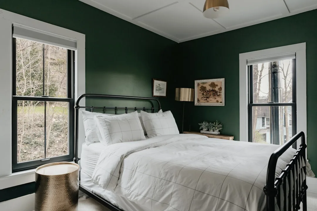
The defining characteristic of moody paint is low Light Reflectance Value (LRV) — a measurement of how much light a surface bounces back into a room. Paint manufacturers publish LRV scores for every color. Most popular whites sit above 85, meaning they return 85% of the light that hits them. A color with an LRV below 30 absorbs most of the light rather than reflecting it — and that’s where moody territory begins. Deep forest greens, inky midnight blues, warm near-blacks, dusty mauves, tobacco browns, aged burgundies: these are moody colors not because they feel moody to look at, but because they behave fundamentally differently than pale colors in a lit room.
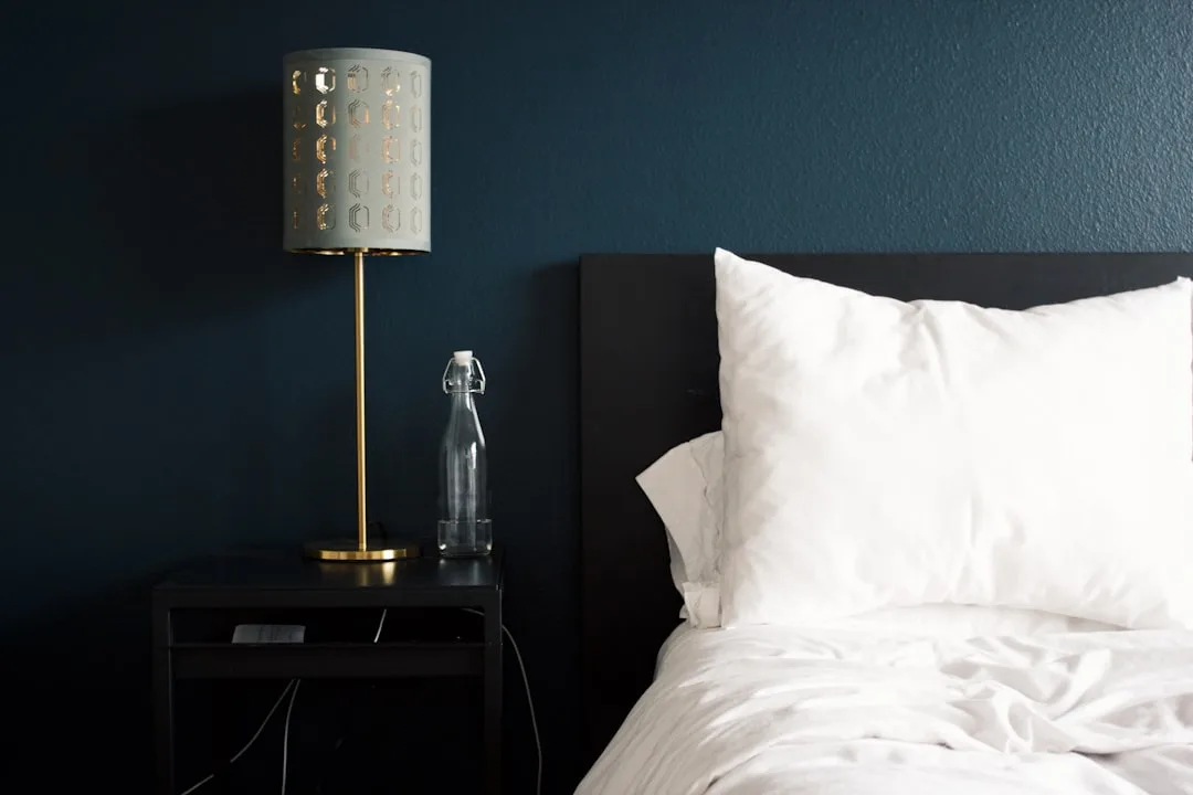
Bedrooms are the one space where that behavior is a functional advantage. Every other room — kitchen, living room, office — benefits from light amplification. A bedroom doesn’t. You sleep there. You want dim. The usual objection to dark walls — “they’ll make the room feel small and dark” — collapses the moment you ask: dark compared to what standard, and for what purpose? A bedroom that naturally reduces perceived light intensity doesn’t need to fight its own function.
Research from the Sleep Foundation notes that lower ambient light in the evening supports melatonin production. A dark-walled bedroom assists this process passively — without blackout curtains, without dimmer switches, without effort. That’s not a design preference. That’s the room working with your biology.
There’s also a critical distinction within the moody category that most people miss. Dark doesn’t mean cold. Deep terracottas, aged burgundies, and tobacco browns have LRV scores well below 30, which qualifies them as moody — but they read as enveloping and warm rather than austere. Moody-cold (slate blue, charcoal, inky black) and moody-warm (tobacco, burgundy, ochre-dark) produce completely different emotional registers in the same light conditions. Which one belongs in your bedroom depends on your room’s orientation, your existing materials, and what your nervous system needs from the space.
When you start evaluating moody paint colors for bedroom use specifically, the warm-versus-cold distinction matters more than the shade itself. A north-facing room that gets no direct sun will amplify the coolness of a slate blue into something that reads closer to gray-cold than blue-rich. That same slate blue on a south-facing wall with afternoon light comes alive entirely differently. This is why sample testing in your actual room, at multiple times of day, is non-negotiable — not a suggestion.
Actionable takeaway: Look up the LRV of any color you’re considering before buying a sample. If it’s above 35, it’s not truly moody — it’s just medium.
What Color Is Replacing Gray in 2026 — and What That Tells Us About the Moody Trend
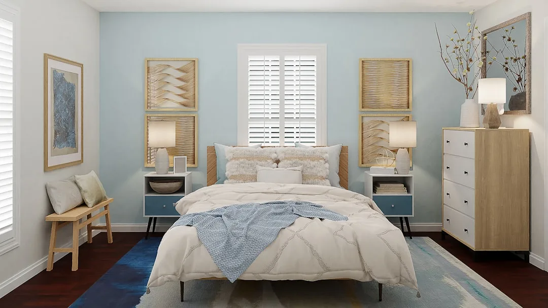
Gray didn’t fail because it went out of fashion. Gray failed because the technology in most homes quietly changed underneath it. LED lighting — specifically the 4000K–5000K “daylight” and “cool white” bulbs that dominated early LED adoption — made gray walls look clinical. Then homeowners started replacing those bulbs with warmer 2700K–3000K options, and suddenly those same gray walls looked dingy instead of crisp. Gray is a color that was designed, in practice, to live under incandescent light. Remove that warm golden bias, and gray has nothing to hold it together.
What’s filling the gap isn’t one color — it’s a direction. Warmer, more committed, more complex tones. The greige era (gray-beige hybrids that hedged in every direction) gave way first. Benjamin Moore’s Pale Oak family — a reliable greige standard for years — has been losing ground to deeper, warmer alternatives that don’t apologize for having a color identity. Sherwin-Williams’ own trend tracking has shifted visibly: where ‘Agreeable Gray’ was a perennial top seller, the conversation is now moving toward shades like ‘Cardboard’ and deeper warm browns that read as decisive rather than neutral.
The specific trajectory, based on what I’ve watched happen in designer circles and paint store conversations over the past two years:
- Greige is transitioning to warm taupe — colors that have actual brown and amber in them, not gray trying to borrow warmth
- Benjamin Moore’s ‘Raccoon Fur’ and ‘Wenge’ represent the darker end of this transition — moody warm neutrals rather than cool graphic darks
- Sherwin-Williams named ‘Quietude’ as a key transitional shade — it sits between gray and the warmer, more complex tones that are gaining dominance
- Benjamin Moore’s 2026 Color of the Year palette leaned into warm, complex neutrals with genuine depth, a direct departure from the clean gray era that defined the previous decade
The cultural engine behind this is what designers have started calling “cocooning” — a deliberate move toward rooms that feel like shelter from overstimulation rather than extensions of a curated public persona. That impulse maps directly onto moody bedroom aesthetics. The room is no longer trying to look good in a photo. It’s trying to feel good at 10pm when you’ve had enough of everything.
Actionable takeaway: If you’re drawn to gray, ask yourself whether your existing bulbs are 2700K or 4000K. If you don’t know, check the packaging in your bedside lamp. That answer should influence whether you go warmer or cooler in your next paint choice.
The Top 3 Bedroom Colors (According to Actual Sleep Science and Designer Data)
I want to be careful here, because most “science says this color is best for sleep” content takes one study, removes all its nuance, and turns it into a universal prescription. Sleep and color research is real. It’s also highly conditional on the specific shade, the room’s light conditions, and the individual.
With that caveat logged: there is a pattern in the evidence, and it’s worth knowing.
Blue is the most researched sleep-supportive color on record. A Travelodge UK study surveyed 2,000 Britons about their sleep habits and bedroom colors, and found that blue bedroom occupants averaged the highest nightly sleep total — 7 hours and 52 minutes — across all colors tested. But here’s the part that gets dropped from every listicle: shade matters enormously. Navy and slate performed best. Bright or icy blue — the kind that reads almost turquoise under daylight — did not show the same effect. The restful quality appears to be in the depth and saturation, which is exactly where the best moody paint colors for bedroom spaces operate. A washed-out powder blue and a deep indigo are both technically blue; they are not the same room experience, and the research doesn’t treat them as such.
Green — specifically muted, forest, or sage-adjacent greens — is the direction most designers are actively recommending right now. The evidence base is softer than it is for blue, but the practical logic is strong: green reads as biophilic, meaning it triggers associations with natural environments that most people’s nervous systems find calming. The moody green family — olive, deep forest, aged sage, eucalyptus with gray in it — sits at the intersection of the LRV requirements for moody behavior and the psychological associations that make a bedroom feel removed from the urgency of everything outside it. Farrow & Ball’s ‘Calke Green’ and ‘Mizzle,’ Benjamin Moore’s ‘Tarrytown Green,’ and Sherwin-Williams’ ‘Jasper’ are the specific shades that keep appearing in designer project documentation for this reason.
Warm dark neutrals — including tobacco brown, aged terracotta, and near-black with warm undertones — are the functional third category. These don’t have the same research backing as blue or green, but they dominate in practice for a specific reason: they work exceptionally well with the warm 2700K–3000K bulbs that most bedrooms use at night. Under that light, a tobacco brown wall doesn’t read as a color choice — it reads as the room itself becoming soft. The walls disappear into warmth. That’s the effect that makes people describe a dark bedroom as “cozy” rather than “claustrophobic,” and it’s almost entirely a function of choosing a shade with the right undertone for your light source.
Actionable takeaway: Before committing to any of these three directions, identify your bulb color temperature. Blue needs warmer light to perform well (2700K is ideal). Green is flexible but looks best under 3000K. Warm dark neutrals are the most forgiving and do their best work under the dimmest, warmest light you have.
How to Test Moody Colors Without Committing to a Mistake
The standard advice — buy samples, paint swatches on the wall — is correct but incomplete. Here’s what the standard advice skips.
Paint your sample on a large piece of foam board, not directly on the wall. This lets you move it around the room: place it next to the window in the morning, next to the lamp at night, behind the bed where it will actually live most of its visual life. A color that looks perfect next to the south-facing window may look completely different in the corner where you’ve positioned the headboard, which never sees direct light. You need to see it in the worst-lit part of the room, not just the best.
Paint two coats of the sample color over white primer on that board. A single coat of a dark moody color over whatever existing color is on your wall will read lighter and warmer than the final result — because the undertone of the wall beneath is still influencing what you see. Your final result will be two or three full coats over a primed or painted surface. Sample it that way.
Observe it at three specific times: mid-morning with natural light, early evening with only overhead lighting active, and late evening with only bedside lamps. These are the three light conditions your bedroom wall will actually live in. The third one — late evening with table lamps — is the one that matters most for a moody bedroom palette, and it’s the one almost nobody checks during sampling.
Watch for undertone drift. This is the biggest source of regret in dark paint choices. A color that reads as sophisticated forest green in the store can reveal a khaki or yellow-green undertone once it’s on four walls and surrounded by itself. Greens are the worst offenders. Blues can reveal purple. Browns can go orange. The undertone becomes the dominant impression at scale, not the base color you selected. This is why the foam board method matters — you can hold it against every fabric, flooring, and furniture piece you own before committing.
Specific Paints Worth Considering in 2026
This is not an exhaustive list. It’s a filtered one — colors that have appeared consistently in designer project documentation, that have LRV scores appropriate for genuine moody behavior, and that address the specific lighting conditions most bedrooms operate in.
Benjamin Moore ‘Newburyport Blue’ (HC-155) — LRV 22. A blue with enough gray to avoid reading as nautical, enough depth to absorb evening light without looking flat. Works exceptionally well in rooms with warm 2700K lighting.
Farrow & Ball ‘Hague Blue’ (No. 30) — LRV approximately 4. One of the most discussed dark blues in designer circles for the past five years, for a reason: it has a green undertone that prevents it from reading as cold even in north-facing rooms. It absorbs nearly all light. The room becomes the color.
Sherwin-Williams ‘Urbane Bronze’ (SW 7048) — LRV 9. The 2022 Color of the Year that has aged better than most. A warm gray-brown that sits at the exact intersection of moody-neutral: dark enough to function, warm enough to avoid austerity.
Benjamin Moore ‘Black Pepper’ (2131-10) — LRV 8. A near-black with warm brown undertones. For bedrooms that want to go dark without committing to a color identity. Functions almost as a sophisticated alternative to true black.
Farrow & Ball ‘Calke Green’ (No. 80) — LRV approximately 6. The darkest end of the muted green family. Deep enough to qualify as genuinely moody, warm enough not to read as clinical.
Sherwin-Williams ‘Dustblu’ (SW 6239) — LRV 15. A blue-gray that sits in the transitional space between the old gray aesthetic and the deeper, more committed blues gaining traction. A useful bridge color for spaces where full commitment to dark feels like too large a step.
The honest framing here: no list of specific colors replaces the process of testing in your actual room. But these are worth starting with because they’ve been stress-tested in real conditions by people whose job it is to get this right.
FAQ
Is a moody paint color going to make my small bedroom feel even smaller?
The “dark makes rooms feel smaller” rule applies primarily to spaces where the visual purpose is to feel expansive — living rooms, open-plan kitchens, entryways. A bedroom’s purpose is the opposite. Enclosure, shelter, warmth, separation from the rest of the house. When a dark color makes a bedroom feel smaller, it’s usually accomplishing exactly what a bedroom is supposed to accomplish. The caveat is ceiling color: if you take dark walls all the way up onto a low ceiling without any treatment, the room can start to feel compressed rather than cozy. Keeping the ceiling one or two shades lighter than the walls — or using a warm white — preserves the sense of vertical space while keeping the walls moody.
Can I use moody paint colors in a bedroom that gets a lot of natural light?
Yes, and it often works better than people expect. High natural light doesn’t neutralize a dark wall — it activates it. A deep forest green in a room with afternoon sun looks entirely different from the same color in a north-facing room, and often more interesting: the light catches the undertones and creates a sense of depth that flat or medium colors can’t produce. The practical concern in high-light rooms is overheating if the color has significant warmth. A cool-leaning dark (deep navy, slate, forest green) handles strong sunlight better than a warm dark (tobacco, burgundy, terracotta), which can make a sunny room feel overwarm.
What finish should I use for moody bedroom walls?
Matte or flat finishes are the standard recommendation for dark, moody colors, and for good reason: they minimize light reflection at exactly the LRV range where these colors operate. An eggshell or satin finish on a very dark wall can produce a subtle sheen that reads as slightly industrial rather than enveloping. The practical tradeoff is cleanability — matte paint marks more easily. A compromise that works well: use a matte finish on walls and a satin finish on trim, which creates enough contrast to define the space without undermining the flat, absorptive quality of the dark wall.
Do moody bedroom colors require specific furniture or bedding to work?
Not specific pieces, but the principle holds: high contrast between dark walls and light-colored bedding tends to feel more graphic and deliberate, while tonal layering (dark walls, medium or warm-dark textiles) feels more immersive. Neither is wrong. The graphic contrast approach — very dark walls, crisp white bedding — photographs well and works in rooms with a cleaner, more modern furniture profile. The tonal approach feels more like the room wrapping around you, which is closer to what most people are chasing when they choose moody paint colors for bedroom spaces in the first place. Avoid metallic or highly reflective hardware and furniture at the extreme low-LRV end of the moody range — it creates bright spots that interrupt the absorbed, enveloping quality you’re working toward.
How do I know if a paint color is truly moody or just dark?
Look up the LRV score before buying a sample — every major paint brand publishes these on their website and on the back of paint chips. A genuine moody color sits below 30 LRV, with most of the best examples falling between 4 and 20. Above 35, you’re in medium territory: the color may look dark on the chip but will read noticeably lighter on four walls in a lit room. The second check is undertone complexity: true moody colors have layered undertones that shift depending on light conditions. A color that looks the same at noon and 10pm is a dark color, not a moody one. The shift — green revealing blue at night, brown warming to amber under lamplight — is what gives moody colors their quality of changing the room rather than just covering the wall.