A well-executed pink aesthetic room is one of the most misunderstood things in interior design — simultaneously dismissed as juvenile and praised as the boldest choice a serious designer can make, sometimes in the same decade. Pink gets written off, then reclaimed as sophisticated, then overexposed, then quietly rediscovered in the corner of a Paris hotel lobby that every serious designer suddenly wants to photograph. This cycle isn’t random. It reflects something real about how pink works — and why most people get it wrong before they eventually get it right.
Quick Answer
Pink is the only color in interior design that’s been declared both the boldest choice a designer can make and the most embarrassing — sometimes in the same decade.
This isn’t a mood board. It’s a framework.
Why Pink Is Having a Serious Design Moment (And It’s Not About Barbie)
In This Article
- Why Pink Is Having a Serious Design Moment (And It’s Not About Barbie)
- Is Pink a Good Color for a Room? The Honest Answer Depends on These 3 Factors
- How to Make a Pink Room Look Intentional, Not Accidental
- The Pink Shades Worth Knowing (And What They Actually Look Like in Practice)
- Room-by-Room: Where Pink Works Hardest and Where It Needs Help
- How to Make a Pink Room Look Intentional, Not Accidental
Most people credit the 2023 Barbie film for pink’s current visibility. Wrong timeline. The rehabilitation started closer to 2016, when a specific shade — muted, slightly gray, warm without being orange — colonized everything from fashion to ceramics to architecture and became known as Millennial Pink. Pantone’s Color Institute later identified it as Pantone 13-2010, calling it one of the most commercially influential colors of the 2010s. That wasn’t hype. It showed up in product sales, in editorial coverage, in the paint samples people were actually requesting.
By 2022, the pink conversation had matured. The candy-sharp version was fading — as trend-chasing colors always do — and what remained were the earthier, more complex pinks: terracotta-adjacent blushes, dusty roses with gray undertones, warm mauves that read almost neutral in certain light. These are the pinks with staying power, and the reason is structural. They function like a warm neutral, which means they play well with wood, linen, leather, and aged metal in a way that bubblegum pink never could.
India Mahdavi understood this before most people were paying attention. Her signature dusty rose — applied to chairs, walls, and architectural surfaces with deliberate restraint — has now appeared in projects across more than 40 countries. That breadth isn’t trend-chasing. It’s evidence that a specific register of pink reads as sophisticated across wildly different cultural contexts. Kelly Wearstler built her maximalist pink moments on the same logic: complexity of tone, not brightness of hue.
There is also documented psychology behind the appeal. Alexander Schauss’s Baker-Miller pink studies from the 1970s became a cultural touchstone — the shade was used in holding cells with reportedly calming effects — though later research complicated those findings considerably. What held up was this: warm pinks, specifically low-saturation versions, consistently read as warmer in perceived room temperature and lower in psychological tension than cooler, starker walls. That’s not opinion. It’s a behavioral pattern that keeps showing up in the research.
Hotel Costes in Paris didn’t choose pink by accident. Luxury residential projects don’t return to rose and blush year after year by accident. The color earns its place when it’s used by people who understand its logic rather than just its look.
Takeaway: If you’re drawn to pink, identify whether you’re responding to a trend-chasing version or an enduring one. Dusty, earthy, and gray-toned pinks have outlasted every “pink is back” moment since the 1980s. That’s your starting point.
Is Pink a Good Color for a Room? The Honest Answer Depends on These 3 Factors
Yes. Also no. The honest answer is that pink is as context-dependent as any other color — more so, actually, because its undertones shift dramatically under changing light and it reacts more strongly to its surroundings than most neutrals do.
Here are the three factors that actually determine whether pink works in your specific room:
Factor 1: Light Direction
North-facing rooms get cool, indirect light all day. Put a cool-toned pink — anything with a gray or blue undertone — on a north-facing wall and you’ll get something that looks institutional by afternoon. Flat. Slightly sad. South-facing rooms get enough warm light to stabilize cooler pinks, so you have more range. East and west light, which is warm in the morning or evening and neutral midday, is most forgiving for warm pinks — dusty rose, blush with peach undertones, any pink that leans toward terra cotta. This matters enormously and almost nobody talks about it.
Factor 2: Room Function
Pink reads warmer than its actual value suggests, which makes it genuinely comfortable in bedrooms and living rooms. The warmth becomes a liability in small kitchens or bathrooms — especially anything under 80 square feet — where it can make the space feel enclosed in a way that reads as pressure rather than coziness. In those spaces, either go very light in value or restrict pink to a single surface.
Factor 3: Undertone Matching
This is the single biggest mistake I watched clients make repeatedly — spending money on a pink paint they loved in the store and then wondering why it looked wrong against their furniture. The problem is almost always undertone conflict. A pink with cool blue undertones will fight warm honey-toned wood. A pink with peach undertones will clash with cool gray linen. The fix is the white paper test: hold a white sheet of paper next to your paint swatch in natural light. The swatch’s undertone becomes immediately obvious against a true neutral.
Paint two 12×12-inch swatches on adjacent walls — not just one patch — and observe them at three different times: morning, midday, and evening. Pink shifts more dramatically under changing light than almost any other color. I’ve seen the same blush look lavender at noon and warm terracotta at 7pm in a west-facing room.
Paint industry data shows that pink and blush tones have ranked consistently in the top 10 bedroom color searches on major paint brand websites since 2019, with Benjamin Moore’s ‘Pale Rose’ and Farrow & Ball’s ‘Middleton Pink’ among the most-sampled shades nationally. That sustained interest isn’t a spike — it’s a baseline.
Takeaway: Before buying a single drop of paint, do the three-light swatch test. One afternoon of observation prevents an expensive mistake.
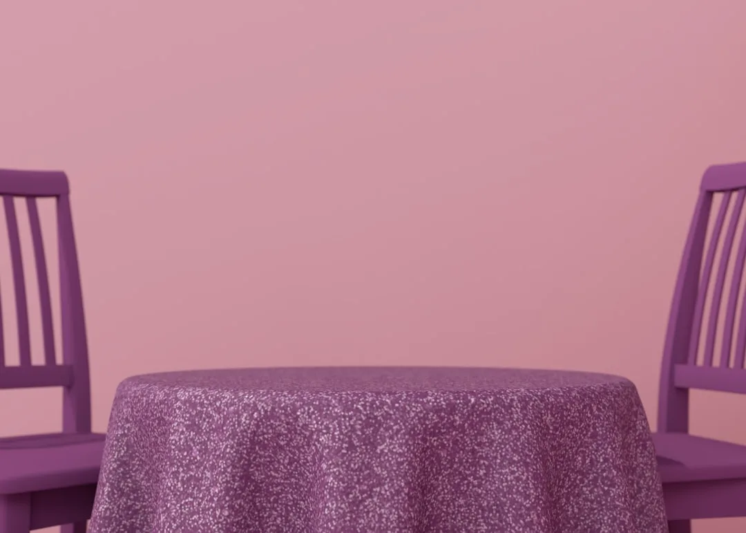
How to Make a Pink Room Look Intentional, Not Accidental

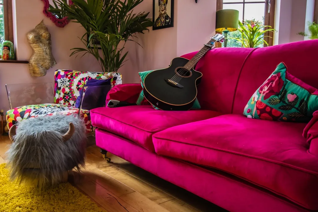
The difference between a pink aesthetic room that looks designed and one that looks decorated is not budget. It’s not even taste, exactly. It’s structural logic — the sense that someone made deliberate decisions about proportion, weight, and texture rather than just accumulating pink things until the room felt pink enough.
The 60-30-10 rule applies, but with a specific caveat for pink. In most single-color-dominant rooms, the dominant color takes 60% of the visual space (walls, large furniture), the secondary color takes 30% (textiles, accent chairs), and the accent takes 10% (art, small objects). Pink rarely works well as all three — when everything in the room is pink or pink-adjacent, you lose the contrast that makes pink visible as a choice rather than a default.
The rooms that work — the ones that photograph well and feel even better in person — tend to follow a specific pattern:
- Pink as the dominant surface (walls, a large upholstered piece) anchored by at least one dark or deeply saturated element: charcoal, deep walnut, forest green, or navy
- Texture doing more work than color — rough linen, matte plaster, aged brass, unpolished stone all read as mature against pink in a way that smooth, shiny surfaces don’t
- One non-pink anchor per visual zone — every corner of the room should have something that isn’t pink, even if it’s just a dark wood frame or a deep-toned ceramic
- Metallics chosen deliberately — brass and unlacquered bronze warm a pink room; chrome and nickel cool it down and can introduce an unintended clinical quality
Where most pink rooms go wrong:
- Combining multiple pink tones without a unifying undertone — warm blush on walls fighting cool mauve on bedding creates visual noise that reads as error, not layering
- Choosing pink furniture and pink walls in the same saturation level — the room flattens because there’s no hierarchy
- Ignoring the ceiling — a blush ceiling even one shade lighter than the walls creates a sense of enveloping warmth that a white ceiling breaks entirely
- Over-softening with too many round shapes and no angular elements — this is what makes a pink room read as childish more than the color itself does
What to pair with pink that most guides get wrong:
Most pink room guides suggest white as the default pairing. White works, but it’s often the least interesting option. The pairings that create genuinely sophisticated spaces are:
- Deep green (particularly sage, olive, or hunter) — creates a botanical tension that reads as curated rather than sweet
- Raw or smoked wood — the warmth bridges without matching
- Charcoal or near-black — provides the visual weight pink needs to stop reading as soft-everything
- Terracotta or brick — works only when the pink has warm undertones; clashes badly with cool-toned pinks
Takeaway: Designing a pink aesthetic room is an exercise in contrast management. Pink needs something to push against — in weight, texture, or tone — or it collapses into visual monotony.
The Pink Shades Worth Knowing (And What They Actually Look Like in Practice)
Not all pinks perform the same way at scale. A color that reads as barely-there on a paint chip can dominate an entire room at full wall coverage. These are the shades that have demonstrated staying power in real projects:
- Farrow & Ball Middleton Pink (245) — a warm, chalky blush with significant yellow undertone; looks like a faded antique textile on walls; reads almost beige in low light
- Farrow & Ball Peignoir (286) — cooler, grayer, more lavender-adjacent in some lights; best in south-facing rooms where warm light compensates for its cooler base
- Benjamin Moore Pale Rose (2093-60) — one of the most versatile blushes in a major paint line; warm without being peachy, light enough to function almost as a tinted neutral
- Portola Paints Rosé — a matte limewash-style finish that adds texture as well as color; particularly effective in rooms where plaster or textured walls are part of the aesthetic
- Clare Hazy Days — a modern dusty rose with gray undertones that leans more mauve than pink in certain lights; one of the better options for a pink room that needs to coexist with cool-toned furnishings
Each of these reads differently depending on your room’s light direction and existing materials. None of them look the way they do on a screen. Sample before committing, always.
Room-by-Room: Where Pink Works Hardest and Where It Needs Help
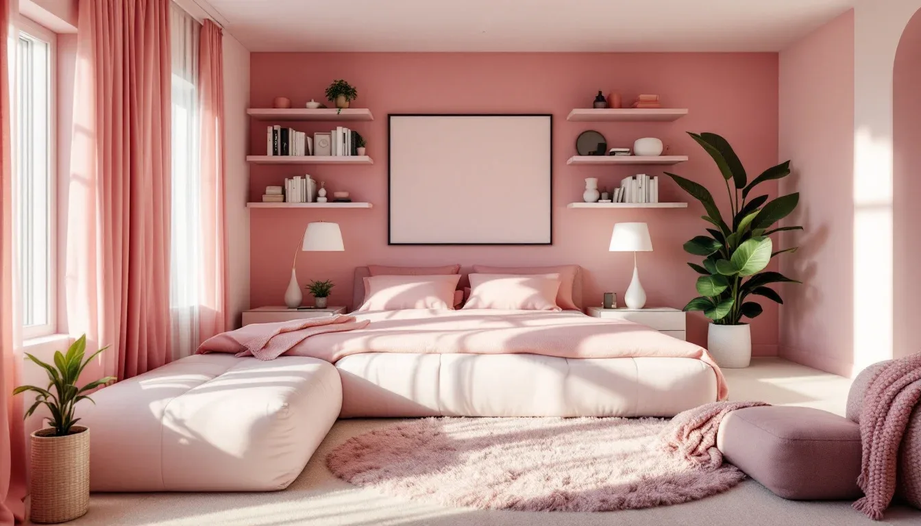
Bedroom
The strongest application for a pink aesthetic room. Low-saturation pinks — dusty rose, warm blush, muted mauve — reduce visual stimulation in a way that supports sleep, which is why so many designers default to pink for master bedrooms even when clients initially resist it. The key is value: keep walls lighter than 50% saturation and let textiles carry any deeper pink tones.
What works in pink bedrooms:
- Linen bedding in a complementary warm neutral (oat, sand, warm white)
- Dark wood or cane furniture to introduce visual weight
- Brass or bronze hardware — never chrome
- A single non-pink accent wall in a deeper tone if the room is large enough to handle it
Living Room
More complex because living rooms carry more visual information than bedrooms. Pink works best here as an accent wall or on a single large upholstered piece — not as a full-room treatment unless the room is large, has generous natural light, and has multiple strong anchoring elements in deeper tones.
Kitchen
The riskiest application. Pink reads as slightly warmer and smaller than it is, which becomes a real problem in kitchens under 150 square feet. If you want pink in a kitchen, the most functional approach is:
- Pink only on upper cabinets, with a neutral or wood lower cabinet
- Blush tile as a backsplash rather than wall paint — the grout lines break up the color and prevent the enclosed feeling
- Avoid pink countertops unless the rest of the room is very light and very neutral
Home Office
Underused application. A warm blush on a single wall behind a desk creates a flattering background for video calls while keeping the room functional. The psychological warmth of pink can make long work sessions feel less stark. Avoid high-saturation pinks — they become visually exhausting over several hours.
How to Make a Pink Room Look Intentional, Not Accidental
The difference between a pink aesthetic room that looks designed and one that looks decorated is not budget. It’s not even taste, exactly. It’s structural logic — the sense that someone made deliberate decisions about proportion, weight, and texture rather than just accumulating pink things until the room felt pink enough.
FAQ: Pink Aesthetic Room Questions Worth Answering
Is a pink aesthetic room only for certain styles, like maximalist or feminine design?
No — and this is one of the most persistent misconceptions about pink in interiors. Pink is applied effectively across minimalist, Japandi, mid-century modern, and industrial contexts. The difference is which pink and how much of it. A dusty, gray-toned blush on a single wall in a minimalist space with concrete floors and raw wood reads nothing like a candy pink maximalist bedroom. The style association people have with pink usually comes from high-saturation versions applied at high volume. Reduce either variable and the style associations shift significantly.
What colors should you never pair with pink in a room?
There are no absolute rules, but several pairings consistently create visual problems:
- Cool pink + warm wood — the undertone conflict reads as indecision rather than contrast
- Multiple pink tones at similar saturation — without clear hierarchy, the room looks unfinished
- Pink + orange — technically analogous on the color wheel, but in practice it tends to read as a clash unless one tone is very muted
- Pink + cool gray in equal proportions — can look like a palette that couldn’t commit to either direction
How do you keep a pink room from looking childish?
The “childish” read almost always comes from one or more of these specific decisions — not from pink itself:
- High saturation (bubblegum, hot pink, candy pink)
- All-pink surfaces with no anchoring contrast
- Round shapes throughout with no angular elements
- Shiny or glossy finishes on walls or furniture
- Pink paired exclusively with white, without any deeper tones
Fix any one of these and the room matures significantly. Fix all five and pink becomes the most sophisticated choice in the room.
What’s the best pink paint for a room with limited natural light?
For north-facing or low-light rooms, the safest choices are warm-undertone pinks with significant yellow or peach in their base — these read warmer under artificial light and don’t flatten the way cool-toned pinks do. Farrow & Ball’s Middleton Pink and Benjamin Moore’s Pale Rose both perform well in low-light conditions. Avoid anything with a gray or blue undertone in a room that doesn’t get direct sun — those shades become muted and slightly institutional without the warmth of natural light to activate them.
Can you do a pink room without painting the walls pink?
Yes, and in many cases this is the better approach — particularly in rented spaces or rooms where you want pink as a mood rather than a commitment. The most effective non-paint approaches:
- A large pink upholstered piece (sofa, headboard, armchair) against neutral walls
- Pink linen or velvet drapery that covers a significant wall area when closed
- A statement pink rug as the room’s color anchor
- Pink limewash or textured plaster on a single accent wall — different enough from standard wall paint that it reads as a deliberate material choice rather than a color trend
Each of these introduces the warmth and tone of pink without requiring the full commitment of four painted walls.
Is a pink aesthetic room only for certain styles, like maximalist or feminine design?
No — and this is one of the most persistent misconceptions about pink in interiors. Pink is applied effectively across minimalist, Japandi, mid-century modern, and industrial contexts. The difference is which pink and how much of it. A dusty, gray-toned blush on a single wall in a minimalist space with concrete floors and raw wood reads nothing like a candy pink maximalist bedroom. The style association people have with pink usually comes from high-saturation versions applied at high volume. Reduce either variable and the style associations shift significantly.
What colors should you never pair with pink in a room?
There are no absolute rules, but several pairings consistently create visual problems:
How do you keep a pink room from looking childish?
The “childish” read almost always comes from one or more of these specific decisions — not from pink itself:
What’s the best pink paint for a room with limited natural light?
For north-facing or low-light rooms, the safest choices are warm-undertone pinks with significant yellow or peach in their base — these read warmer under artificial light and don’t flatten the way cool-toned pinks do. Farrow & Ball’s Middleton Pink and Benjamin Moore’s Pale Rose both perform well in low-light conditions. Avoid anything with a gray or blue undertone in a room that doesn’t get direct sun — those shades become muted and slightly institutional without the warmth of natural light to activate them.
Can you do a pink room without painting the walls pink?
Yes, and in many cases this is the better approach — particularly in rented spaces or rooms where you want pink as a mood rather than a commitment. The most effective non-paint approaches: