The reason your small apartment furniture arrangement never looks right has nothing to do with how much space you have — it’s that every guide online was written for a room that doesn’t exist. A perfect square with a centered window, one door, and nothing awkward happening anywhere. Your apartment has a radiator under the only good wall. Your window is six inches from the corner. Your bedroom door swings into the exact spot where the bed needs to go.
This article is built around those real layouts. Not diagrams from a design textbook.
Why Most Small Apartment Furniture Advice Fails You in the Real World
Open any top result for small apartment furniture arrangement ideas and you’ll find the same illustration: a tidy rectangle, furniture floating symmetrically, a window perfectly centered on the far wall. It’s a useful fiction. Almost no apartment actually looks like that.
Real apartments have off-center windows, doors that interrupt the longest wall, radiators that claim three feet of prime real estate, and kitchens that open directly into the living area at an angle nobody planned for. Generic diagrams aren’t wrong — they’re just describing a room most people don’t live in.
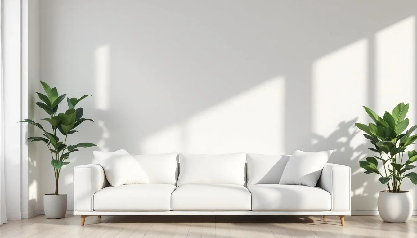
The second piece of bad advice recycled across almost every competitor is this: push your furniture against the walls to open up the center. Experienced interior designers consistently cite this as one of the most counterproductive moves you can make in a small room. When every piece of furniture is pressed against a wall, the center of the room becomes dead space — a void that makes the room feel like a waiting room rather than a home. Floating furniture away from walls, even by 12 to 18 inches, creates visual depth and zone definition that wall-hugging simply can’t achieve.
The frustration is real and it’s widespread. Threads on r/interiordesign and r/malelivingspace receive hundreds of layout help requests weekly, and the reason people keep posting isn’t that they’re bad at spatial reasoning. It’s that the standard playbook doesn’t map to their actual floor plan.
What works instead is a layout approach built on your specific fixed points — not on what a generic diagram looks like. That means understanding your window placement, your traffic flow, and your ceiling height before a single piece of furniture moves.
Actionable takeaway: Before you rearrange anything, take a photo of your floor plan from above — even a rough sketch on graph paper — and mark every door, window, outlet, and radiator. That map is your actual starting point. The generic diagram isn’t.
The Three Variables That Should Drive Every Small Apartment Furniture Decision
Most layout advice treats furniture arrangement as a visual puzzle. Move this here, angle that there, see how it looks. The problem is that purely visual thinking ignores the functional logic underneath every good room — and that logic comes down to three variables that almost no competitor content addresses together.
1. Window Placement
Your windows are your most powerful fixed points, and they dictate where your largest piece of furniture cannot go. A sofa pushed against a window doesn’t just block light — it creates a glare problem for anyone sitting across from it, and it eliminates the one wall that naturally draws the eye. Window placement determines your focal point, which means it determines where your main seating should face, not sit.
2. Traffic Flow
Every apartment has invisible pathways — the route from your front door to your bathroom, from your kitchen to your couch, from your bed to your closet. You walk them without thinking. When furniture interrupts those paths, you feel it as low-level daily friction: a slight turn here, a squeeze past that corner there. It accumulates.
The standard minimum clearance for a comfortable traffic pathway is 36 inches. In genuinely tight spaces, 24 inches is the functional floor — the absolute minimum where two people can pass or one person can move without turning sideways. That’s not a design goal; it’s a constraint. Map your paths before you place anything.
3. Ceiling Height
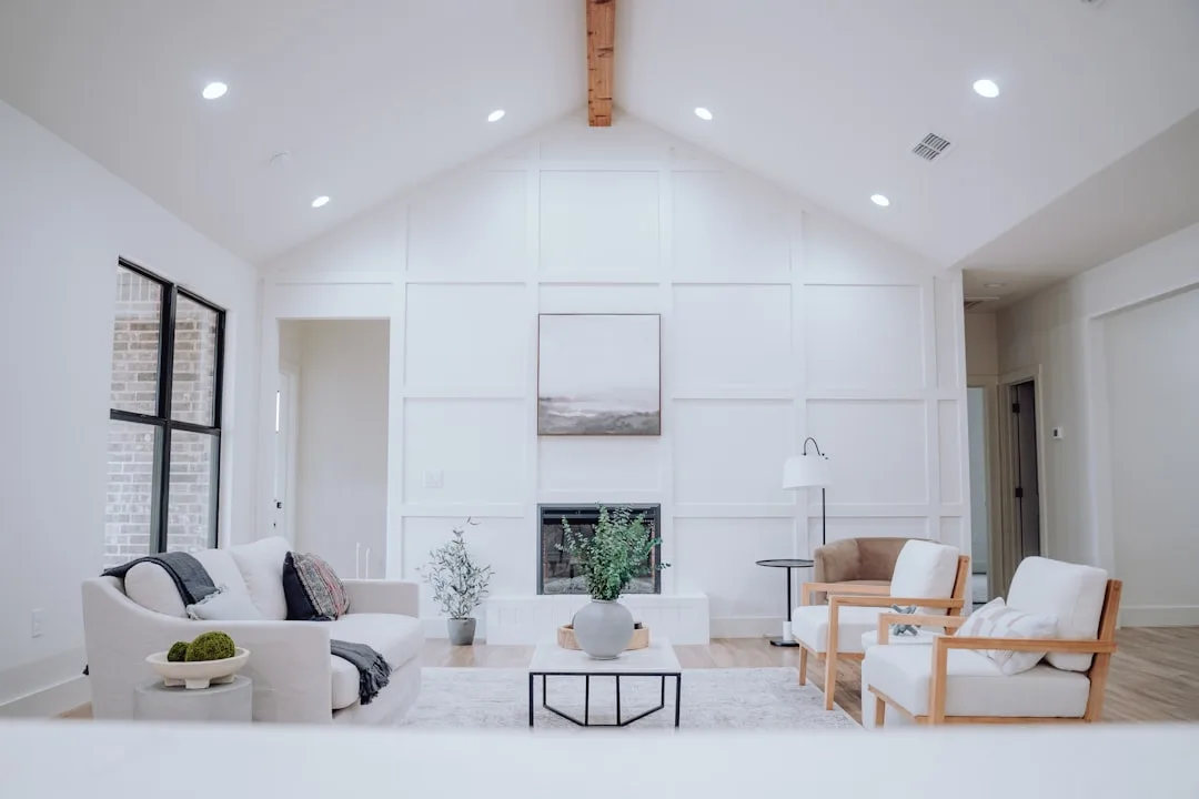
This is the variable almost nobody accounts for when choosing or placing furniture. Low ceilings — anything under 8 feet — are visually compressed by tall furniture. High ceilings swallow low-profile pieces and make them look stranded.
Here’s what the ceiling height rule set actually looks like in practice:
- Under 8 feet: Choose furniture with visible legs. When you can see floor underneath a sofa or chair, the floor plane appears to extend further, making the room read taller.
- Standard 8-foot ceilings: Keep the tallest furniture at 60 to 72 inches maximum. A bookcase that reaches 84 inches in an 8-foot room isn’t dramatic — it’s just compressing.
- 9 feet and above: You can use taller pieces, statement pendants, and vertical art to draw the eye upward and make the ceiling feel like a feature.
Actionable takeaway: Before shopping for or moving any furniture, write down your ceiling height and your dominant window wall. Those two facts eliminate half your arrangement options immediately — which is a relief, not a limitation.
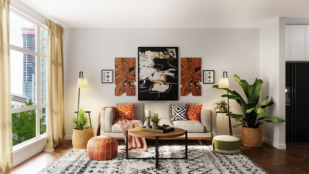
Case Study: The Classic Rectangular Living Room With an Off-Center Window
This is the layout that generates more help requests on r/malelivingspace than almost any other configuration. The post usually reads something like: “Where do I put my couch when the window isn’t centered?” And the reason it’s so common is that off-center windows are the norm in pre-war and mid-century apartment buildings, where windows were placed for exterior symmetry, not interior convenience.
Here’s the logic that actually works:
The sofa belongs on the wall opposite the window — not the wall beside it. When you anchor the sofa to the wall across from your window, everyone sitting on it faces the natural light source. That’s comfortable for conversation, good for the room’s sense of depth, and it doesn’t block the window from doing its job. Placing the sofa on the wall adjacent to the off-center window creates an awkward sightline and pushes people to look sideways at a glare source.
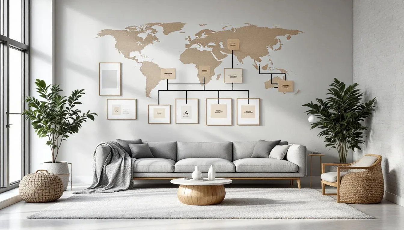
Once the sofa is placed, float it. Pull it 12 to 18 inches away from the wall rather than pressing it flush. Then place a narrow console table — something like the IKEA Hemnes console at 61 inches wide, or the West Elm Reeve at 48 inches — directly behind it. This does two things: it creates a visual back wall for the seating zone, and it gives you a surface for lamps and objects without eating any floor space in the main path.
The rug ties it together. A rug sized to sit under the front two legs of all seating pieces — not centered on the room, but anchored to your seating zone — reads as intentional. The standard mistake is a rug that’s too small and floats in the middle of nothing. In a rectangular living room with an off-center window, you’re often working with a 10×7 or 9×6 rug pulled toward the window wall, not centered on the room’s geometry.
The result is a zone that feels designed rather than defaulted into.
Actionable takeaway: If your window is off-center, don’t try to center your furniture around it. Let the sofa anchor to the opposite wall, float it forward, back it with a console, and use the rug to define the zone — not the room’s center point.
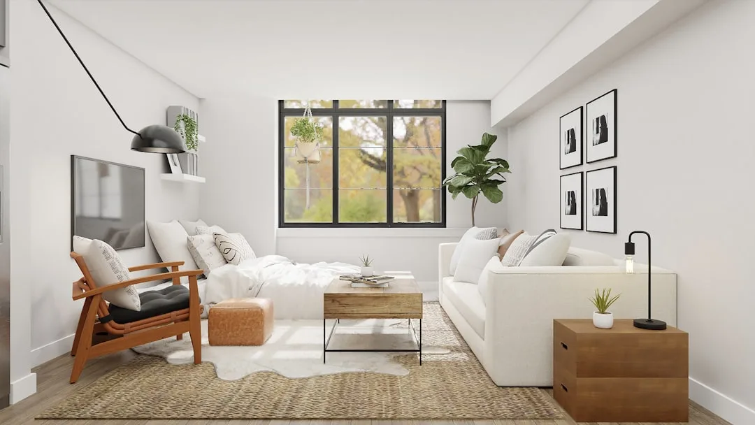
Case Study: The L-Shaped Studio Where the Living Room and Bedroom Share One Space

Studios and junior one-bedrooms make up the majority of first-apartment rentals in major U.S. cities, which makes this the highest-volume layout question for new renters. And the anxiety is understandable — when one room has to do two jobs, every decision carries double the weight.
The single most impactful move in an L-shaped studio isn’t a furniture choice. It’s an orientation choice. Place the bed perpendicular to the main entry line so it is not the first thing visible when you walk through the door. When the bed is the first thing you see, the entire apartment reads as a bedroom that also has a couch in it. Rotate the bed so it’s tucked into the L, angled away from the entry sightline, and the same space suddenly reads as an apartment with a separate sleeping area.
From there, use your sofa as a soft architectural divider rather than adding a room divider screen, which eats square footage without adding function. Position the sofa so its back faces the sleeping area. A sofa with a back height of 34 to 36 inches — like the Floyd sofa or the Article Sven — creates a visual wall without physically blocking light or path. You’ve now defined two zones with a piece of furniture that was going to be in the room anyway.
At the foot of the bed, place a narrow console or low bookshelf facing the living zone. Something 15 to 18 inches deep — an IKEA Kallax unit on its side works well — gives the sleeping area a distinct visual back wall and prevents the two zones from bleeding into each other.
What you’re building is two rooms that happen to share air. The trick is giving each zone something to face and something to back up against, rather than letting them float in a shared void.
Actionable takeaway: In a studio, place the bed out of the entry sightline, use the sofa back as a zone divider, and give each area a visual anchor wall. You’re creating the sensation of two rooms without building any walls.
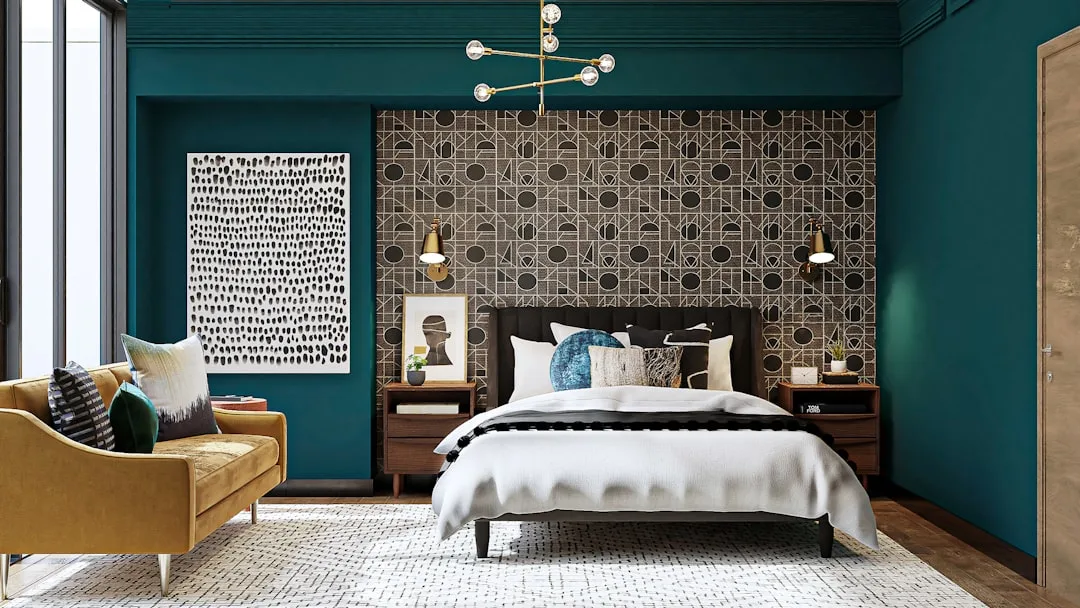
Case Study: The Awkward Bedroom With the Door and Window on the Same Wall
This configuration shows up repeatedly in r/interiordesign help threads, consistently from first-time renters who’ve moved into apartments where the original layout was never designed with furniture placement in mind. The door and window share the same wall — often the shorter wall in a rectangular room — and suddenly the obvious bed placement is either blocking egress or swallowing the only natural light source.
The logic here is actually straightforward once you accept the constraint: when the door and window share a wall, the opposite wall is your only real anchor for the bed. Not an option to consider — the actual correct answer in most configurations.
The resistance usually comes from the opposite wall being shorter than the bed is wide. A standard queen bed is 60 inches wide. If your opposite wall runs 72 inches between the corner and a closet door, you have 12 inches of clearance, one nightstand, and a tight but workable arrangement. That trade-off — one nightstand instead of two — is correct. The alternative is a bed blocking a window or a door, which is neither functional nor legal in most building codes.
If the opposite wall truly can’t accommodate the bed width, the longer side wall is the next option. Place the bed lengthwise against it with a nightstand on the accessible side only. Yes, you’ll have to climb over one side to get in. Most people adapt within a week, and the room reads far better than any compromise that blocks light.
To compensate for the reduced natural light in this configuration, place mirrored or light-reflecting furniture on the wall directly opposite the window — even a single piece, like a mirrored dresser or a large framed mirror leaning against the wall. Light bounces back into the room and partially compensates for what the bed placement takes away.
Actionable takeaway: Accept the constraint early. Door-and-window-on-same-wall means the opposite wall holds the bed, full stop. Work the nightstand and mirror placement from there, not the other way around.
How to Use a Decision Tree to Solve Any Layout You Haven’t Seen Before
The case studies above cover the most common configurations, but apartments are genuinely weird. You might have a support column in the middle of your living room, a door that opens outward, or a kitchen pass-through that interrupts your longest wall. The frameworks below apply to any layout, including ones nobody’s written a guide for.
Step One: Map Your Fixed Points
Before anything moves, identify everything that can’t. Doors, windows, outlets, radiators, HVAC vents, load-bearing columns, and built-in shelving are all non-negotiable anchors. Everything else orbits around them. Professional space planners recommend using painter’s tape on the floor to map furniture footprints before physically moving a single piece — it’s a zero-cost technique that eliminates around 80 percent of placement mistakes and saves your back considerably.
Step Two: Draw Your Traffic Lines
Walk your apartment and trace the natural paths:
- Front door to bathroom
- Front door to kitchen
- Bed to closet
- Couch to kitchen
Mark those paths on your sketch. Treat them as sacred. Furniture that sits in a traffic line looks fine in a photo and feels wrong every single day.
Step Three: Size and Place in Order
Never start with the accent chair. Start with the largest piece, place it in relation to your best fixed point, and build outward in descending size. The sequence looks like this:
- Anchor piece (sofa, bed, dining table)
- Secondary seating or storage (armchair, dresser, bookcase)
- Surface pieces (coffee table, nightstand, console)
- Accent pieces (floor lamp, small chair, plants)
Starting with accent pieces and building up to the anchor is how rooms end up feeling backwards and full at the same time.
Actionable takeaway: Tape your floor plan before you lift anything. It takes 20 minutes and makes every other decision faster and more confident.
The Ceiling Height Rules That Change Everything About Scale and Proportion
The average ceiling height in U.S. apartments built before 1980 is approximately 8 feet. Newer construction trends toward 9 feet, and some luxury developments push to 10 or 11. The furniture rules that apply to one category actively hurt you in another — and yet nearly every small-space guide treats ceiling height as a backdrop rather than an active variable.
Here’s what changes based on your actual measurement:
Rooms under 8 feet:
- Choose sofas, chairs, and beds with visible legs rather than pieces that sit flush on the floor. The visible floor plane extends the room visually.
- Avoid wall-to-ceiling shelving unless you’re maximizing storage and willing to trade visual breathing room for function.
- Hang curtains as close to the ceiling as possible — even if the window is low — to pull the eye upward.
- Low-profile coffee tables (under 16 inches) keep the center of the room visually open.
Standard 8-foot ceilings:
- Cap furniture height at 60 to 72 inches. A bookcase or armoire that reaches 84 inches in this space compresses the visual headroom noticeably.
- Pendants and flush-mount fixtures that hug the ceiling read better than hanging fixtures that drop more than 12 to 18 inches.
- Horizontal lines in furniture — long, low sofas, wide dressers — reinforce a sense of width rather than fighting the ceiling constraint.
Ceilings at 9 feet and above:
- Tall bookcases, gallery walls that extend toward the ceiling, and statement pendants all work in your favor here.
- Low-profile furniture in a high-ceiling room can feel marooned — anchor it with a substantial rug and layered lighting.
- The vertical space above furniture becomes a design opportunity: art clusters, hanging plants, architectural lighting.
The rule set you apply must match your actual ceiling height, not a generic assumption written for a room that might be two inches taller or shorter than yours.
Actionable takeaway: Measure your ceiling height today. Then check every piece of furniture you’re considering against the scale rules for your specific category. A 78-inch bookcase is a different object in a 96-inch-ceiling room than in an 84-inch one.
What to Do When Every Layout Option Still Feels Wrong
You’ve tried three configurations. Nothing clicks. The room still feels off — either cramped and chaotic or weirdly empty despite being full of stuff. This is the dead-end moment most layout guides don’t address, probably because “your furniture is the wrong size” isn’t a satisfying answer when you already own the furniture.
But it’s usually the right one. Design professionals cite over-scaled furniture as the single most common mistake in small apartments. A standard three-seat sofa runs 84 to 96 inches wide — that’s seven to eight feet. In a studio apartment or a small rectangular living room where the longest wall might measure 10 to 12 feet, an 84-inch sofa leaves almost no room for anything else to breathe. No arrangement fixes an 84-inch sofa in a 120-inch room. The sofa is the problem.
If every arrangement feels cramped, ask yourself:
- Is my sofa longer than two-thirds of the wall it’s on or facing?
- Does my bed leave less than 24 inches of clearance on the accessible sides?
- Do I have to turn sideways anywhere in my main traffic path?
If you answered yes to any of those, scale is the issue, not position.
The opposite problem — a room that feels empty despite being full — has a different cause. When furniture pieces don’t relate to each other visually, the room reads as noise. Mismatched leg heights, a mix of three different wood tones, pieces oriented in different directions — it creates a sense of chaos that the eye reads as emptiness, because nothing coheres into a readable zone.
Two fixes work faster than any rearrangement:
- A single large rug that anchors all major pieces in a zone will unify a room more quickly than any furniture move. The rug creates a visual container that the eye reads as intentional.
- Consolidating leg heights — getting your sofa, chairs, and tables to within 2 to 3 inches of each other — creates a visual horizon line that reads as cohesion.
Actionable takeaway: If nothing is working after two or three layout attempts, stop rearranging and start diagnosing. Write down the dimensions of your largest piece and compare them to your room’s wall lengths. Scale problems don’t respond to arrangement solutions.
Frequently Asked Questions
Should furniture be pushed against the walls in a small apartment?
No — and this is probably the most counterproductive piece of advice still circulating online. When every piece of furniture is pressed against a wall, the center of the room becomes dead void that makes the space feel like a hallway or waiting area. Floating your main seating piece 12 to 18 inches from the wall creates visual depth, allows a console table to live behind the sofa, and signals that the space has been arranged rather than just deposited. The wall-hugging instinct comes from wanting to “open up” the center, but it achieves the opposite — the center becomes a zone with no purpose.
How do I arrange furniture in a studio apartment without it feeling like one room?
Zone definition is the answer, and you don’t need walls to create it. Use your sofa as a soft divider between the living and sleeping areas by positioning its back toward the bed. Place the bed so it’s not the first thing visible from the entry — rotate it perpendicular to your main sightline if the layout allows. At the foot of the bed, a narrow console or low bookshelf (an IKEA Kallax on its side, a West Elm narrow console) gives the sleeping zone a distinct visual back wall. A rug in each zone reinforces the separation. Lighting does the rest: a floor lamp in the living zone and a table lamp in the sleeping zone create two separate pools of light that the brain reads as two separate spaces.
What size rug should I use in a small living room?
Bigger than you think, and specific to your seating zone — not the room’s center point. The most common rug mistake in small living rooms is going too small: a 5×7 floating in the middle of a room makes the space feel more fractured, not more defined. The right approach is to size the rug so the front legs of all seating pieces rest on it. In most small living rooms, that means a 8×10 minimum, or a 9×12 if the room’s proportions allow. The rug doesn’t need to center on the room — it should center on your seating arrangement, which is pulled toward the window wall, not floating in the room’s geometric middle.
How do I figure out where to put my bed when the door and window are on the same wall?
The opposite wall is almost always the correct answer, and accepting that early saves a lot of frustration. When the door and window share a wall, placing the bed on that wall either blocks egress (a safety and code issue) or covers the window, which kills your light and ventilation. The opposite wall is your anchor. If it’s too short for your bed’s full width, the longer side wall is the next option — place the bed lengthwise against it with a nightstand on the accessible side only. You’ll have one-sided access, which most people stop noticing after a week. To compensate for reduced natural light, place a large mirror or mirrored dresser on the wall opposite the window to bounce available light back into the room. It won’t replace the window, but it recovers a meaningful amount of the brightness you lose.
Start Here, Today
Pick one room. Not the whole apartment — one room that’s bothering you most.
Sketch its footprint on paper, even roughly. Mark every door, window, outlet, and radiator. Measure your ceiling height and write it in the corner of the sketch. Then draw two lines for your main traffic paths.
Now look at where your largest piece of furniture currently sits. Is it in a traffic path? Is it against a wall in a way that creates dead center space? Is it taller than two-thirds of the ceiling height?
That sketch, those measurements, and those three questions will tell you more about what’s wrong than any generic guide can. The arrangement that works for your apartment is the one built around your specific fixed points — not the one in the diagram where everything lines up perfectly and the window is exactly where it should be.