Most people rearrange their small living room three times before they get it right. The fourth attempt — the one that finally works — almost always breaks a rule they were certain was non-negotiable.
That’s the real problem with small living room layout ideas as a category of advice. The internet is full of rules. Push the sofa against the wall. Keep it minimal. Use only light colors. But rules aren’t layouts. They’re opinions dressed up as physics. And following them blindly is why so many small living rooms feel like waiting rooms instead of homes.
Here’s what actually matters: proportion, flow, and the specific shape of your room. Not trends. Not what photographed well in a Scandinavian apartment in 2019. Your room. Your dimensions. Your life inside it.
Let’s do this properly.
Your Room Has a Shape — and That Shape Is Everything
Before you move a single piece of furniture, you need to know what you’re actually working with. Not just square footage — shape. A 200-square-foot square room and a 200-square-foot rectangular room are completely different spatial problems requiring completely different solutions. Most small living room layout guides gloss over this. They treat “small” as a monolith. It isn’t.
Square rooms are deceptively tricky. They feel balanced, but that symmetry works against you if you’re not careful — everything ends up equidistant from everything else, creating a dead, static energy. The fix is asymmetry introduced on purpose. A sectional angled to cut across one corner. A single accent chair positioned at 45 degrees. Something that breaks the grid and creates what designers call a conversation triangle — three seating points that form a rough triangle, none more than 8 feet from the others, which is the maximum comfortable conversational distance according to proxemics research.
Rectangular rooms — the tunnel problem — are where most people go wrong. The instinct is to run everything parallel to the long walls, which amplifies the tunnel effect until the room feels like a hallway with ambition. The actual solution: place your primary sofa perpendicular to the longest wall, not parallel to it. This visually shortens the room by interrupting the sight line. Pair that with a rug oriented the same way, and you’ve essentially redrawn the proportions without touching the walls.
L-shaped rooms and awkward rooms with alcoves or bay windows need anchor points. Find the natural focal point — a fireplace, a window with a view, the wall that gets the most light — and build outward from there. If your room doesn’t have an obvious focal point, create one. A large-format piece of art (minimum 24 by 36 inches for anything to read properly in a small space) or a media console that fills 60–75% of the wall width will do it. Everything else orients around that anchor. This is the principle professional interior designers use on every project regardless of scale, and it works in 180-square-foot studios just as well as it does in large family rooms.
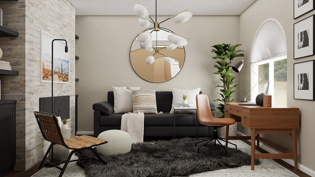
Stop Pushing the Sofa Against the Wall — and Here’s Why

Sectional sofa pulled away from wall in stylish living room with 3D wall panels — Photo by Kate on Unsplash
This is the one piece of advice almost every beginner ignores, and almost every experienced decorator swears by. Pulling your sofa away from the wall — even just 4 to 6 inches — makes a room feel larger, not smaller. It creates depth. It implies there’s space behind the furniture, which tricks the eye into perceiving more room than actually exists.
Why does this work? The brain reads furniture pressed flat against a wall as furniture trying to hide. It reads furniture with breathing room as furniture that belongs. The space behind a floated sofa also creates a natural circulation path, which is why 30–36 inches of clearance between major seating pieces isn’t just an aesthetic preference — it’s the minimum comfortable walkway width for two adults to pass without turning sideways. Go below 24 inches and the room stops functioning as a social space and starts functioning as an obstacle course.
The counter-intuitive recommendation here is this: in a very small room, floating furniture away from walls sometimes means choosing a smaller sofa instead of a larger one. A 90-inch sofa pressed against the wall makes less visual sense and offers less functional flexibility than an 80-inch sofa floated 5 inches out, even though you’ve technically lost 10 inches of seating. The room gains usability. That’s the trade worth making.
One caveat I can’t verify with hard data but have observed consistently: this rule tends to work better in rooms wider than 11 feet. In rooms under 10 feet wide, floating the sofa can genuinely reduce circulation to the point where it creates a different problem. Measure before you commit. Painter’s tape on the floor costs nothing and saves you from moving a 200-pound sofa twice.
What Everyone Gets Wrong About Rugs, Scale, and Furniture Size
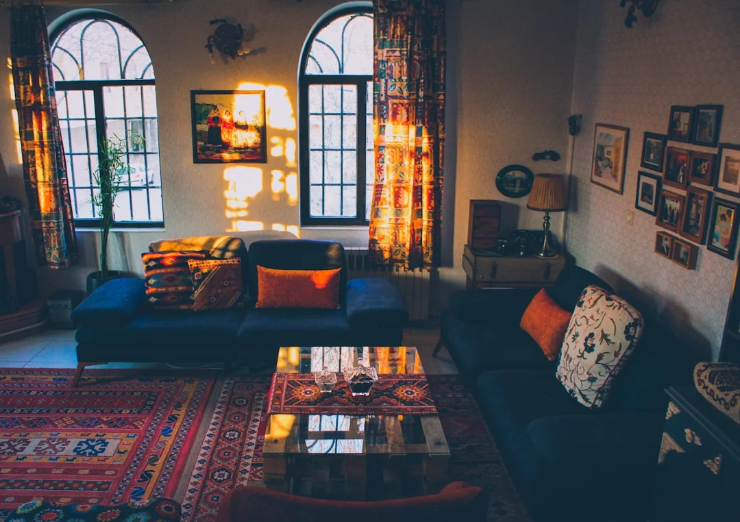
Large sofa and Persian rug scale in small living room layout example — Photo by Nasim Keshmiri on Unsplash
Here’s what most small living room layout guides get wrong: they tell you to buy smaller furniture. This advice is almost always counterproductive. One large, well-proportioned sofa reads better in a small room than two small loveseats fighting for dominance. One oversized rug anchors a space; three small rugs fracture it into visual chaos. Scale isn’t about matching the room’s size — it’s about establishing hierarchy.
The rug is where this plays out most dramatically. The standard mistake is buying a rug that’s too small — a 5 by 8 sitting in the middle of a living room like a postage stamp. The correct approach: your rug should be large enough that at least the front legs of every major seating piece rest on it. For most living rooms, that’s an 8 by 10 or a 9 by 12. In a genuinely small space — say, 12 by 14 feet — an 8 by 10 rug that the sofa’s front legs sit on and the coffee table sits fully on creates a unified zone that makes the entire room cohere. A 5 by 8 in the same room just creates negative space where your eye goes to die.
Furniture height matters more than footprint in small spaces. Low-profile furniture — sofas and chairs with seat heights around 15 to 17 inches and back heights under 32 inches — keeps the visual sightline open across the room, making it feel airier. Tall, boxy furniture interrupts sightlines, chops the room into pieces, and makes the ceiling feel lower than it is. This is why minimalist living room design consistently uses low, horizontal furniture lines — it’s not purely aesthetic. It’s spatial engineering.
Coffee tables deserve their own moment here. The ideal coffee table is 1 to 2 inches lower than the sofa seat height and roughly two-thirds the length of the sofa. In tight rooms, a round coffee table outperforms a rectangular one because it eliminates corners — both visually and literally. No one is shins against sharp corners. Nesting tables are the smartest solution in genuinely cramped spaces: stacked, they take up 18 by 20 inches; spread out for a gathering, they cover three times that.
The Specific Layouts That Work by Room Dimension
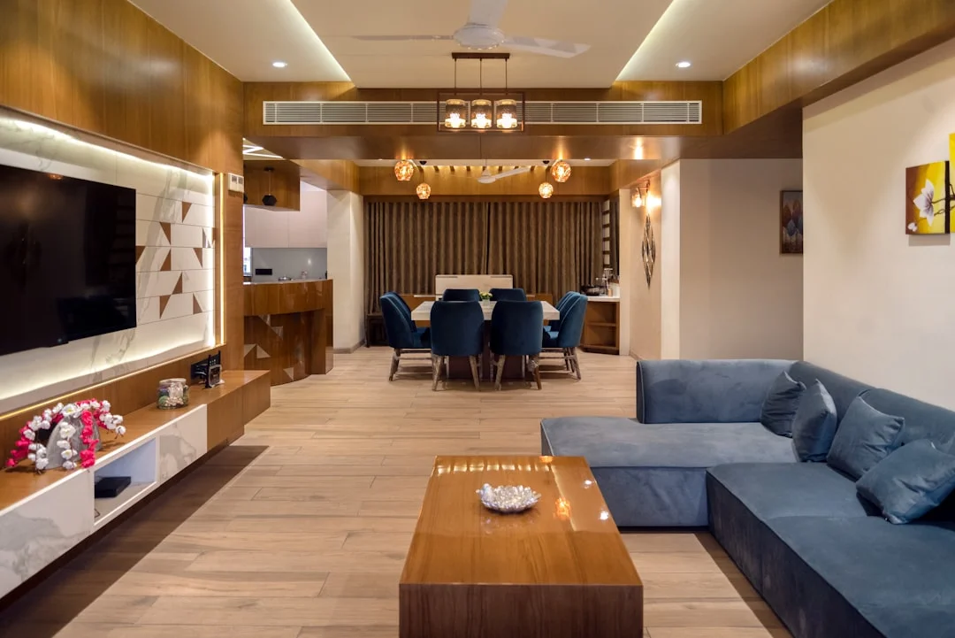
Open-plan living dining room layout with blue sectional sofa and dining table for medium to large ro — Photo by iKshana Productions on Unsplash
Abstractions are useless. Here’s what actually works for specific room sizes.
Rooms 10 by 12 feet or smaller: This is genuinely tight. Your primary sofa maxes out at 72 inches — go longer and circulation disappears. Use a loveseat paired with two lightweight accent chairs that can be moved to a wall when not in use. No coffee table; use a 16-inch side table between the chairs and a small ottoman in front of the loveseat that doubles as surface space. A single wall-mounted media unit keeps the floor clear. Mount your television at eye level from seated position (typically 42 to 48 inches from floor to screen center) to avoid neck strain, and position the screen on the wall that receives the least direct light to cut glare without requiring blackout shades during the day.
Rooms 12 by 15 to 13 by 18 feet: This is the most common “small living room” dimension, and it gives you real options. An 84-inch sofa floating 5 inches from the wall, a 36-inch round coffee table, and a single accent chair in the opposite corner creates a classic conversation triangle without blocking traffic. For rooms in this range that need to double as entertainment spaces, an L-shaped sectional with the chaise on the wall-side maximizes seating while keeping the main traffic path — typically from the entry toward the kitchen or hallway — completely unobstructed. Leave a minimum 36-inch path clear. Preferably 42 inches if you ever have children or pets in the room.
Narrow rooms under 10 feet wide but over 16 feet long: This is the tunnel scenario, and it requires the most discipline. The sofa goes perpendicular to the longest wall, full stop. Create two distinct zones using a pair of pendant lights or a floor lamp to define each area, rather than trying to make the entire room function as one space. A console table behind the sofa — used as a narrow workspace or bar surface — adds function and visually breaks the room into thirds. The visual break is the goal. Small apartment decorating uses this zone-within-zone approach constantly because it transforms one long awkward space into two intentional ones.
Rooms with unavoidable obstacles — radiators, support columns, swing-out doors: Work around them by treating them as design features, not problems. A column becomes a natural divider between zones. A radiator under a window becomes the base for a window seat with storage underneath. A door that swings into the room dictates furniture placement within a 36-inch arc — instead of fighting this, keep that 36 inches clear and position a low bookshelf or console perpendicular to the wall at the door’s swing limit. It becomes a natural room divider.
Lighting Is a Layout Tool, Not an Afterthought
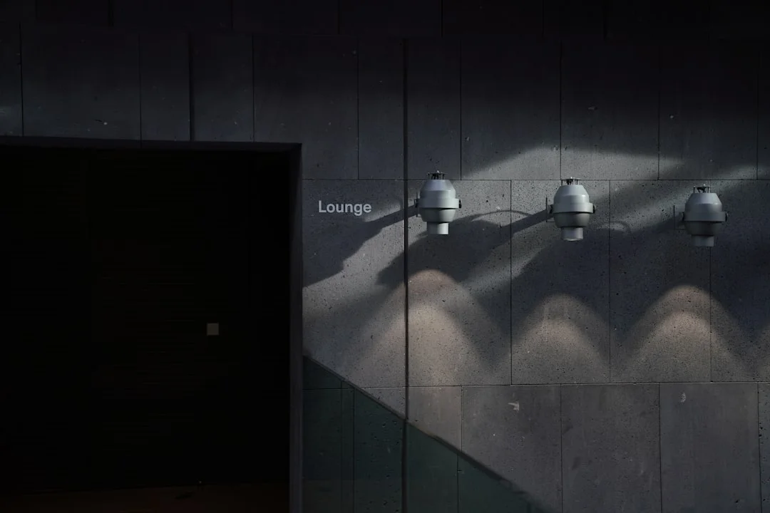
Wall-mounted lounge lights casting scalloped patterns showing how lighting shapes room perception — Photo by Deyan Sight on Unsplash
The most overlooked element in any discussion of small living room layout ideas is lighting — specifically, how the placement of light sources changes the perceived shape and size of the room. One overhead fixture in the center of a small room creates a puddle of light surrounded by shadow, which makes the room feel like a cave with pretensions. It flattens everything and makes corners disappear into murk.
The solution is layered light at multiple heights. A floor lamp in one corner. A table lamp on a console or end table. Under-shelf strip lighting if you have built-ins. Three distinct light sources, positioned at three different heights, creates the illusion of depth and volume. The corners light up. The walls push back visually. The room feels 20% larger without a single piece of furniture moving.
Color temperature matters here more than most people realize. 2700K to 3000K (warm white) is the sweet spot for living rooms — warm enough to feel residential, bright enough to avoid the “romantic restaurant that’s trying too hard” problem. Go above 4000K (cool white or daylight) and the room starts to feel clinical. The light bounces off walls differently, makes colors look flat, and undermines everything your thoughtful layout is trying to accomplish.
Mirrors aren’t lighting, but they behave like it. A large mirror — minimum 24 by 36 inches, ideally larger — positioned to reflect natural light from a window can effectively double the perceived light in a room. The placement matters: the mirror needs to face the light source, not be adjacent to it. Most people hang mirrors on the wall nearest the window, which does almost nothing. Hang it on the wall opposite the window and watch the room change.
Questions We Get Every Day
What counts as a “small” living room?
Anything under 200 square feet qualifies, though the principles apply up to about 250. The most challenging range is 100–150 square feet, where every square inch of floor plan is a real decision.
Should I use a sectional in a small room?
Yes — with conditions. A sectional only works in a small room if it’s an L-shape with a short return (the short side of the L should be 60 inches or less) and it’s positioned so the chaise or return faces away from the main traffic path. A full U-shaped sectional in a room under 180 square feet will eat the space alive. A compact L-shaped sectional in a 12 by 15 room can actually seat more people than a sofa-plus-chairs arrangement while taking up less floor space because it eliminates the gaps between individual pieces.
Does furniture color matter as much as people say?
Less than lighting, more than most people think. Light upholstery in a small room reflects light and visually recedes. Dark upholstery absorbs light and visually advances — making a piece feel larger and closer than it is. This doesn’t mean avoiding dark furniture; it means being intentional. One dark sofa as a grounding anchor in a light room works beautifully. Three dark pieces in a small room with limited natural light creates a space that feels like it’s closing in on you.
What’s the minimum space between a sofa and TV?
The absolute minimum comfortable viewing distance for a 55-inch television is 7 feet. For a 65-inch screen, it’s 8 feet. Go closer and you’re not watching television — you’re reading it. In rooms where this distance isn’t possible with a 65-inch screen, size down. A 55-inch screen in a room where you can sit 7 feet back looks better than a 65-inch screen you’re sitting 5 feet from.
Should I float a rug or extend it wall to wall?
Float it. Wall-to-wall rugs make a small room feel smaller by emphasizing the actual perimeter of the space. A floated area rug, with 12 to 18 inches of bare floor visible around the edges, creates a defined zone that tricks the eye into thinking the room extends beyond the rug’s edge.
Do I need a coffee table at all?
No. In rooms under 12 by 14 feet, skipping the coffee table entirely — or replacing it with a 30-inch upholstered ottoman — frees up enormous visual and physical real estate. An ottoman can become extra seating, a footrest, or a surface (with a tray) as needed. This is the most underused move in small living room layout ideas, and it’s the one that consistently surprises people with how much it opens a space.
Can I have a home office in my small living room without it looking like a mess?
Yes, but only if it has a dedicated corner and a visual boundary. A desk perpendicular to the wall in a defined corner, with a pendant light above it or a distinct rug underneath it, reads as intentional. A desk shoved awkwardly between the sofa and the TV reads as desperation. The boundary is everything. Even a low open bookshelf used as a room divider between the office corner and the seating area creates enough visual separation to make both zones feel purposeful.
The Move That Changes Everything
Here’s the truth that ties every small living room layout idea together: the room you have is a fixed geometry. The life you live in it is flexible. The best layouts aren’t the ones that follow rules — they’re the ones that understand the specific tension in your specific room and resolve it.
Before you buy anything, tape out the footprint of every piece of furniture you’re considering, directly on the floor. Use painter’s tape. Walk through the room as you actually live — getting up from the sofa, reaching for a lamp, coming in from the front door with a bag in each hand. The layout that survives that test is the layout that works. Not the one that looked good in a mood board. Not the one the algorithm recommended. The one that makes you stop noticing the room and start living in it.
That’s what good design does in any space. Small space design at its best is invisible — you don’t see the layout, you feel the ease of it. And when you get there, you’ll know. Not because the room looks different. Because it finally feels right.