As someone who reads a lot about interior design, I frequently come across interior photos where I think “wow, that’s really intriguing and stunning,” and simultaneously, “I could never do anything like that in my home.”
The conversation about interiors is often dominated by assertive aesthetics. This makes sense: a room that effectively uses a bright color or a space done up in stark monochrome (trending of late) will grab more attention and attract more eyes than a more discreet one.
But there’s a difference between repinning something on Pinterest and choosing to live with it for many years. I’ll never have a space that’s highly stylized because I have too many beloved objects – art, photos, family heirlooms – that I want to highlight. I want those things to speak to my personality, and I don’t want them overshadowed by too many bright colors or ornamental wallpaper.
Neutral gets a bad name because it’s seen as a default, and a middle-brow, highly-commoditized one at that. But a good neutral interior is anything but unrefined. Creating such a space can be broken down into three main components.
Structure
The structural design of an interior is usually figured out before construction (or before renovation). If you are in this phase, it’s a good idea to let your architect know what you plan on putting inside. Often times, a designer will want to visit your current space to get a feel for how you live.
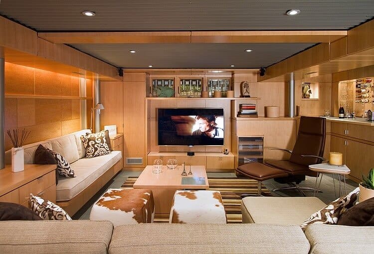
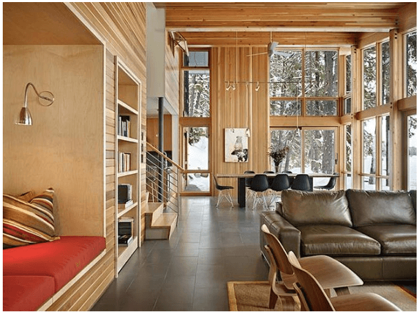
But after construction, it’s also important to think about structure as it relates to furniture and decoration. The photo above is of a basement-level entertainment room, and since the ceiling is a bit lower, the rectangular wood paneling and low-back sectional emphasizes the horizontal length of the room and lends a sense of spaciousness.
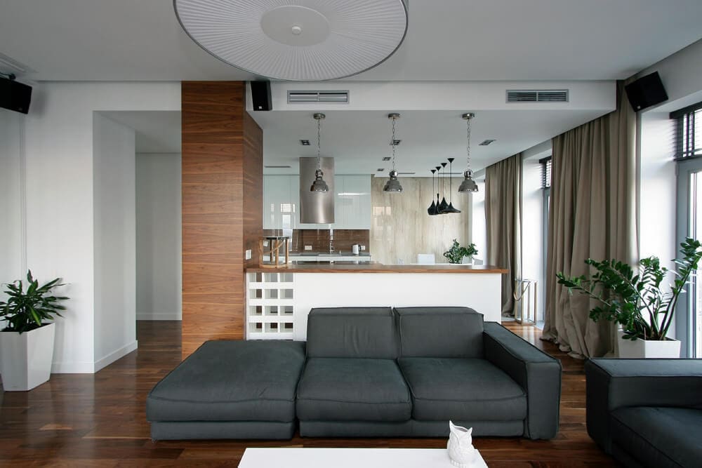
Likewise in this space, decorative beams give a touch of chic to the wood ceiling. There is still a lot of aesthetic variance that’s achievable with a neutral palette. A space can have features that are architecturally interesting, but also don’t overwhelm key decorative elements, more examples on San Francisco store.
Texture
Texture is such an important part of good design, but probably also the element that’s easiest to overlook. It’s not just a matter of making something tactilely comfortable, texture lends nuance. It might reference the aesthetic of the occupants or the environment within which the space is built. It also can have a powerful oppositional force: Juxtaposing dissimilar materials gives depth; a place is always more interesting when it’s made up of contrasting elements.
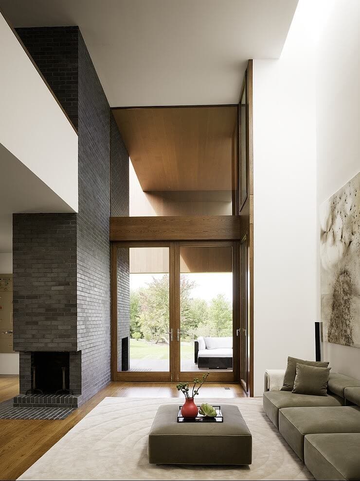
The sleek minimalist living room above uses dark wood accents and a thick cream rug to offset its heavy linear structural elements and tall white walls. The use of brick and wood are stunning in themselves, but they still allow the art to take center stage.
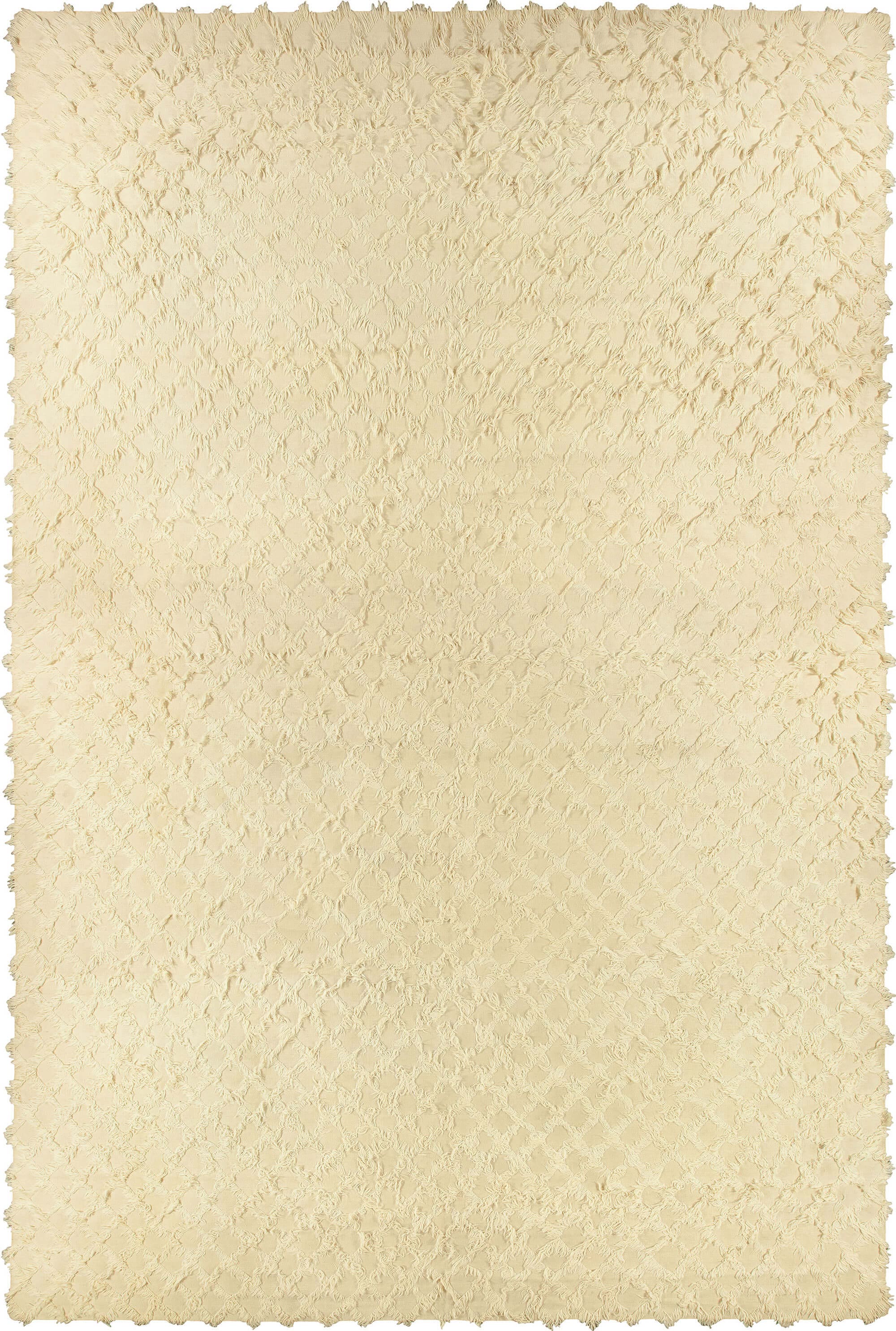
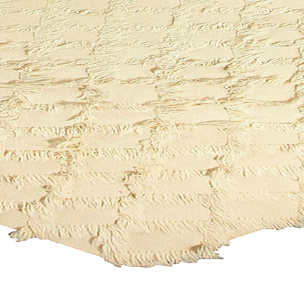
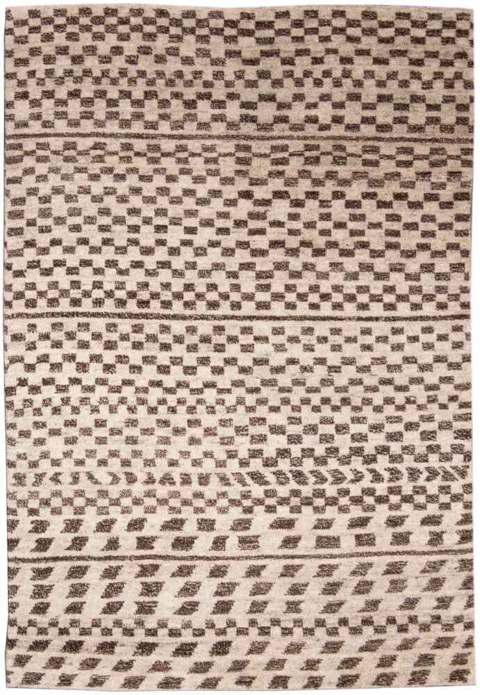
A good example of subtlety in texture is this mid-century vintage Moroccan rug to get a closer look see it here. The knotted pile quietly calls our attention with the way it shows its wear. From our contemporary collection, this cozy shag is bolder. Its color scheme may be muted, but the pile is decidedly playful.
Color
Beige and white are great standards, but they aren’t the only colors to work with. Deep grays, earthy reds, natural yellows and pale mauve also fall under the scope of neutral.
Even working with neutrals, color picking is still a task that takes a lot of thought. One has to consider the architectural features of the space, what kind of mood is desired and what sort of objects and furniture the color will be paired with. Another reason neutral gets a bad name is often when people try to pick colors conservatively they tend toward hues that are too light, where a saturated shade would be the better choice.
Color isn’t all about paint and upholstery. A neutral scheme often works best when it plays up natural elements. The wood walls and ceiling in the home above provide a delicious array of reds and browns, and the tile also contains serene purples.
A neutral scheme poses myriad possibilities. Deciding which ones to seek out is no less challenging but is potentially more flexible and satisfying in the long-term than brighter schemes.