Fashion designers may sometimes fail because of various reasons. It can be because of poor design, incorrect pricing, lack of research and the like.
Photo by form PxHere
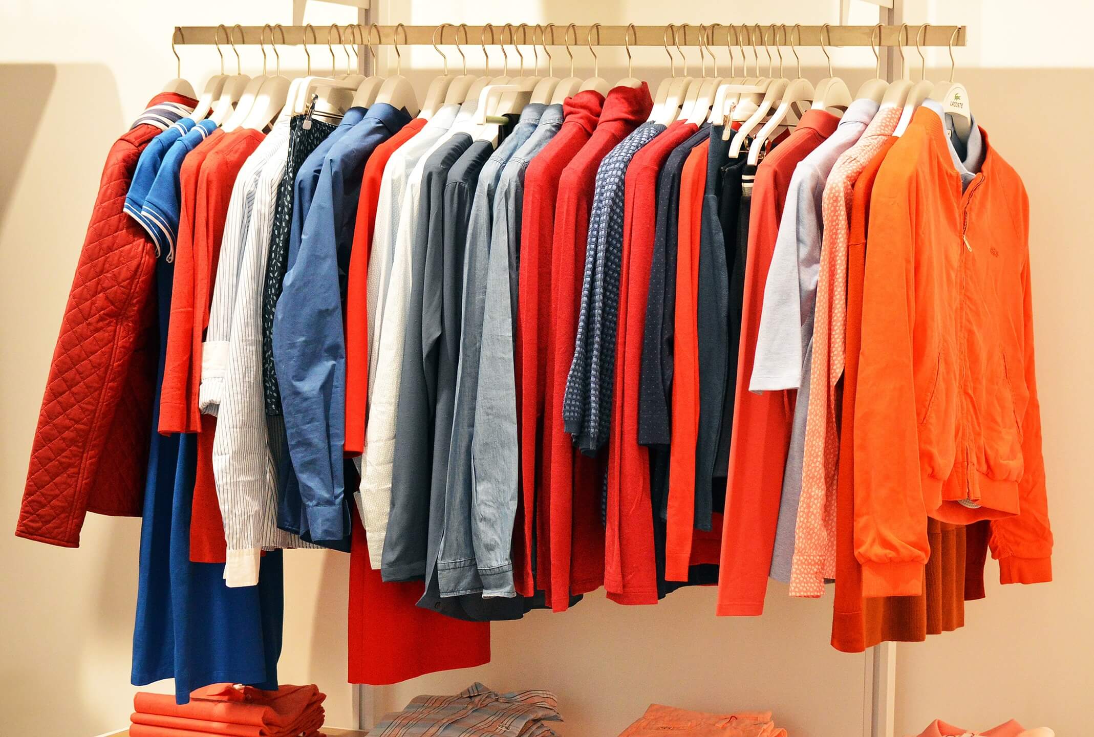
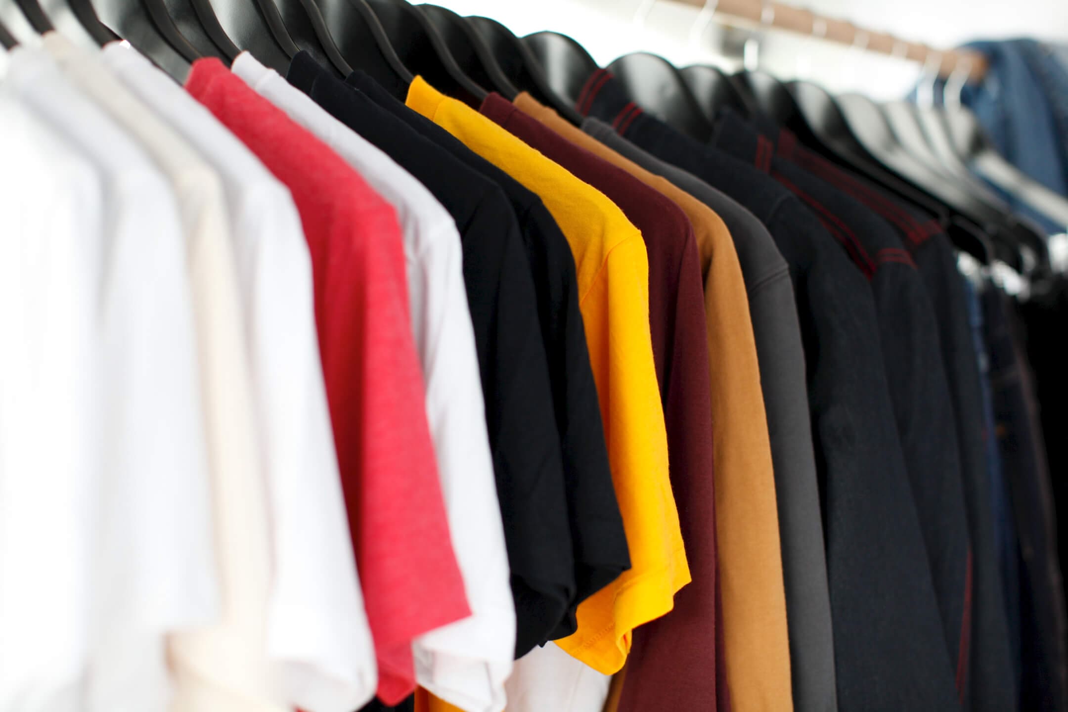
Colour plays a dominant role in the fashion statement. Going by recent records, well-known fashion designers take good care of every aspect of fashion apparel. If you are interested in this, then pay attention to the guidelines that experts provide. Following them will help you come up with the best combination of colour that will get you attention. The right colour combination will help you impact the consumers.

Apart from the personal taste, you must know what is in trend in the market. Irrespective of how appealing your design is, customers’ inherent dislikes about some colours may lead your efforts into vain. Apart from the colour, you have to pay attention to the equipment you are using in the firm. From the different types of printers to the way people use them, everything requires crucial attention. You may go for screen printing, digital printing, direct to garment printing and the like. It all depends upon your requirements and financial resources.
If you opt for DTG printing, check out what the #1 selling direct-to-garment printer, the Epson SureColor F2100, has to offer to make your business grow.
Get to know the best colour schemes that may work well for your apparel
There is something called the colour wheel; it is traditional equipment used by fashion designers and artists of the digital age. The different combinations will help you understand which colour might reveal the best aspect of your t-shirt. Hence, exploring the colour palette is crucial for the overall look of your outfit.
• Analogous: You must understand the colour schemes in detail so that you can combine them for the best results. Analogous colours are those which are placed close to each other in the colour wheel. If you take a look at a bird, you will understand what this means. The natural order of the colours invites emotion and calmness. Tranquillity and creativity are an integral part of this colour scheme. If you want to create a decorated and attractive tshirt designs, there is no alternative to analogue
• Complementary: As the name suggests, complementary colours appear diametrically opposite each other in the colour wheel. These are said to be complementary to each other and used for the best results. They create colourful and exciting designs and are best suitable for funky T-shirts.
• Triadic: Triadic colours are those which get evenly spaced out in the colour wheel. It will provide you with the best contrast possible but remains harmonious in the long run. Triadic colours are used for print on demand Canada with the help of PrintBest for creating the best combinations possible. Apart from this, they also use other combinations for creating custom T-shirts.
• Tetradic: When two complementary sets of colour become arranged in a combination, it gives rise to tetradic colour. For complicated designs and highly textured patterns, these are the best option. These colours are best for creating a harmonious blend of different primary and secondary colours.
• Split complementary: Apart from the core colours, when two additional complementary colours are combined, it gives rise to split complementary colours. These colours are best for evoking memories and emotions. Multiple themes combine to create the best appeal. You can align the colours with the concepts which are closely related to each other. Well-known brands these days use these colours for creating simplistic designs.
• Military and sorority: For creating custom T-shirt designs, military and sorority colours are gaining ground. While considering a military appeal, camouflage colours may come to your mind. The black and white and different shades of grey are typical. However, these days orange is best for demonstrating strength. For designing sorority apparel, unique colours become essential. For maximizing images, colours and designs, there is no comparison to sorority colours. There are different pastel shades known for their classic appeal and galaxy of options.
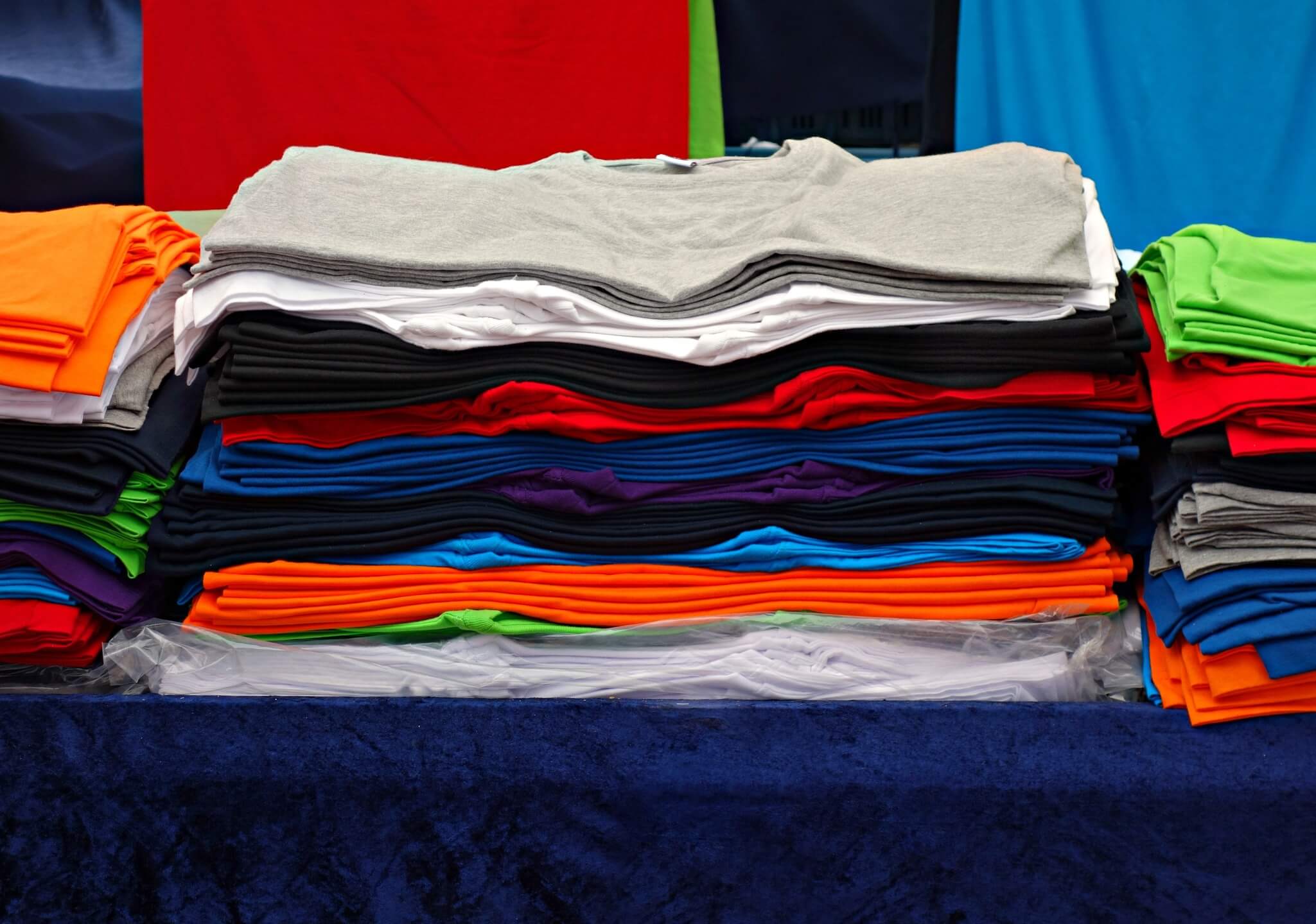
Youngsters love primary shades and bright colours. Apart from these, there are secondary and tertiary colours to consider. A perfect combination of these will help you create desirable products. Hence, in the realm of custom T-shirts, brainstorming is required. When you brainstorm different designs, you develop the capacity format appeal. Primary colours need proper attention and a combination. Hence, it creates a chance for you to succeed in the marketplace.
When using colours to invoke your memories and imagination make sure that you do not dilute it. Using theme colours and aligning them properly with the concept may develop a whole new aspect. When you pay attention to the themes, you can provide a highly aristocratic feel to the simplistic designs. One thing is very crucial that you must pay attention to the event for which you design the custom t-shirt. If it is for formal occasions, you must choose light shades. On the other hand, for casual events, you can go for bright and attractive colours.