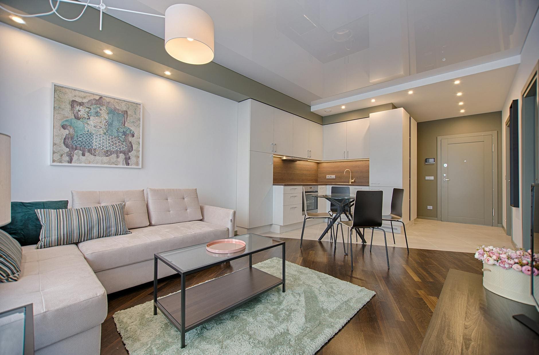
Ever walked into a room and felt something was just not right? 🤔 You’ve invested time and money into decorating your space, yet it lacks that magazine-worthy appeal you’ve been dreaming of. Don’t worry – you’re not alone. Even the most enthusiastic home decorators can fall prey to common interior design pitfalls that subtly transform their vision from fabulous to frustrating.
From awkward furniture arrangements to lighting that casts unflattering shadows, these design missteps can make a space feel uncomfortable and disjointed rather than welcoming and harmonious. The good news? These mistakes are completely avoidable. In this guide, we’ll walk you through the top 10 interior design blunders that might be holding your space back, and more importantly, show you exactly how to fix them. Let’s transform your home from a collection of common errors into a masterpiece of thoughtful design. ✨
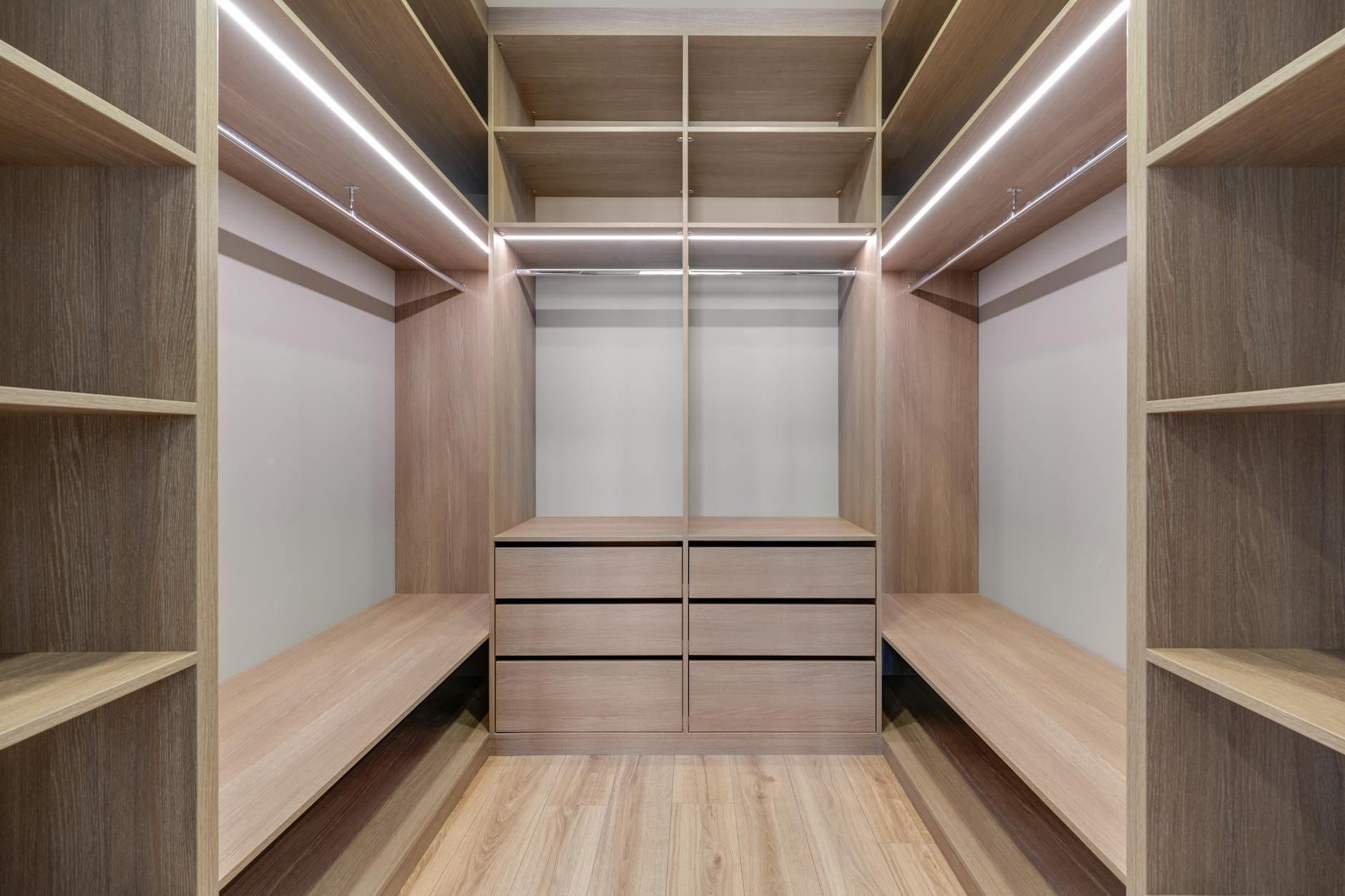
Poor Space Planning
Ignoring Traffic Flow
Poor traffic flow can turn an otherwise beautiful room into a frustrating maze. The key is to maintain clear pathways of at least 30-36 inches between furniture pieces. Create deliberate routes that allow easy movement between doorways, seating areas, and frequently used spaces.
| Traffic Flow Guidelines | Minimum Space Required |
|---|---|
| Main pathways | 36 inches |
| Secondary paths | 30 inches |
| Dining chair clearance | 24-30 inches |
| Conversation areas | 6-8 feet diameter |
Incorrect Furniture Sizing
One of the most common interior design mistakes is choosing furniture that’s either too large or too small for the space. Consider these essential guidelines:
- Leave 18 inches between a sofa and coffee table
- Maintain 3-4 feet clearance around dining tables
- Ensure bedroom furniture allows for comfortable bed access
- Scale artwork and accessories to room dimensions
Inadequate Storage Solutions
Effective storage planning is crucial for maintaining a clutter-free space. Implement these smart storage strategies:
- Utilize vertical space with floor-to-ceiling shelving
- Incorporate multi-functional furniture pieces
- Install built-in solutions in dead corners
- Consider hidden storage options under stairs or window seats
Now that we’ve addressed space planning fundamentals, let’s explore another critical aspect of interior design: lighting mistakes and their impact on your space.

Lighting Mistakes
Over-relying on Overhead Lights
One of the most common interior design mistakes is depending solely on overhead lighting. While ceiling fixtures provide general illumination, they often create harsh shadows and unflattering environments. Instead, implement a layered lighting approach using multiple light sources at different heights.
Neglecting Task Lighting
Task lighting is crucial for specific activities like reading, cooking, or working. Many homeowners overlook this essential layer of lighting, leading to eye strain and reduced functionality.
Key Task Lighting Areas:
- Reading nooks
- Kitchen counters
- Home office desks
- Bathroom mirrors
- Craft areas
Wrong Bulb Temperatures
Different color temperatures can dramatically affect a room’s atmosphere. Using inconsistent or inappropriate bulb temperatures is a common misstep that can disrupt your space’s intended mood.
| Bulb Temperature | Best Used For | Mood Created |
|---|---|---|
| 2700K-3000K | Living spaces | Warm, cozy |
| 3500K-4000K | Workspaces | Energetic |
| 5000K-6500K | Task areas | Daylight |
Poor Natural Light Utilization
Many homeowners fail to maximize natural light, which is essential for both aesthetics and well-being. Position furniture to allow sunlight flow, use reflective surfaces strategically, and avoid blocking windows with heavy drapes or large pieces.
Now that we’ve illuminated the common lighting pitfalls, let’s explore how color selection can make or break your interior design scheme.
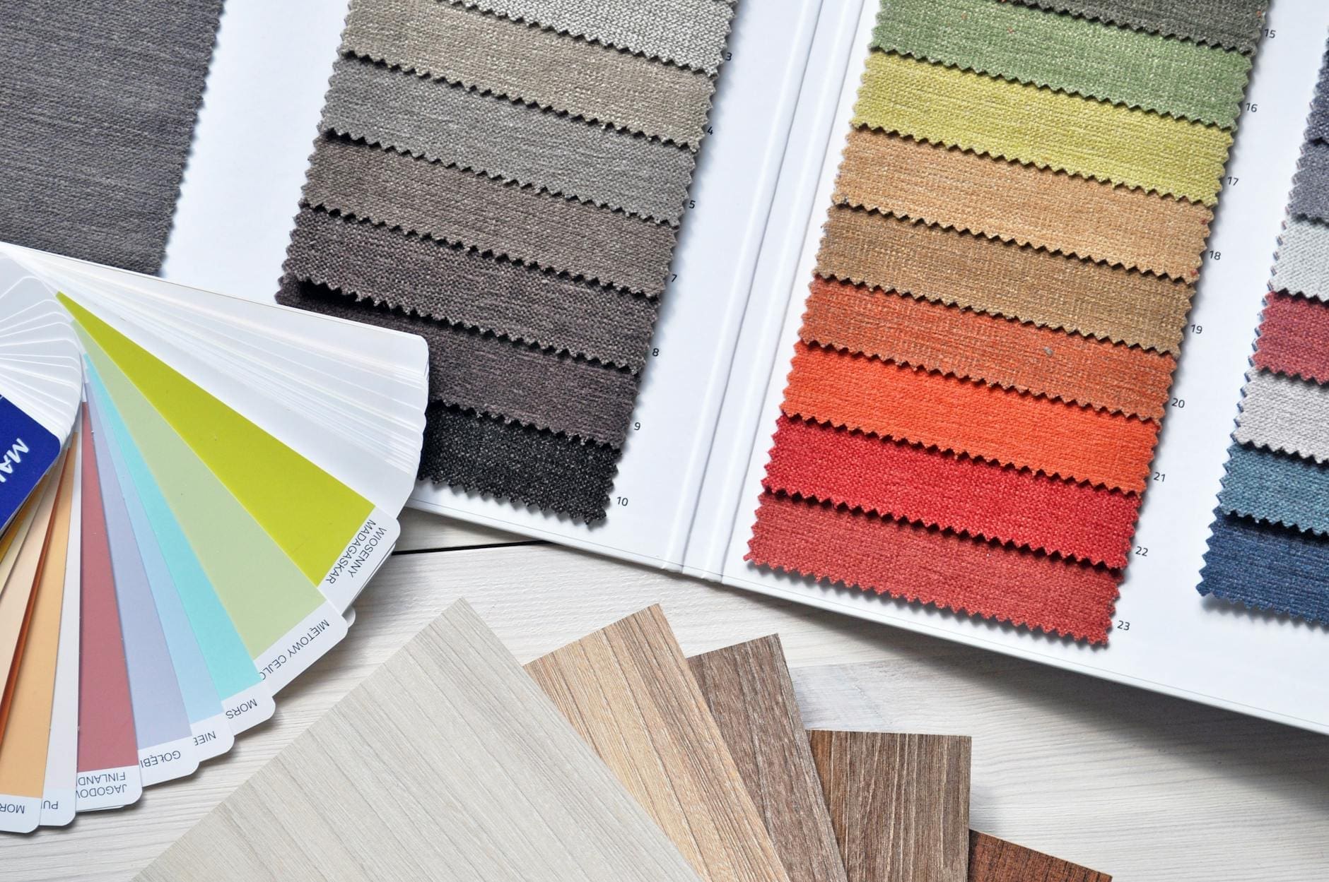
Color Selection Errors
Too Many Competing Colors
One of the most common interior design mistakes is overloading a space with multiple competing colors. A well-designed room typically follows the 60-30-10 rule:
- 60% dominant color (walls, large furniture)
- 30% secondary color (upholstery, accent furniture)
- 10% accent color (accessories, artwork)
Improper Color Coordination
Creating harmonious color schemes requires understanding color theory basics:
| Color Scheme | Description | Best Used In |
|---|---|---|
| Monochromatic | Different shades of one color | Bedrooms, studies |
| Complementary | Opposite colors on wheel | Living rooms, dining areas |
| Analogous | Colors next to each other | Transitional spaces |
Ignoring Room Orientation
Room orientation significantly impacts color perception:
- North-facing rooms: Use warm colors to counteract cool light
- South-facing rooms: Both cool and warm tones work well
- East-facing rooms: Cool colors balance morning light
- West-facing rooms: Neutral colors help manage afternoon glare
When selecting colors, consider the room’s natural light throughout the day. Paint samples should be tested on different walls and observed during various lighting conditions. Remember that colors can appear different depending on artificial lighting types – LED, fluorescent, or incandescent bulbs each affect color perception differently.
Now that you understand color selection principles, let’s explore how furniture arrangement can make or break your room’s design.
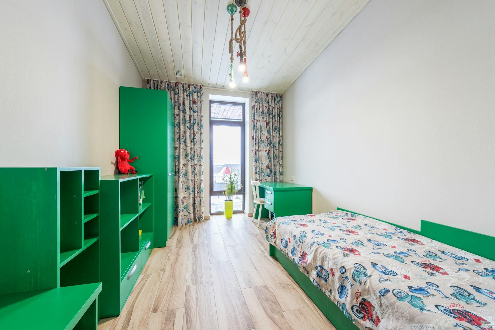
Furniture Arrangement Blunders
Pushing Everything Against Walls
Creating a “dance hall” effect by pushing all furniture against walls is one of the most common interior design mistakes. Instead, float furniture pieces to create intimate spaces and improve flow. This technique, known as “conversation grouping,” makes rooms feel more welcoming and purposeful.
Mismatched Proportions
Room balance depends heavily on furniture sizing and scale. Here’s a quick guide for proper proportioning:
| Furniture Type | Ideal Spacing | Common Mistake |
|---|---|---|
| Sofa to Coffee Table | 14-18 inches | Too far apart |
| Chairs to Sofa | 3-8 feet | Too close together |
| TV to Seating | 1.5-2.5x screen size | Too close/far |
Blocking Architectural Features
Key architectural elements that should never be obstructed:
- Windows and natural light sources
- Fireplaces and built-in features
- Doorways and traffic patterns
- Decorative moldings and trim work
Poor Conversation Areas
Successful conversation areas require thoughtful furniture placement. Essential tips include:
- Arrange seating within 8 feet of each other
- Create multiple small groupings in larger rooms
- Ensure all seats have a clear view of each other
- Include accessible side tables for drinks and items
Now that you understand proper furniture arrangement, let’s explore how art and accessories can either enhance or detract from your space’s overall design.

Art and Accessory Missteps
Wrong Artwork Height
One of the most common interior design mistakes is hanging artwork at incorrect heights. The general rule is to position the center of the artwork at eye level, approximately 57-60 inches from the floor. Consider these guidelines:
- For living rooms: maintain consistent height across multiple pieces
- Over furniture: leave 6-8 inches of space between furniture and artwork
- In dining rooms: account for seated viewing height
Overcrowding Shelves
Cluttered shelves can make a space feel chaotic and unorganized. Follow these shelf styling principles:
- Maintain 20-30% empty space for visual breathing room
- Group items in odd numbers (3 or 5)
- Vary heights and textures of displayed items
Mismatched Scales
Proper scaling of accessories is crucial for balanced design. Here’s a comparison guide:
| Item Type | Recommended Scale | Common Mistake |
|---|---|---|
| Table Lamps | 1/3 of table width | Too small or large |
| Throw Pillows | 20-24″ for sofas | Using only small sizes |
| Wall Art | 2/3 width of furniture | Choosing undersized pieces |
When selecting accessories, consider the room’s proportions and existing furniture. Large rooms need substantial pieces to avoid looking sparse, while smaller spaces require more delicate accessories. Moving forward, we’ll explore how window treatments can dramatically impact your space’s overall aesthetic.

Window Treatment Failures
Wrong Curtain Lengths
One of the most noticeable interior design mistakes occurs when curtains are hung at incorrect lengths. Here’s a quick guide to proper curtain lengths:
| Room Type | Recommended Length | Effect |
|---|---|---|
| Living Room | Floor to ceiling | Dramatic, elegant |
| Bedroom | 1/2 inch above floor | Polished, clean |
| Kitchen | Sill length | Practical, functional |
Inappropriate Fabric Choices
Selecting the wrong fabric can diminish both functionality and aesthetics. Consider these key factors:
- Light filtration needs
- Room humidity levels
- Maintenance requirements
- Color fastness
- Seasonal appropriateness
Poor Hardware Placement
Proper mounting of curtain hardware dramatically affects the overall appearance:
- Install rods 4-6 inches above window frame
- Extend brackets 6-12 inches beyond window width
- Ensure secure mounting into wall studs
- Use appropriate weight-bearing supports
Blocking Natural Light
Strategic window treatment placement maximizes natural light while maintaining privacy:
- Use sheer layers for daytime privacy
- Install dual-track systems for versatility
- Consider top-down, bottom-up shades
- Opt for light-filtering materials in dark rooms
With proper window treatments now addressed, let’s examine how rug placement can make or break your room’s design.
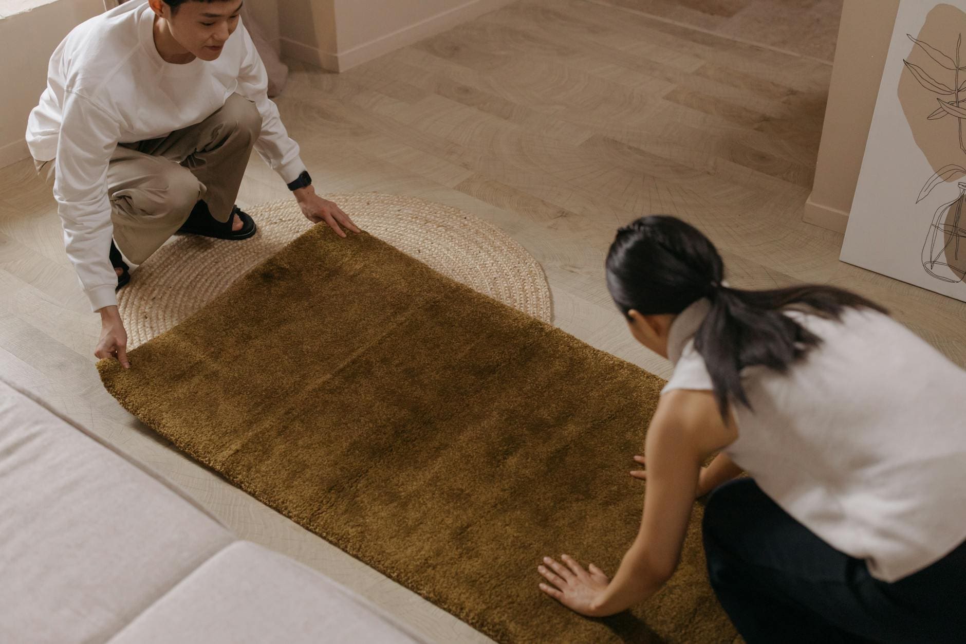
Rug Placement Issues
Wrong Size Selection
A properly sized rug can make or break a room’s design. Here are the most common sizing mistakes:
- Living Room: Selecting a rug that’s too small, creating a “floating furniture” effect
- Dining Room: Choosing a rug that doesn’t extend at least 24″ beyond the table edges
- Bedroom: Using tiny rugs that barely peek out from under the bed
| Room Type | Minimum Rug Size | Ideal Placement |
|---|---|---|
| Living Room | 8′ x 10′ | All furniture legs on rug |
| Dining Room | 9′ x 12′ | 24″ clearance from table |
| Bedroom | 8′ x 10′ | Extends 2-3′ from bed sides |
Improper Positioning
Correct rug positioning creates visual harmony and defines spaces effectively. Position your rug to:
- Center it under key furniture pieces
- Maintain consistent spacing from walls
- Align with major architectural features
Mismatched Style
Your rug should complement your room’s design aesthetic. Common style mistakes include:
- Pairing traditional Persian rugs with ultra-modern furniture
- Using bold patterns in already busy rooms
- Selecting inappropriate materials for the room’s function
Now that you understand proper rug placement, let’s examine how budget distribution affects your overall design success.

Budget Distribution Problems
Overspending on Trendy Items
One of the most common interior design mistakes is allocating too much budget to trendy pieces that may quickly go out of style. While it’s tempting to fill your space with the latest design fads, this approach often leads to costly replacements when trends change.
| Budget Category | Recommended Allocation |
|---|---|
| Timeless Pieces | 50-60% |
| Trendy Items | 20-25% |
| Accessories | 15-20% |
| Emergency Fund | 5-10% |
Neglecting Quality Basics
Quality foundational pieces deserve priority in your budget:
- High-traffic furniture (sofas, beds)
- Lighting fixtures
- Storage solutions
- Flooring materials
Poor Planning for Accessories
Strategic accessory planning helps avoid these common pitfalls:
- Buying too many small items without a cohesive plan
- Underestimating the cost of quality accessories
- Forgetting to budget for functional items like curtains and throws
- Not reserving funds for unexpected finishing touches
The key to successful budget distribution lies in balancing quality investment pieces with carefully chosen trend items. Instead of impulse-buying decorative items, create a detailed budget breakdown that prioritizes essential elements while leaving room for stylish accents. Now that we’ve covered budget management, let’s explore how material and texture choices can impact your interior design project.

Material and Texture Mistakes
Lack of Texture Variety
Creating a visually interesting space requires a thoughtful mix of textures. A common interior design mistake is using too many similar textures, resulting in a flat, uninspiring room. To create depth and visual interest, combine:
- Smooth surfaces (glass, polished metal)
- Rough textures (natural stone, rustic wood)
- Soft materials (velvet, wool)
- Woven elements (rattan, basketweave)
Poor Fabric Choices
Selecting inappropriate fabrics can lead to both aesthetic and functional failures. Consider these key factors:
| Room Type | Recommended Fabrics | Fabrics to Avoid |
|---|---|---|
| Living Room | Performance fabrics, durable weaves | Delicate silks, light linens |
| Kitchen | Stain-resistant, wipeable materials | Velvet, suede |
| Bathroom | Moisture-resistant, quick-drying | Non-treated natural fibers |
Impractical Surface Materials
Choose materials that align with the room’s function and traffic level. High-maintenance marble countertops in a busy kitchen or glossy tiles in a frequently used bathroom can become problematic quickly.
Ignoring Maintenance Requirements
Different materials demand varying levels of care. Before selecting materials, consider:
- Cleaning frequency requirements
- Cost of maintenance products
- Time investment for upkeep
- Professional maintenance needs
Now that we’ve covered material and texture considerations, let’s explore how to create effective focal points in your space.
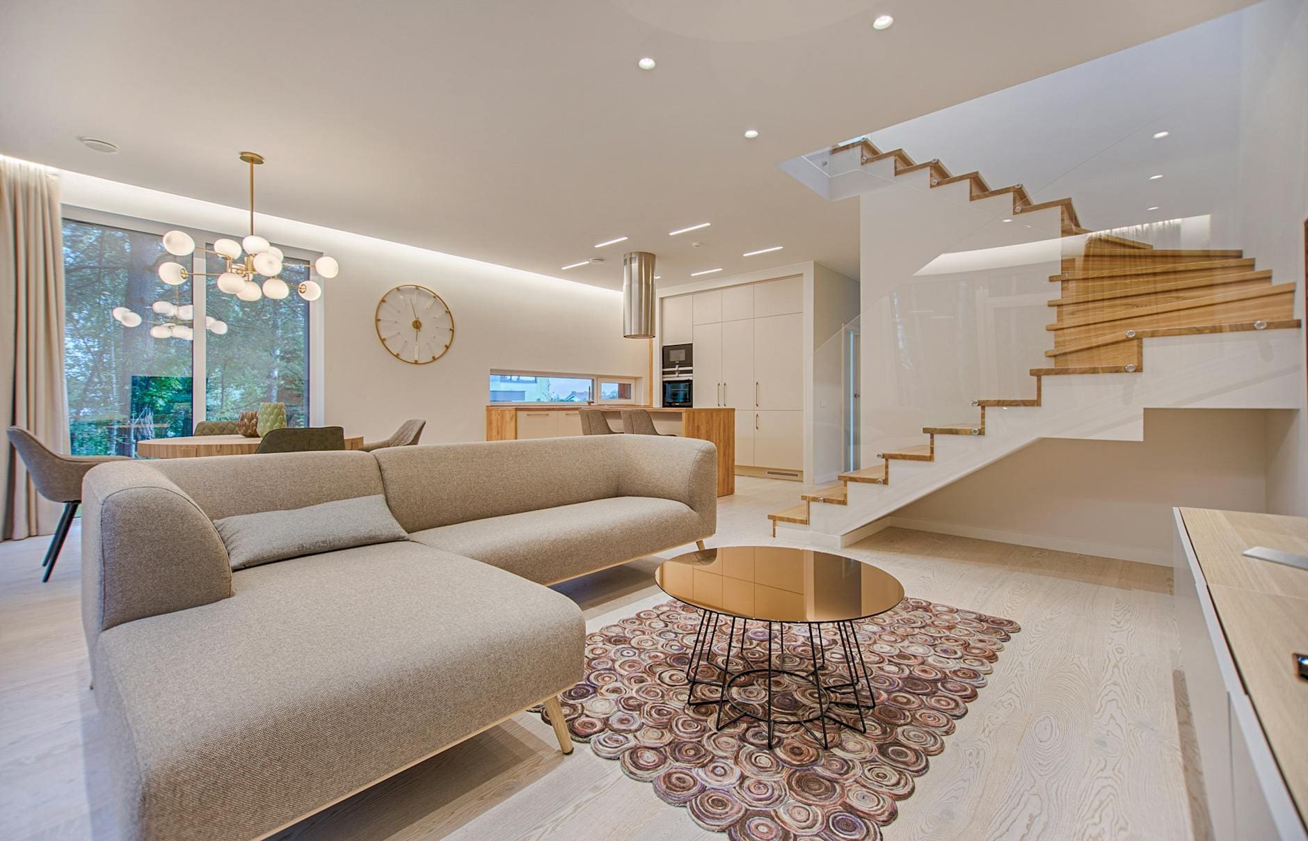
Focal Point Errors
Multiple Competing Focal Points
When multiple elements vie for attention in a single space, they create visual chaos and confusion. This common interior design mistake occurs when homeowners incorporate too many statement pieces, such as:
- An oversized artwork
- A dramatic fireplace
- Bold accent walls
- Large decorative mirrors
- Elaborate light fixtures
No Clear Focal Point
A room without a focal point lacks direction and feels uninspiring. Your eye needs a natural resting place to create visual harmony. Consider these strategic focal point options:
| Room Type | Recommended Focal Points |
|---|---|
| Living Room | Fireplace or media wall |
| Bedroom | Headboard or window view |
| Dining Room | Statement chandelier or buffet |
| Kitchen | Range hood or backsplash |
Poorly Positioned Focal Elements
Even with a well-chosen focal point, improper positioning can diminish its impact. Ensure your focal point is:
- Visible immediately upon entering the room
- Proportionate to the room size
- Well-lit and properly highlighted
- Complemented by, not competing with, surrounding elements
The key to avoiding these focal point errors lies in selecting one dominant feature and supporting it with complementary design elements. Next, we’ll explore how these common mistakes impact your overall design budget and financial planning.
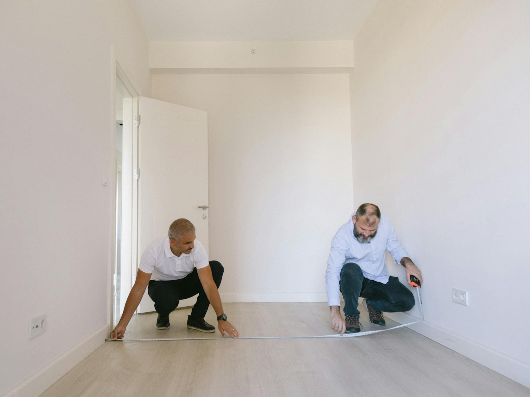
Creating a beautiful and functional living space requires careful attention to detail and thoughtful planning. By avoiding these common interior design pitfalls – from poor space planning and improper lighting to mismatched colors and incorrect furniture placement – you can transform your home into a well-designed sanctuary. Understanding the importance of proper rug placement, window treatments, and balanced accessories helps create a cohesive look that reflects your personal style.
Take time to evaluate your space, plan your budget carefully, and consider each design element’s purpose and placement. Remember, successful interior design is about creating harmony between functionality and aesthetics. Whether you’re decorating a single room or an entire home, avoiding these top 10 mistakes will help you achieve professional-looking results that you’ll enjoy for years to come.
