The reason most two tone walls look like a DIY mistake instead of a design choice comes down to one decision — and it has nothing to do with which colors you picked. It’s where you drew the line. Literally. I’ve walked into apartments where the homeowner spent real money on quality paint, chose colors that genuinely worked together, and still ended up with something that looked like a rental property trying too hard — because the split landed at exactly the wrong height, or worse, at exactly the midpoint of the wall, which is the decorating equivalent of wearing a belt around your armpits. The color pairing gets all the attention in every article you’ll read about this topic. The line placement, the technique sequence, the proportional logic — those are what actually determine whether your room looks like a design decision or a phase.
Quick Answer
The reason most two tone walls look like a DIY mistake instead of a design choice comes down to one decision — and it has nothing to do with which colors you picked.
This article is about all of it.
Are Two Tone Walls Still in Style in 2026?
In This Article
- Are Two Tone Walls Still in Style in 2026?
- The 5 Split Techniques Competitors Never Mention (Beyond Horizontal and Vertical)
- What Two Colors Actually Look Good Together on a Wall?
- The Color Replacing Gray in 2026 — and How to Use It in a Two Tone Scheme
- Room-by-Room Split Point Guide: Where Exactly to Draw the Line
- What Color House Sells the Fastest — and What That Tells Us About Interior Two Tone Choices
- The Tape, Tool, and Prep Sequence That Separates Clean Lines from Paint Disasters
Straightforward answer: yes. But that’s not the interesting part of the question.
What’s actually happening is that two tone walls have gone through a meaningful evolution — from the colonial-era chair rail aesthetic, through the 1990s mauve-over-cream awkwardness, into something that contemporary designers are using with real intention. The version that dates is the one done trend-first: someone sees a photo on Pinterest, picks two colors that were popular that month, slaps a horizontal line at 36 inches, and calls it done. The version that lasts is the one done contrast-first: you identify what the room needs spatially — more warmth, a lower visual ceiling, an anchored furniture grouping — and you use a second color as an architectural tool to get there.
Google Trends data shows that searches for two tone wall treatments have grown consistently year-over-year since 2021, with a notable spike in early 2026 tied to the broader color maximalism movement that’s been displacing the all-gray era. People are tired of rooms that photograph well and feel like nothing when you’re actually sitting in them. That backlash is real, and two tone walls are one of the main beneficiaries.
Major paint brands have taken notice. Both Farrow & Ball and Benjamin Moore have released curated duo-color collections specifically developed for split-wall application — pairing shades within the same tonal family so that the contrast reads as intentional rather than accidental. That’s not a trend signal. That’s the industry acknowledging a shift in how homeowners actually want to live.
Two types of two tone exist. One chases the moment. One solves the room. Know which one you’re doing before you buy a drop cloth.
Actionable takeaway: Before you choose any colors, write down one spatial problem you want the second color to solve — ceiling too high, room feels too narrow, wall behind the bed too blank. If you can’t answer that, you’re trend-chasing. Start with the problem.
The 5 Split Techniques Competitors Never Mention (Beyond Horizontal and Vertical)
Every guide you’ll find on this topic covers two methods. Horizontal line, vertical line. Done. That’s like teaching someone to cook by explaining that heat exists.
There are at least five additional split techniques that are genuinely useful — and several of them are actually more forgiving to execute than a perfectly straight horizontal line across a 14-foot wall.
The diagonal split runs at a 30 to 45-degree angle from one corner of the wall to another. It generates kinetic energy in rooms that are architecturally static — hallways especially, where there’s no furniture to create visual movement. Stairwells are another strong candidate. The diagonal follows the angle of the stair rise naturally, which means it can look almost structural rather than decorative.
The arch or curve split is having a significant moment — Pinterest Predicts data shows that searches for “curved wall paint” and “arch painted wall” grew by over 140% between 2023 and 2025, which signals that straight-line splits are actively giving way to organic boundary shapes. The execution is simpler than it looks: use a projector template or a large compass made from a string and a pencil to mark the curve, then paint inside it. The curved boundary softens hard architectural lines in a way that no straight split can, and it’s particularly effective in bedrooms where you want the space to feel wrapped rather than divided.
The panel inset technique involves painting a framed rectangle of contrast color inside a border of the base color — essentially mimicking wainscoting or picture frame molding without installing anything. A room I worked on in a Wicker Park studio used this technique in dusty blue against an off-white base and it looked like the homeowner had spent $2,000 on millwork. She spent $40 on paint.
The ceiling dip bleeds the upper wall color 6 to 12 inches onto the ceiling plane. It visually lowers a too-tall ceiling — something that sounds counterintuitive until you experience a room with 11-foot ceilings that feel cavernous — and creates what designers sometimes call a “cocooning effect” in living rooms. This one requires no tape on a difficult line. The ceiling edge is already there.
The ombre fade boundary replaces the hard tape line with a 3 to 4-inch gradient blended zone, achieved with a dry brush technique during the transition from one color to the other. It removes the precision demand entirely and reads as intentional texture rather than a slightly imperfect line.
Actionable takeaway: If you’re nervous about execution, choose the ceiling dip or panel inset — both eliminate the long horizontal tape run that causes most DIY disasters.
What Two Colors Actually Look Good Together on a Wall?
Let me be direct about something: “use complementary colors” is the kind of advice that sounds useful and helps no one. I once watched a client spend three weekends repainting after following that exact guidance from a home improvement blog. Complementary colors — opposites on the color wheel — are high risk on walls because the space between them has nowhere to hide. Every undertone conflict becomes visible.
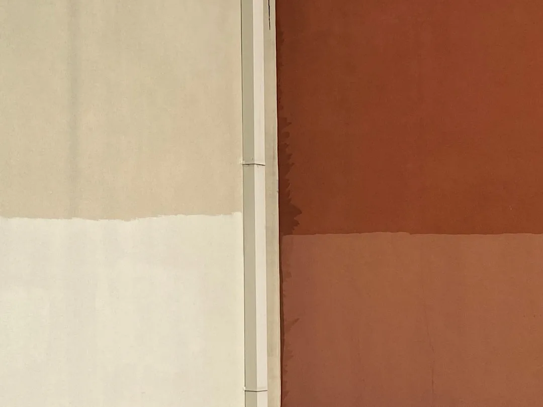
The 60/40 rule is the most important proportion principle in two tone work. The lighter or more neutral color should occupy 60% of the wall surface. Reversing this creates visual imbalance that registers as accidental rather than designed, even if the viewer can’t name why it bothers them.
The lowest-risk starting point is a tonal pair — two colors from the same hue family at different saturation levels. Benjamin Moore’s Pale Oak paired with Antiquity, or Farrow & Ball’s Elephants Breath over Mole’s Breath, are both examples of this approach. The eye reads them as related, which means the split looks considered.
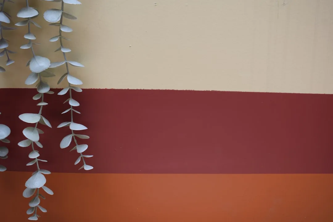
For bolder rooms — offices, dining rooms, reading spaces — a deep forest green lower half with a warm cream upper half is one of the strongest current combinations. It reads as what I’d call library chic. Serious but not cold. It works precisely because the green has enough warmth in its undertone to meet the cream without fighting it.
Color psychology research from the Pantone Color Institute shows that contrast wall treatments using analogous color pairs — colors adjacent on the color wheel — test higher for “calming” and “intentional” in residential settings compared to complementary pairs, which test higher for “energizing” but also, notably, “stressful.” That data matches what I observed working with clients over 11 years. The room that photographs dramatically and feels exhausting to sit in is almost always a complementary pairing at high contrast.
Trending 2026 pairings worth considering:
- Terracotta lower, dusty rose upper — warm, earthy, surprisingly sophisticated
- Slate blue lower, warm white upper — works in rooms with north-facing light where cooler tones can read flat
- Deep plum lower, soft lavender upper — tonal but unexpected; particularly strong in bedrooms
One combination to actively avoid: yellow-based whites paired with blue-based grays. The undertone conflict is visible in every light condition and looks like a mistake no matter how deliberately you executed it.
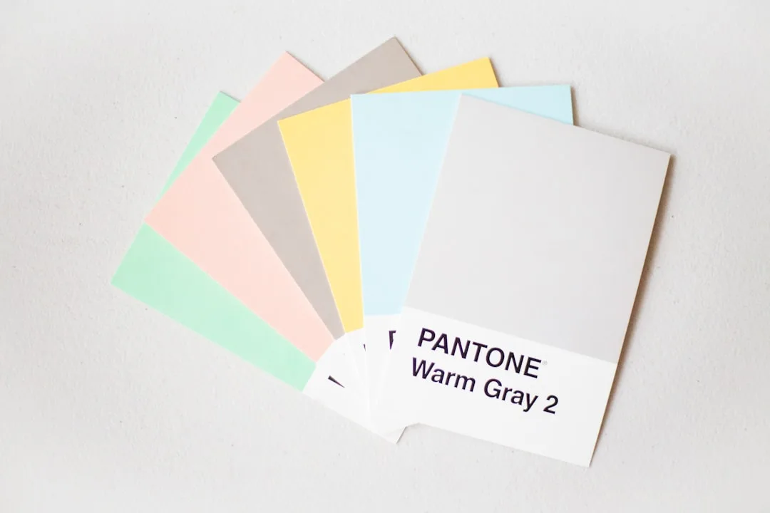
The undertone test is non-negotiable. Place both paint chips on your actual wall — not side by side on a chip card — and look at them at 7am, at noon, and at 9pm with your lamps on. The same pairing can look harmonious in morning light and actively wrong under incandescent bulbs. I’ve seen it happen enough times that I won’t let anyone skip this step.
Actionable takeaway: Start with tonal pairs from the same color family. Make the lower portion the darker or more saturated color. Look at chips on your actual wall in three different light conditions before buying a full can.
The Color Replacing Gray in 2026 — and How to Use It in a Two Tone Scheme
Gray had a decade-long run as the default residential neutral. It photographed well, offended no one, and worked with stainless steel appliances. It also made most rooms feel like a waiting area. The departure from it has been accelerating, and 2026 is where that shift becomes undeniable.
Warm greige and what the industry is calling “dirty whites” are the primary transition shades — colors like Benjamin Moore White Dove, Sherwin-Williams Accessible Beige, and Farrow & Ball Elephant’s Breath. These are the bridge tones: neutral enough to feel safe, warm enough to feel inhabited. Sherwin-Williams named Quietude — a soft sage-green — as its 2026 Color of the Year, while Benjamin Moore selected a warm clay tone. Both choices point in the same direction: grounded, warm, nature-referencing. The cool gray era is over.
Beyond greige, the deeper movement is toward what designers are broadly calling mushroom neutrals — warm taupes, muted terracottas, earthy tones that feel like they belong to the natural world rather than a hardware store color chart. New construction projects I’ve been aware of are specifying these as default wall colors in a way they never would have with anything outside of gray five years ago.
Using the gray replacement in a two tone scheme requires a specific approach. Pair a warm greige upper wall — something like Accessible Beige or Benjamin Moore Pale Oak — with a richer earthier tone below. A warm taupe, a soft terracotta, a muted clay. The result is depth without bold color commitment. It works for renters, for homeowners planning to sell, and for anyone who wants the room to feel different without feeling like a statement.
There’s also an anti-trend move worth knowing about. Some designers are deliberately pairing a cool gray on the upper portion with a warm emerging tone on the lower half — using the combination to bridge eras, creating what I’d describe as a collected look rather than a trend-chasing one. It reads as intentional precisely because the pairing is slightly unexpected. Done with restraint, the cool-warm tension actually makes both colors more interesting.
Actionable takeaway: If you’re replacing existing gray walls, don’t repaint both halves at once. Try the warm tone on the lower third first, leaving the gray above. You may find the contrast works better than a full replacement — and you’ll save yourself two coats of labor.
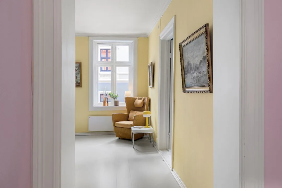
Room-by-Room Split Point Guide: Where Exactly to Draw the Line
This is the section no one writes. Every tutorial shows the finished room. Almost none of them tell you where the line actually is and why it’s there.
The chair rail myth needs addressing first. The standard 32-inch chair rail height exists because it’s where chair backs historically hit walls in dining rooms. It is a functional measurement from furniture history. It has nothing to do with contemporary room proportions or visual balance, and using it as your default split point produces a result that looks dated almost regardless of which colors you choose.
The most important optical rule in split placement: placing the divide at exactly half the wall height reads as indecisive. The eye expects a deliberate choice — either low or high. The midpoint looks like a measurement error. Go lower (one-third from the floor) for a grounded, anchored look that makes furniture feel planted. Go higher (two-thirds from the floor) for a gallery-like effect that emphasizes height.
Room-specific guidance:
- Bedrooms: A higher split — lighter upper two-thirds, darker or richer lower third — creates a visual headboard effect behind the bed. I’ve used this in studios where there wasn’t room for a physical headboard and the result looked more intentional than anything I could have bought.
- Living rooms: Align the split with the top of your largest piece of furniture — sofa back, bookcase top. The color change disappearing behind the furniture creates a built-in look that makes the room feel designed rather than simply painted.
- Hallways and entryways: Lower splits — one-third from floor — draw the eye outward along the wall rather than upward, making narrow spaces read as wider. This is the opposite of what you’d expect, but it works consistently.
- Small rooms under 120 square feet: Avoid horizontal splits entirely. A horizontal line in a small room cuts the space in half visually and makes it feel compressed. Use vertical splits at a doorway or corner, or use the panel inset technique instead.
Actionable takeaway: Measure your ceiling height, multiply by 0.4 for the lower-third option or by 0.6 for the upper-third option, and mark that height at multiple points across the wall before taping. Stand back at the doorway. Trust what you see more than what the tape measure says.
What Color House Sells the Fastest — and What That Tells Us About Interior Two Tone Choices
Exterior research on this question is fairly consistent. Homes with greige, soft white, or light gray exteriors have repeatedly shown faster sale times and stronger prices than homes with saturated or unusual exterior colors — the neutrals photograph better in listing photos, mentally place less demand on buyers to imagine themselves in the space, and reduce the psychological discount buyers apply to anything they’d personally repaint.
The interior parallel holds. A 2023 Zillow analysis of 135,000 home sales found that homes with light beige, greige, or off-white interiors sold for up to $5,000 more than comparable homes with bold interior color choices. That’s a real number attached to a real paint decision.
The resale-safe two tone strategy uses this logic directly: keep the upper portion of the wall — the larger, dominant surface — in a neutral that photographs well and appeals broadly. Warm white, soft greige, muted taupe. Place the bolder or more saturated color on the lower portion only, below 40% of the wall surface. You get the visual interest and the designed feeling. You keep the broadest possible buyer appeal.
What to avoid if you’re selling within three years:
- Highly saturated jewel tones as dominant colors — they read well in editorial photography and poorly in real estate listings
- Trendy specific shades that have a visible expiration date (the specific olive green of 2021–2023 is already starting to look dated in listings I’ve seen)
- High-contrast black-and-white horizontal splits in small rooms — they’re striking in person and severe in listing photos
One exception worth knowing: kitchens and bathrooms where you use a high-gloss finish on the lower half and a matte finish on the upper half of the same color — creating a finish contrast rather than a color contrast — have tested remarkably well with buyers who often mistake the effect for tile work. It’s a two tone wall treatment that reads as a material upgrade. That’s the kind of trick that earns its square footage.
Actionable takeaway: If you’re within five years of a potential sale, photograph your two tone wall with your phone under regular listing light conditions before committing. If the lower color reads as a feature, proceed. If it reads as something a buyer would immediately repaint, reconsider the saturation level.
The Tape, Tool, and Prep Sequence That Separates Clean Lines from Paint Disasters
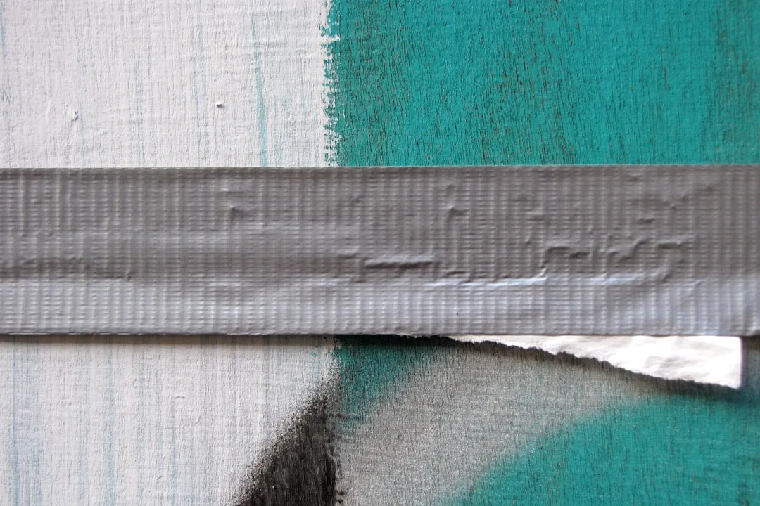
Professional painters report that 80% of two tone wall complaints from DIYers come from three specific mistakes: inadequate surface prep before taping, removing tape after paint has fully cured, and using low-quality tape that allows bleeding. Every one of these is preventable. None of them are about color choice or design vision. They’re procedural failures.
Surface prep is the actual first step — not taping, not cutting in, not opening paint cans. Any texture irregularity, scuff, or sheen variation in a 6-inch band around your intended split line will telegraph through the finished paint and make the line look uneven even if your tape placement was perfect. Sand that band lightly. Prime it. This adds an hour to your project and saves you a weekend of frustration.
Tape selection is not trivial. Frog Tape outperforms standard blue painter’s tape for two tone walls because its PaintBlock technology swells slightly when it contacts wet paint, physically sealing the edge and preventing bleeding. The price difference is roughly $3 per roll. It is not a place to economize.
The paint-your-tape trick is the single most underused technique in DIY two tone work — and I learned it from watching a professional painter work on a Bucktown renovation that needed perfect lines. Before you apply your second color, paint over the tape line with your first color and let it fully dry. This seals any microscopic gaps between the tape and the wall surface. When the second color goes on, it has nowhere to bleed. The seal is already there.
Removal timing matters significantly. Pull the tape at a 45-degree angle back over itself while the second color is still slightly tacky — not wet, not fully dry. Fully dry paint forms a bond with the tape backing that causes chipping when you pull. The window is usually 30 to 60 minutes after your final coat, depending on humidity and temperature.
Touch-ups are not a failure. Budget 20 to 30 minutes for edge work with a small artist’s brush — the kind that costs $4 at any art supply store. Even professional painters do this. Expecting zero touch-up on a long tape line is how you end up repainting an entire section.
When to skip tape entirely: the ombre fade boundary technique and diagonal splits are often cleaner when executed freehand using a chalk snap line as a guide and a 1-inch angle brush. Tape creates a rigid line that can actually work against you on diagonal runs, where any slight variation in the tape’s tension makes the line bow. A steady hand and a chalk line beats tape every time on angles.
Actionable takeaway: Buy Frog Tape, not blue tape. Prep the band. Seal the tape edge with your first color before applying the second. Pull while tacky. Those four steps will determine 90% of your result.
Frequently Asked Questions
Are two tone walls still in style in 2026?
Yes — but the version that ages well isn’t the trend-driven version. Two tone walls that last are ones that solve a spatial problem: a ceiling that needs visually lowering, a room that needs warmth, a wall behind furniture that needs anchoring. Google Trends data shows consistent growth in two tone wall searches since 2021, with a 2026 spike tied to the color maximalism movement replacing the all-gray era. The technique is sound. The version that dates is the one that chases a specific color moment rather than a spatial need.
What two colors look good together on a wall?
Tonal pairs — two colors from the same hue family at different saturation levels — are the lowest-risk starting point. The 60/40 rule applies: lighter or more neutral color on 60% of the surface, richer or darker color on the remaining 40%. Avoid pairing warm-undertone whites with cool-undertone grays — that undertone conflict is visible in every light condition. The Pantone Color Institute’s research on analogous pairs (colors adjacent on the color wheel) supports using similar-family pairings for residential spaces where you want calm and intentionality rather than visual stimulation.
What color is replacing gray in 2026?
Warm greige and what designers are calling dirty whites — Benjamin Moore White Dove, Sherwin-Williams Accessible Beige, Farrow & Ball Elephant’s Breath — are the transitional shades. Deeper nature-referencing tones are emerging behind them: warm taupes, soft terracottas, mushroom neutrals. Sherwin-Williams’ 2026 Color of the Year is Quietude, a soft sage-green. Benjamin Moore selected a warm clay tone. Both signal the same industry-wide move away from cool, detached grays toward warmer, grounded naturals.
What color house sells the fastest?
A 2023 Zillow analysis of 135,000 home sales found that homes with light beige, greige, or off-white interiors sold for up to $5,000 more than comparable homes with bold interior choices. For exterior color, greige, soft white, and light gray consistently show faster sale times in real estate market analyses. The pattern is consistent: neutral-dominant surfaces reduce the psychological discount buyers apply to things they imagine repainting. For two tone walls specifically, keep the upper — dominant — surface in a neutral and reserve bolder choices for the lower 40%.
Where should the dividing line go on a two tone wall?
Can I do a two tone wall without tape?
For certain techniques, yes — and the result is often cleaner than tape. The ombre fade boundary technique intentionally blends the transition zone with a dry brush, eliminating the need for a hard line entirely. Diagonal splits frequently execute better freehand along a chalk snap line than with tape, which can bow under tension and create an uneven angle. Ceiling dip technique uses the existing ceiling edge as your natural guide. Tape is most useful for clean horizontal lines on flat, well-prepped surfaces — for anything more complex, a 1-inch angle brush, a chalk line, and steady hands will outperform it.
Pick one wall. The one that bothers you most, or the one you see first when you walk in the door. Mark three horizontal lines on it — at one-third, at half, and at two-thirds height. Live with those marks for two days. Look at them in morning light, in the afternoon, at night. The line you keep wanting to paint is the right line. Buy your Frog Tape this weekend. The rest follows.
Are two tone walls still in style in 2026?
Yes — but the version that ages well isn’t the trend-driven version. Two tone walls that last are ones that solve a spatial problem: a ceiling that needs visually lowering, a room that needs warmth, a wall behind furniture that needs anchoring. Google Trends data shows consistent growth in two tone wall searches since 2021, with a 2026 spike tied to the color maximalism movement replacing the all-gray era. The technique is sound. The version that dates is the one that chases a specific color moment rather than a spatial need.
What two colors look good together on a wall?
Tonal pairs — two colors from the same hue family at different saturation levels — are the lowest-risk starting point. The 60/40 rule applies: lighter or more neutral color on 60% of the surface, richer or darker color on the remaining 40%. Avoid pairing warm-undertone whites with cool-undertone grays — that undertone conflict is visible in every light condition. The Pantone Color Institute’s research on analogous pairs (colors adjacent on the color wheel) supports using similar-family pairings for residential spaces where you want calm and intentionality rather than visual stimulation.
What color is replacing gray in 2026?
Warm greige and what designers are calling dirty whites — Benjamin Moore White Dove, Sherwin-Williams Accessible Beige, Farrow & Ball Elephant’s Breath — are the transitional shades. Deeper nature-referencing tones are emerging behind them: warm taupes, soft terracottas, mushroom neutrals. Sherwin-Williams’ 2026 Color of the Year is Quietude, a soft sage-green. Benjamin Moore selected a warm clay tone. Both signal the same industry-wide move away from cool, detached grays toward warmer, grounded naturals.
What color house sells the fastest?
A 2023 Zillow analysis of 135,000 home sales found that homes with light beige, greige, or off-white interiors sold for up to $5,000 more than comparable homes with bold interior choices. For exterior color, greige, soft white, and light gray consistently show faster sale times in real estate market analyses. The pattern is consistent: neutral-dominant surfaces reduce the psychological discount buyers apply to things they imagine repainting. For two tone walls specifically, keep the upper — dominant — surface in a neutral and reserve bolder choices for the lower 40%.
Where should the dividing line go on a two tone wall?
Not at the midpoint. Never at the midpoint — it reads as indecisive. For a grounded, anchored look, place the divide at one-third of the wall height from the floor. For a gallery-like, airy feel, place it at two-thirds. In bedrooms, a higher split behind the bed mimics a headboard. In living rooms, aligning the split with the top of your sofa back creates a built-in effect.