The living rooms people regret painting terracotta didn’t fail because of the color — they failed because the undertone was wrong, the lighting was left unchanged, and the furniture ratios were never adjusted. Choosing a terracotta paint color for a living room requires more nuance than most color guides admit, and I’ve watched this go wrong more times than I’d like to admit, including once in a client’s north-facing apartment in Wicker Park where we chose a terracotta that looked like dried blood under her cool overhead lighting. The color wasn’t the problem. Everything around it was.
Quick Answer
The living rooms people regret painting terracotta didn’t fail because of the color — they failed because the undertone was wrong, the lighting was left unchanged, and the furniture ratios were never adjusted.
This is a guide for people who want terracotta walls that actually feel livable — not staged, not trendy, not a room that photographs well but exhausts you every evening. Getting there requires a different set of decisions than most paint color content will tell you about.
Why Terracotta Paint Color Works So Well in a Living Room (Beyond the Trend)
In This Article
- Why Terracotta Paint Color Works So Well in a Living Room (Beyond the Trend)
- Reading the Undertone Before You Buy a Single Sample Pot
- The Honest Breakdown: Terracotta Paint on Every Surface in the Living Room
- Furniture and Fabric Pairings That Actually Work
- Lighting Adjustments That Make or Break the Color
- Specific Paint Shades Worth Testing

Here’s what surprises most people the first time they put terracotta on a wall properly: it reads like a neutral. Not in the way beige reads as a neutral — passive, non-committal, slightly apologetic — but in the way that a warm wood floor reads as a neutral. It has presence without competition. A true red will fight your sofa. A deep blue will fight your curtains. Terracotta, when the undertone is right and the lighting cooperates, seems to settle into the room and absorb everything else.
That isn’t an accident of aesthetics. It’s color science.
Terracotta sits at the junction of the red-orange family and the earth tone spectrum, which means it carries the psychological warmth of red without red’s aggression. Research published by Valdez and Mehrabian in 1994 — one of the foundational studies in environmental color psychology — found that hues in the warm red-orange family measurably increase perceived warmth and social engagement. Living rooms are social spaces. The color is doing functional work, not just decorative work.
The Light Reflectance Value of most terracotta shades falls between 15 and 35. That range matters more than people realize. It means terracotta absorbs a significant percentage of light rather than bouncing it back, which is precisely why it feels cozy rather than stimulating — but it also means under-lit rooms can tip from cozy into oppressive. That threshold is worth keeping in mind for every decision that follows.
There’s also longevity to consider. Terracotta’s pigment origins — iron oxide, mineral clay — are why this color doesn’t feel dated the same way a trending emerald or a millennial pink does after three years. The palette references earth, not fashion. Rooms painted in terracotta from the 1980s look considered; rooms painted in the saturated avocado green from the same era look like a film set.
- Terracotta’s LRV range (15–35) makes it ideal for rooms with moderate natural light — not too bright, not too dim
- Its red-orange hue family triggers perceived warmth in living spaces, supported by decades of environmental psychology research
- Unlike purely trendy saturated colors, terracotta’s mineral-pigment origins give it visual durability across decades
Takeaway: Before you question whether terracotta will date your room, ask whether your room has moderate natural light and a social function. If yes to both, the color is working in your favor from the start.
Reading the Undertone Before You Buy a Single Sample Pot
Most paint mistakes I’ve seen — and I’ve seen a lot of them — don’t happen at the color family level. They happen at the undertone level. Someone decides they want terracotta, they pick the chip that looks most like terracotta under the fluorescent lights at the hardware store, and then they’re standing in their finished living room six weeks later wondering why the walls look pink. Or muddy. Or somehow both at once.
Terracotta undertones split into three recognizable families. Pink-leaning terracottas have a dusty rose quality when dry — beautiful with linen, blush, and warm wood, but difficult if your existing furniture runs cool-toned. Brown-leaning terracottas read as adobe or clay, earthier and more forgiving across different lighting conditions. Orange-leaning terracottas carry more energy — these are the shades that look electric in a south-facing room and turn aggressive in a poorly lit one.
The single most important thing to know about paint chips: never read them against a white wall.
Hold the chip against your flooring. Hold it against your sofa fabric. The context of your largest existing elements is where the color will actually live, and a chip that looks warm and rich against a white showroom display will look completely different next to your honey-toned oak floors or your cool gray sectional.
The wet-dry shift compounds everything. Terracotta typically deepens 20–30% from its wet state to its dried state, which means the chip is showing you an approximation at best. Paint a full A4-sized patch — not a three-inch swatch — and look at it in the morning, in the afternoon, and under your artificial lights at night. These are genuinely three different colors. You’re choosing for all three conditions simultaneously.
One more variable most people skip entirely: paint undertones shift under different Kelvin temperatures. Incandescent bulbs at 2700K amplify warm undertones, making your terracotta look richer. Cool daylight at 5000K and above can push the same terracotta toward a muddy orange-brown that looks nothing like what you intended. Check the Kelvin rating on your living room’s primary light source before you commit to any shade.
- Pink-leaning undertones: works with cool-toned furniture but risks reading as blush in bright light
- Brown-leaning undertones: most forgiving, reads as true earth in most conditions
- Orange-leaning undertones: high energy, requires strong natural light to avoid looking harsh
Takeaway: Sample one shade from each undertone family, paint all three patches on the same wall, and compare them over 48 hours before buying a full gallon of anything.
The Honest Breakdown: Terracotta Paint on Every Surface in the Living Room
Somewhere along the way, “accent wall” became the default recommendation for anyone nervous about committing to a bold color. I understand the impulse. But it’s worth thinking through all five surfaces in a living room before defaulting to that answer — because the right application depends entirely on your room’s specific proportions, light, and existing fixed elements.
Full four-wall application works best in rooms over 200 square feet with at least one generously sized window. Smaller rooms can pull it off, but require one adjustment: paint the ceiling two shades lighter than the walls. Without that relief, the room reads as a closed box rather than a cocoon.
A terracotta paint color throughout the entire living room — walls, trim, and ceiling all in coordinated shades from the same family — is one of the more sophisticated moves you can make with this palette. It’s called a tonal or monochromatic application, and it eliminates the visual interruptions that make a room feel busier than it is. The trim goes two shades lighter, the ceiling goes two shades lighter still, and the walls carry the full terracotta. The effect is envelope-like without being overwhelming, especially in rooms that already have strong architectural detail like crown molding or deep window casings.
Single accent wall is forgiving, but placement matters more than people think. The wall that receives the least natural light is almost always the wrong choice for a deep terracotta — it will absorb into shadow and read as brown rather than warm. The wall opposite your primary window is typically the strongest option: it catches reflected light and allows the color to perform at full saturation during daylight hours.
Fireplace surrounds and built-in alcoves are underused applications for terracotta. Painting just the recessed interior of a built-in bookcase in a rich terracotta while keeping the surrounding walls neutral creates a focal point that feels deliberate without requiring full commitment. The depth of the recess actually helps here — recessed surfaces read more saturated, which means a terracotta that might feel too intense on a flat wall lands perfectly inside an alcove.
Ceiling application is genuinely worth considering in living rooms with high ceilings above ten feet. A terracotta ceiling with white or off-white walls creates a different kind of warmth — overhead warmth, the kind that makes a room feel sheltered rather than enclosed. The proportion has to be right. Low ceilings painted terracotta will compress the space; high ceilings painted terracotta will make the room feel curated and intentional.
- Full four-wall application: most immersive, requires light management and furniture ratio adjustments
- Single accent wall: most forgiving, but wall selection matters more than most people realize
- Alcoves and built-ins: highest impact-to-commitment ratio, excellent for testing the color before full application
- Ceiling application: works in rooms with ceilings above ten feet, creates overhead warmth rather than enclosure
Takeaway: The best terracotta application depends on ceiling height, window placement, and your existing furniture palette — not on the default assumption that one accent wall is always the safe answer.
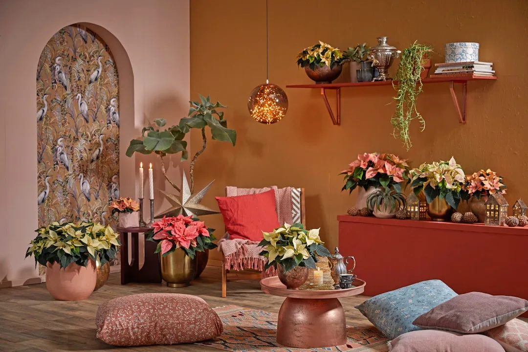
Furniture and Fabric Pairings That Actually Work
The furniture decisions that follow a terracotta paint color choice in a living room are where most rooms either come together or fall apart. The color is generous enough to work with a wide range of furniture tones, but it has clear preferences, and ignoring them is where rooms end up looking muddy or mismatched rather than layered.
Warm neutrals are the foundation of a successful terracotta room. Cream, warm white, sand, and natural linen perform well against terracotta walls because they share the same warm undertone without competing for attention. A cream sofa against terracotta walls feels balanced and intentional. The same sofa in bright optical white will create a cold contrast that works against the warmth the color is trying to establish.
Natural materials are terracotta’s strongest allies. Rattan, raw linen, jute, unsealed wood, leather in cognac or camel tones, and stone surfaces all carry the same mineral, organic quality that terracotta references. Rooms that pair terracotta walls with these materials look collected rather than decorated — like the room accumulated its pieces over time from places that share a similar sensibility.
The one material to approach carefully: cool-toned metals. Chrome, brushed nickel, and cool silver tones pull against terracotta’s warmth and create a tension that rarely reads as intentional. Brass, unlacquered bronze, and warm gold tones are a different story entirely — they amplify the richness of the wall color without competing with it. This applies to light fixtures, cabinet hardware, curtain rods, and any metal-framed furniture.
Jewel tones as accent colors work with terracotta in ways that surprise most people initially. Deep teal, dusty sage, burgundy, and a warm navy all hold their own against terracotta without fighting it — they’re grounded enough in their own saturation to create contrast rather than chaos. Bright, highly saturated secondary colors are where the pairing breaks down. A bright cobalt or a saturated lime green will look jarring against terracotta, not because the hues are wrong but because the intensity levels are mismatched.
Pattern scale matters significantly in a terracotta room. Large geometric patterns in contrasting colors can visually compete with a strong wall color; smaller-scale patterns and organic textures integrate more easily. A kilim rug with terracotta tones pulled through it acts as a transition element, connecting the walls to the floor and unifying the room’s palette without requiring any additional color coordination.
- Cream and warm white: best neutral pairing for sofas and large upholstered pieces
- Natural materials (rattan, jute, linen, cognac leather): strengthen the mineral quality of the palette
- Warm metals (brass, bronze): amplify richness; cool metals (chrome, nickel) create uncomfortable tension
- Jewel tones (teal, dusty sage, burgundy): viable accent colors that hold their own against terracotta’s saturation
Takeaway: The furniture and fabric decisions in a terracotta living room are fundamentally about maintaining the warmth the wall color establishes — every cool-toned or highly saturated element works against that, and every warm or organic element reinforces it.
Lighting Adjustments That Make or Break the Color
A terracotta paint color in a living room will perform entirely differently under different light sources, and this is the variable most guides treat as an afterthought. It isn’t. For deep, absorbing colors with LRV values below 35, lighting is as consequential as the paint itself.
The Kelvin problem is real and specific. Light bulbs in the 3000K–3500K range — described on packaging as “warm white” or “soft white” — are the functional range for terracotta rooms. Below 2700K (the incandescent warm range), the color can veer into a heavy, muddy amber that loses its clarity. Above 4000K (the “neutral white” and “cool daylight” range), the same terracotta paint reads as an unpleasant orange-brown with none of the warm sophistication that made you choose it.
Layered lighting is non-negotiable. A single overhead fixture in a terracotta living room will create a flat, top-lit effect that flattens the color and makes the room feel institutional. The minimum effective lighting setup for a terracotta room: overhead ambient lighting at reduced intensity (on a dimmer), floor lamps positioned in corners to push warm light upward into the walls, and table lamps at seated eye level that create pools of warm light in the conversation area. Three layers. The overhead light alone will make the room look like a waiting room.
North-facing rooms require the most lighting intervention. Terracotta in a north-facing living room without supplemental warm lighting is a difficult situation — the cool, flat natural light will work against the color’s warmth constantly. The fix is achievable but requires commitment: increase warm artificial light sources to compensate for the cool daylight quality, and consider a shade of terracotta that leans slightly more orange than you might otherwise choose, because the cool light will pull it back toward neutral.
South-facing rooms are terracotta’s natural habitat. The warm, high-angle afternoon light that floods a south-facing living room is almost exactly what the color needs to perform at its best. The risk in a south-facing room is oversaturation in peak afternoon hours, which can make an orange-leaning terracotta feel aggressive. A brown-leaning or pink-leaning shade tends to perform better in strong direct light, while orange-leaning shades are better reserved for rooms with moderate or indirect light.
- Ideal bulb range: 3000K–3500K warm white; avoid anything above 4000K
- Three-layer lighting: ambient (dimmed), floor lamps in corners, table lamps at eye level
- North-facing rooms: increase warm artificial sources, consider slightly more orange-leaning shades to compensate
- South-facing rooms: use brown-leaning or pink-leaning terracottas to prevent oversaturation in direct afternoon light
Takeaway: Before committing to a final terracotta shade, test your sample patches under both natural daylight and your evening artificial lighting. The color you’re choosing for the other sixteen hours of the day matters just as much as how it looks at noon.
Specific Paint Shades Worth Testing
Abstract color guidance only goes so far. These are shades that consistently perform well as a terracotta paint color in a living room across different lighting conditions and undertone families — tested in actual rooms, not just on digital swatches.
Farrow & Ball’s Antique Pink (No. 235) reads more terracotta than its name suggests, sitting in the pink-leaning family with enough dusty depth to avoid reading as blush. Works exceptionally well in rooms with warm wood floors.
Benjamin Moore’s Pueblo (AC-16) is a brown-leaning terracotta with adobe undertones — one of the most forgiving options across varied lighting conditions, and the shade I’d recommend first to anyone nervous about getting it wrong.
Sherwin-Williams’ Fired Brick (SW 6335) sits in the orange-leaning family, richer and more saturated than most terracottas. Best in south-facing rooms with strong natural light; can feel intense in north-facing or under-lit spaces.
Little Greene’s Tuscan Red occupies the deeper end of the terracotta spectrum, with more red present than orange. Excellent in rooms with high ceilings, where its depth reads as richness rather than heaviness.
Clare’s Lust for Life is a mid-toned terracotta with balanced warm undertones — accessible, broadly flattering across room orientations, and available in a sample pot size that makes it practical to test properly before committing.
One note on finish: eggshell is almost always the right choice for terracotta living room walls. Flat finishes absorb light beautifully but are difficult to clean and can look chalky in rooms with strong light. Satin finishes reflect too much and make the color look plasticky. Eggshell sits between both, providing enough sheen to hold the color’s warmth without creating a surface that competes with it.
FAQ
Does a terracotta paint color make a living room feel smaller?
It can, if the room is already small and the application isn’t adjusted. The LRV range of most terracottas (15–35) means they absorb light significantly, which can reduce the perception of space. In rooms under 150 square feet, the ceiling fix matters: keeping the ceiling white or two shades lighter than the walls maintains vertical openness. Full four-wall terracotta in a small room isn’t automatically wrong, but it requires compensatory lighting and a ceiling that stays light.
Can terracotta work with gray furniture?
It depends on the gray’s undertone. Cool blue-gray furniture will pull against terracotta’s warmth and create an uncomfortable contrast rather than a considered one. Warm greige — gray with brown or beige undertones — integrates much more naturally. If your furniture is a cool gray and you’re committed to both, introduce a warm-toned rug or textile layer between them to mediate the contrast.
How many coats of paint does terracotta typically require?
More than lighter colors. Because terracotta contains high concentrations of red and orange pigment — historically the most difficult pigments to achieve full opacity with — expect three coats over a white-primed wall, or two coats over a tinted primer in a similar base color. Skipping the tinted primer is where people end up with patchy, uneven coverage that reads as orange in some areas and brown in others.
Is terracotta a good choice for a living room that doubles as a home office?
This depends on how you respond to warm, absorbing colors during work hours. The same psychological warmth that makes terracotta excellent for social evening spaces can feel slightly heavy during focused daytime work. If the room is used primarily for work during the day, a terracotta accent wall behind the seating area — rather than full four-wall application — gives you the warmth in the periphery without surrounding yourself in a deep color during hours that require concentration.
What trim color works best with terracotta living room walls?
Warm white or cream trim is the most reliable pairing. Bright optical white trim creates a cold contrast that works against the wall color’s warmth. Off-white options like Benjamin Moore’s White Dove (OC-17) or Farrow & Ball’s Pointing (No. 2003) share just enough warm undertone to feel cohesive rather than jarring. In rooms with a more rustic or Mediterranean sensibility, painting the trim the same terracotta two shades lighter creates a seamless, tonal effect that eliminates the contrast entirely.