If you’ve been searching for greige paint colors living room ideas that actually hold up past the paint chip stage, you’ve already noticed the problem: the same greige that looked warm and sophisticated in the store will turn lavender on your north-facing living room wall — and no amount of accent pillows will fix it once it’s painted. I’ve watched this exact scenario play out more times than I can count, usually after a client fell in love with a chip under fluorescent light, went home and rolled it across 400 square feet, and called me in a panic two days later. The color isn’t wrong. Their testing method was. Understanding why greige shifts — and knowing which version of it belongs in your specific room — is the only thing that separates a sophisticated neutral from a wall that looks vaguely mauve by 7pm.
Quick Answer
The same greige that looked warm and sophisticated in the store will turn lavender on your north-facing living room wall — and no amount of accent pillows will fix it once it’s painted.
Is Greige a Good Color for a Living Room?
In This Article
Greige is genuinely one of the most functional colors you can put in a living room, but not for the reason most people choose it. Most people pick it because it feels safe. That‘s the wrong reason, and it usually produces a wrong result — a room that’s technically inoffensive and somehow still unpleasant to sit in.
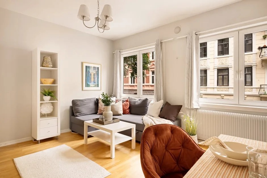
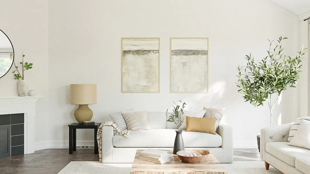
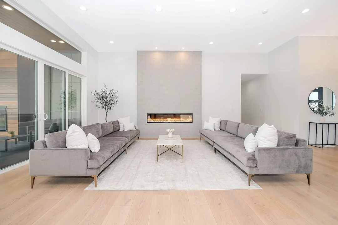
The real reason greige works in living rooms is structural. Most living rooms contain a collision of warm and cool elements: honey-toned wood floors, a gray stone fireplace, cream upholstery, white trim — tones from opposite ends of the temperature spectrum that would fight each other under a pure warm or pure cool wall color. Greige sits at the intersection. It doesn’t compete with your walnut coffee table or your slate tile hearth because it borrows from both camps.
What most articles skip is the light direction problem, and it matters enormously. North-facing living rooms receive indirect, bluish daylight throughout the day — this light pulls the gray side of greige forward and can make even a warm greige read as a cold, slightly purple mid-tone. In a north-facing room, you want a greige with a dominant beige or yellow undertone to counteract that cool cast. South-facing rooms have the opposite problem: warm, direct sun amplifies beige tones, which can make a beige-heavy greige feel golden by afternoon. In those rooms, a cooler gray-leaning greige actually holds its balance better.
East and west-facing rooms add another layer of complexity that doesn’t get nearly enough coverage:
- East-facing living rooms get warm golden light in the morning and shift to cool, flat light by early afternoon. A greige with a yellow-beige undertone holds better through this transition than a pink-based greige, which goes muddy as the warmth leaves.
- West-facing living rooms get the reverse — flat cool light through the morning, then intensely warm amber light from mid-afternoon onward. A slightly cooler greige works here because the afternoon light will warm it sufficiently without pushing it into full-on beige territory.
The LRV range matters too. Livable greige in a living room falls between LRV 55 and 72. Below 55, the color reads as a true mid-tone and the room starts to feel smaller and heavier — fine in a bedroom, often oppressive in a main living space. Above 72, you start losing the warmth that makes greige worth choosing over plain white.
The mistake I see constantly — not occasionally, constantly — is people sampling greige under store lighting and calling it done. Fluorescent retail bulbs have a completely different color temperature than your home’s recessed LEDs or your afternoon window light. A paint chip is not a wall. It’s a starting point.
How to identify your room’s light conditions before you buy:
- Note which direction your largest windows face — this is your dominant light source
- Check the color temperature of your artificial lighting (printed on the bulb or its packaging — 2700K is warm, 4000K+ is cool)
- Look at your largest fixed surface (floor) in both morning and evening light and note what color it reads as — warm honey, cool gray, or neutral brown
- Hold a white sheet of paper in the center of the room at noon and at 7pm — if the white shifts noticeably toward yellow or blue, your light has a strong cast
Takeaway: Before you pick a greige paint color for your living room, identify your room’s light direction and your largest fixed elements (floor, trim, fireplace). Those two things determine which type of greige you need, not which one looks prettiest at the store.
What Is the Most Popular Greige Paint Color Right Now?
Agreeable Gray. That’s the answer most people are looking for, and it’s accurate by any measure of sales volume. Sherwin-Williams Agreeable Gray (SW 7029) has appeared on over 1 million Pinterest boards and consistently ranks as Sherwin-Williams’ top-selling neutral — a figure that would be impressive if it also meant it was universally flattering. It isn’t.
Here’s what the popularity numbers don’t tell you: Agreeable Gray has a pink-violet undertone that only reveals itself under cool-white LED lighting, which is exactly the lighting condition inside most modern homes. In a south-facing room with warm afternoon light, it’s stunning — honeyed and sophisticated. In a north-facing room under 4000K+ LEDs, it creeps toward lavender. I’ve seen it. It’s not subtle.
Repose Gray (SW 7015) is Agreeable Gray’s cooler counterpart — it ranks second in the same Sherwin-Williams neutral category and pulls more definitively purple in cool light. Worth knowing before you choose it as a “safe” alternative.
The designer’s pick, consistently, is Benjamin Moore Pale Oak (OC-20). Its base reads yellow-beige rather than pink-beige, which makes it warmer and more stable across light conditions without veering into the dated territory of something like Accessible Beige. I’ve used it in two Chicago apartments with north-facing windows and it held its warmth without going gold.
For readers working with a tighter budget, Behr Sculptor Clay and PPG Antique White are genuinely underused alternatives — both perform in the same warm greige register as the BM and SW options at a lower price point per gallon. They don’t have the brand recognition, but they’re not inferior products.
Here’s the ranking framework that actually matters, across three brands:
- Warmest and most stable: Benjamin Moore Pale Oak (OC-20) — yellow-beige base, minimal pink pull
- Most popular, not universal: Sherwin-Williams Agreeable Gray (SW 7029) — pink-violet undertone, watch in north-facing rooms
- Coolest of the top picks: Sherwin-Williams Repose Gray (SW 7015) — gray-dominant, purple undertone in cool light
- Budget alternatives worth testing: Behr Sculptor Clay, PPG Antique White
- Underrated warm option: Benjamin Moore Balboa Mist (OC-27) — sits slightly lighter than Pale Oak, works particularly well in rooms with warm wood tones and minimal natural light
- For rooms with cool gray stone or tile: Sherwin-Williams Accessible Beige (SW 7036) — more yellow than its name suggests, pushes back against cool fixed elements effectively
Takeaway: Popularity tells you what sold well in other people’s houses. Your floor, your light, and your hardware determine which greige paint color works in your living room.
The Undertone Problem Nobody Warns You About
This is the section that would have saved me three client repaints if I’d articulated it clearly enough, early enough. Every greige has a dominant undertone and a secondary one, and those undertones are invisible on the chip until your specific walls and your specific light make them visible — at which point you’ve already bought three gallons.
Repose Gray pulls purple. Revere Pewter — technically more of a warm gray, but it lives in the greige conversation — pulls green, which is why it clashes so aggressively with warm honey oak floors and red-toned brick. Agreeable Gray pulls pink-violet. None of these are defects. They’re just undertone personalities that need to match the room they’re entering.
The simplest test I’ve ever used costs nothing: hold a pure white card flush against your paint chip. The color you perceive on the chip relative to that white is the undertone. If the greige suddenly looks pinkish next to the white card, pink is the undertone. If it looks slightly greenish, there’s your answer. This isn’t a trick — it’s just how color perception works. The white gives your eye a reference point it doesn’t have when you’re holding a chip against a background that already has a color temperature of its own.
Undertone quick-reference for the most commonly considered greiges:
- Benjamin Moore Pale Oak (OC-20): Yellow-beige undertone — stable across light conditions, safest for mixed warm/cool rooms
- Sherwin-Williams Agreeable Gray (SW 7029): Pink-violet undertone — beautiful in warm light, problematic in cool-lit or north-facing rooms
- Sherwin-Williams Repose Gray (SW 7015): Purple-gray undertone — modern and clean in the right light, noticeably cold under 4000K+ LEDs
- Benjamin Moore Revere Pewter (HC-172): Green undertone — clashes with red-toned brick, honey oak, and warm wood floors; works in rooms with cool stone or concrete
- Sherwin-Williams Accessible Beige (SW 7036): Yellow-orange undertone — the warmest of the group, can tip too golden in strong south-facing light
- Benjamin Moore Balboa Mist (OC-27): Soft violet-gray undertone at higher light levels, beige-warm in lower light — predictably unpredictable, test carefully
The secondary undertone is where most people get blindsided. A greige can have a dominant beige base and a secondary green pull that only activates when it’s next to warm wood tones. This is why Revere Pewter looks stunning in a room with white oak floors and reads muddy-green in a room with red oak. The floor didn’t change — the secondary undertone just got activated by the contrast.
How to test undertones at home before committing:
- Paint a 12×12 inch swatch directly on the wall — not on a card, not on foam board
- Observe it at three different times: morning, noon, and 7pm with your artificial lights on
- Place your largest furniture sample (a sofa cushion, a floor sample) directly beneath the swatch and look for color shifts
- Stand six feet back — undertones read differently at conversation distance than they do up close
How to Match Greige to Your Existing Fixed Elements
This is the part of the process most paint articles skip entirely because it requires actual specificity about what’s already in your room. Your floor, your trim color, your fireplace surround, and your hardware are permanent. The paint is the variable. Choosing greige in isolation — without mapping it against those fixed elements — is the reason so many “safe” greige choices end up looking wrong.
Wood floors are the most common source of conflict. Here’s how to read yours:
- Red or orange-toned oak (common in homes built before 1990): Avoid any greige with a green or purple undertone. The contrast will read as dirty rather than sophisticated. Reach for yellow-beige bases like Pale Oak or Accessible Beige.
- Cool gray-toned white oak or maple (common in renovated or newer homes): You have more flexibility. A cooler greige like Repose Gray can work because your floor is already pulling in that direction. A warm greige here creates an intentional contrast rather than a clash.
- Dark walnut or espresso stains: These are the most forgiving floor tones for greige because they’re dark enough to anchor the room without competing on undertone. Most greiges work. Focus on LRV — you want a lighter greige to keep the room from feeling heavy.
Trim color creates a frame your greige has to live inside:
- Bright white trim (like OC-17 or SW Extra White): Creates high contrast — your greige will look noticeably darker and more saturated by comparison. Choose a greige on the lighter end of the LRV range (65–72) to keep it from reading too heavy.
- Warm white or cream trim (like White Dove or Navajo White): Reduces contrast and creates a softer, more cohesive look. Works particularly well with yellow-beige greiges. Avoid pink-undertone greiges here — they’ll fight with the cream.
- Off-white with gray undertones (like Chantilly Lace): This is the modern pairing. A warm greige against a cool white trim creates a clean, intentional separation. Make sure your greige is noticeably warmer than the trim to sell the contrast.
Fireplace surrounds and stone elements:
- Warm cream or ivory stone: Use a greige that borrows from the same yellow-beige family. Pale Oak was practically designed for this pairing.
- Cool gray or blue-gray stone: Use a greige that leans slightly cooler to bridge the gap — Repose Gray or Balboa Mist in a south-facing room where the light will add warmth back.
- Red brick: This is the hardest fixed element to work with. Brick has such a strong warm-red tone that even a warm greige can look cold by comparison. The key is choosing a greige with a yellow or brown base — not pink or green — and going slightly lighter than you’d normally choose.
The Right Finish for Greige in a Living Room
Finish selection is the detail that makes the difference between a greige wall that photographs beautifully and one that looks flat and institutional in real life. It also determines how much of that undertone shifts become visible.
The finishes worth considering for living room walls:
- Flat/Matte: Absorbs light rather than reflecting it, which means undertones are less dramatic and shifts are less visible. The trade-off is that flat finishes mark easily and are harder to wipe clean. Best for rooms with minimal traffic and walls that won’t be touched frequently.
- Eggshell: The standard living room finish for good reason. Slight sheen adds depth to greige without creating harsh reflections. Cleanable without being glossy. This is the default recommendation for most living rooms.
- Satin: Noticeably more reflective than eggshell — adds warmth and richness to greige tones but also amplifies any undertone shifts. Worth considering in a room where you want the greige to feel more enveloping and rich. Not recommended in rooms with uneven walls or obvious texture, because the sheen will highlight every imperfection.
- Semi-gloss: Belongs on trim, not on living room walls. Mentioned here only because some people consider it — don’t.
One practical note: the same greige color in an eggshell finish will read approximately one shade lighter than in a satin finish, because the extra sheen in satin absorbs less light. If you’re sampling and plan to use satin, keep that in mind when comparing swatches.
FAQ
Q: Can greige paint colors work in a small living room, or will they make it feel smaller?
Yes — but LRV matters more in small rooms than in large ones. Stick to greiges with an LRV of 65 or above for rooms under 200 square feet. Darker greiges (LRV below 60) will add visual weight you don’t have room to spare. In a small north-facing living room specifically, a light yellow-beige greige like Benjamin Moore Pale Oak or Sherwin-Williams Accessible Beige will hold warmth without closing the room in. The mistake most people make in small rooms is going too light and losing the greige quality entirely — you want enough color depth to read as intentional, just not enough to absorb light.
Q: My living room has no natural light at all. Should I still use greige?
You can, but you need to control your artificial light temperature before you pick a color. If your recessed lights or lamps are running at 4000K or higher (cool white), any greige with a pink or purple undertone is going to look grim. Switch to 2700K or 3000K bulbs first — warm white light — and then sample. In a room with entirely artificial warm light, greige can actually look better than in a naturally lit room because you control the color temperature completely. Pale Oak and Accessible Beige are the most reliable choices here.
Q: What’s the best greige paint color for a living room with honey oak floors?
Avoid Revere Pewter (green undertone clashes with red-toned oak), Repose Gray (purple undertone fights the warm wood), and anything with a distinctly pink base. Your best options are yellow-beige greiges: Benjamin Moore Pale Oak, Sherwin-Williams Accessible Beige, or Behr Sculptor Clay. The yellow base in all three borrows from the same warm family as honey oak without matching it so closely that the room reads as monochrome.
Q: How do I know if I’ve chosen a greige that’s too beige or too gray for my living room?
Paint a large swatch (at minimum 12×12 inches) directly on the wall and live with it for 48 hours before deciding. If it reads as obviously sandy or tan under your evening lighting, it’s pulling too beige — step cooler with something like Balboa Mist. If it looks cold, gray, or faintly purple by 7pm with your lights on, it’s pulling too cool — step warmer toward Pale Oak or Accessible Beige. The 48-hour test across different times of day is the only method that’s actually reliable. Paint chips, phone photos, and samples on foam board all lie in different ways.
Q: Does greige go out of style, and is it still a good choice for a living room right now?
Greige has cycled through peak popularity and come out the other side as a genuine neutral — which means it no longer reads as trendy in the way it did around 2015, but it also doesn’t read as dated. It functions more like gray or white at this point: a practical background color that doesn’t demand attention. The specific shades that feel current right now lean slightly more complex — less pure gray-beige blend and more toward nuanced warm neutrals with subtle mineral or clay qualities. If you’re concerned about longevity, Benjamin Moore Pale Oak and Accessible Beige have both been in continuous use long enough that they’ve lost any trendy association and read simply as warm, functional neutrals. The greige paint colors living room choices that age poorly are the ones that were very on-trend in a specific moment — like a very specific 2014 interpretation of Agreeable Gray with gray floors and gray furniture — not greige itself as a wall color category.