Most white paint regret isn’t caused by choosing the wrong white — it’s caused by choosing a white that fights everything else in the room, and not realizing it until the second coat is dry. The warm white vs cool white paint decision looks simple from the paint store aisle. It is not simple. And getting it wrong is expensive, time-consuming, and entirely avoidable if you understand what’s actually happening.
Quick Answer
Most white paint regret isn’t caused by choosing the wrong white — it’s caused by choosing a white that fights everything else in the room, and not realizing it until the second coat is dry.
I’ve watched clients stand in freshly painted rooms with that particular expression — not quite horror, not quite disappointment, but something in between — and the conversation always goes the same way. The white looked perfect on the chip. It looked fine on the sample patch. And now the whole room has this quality they can’t name, a visual hum of wrongness that they can feel but can’t locate. What they’re experiencing is an undertone conflict. It’s invisible until it’s everywhere, and by then you’ve got two choices: repaint or learn to live with it.
This is the article I wish existed when I started out. Not a compass-direction chart. Not a mood board. A real framework.
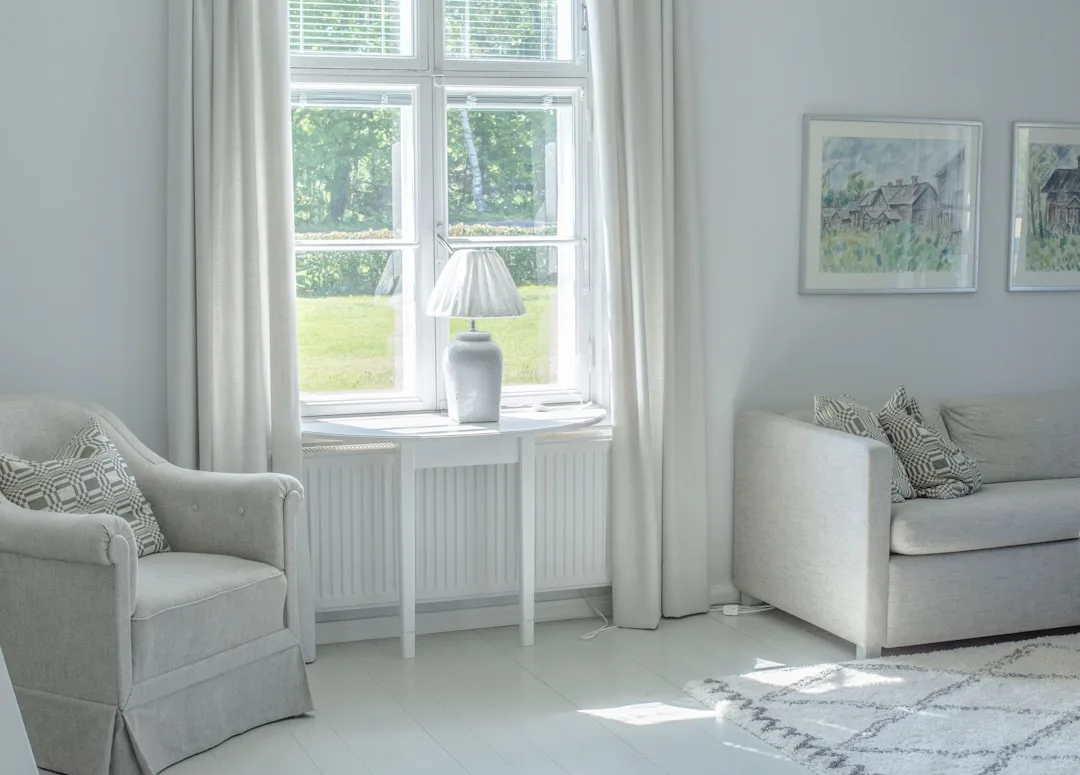
Warm White vs Cool White: What the Undertone Actually Does to a Room
In This Article
- Warm White vs Cool White: What the Undertone Actually Does to a Room
- The Sheen Variable Nobody Mentions in the Warm White vs Cool White Paint Conversation
- Should I Use Warm or Cool White Paint? The Real Decision Framework
- Why Warm Whites Go Wrong (And What to Do About It)
- Why Cool Whites Go Wrong (And What to Do About It)
Undertones are not decorative suggestions. They are the actual color hidden inside the white, and understanding what they physically do to reflected light is the only way to predict how a white will behave before you commit to a gallon.
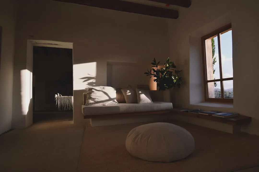
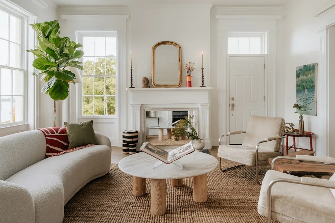
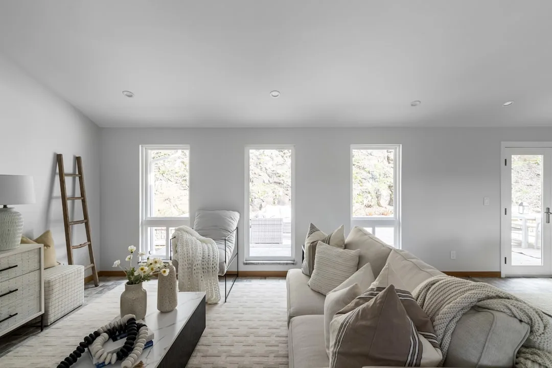
Warm whites carry yellow, red, or pink undertones. When light bounces off them, it picks up that cast — your room takes on a golden, amber-adjacent quality that reads as cozy or aged depending on what surrounds it. Cool whites carry blue, green, or gray undertones, and the reflected light has a crisp, clean quality that can tip into clinical if nothing in the room pulls it back toward warmth. Neither is better. Both will ruin your room if placed without regard for context.
Here’s what most paint advice skips entirely: undertones don’t operate in isolation. They react with every other surface in the room — your floor, your cabinetry, your sofa fabric, your trim. A warm yellow-white wall next to a honey oak floor will feel harmonious and intentional. That exact same white next to a cool gray tile floor will make the wall look faintly jaundiced. The wall didn’t change. The context did.
This is the phenomenon researchers call simultaneous contrast — the way adjacent colors shift each other’s perceived hue. It’s not a lighting trick, and it doesn’t go away as you get used to the room. Vision scientists at UC Berkeley studying color constancy have documented how context-dependent white perception specifically is. The human eye can distinguish roughly 10 million colors, but our ability to judge white accurately in isolation is remarkably poor — we are hardwired to perceive white relative to its surroundings, not as an absolute value.
The practical implication is blunt: the sample chip at the paint store tells you almost nothing. The chip is surrounded by other chips. In your room, that same white will be surrounded by your floor, your furniture, and your light source — and the undertone will respond to all three simultaneously.
What to look for when reading a white paint chip:
- Hold the chip against your existing trim or cabinetry, not against other paint chips
- Look for a pink or yellow cast when held near warm wood — that’s the undertone activating
- Look for a blue or gray shift when held near cool surfaces like slate tile or stainless steel
- Check it in the actual room at three different times: morning light, midday, and after dark with your lamps on
- If the chip looks different every time, the undertone is reactive — you need to know what it reacts toward
One more step most people skip: paint a large sample patch — at least 12 by 12 inches — directly on the wall in the actual room, not on a piece of poster board you move around. The substrate matters. Drywall absorbs paint differently than primed board, and the underlying color of your existing wall can influence how the new white reads during the first few weeks until full coverage is achieved. Paint two coats on the sample patch and let it cure for at least 48 hours before making any judgment. Fresh paint is up to 10 percent darker than fully dried paint, which means a warm white that looks too creamy on day one may land exactly where you want it by day three.
> Takeaway: Before you evaluate any white paint, identify the dominant undertone of your largest fixed surface — floor, cabinetry, or ceiling — because that surface is already running the room’s color temperature whether you want it to or not.
The Sheen Variable Nobody Mentions in the Warm White vs Cool White Paint Conversation
Most warm white vs cool white paint discussions treat sheen as a finishing detail — something you decide after you’ve chosen the color. That’s backwards. Sheen directly amplifies the undertone, and ignoring it can take a subtle undertone conflict and turn it into an obvious one.
Flat and matte finishes scatter light in all directions. They soften undertones because no single angle receives concentrated reflected light. This is why a flat warm white can feel almost neutral in certain rooms — the yellow undertone is diffused rather than focused. The same warm white in an eggshell or satin finish will push that undertone harder because the semi-gloss surface is now directing reflected light at specific angles depending on where your light source sits in relation to the wall.
In practical terms: if you’re nervous about a warm undertone in a room with lots of natural light, choose a flat or matte finish for the walls. If you’re nervous about a cool white reading too icy in a low-light bathroom, avoid high-sheen finishes on the walls entirely — the gloss will concentrate the blue or gray cast directly back toward whoever’s standing at the sink.
The exception is trim. Trim is almost always painted in semi-gloss or gloss, which means whatever undertone is hiding in your trim white will be broadcast more aggressively than the same white on your walls. This is why the trim choice, not the wall choice, should be your starting point. Lock in the trim white first, evaluate its undertone in your actual lighting conditions, and then select a wall white that either matches the undertone family or is a true neutral that doesn’t conflict.
Should I Use Warm or Cool White Paint? The Real Decision Framework
Every answer to this question that starts with “it depends on the mood you want” is useless. Here’s why: you can’t control mood from a paint chip. You can control the interaction between your white and three specific variables that are already fixed in your room before you open a can.
The three variables that actually determine your answer:
- Your fixed surfaces — floor tone, cabinetry color, and trim. These are non-negotiable anchors. If your flooring is warm-toned wood — medium oak, walnut, red-toned pine — a cool white wall will create a jarring disconnect that reads as a mistake rather than contrast. Match the undertone family of your largest fixed element. If your trim is already painted and it’s a cool white, fighting it with a warm wall white is where the “whites fighting each other” situation actually begins.
- Your light source temperature — not compass direction. This is the variable almost everyone ignores until it’s too late. Incandescent bulbs emit at approximately 2700K; most “daylight” LEDs run at 5000–6500K — a gap wide enough to shift a warm white into apparent neutrality or a cool white into something that looks like the inside of a walk-in freezer. LED bulbs below 3000K will pull cool whites toward icy gray. Bulbs above 3000K amplify warm whites into cream. Identify your bulb temperature before you pull a single paint chip.
- Adjacent room temperature — the visual temperature of rooms that share a sightline. Open floor plans and connected hallways mean two whites that fight each other will be visible simultaneously. This is more disruptive than either choice on its own.
A room-by-room breakdown of which direction typically works:
- Living rooms with warm wood floors: warm white — match the undertone family of the floor, don’t fight it
- Kitchens with white or gray cabinetry: cool white or true neutral — warm whites against bright white cabinets will make the walls look dingy
- Bathrooms with chrome fixtures: cool white — warm whites next to chrome read as off-yellow under most bathroom lighting
- Bedrooms with warm textiles: warm white — the undertone should support the softness you’re already building with fabric and rugs
- Home offices with lots of natural light: test both; offices often have mixed light throughout the day and the undertone shift is most noticeable in workspaces
- Hallways connecting warm and cool rooms: a true neutral white with no discernible undertone — it’s the only way to transition without conflict
The north/south/east/west framework you’ll find in almost every warm white vs cool white paint article is overused and misleading in most real homes. Compass direction matters far less than the ratio of artificial to natural light throughout your actual day. A south-facing room where the blinds are always closed runs on artificial light, and the color temperature of those bulbs is doing more work than any window. A north-facing room with no window treatments and high ceilings may receive enough ambient daylight to make a cool white feel perfectly balanced rather than cold.
Before you commit to either direction, spend three days in the room you’re painting and notice when you turn lights on and off. If artificial light dominates from 4pm onward and you spend most of your time in the room at night, your bulb temperature is the controlling variable — not your window orientation.
Why Warm Whites Go Wrong (And What to Do About It)
Warm whites fail in predictable ways, and recognizing the pattern before it happens saves you a repaint. The most common failure mode: a yellow-undertoned warm white in a room with cool-toned flooring and LED lighting above 4000K. The warm undertone gets amplified by the artificial light until it reads as visibly yellow rather than softly golden. The fix is rarely a different white — it’s usually a lower-kelvin bulb swap, which costs less than a quart of paint.
The second failure mode is using a warm white in a high-gloss or satin finish in a kitchen that gets strong afternoon western light. The combination of warm undertone, reflective surface, and direct sunlight can make walls look almost orange between 3 and 6pm. If this describes your kitchen, choose a flat or matte wall finish and let your cabinetry carry whatever sheen is needed.
The third failure mode — and the one that surprises people most — is using a warm white on the ceiling. Ceilings are almost never evaluated the way walls are, but a cream or yellow-warm white ceiling directly above cool-toned walls creates a visual sandwich effect that makes the room feel lower and somehow off. Ceilings generally want a white that is either a true neutral or has just a fraction more cool undertone than the walls, which optically pushes the ceiling upward and keeps it from reading as a separate color.
Why Cool Whites Go Wrong (And What to Do About It)
Cool whites fail differently. The most common pattern: a blue or gray-undertoned white in a small bathroom with a single overhead fixture and no natural light. The undertone has nowhere to go — no warm surfaces to balance against, no daylight to neutralize it — and the room reads as cold and institutional regardless of how many warm towels or wood accessories you add. In this situation, the accessories are fighting the walls instead of working with them.
The second cool white failure is using it in a bedroom with warm wood furniture and warm textile layers. The wall and the furniture are having an argument that never resolves. Every warm element looks slightly dingy against the cool wall, and every cool wall element looks slightly chilly against the warm bedding. The room never settles into a coherent temperature.
The fix in both cases usually isn’t switching to a warm white — it’s finding a true neutral that removes the conflict without committing to the other extreme. There are whites on the market with no discernible undertone at all: Benjamin Moore’s Chantilly Lace, Sherwin-Williams’ Alabaster at its most neutral reading, and several options in the Farrow & Ball range that sit genuinely between warm and cool. These are harder to use well because they don’t anchor to either family, but they’re valuable tools when a room is already too divided to resolve with a directional white.
Frequently Asked Questions About Warm White vs Cool White Paint
How do I know if my existing trim is warm or cool white?
Hold a piece of white printer paper against it. Printer paper is a fairly neutral cool white — it sits around 6500K and has minimal undertone. If your trim looks cream, ivory, or slightly yellow next to the paper, it’s a warm white. If it looks the same shade or slightly gray, it’s a cool or neutral white. This test works in any lighting condition and doesn’t require any special equipment.
Can I mix warm and cool whites in the same room?
Deliberately, yes — accidentally, no. A warm white on the walls and a cool white on the trim creates the “whites fighting each other” problem the title describes. However, using a warm white on walls, warm white on the ceiling, and a true neutral on the trim can work because the neutral acts as a buffer rather than a direct contrast. The rule is that whites that share a sightline need to either match undertone families or be separated by a genuine neutral.
Does paint finish affect whether a white reads warm or cool?
Yes, significantly. Higher-sheen finishes concentrate reflected light and amplify undertones. A warm white in satin will read warmer than the same white in flat. A cool white in semi-gloss will read cooler than in matte. If you’re working with a reactive undertone and need to soften it, choosing a lower sheen is one of the most reliable adjustments available — and it doesn’t require buying a different paint color.
Why does my white paint look different in photos than in person?
Camera white balance. Every camera — phone or otherwise — automatically adjusts its white balance to normalize the image, which means it actively corrects for the color temperature it reads in the room. The result is that a warm white room often photographs as a more neutral or even slightly cool white. This is why paint color inspiration photos pulled from design sites can mislead you — you’re seeing the camera’s interpretation of the color, not the color itself. Always evaluate paint in person, in your actual room.
What’s the difference between a true white and a white with undertones — and does true white actually exist in paint?
True white — a white with absolutely no discernible undertone — is technically achievable but practically rare on paint store shelves. Most whites that claim to be “pure” or “bright” white still contain a small amount of optical brightener or a slight cool bias introduced during the tinting process. Benjamin Moore’s Super White and Sherwin-Williams’ Extra White both sit close to true neutral but still read slightly cool in warm-light environments. The closest thing to a functional true white for most homes is a paint that reads as neutral under both warm and cool light — which requires testing in your actual space, not evaluating a chip under the fluorescent lights of a hardware store.