Finding the best white paint for north facing rooms is harder than it looks — the white you fell in love with at the paint store will almost certainly look wrong on your north-facing walls, and the reason has nothing to do with how light or dark it is.
Quick Answer
The white you fell in love with at the paint store will almost certainly look wrong on your north-facing walls — and the reason has nothing to do with how light or dark it is.
I’ve watched this play out more times than I can count. A client picks a beautiful, crisp white from a chip fan, I have a quiet moment of dread, and three weeks later I get the call: it looks gray, it looks cold, what happened? What happened is that the paint store’s warm overhead lighting was lying to them — and the north-facing room stopped being polite about it the moment the paint dried.
This is not a problem you solve by buying a brighter white or a more expensive one. It is a problem you solve by understanding exactly what is happening to light in that room, and then choosing accordingly.
What Actually Happens to Light in a North-Facing Room
In This Article
Sunlight never enters a north-facing room directly. Not in the morning, not at noon, not at 4pm in July. What enters instead is sky light — reflected, diffused, bounced off clouds and atmosphere before it ever reaches your window. Sky light in a north-facing room has a color temperature that typically falls between 5500K and 7000K, which positions it firmly in the cool-to-cold zone of the spectrum. Compare that to a typical incandescent bulb at 2700K or even a warm LED at 3000K, and you start to understand the problem.
That number — 5500K to 7000K — is not abstract. It’s roughly the same color temperature as the “Daylight” setting on cheap photography panels, the ones that make everyone look slightly ill. Your room is being lit, all day, by that quality of light.
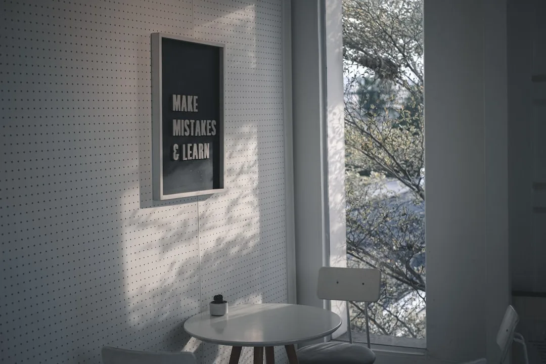
Here’s what that does to paint. Cool ambient light acts as a filter, suppressing warm wavelengths and amplifying cool ones. A white with even a hint of blue or violet in its undertone will have those qualities pulled forward — aggressively. The white you chose starts reading as lavender near the window, shifts toward gray mid-room, and flattens entirely in the corners. Some whites go greenish. Some just look like someone forgot to turn the lights on.
The darkness is a secondary issue. A misconception I keep running into is that north-facing rooms are simply “dim” — and that you fix dim rooms with light colors and high LRV values. That’s incomplete. East and west rooms at least receive direct sunlight for a portion of the day, which temporarily shifts the room’s ambient temperature toward warmer values. North rooms never get that reset. The cool light is constant, relentless, and it doesn’t care what LRV number is on your paint chip.
This matters because it changes the prescription entirely. You’re not just choosing a lighter color — you’re choosing a specific undertone that counteracts a specific color temperature, consistently, across changing weather and seasons.
The seasonal dimension is worth understanding too. In summer, a north-facing room receives more sky light overall because the sun is higher and the sky dome is brighter — the room feels less gloomy, and a warm white can read beautifully. In winter, the same room operates under a lower, grayer sky with far less ambient light reaching the window. The paint that felt acceptable in July can turn genuinely oppressive by November. When you’re testing samples, try to do it in conditions that reflect the worst-case season for your climate, not the best.
Takeaway: Before you touch a paint chip, accept that your north-facing room’s light problem is an undertone problem, not a brightness problem.
The Undertone Problem: Why Pure White Fails in Cool Light
Pure white — bright, bright white, the kind with an LRV of 90 or above and no discernible tint — is not automatically ruined in a north-facing room. But it requires a very specific set of circumstances to succeed, and most rooms don’t have them.
The undertone is the variable that determines everything. A white with an LRV of 92 and a blue-gray undertone will look clinical and cold in a north-facing room despite being technically very bright. A white with an LRV of 85 and a soft yellow undertone can feel warmer and more inviting in that same room, even though it reflects less total light. LRV alone does not predict whether a white will feel good to live with under cool, diffused light.
The undertone categories that routinely fail in north-facing rooms:
- Blue undertones — pulled forward by cool sky light, end up reading as light gray or lavender
- Violet undertones — similar effect; often subtle in the chip, alarming on the wall
- Gray undertones — can look sophisticated in rooms with balanced light; in north-facing rooms, they flatten into something that just reads as unfinished
- Stark green undertones — usually a sign of too much raw titanium or zinc in the formulation; cool light makes these glow in a way that is difficult to live with
The undertones that tend to survive north-facing light — and sometimes thrive in it:
- Soft yellow — the most reliable counterweight to cool blue light; subtle enough not to read as “butter” in photographs
- Barely-there orange or red — warms without yellowing; this is the undertone range where most good north-room whites actually live
- Cream or linen — not truly an undertone but a density of warm pigment that resists the cooling effect
Here’s something I learned from a particularly bad project in a Lincoln Park apartment: pink undertones are treacherous. They feel warm on the chip, they look fine in the store, and under cool north-facing light they reveal themselves as distinctly pink. Not rosy. Pink. It is not a good look in a kitchen.
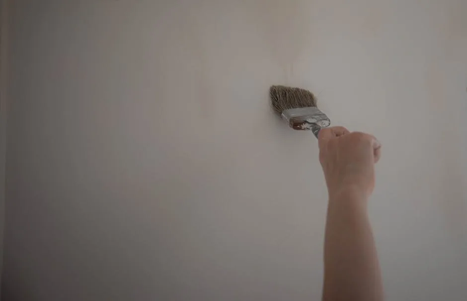
One more thing about testing samples that most guides gloss over: always paint your test patch on the actual wall, not on sample boards you move around the room. A large painted section — at minimum 12 inches by 12 inches, ideally bigger — on the wall itself behaves differently from a portable board because it reflects the specific light entering that room at that position. Paint at least two or three candidates side by side, live with them for a full week, and look at them at different times of day, in different weather, and under your artificial lighting at night. The white that looks best on a gray Tuesday afternoon in November is almost always the right answer.
Takeaway: Test specifically for undertone behavior, not brightness. A slightly lower LRV with the right undertone will always outperform a higher LRV with the wrong one.
What Color Should You Paint a North-Facing Living Room vs. Bedroom vs. Kitchen

The room’s function changes the prescription more than most paint guides acknowledge. And yet I keep reading articles that treat a north-facing room as a single category, as if a bedroom and a kitchen have the same requirements. They don’t.
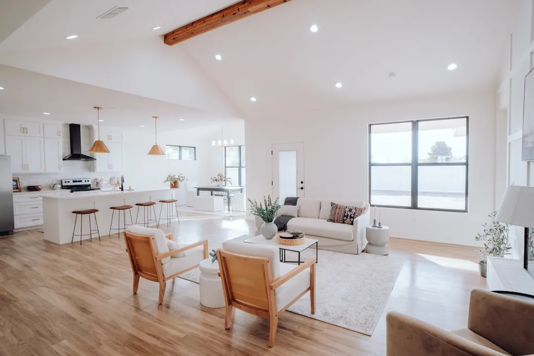
Living Rooms
This is where warmth and livability take priority over everything else. A north-facing living room is typically occupied in the evening, under artificial light, and that shifts the calculus significantly. Choose a white with yellow-red undertones — something that will feel inviting at 7pm under warm LEDs, not just tolerable at noon under gray sky light. Creamy whites with subtle depth work better here than flat, high-LRV whites. The room needs to feel like somewhere you want to stay.
One thing most guides skip: think about your artificial lighting before finalizing any paint choice. LED bulbs under 2700K will warm a moderately cool white significantly. Bulbs above 4000K — the “cool white” or “daylight” LEDs that many people install in living rooms without thinking — will worsen your cold paint problem regardless of what’s on the walls. If you’re committed to a particular white, commit to your bulb temperature first.
The finish matters here too. A flat or matte finish absorbs more light and can make a north-facing living room feel heavier than it needs to. An eggshell finish — the standard recommendation for living spaces — provides just enough sheen to bounce diffused light around the room without creating glare. Some designers go as far as satin on the upper half of the walls in a north-facing room, particularly if ceilings are high enough that the reflection reads as brightness rather than slickness.
Bedrooms
North-facing bedrooms can lean slightly warmer and slightly deeper than living rooms without any risk. Off-whites and soft warm whites — paints that hover at the edge of white and cream — tend to create coziness rather than coldness in a bedroom because the room is primarily experienced in low-light conditions anyway. You’re not fighting the same battle you are in a living room.
The more interesting challenge in a north-facing bedroom is what to do with the ceiling. Many people default to the same white on ceiling and walls, which in a north-facing room can create a uniformly flat, washed-out effect with no visual warmth anywhere. Consider going one shade warmer on the walls and using a true bright white — ideally one with a very faint warm undertone — on the ceiling. The ceiling gets the most indirect bounce light in the room and benefits from having a slightly higher LRV to reflect it back down.
Trim color is another lever most guides ignore entirely. In a north-facing bedroom, painting trim in a slightly warmer white than the walls creates contrast that reads as deliberate and enlivening rather than accidental. It also gives the eye somewhere to travel — which matters in rooms where the ambient light tends to flatten depth and dimension.
Kitchens
North-facing kitchens are where people most often want the best white paint for north facing rooms to do something practically impossible: look clean, bright, and clinical without feeling cold. It is a genuinely difficult brief. The whites that read most cleanly — stark, high-contrast, bright — are usually the ones with the coolest undertones, and cool undertones are precisely what fails in north-facing light.
The solution most working designers land on is a warm white with enough yellow or linen in it to resist the cool pull, paired with strong artificial lighting at the right color temperature. Under 3000K task lighting directly over worksurfaces, a warm white kitchen can look both clean and inviting even in a room that never sees direct sun. The warmth in the paint doesn’t read as yellow under that lighting — it reads as white, because the light source is calibrated to bring out those wavelengths rather than suppress them.
Cabinet color introduces another variable. If you’re painting cabinets a different white than walls — very common in kitchens — test both simultaneously on adjacent surfaces before committing. The undertone interaction between two whites under cool north-facing light can be genuinely surprising: a combination that looks harmonious in the store can look like a mistake on the wall.
Specific Paints That Actually Work in North-Facing Rooms
Recommendations age faster than formulations change, so I’ll give you the logic behind these picks as much as the picks themselves. The best white paint for north facing rooms sits in a narrow band: warm enough to resist the cool ambient light, light enough not to darken the room, and subtle enough to read as white rather than cream in photographs.
Benjamin Moore White Dove OC-17 remains the most consistently recommended white for north-facing rooms among designers who work in them regularly, and for good reason. Its LRV is 85.09 — high, but not so high that it produces the harshness of ultra-bright whites — and its undertone sits in a soft yellow-gray zone that reads as clean rather than warm until the cool light hits it. Under north-facing diffused sky light, the yellow component pushes back against the blue without tipping into butter or linen. It is not exciting. It works.
Sherwin-Williams Alabaster SW 7008 is another reliable performer, with an LRV around 82 and a warm, slightly peachy undertone that flatters north-facing light well. It is slightly more obviously warm than White Dove, which makes it better in living rooms and bedrooms and potentially less ideal in kitchens where you need cleaner contrast.
Farrow & Ball Pointing No. 2003 is worth mentioning for those working with premium finishes. It sits at the warm end of white — creamy, with a red-yellow undertone — and performs exceptionally well in north-facing rooms with low winter light. The Farrow & Ball formulation tends to show undertone behavior more dramatically than most American paints, which means Pointing will read quite warmly in good light and reveal its complexity rather than just disappearing. Not for everyone, but when it works it really works.
Benjamin Moore Chantilly Lace OC-65 is the cautionary example: extremely popular, very bright, very cool undertone. In south or east-facing rooms it is genuinely beautiful. In north-facing rooms I’ve seen it go lavender, I’ve seen it go silver-gray, and once memorably I watched it turn a beautifully proportioned Brooklyn living room into something that felt like a walk-in freezer. Avoid it in north-facing applications unless you have exceptional supplemental lighting.
Frequently Asked Questions
What is the best white paint for north facing rooms overall?
If you want a single answer: Benjamin Moore White Dove OC-17. It has the right LRV, the right undertone behavior under cool diffused light, and it performs consistently across different room sizes and ceiling heights. That said, “best” still depends on your specific room, your artificial lighting, and your flooring and furniture — always test samples before committing.
Why does my white paint look gray in my north-facing room?
Cool undertones in your paint are being amplified by the blue-shifted sky light that north-facing rooms receive all day. The paint was likely tested under warm store lighting that masked those undertones — on your wall, under diffused cool light, they become the dominant characteristic. The fix is choosing a white with a soft yellow or warm orange-red undertone that counteracts rather than amplifies the cool ambient light.
Should I use a higher LRV white to brighten a north-facing room?
Not necessarily. LRV measures how much light a paint reflects but says nothing about the quality or temperature of that reflected light. A very high LRV white with cool undertones will reflect plenty of light — and all of it will feel cold. A slightly lower LRV white with warm undertones often makes a north-facing room feel brighter in practice because the warmth reads as light and life rather than flat reflection.
Does paint finish matter in a north-facing room?
Yes, more than most people realize. Flat and matte finishes absorb light, which can deepen the gloomy quality of a north-facing room. Eggshell is the recommended standard — it provides a subtle sheen that bounces diffused light around the room without looking shiny. In kitchens and bathrooms where you need a washable surface, satin works well and adds a bit more reflectivity that a north-facing room can genuinely use.
Can I use a cool white in a north-facing room if I have good artificial lighting?
In some cases, yes — but only if your artificial lighting is both warm in color temperature (2700K to 3000K) and genuinely powerful enough to override the ambient cool light during the day. Most residential lighting is not bright enough to do this. At night, a 2700K bulb will make almost any white look warm. The problem is the hours between 9am and 5pm when sky light dominates and your overhead fixtures are off. If you work from home, spend daytime hours in the room, or entertain during the day, a cool white under those conditions will read exactly as cold as you’re afraid it will.