Most rooms described as “minimalist” online would fail every principle the style was actually built on — because minimalist interior design is a spatial philosophy with a 100-year history, not a synonym for owning fewer things.
The white walls, the single artfully placed succulent, the bare shelf — that’s a mood board aesthetic. Actual minimalist design is a rigorous decision-making framework that governs everything from ceiling height proportions to where the light switch is placed. Getting familiar with the real thing changes how you see every room you walk into.
The Real Definition of Minimalist Interior Design (Beyond the Clichés)
Minimalist interior design is a spatial philosophy that treats every element in a room as requiring justification. If an object, material, surface treatment, or color can be removed without diminishing the space’s function or intentional meaning, it has no place in the design. That’s the operating principle — not “fewer things,” but purposeful things only.
The roots run deep. The Dutch De Stijl movement of the 1910s and ’20s, driven by Theo van Doesburg and Piet Mondrian, argued for stripping visual language down to its irreducible geometry — primary colors, horizontal and vertical lines, and nothing decorative for its own sake. Around the same period, Japanese wabi-sabi philosophy — the aesthetic of imperfection and transience — was reaching Western designers through the work of architects like Frank Lloyd Wright, who spent formative time studying Japanese spatial principles. Both traditions arrived at similar conclusions through completely different cultural routes: a room’s power comes from what you leave out, not what you put in.
By the mid-20th century, designers including Mies van der Rohe, Florence Knoll, and John Pawson had formalized these ideas into built environments. The movement embedded itself in Western architecture and interior design practice — not as a trend, but as a discipline with documented principles and measurable outcomes.
This distinction matters enormously: minimalist design is a deliberate system, not the result of decluttering. You can throw out half the contents of a Victorian parlor and end up with a sparse Victorian parlor. Removing objects without replacing them with intentional spatial logic isn’t minimalism — it’s just less stuff. The design philosophy requires active decisions about proportion, material, light, and spatial sequence, not just subtraction.
The commercial scale of minimalist interior design reflects genuine demand. The market was valued at approximately $4.5 billion globally in 2023 and is projected to keep growing as urbanization increases demand for space-maximizing design solutions. That growth isn’t driven by aesthetics alone — it’s driven by people living in smaller spaces who need design to do real work.
Takeaway: Before describing any space as minimalist, ask whether every element in it was chosen deliberately, or whether things were simply removed. The distinction is the entire philosophy.
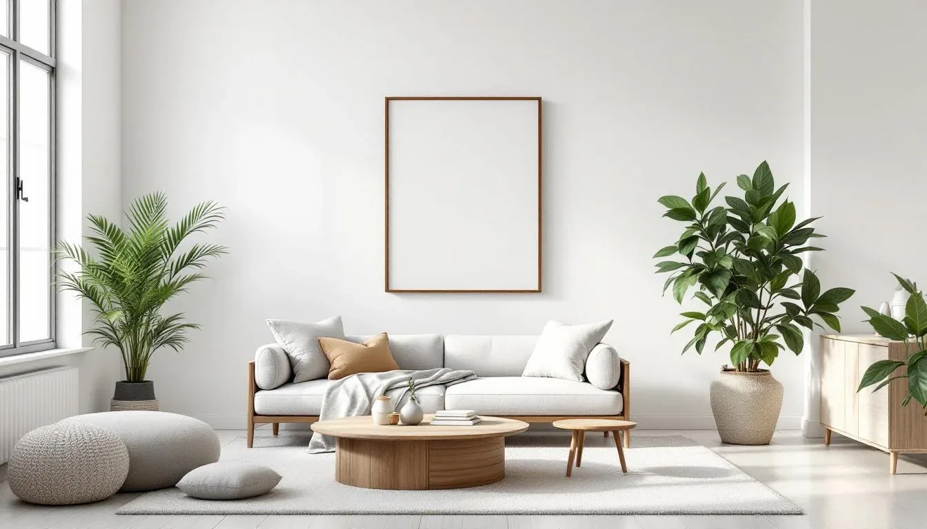
What Minimalist Interior Design Actually Looks Like in Practice
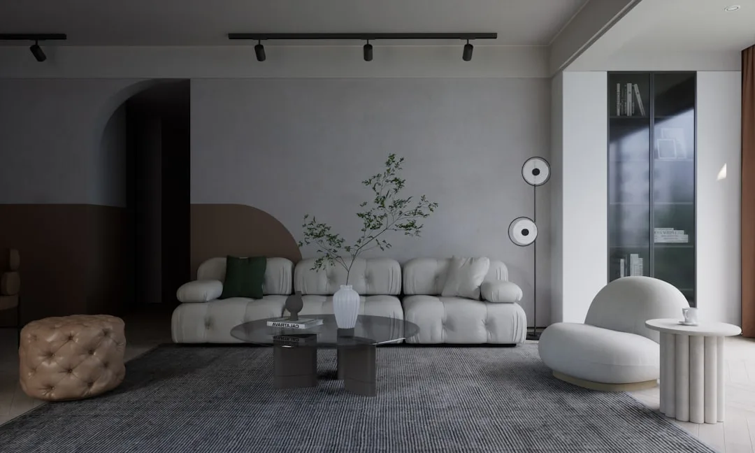
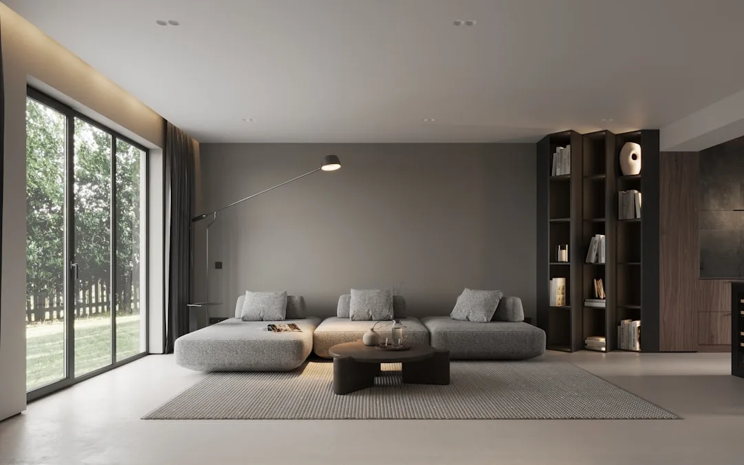
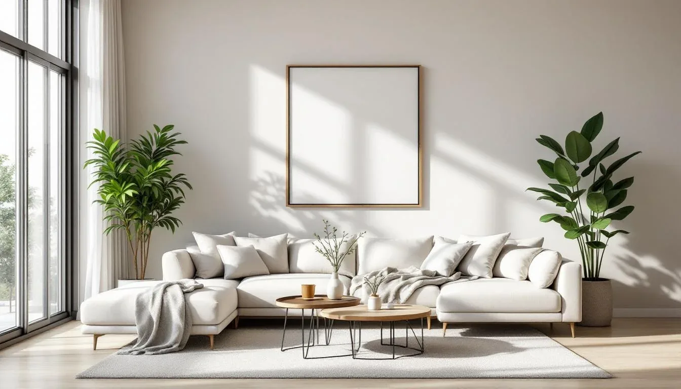
The easiest way to recognize a genuinely minimalist space is structural honesty. Minimalist interiors don’t hide their architecture behind decoration — they expose it and let it carry the visual weight. Raw concrete ceilings, visible steel joinery, unadorned window frames that reveal their depth and shadow — these aren’t cost-cutting measures. They’re the design. The architecture itself becomes the visual content.
What this means practically: a minimalist room in a 1920s brownstone might expose original brick and leave window reveals unpainted to show the masonry depth. A minimalist apartment in a new-build might emphasize ceiling height through floor-to-ceiling storage panels that disappear into the wall plane. In both cases, the building’s own geometry is doing the decorative work.
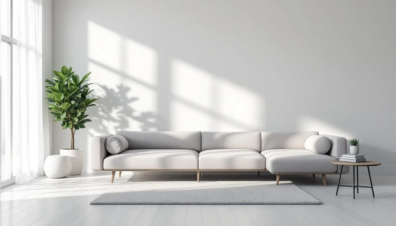
Negative space is the most misunderstood tool in minimalist design. Most people read empty space as absence — something that needs to be filled. Skilled minimalist designers read it as active material. The gap between a low-profile sofa and the wall behind it, the unoccupied floor area in front of a window, the unmarked stretch of white plaster between two considered objects — these create visual rhythm and give the eye somewhere to rest. Neurologically, this matters more than it might seem. Research from the Journal of Environmental Psychology found that visually complex interiors increase cognitive load by up to 35% compared to visually simplified spaces. The calm you feel in a well-executed minimalist room isn’t imagined — it’s measurable.
Material depth replaces decorative variety. Where a maximalist room achieves richness through pattern, color layering, and object accumulation, a minimalist room achieves it through material consistency and quality. A single species of white oak used across the floor, the custom cabinetry, and the window sill reads as coherent and warm without a single decorative object in view. The grain does the work. This is why material selection in minimalist design requires far more precision than in other styles — there’s nothing else to distract from a mediocre finish.
Lighting in minimalist design isn’t supplementary — it’s primary. The angle of afternoon light crossing a bare plaster wall, the shadow a deep window reveal casts at 3pm in January, the way a single recessed fixture washes a concrete column — these are the equivalent of the artwork and objects in other design styles.
- Prioritize natural light sources before specifying any artificial lighting
- Use directional lighting to create shadow patterns that add dimension to plain surfaces
- Avoid decorative fixtures where architectural lighting achieves the same effect
Takeaway: If the light were removed from a minimalist room, the space would feel incomplete — that’s how you know the lighting is doing real design work, not just illuminating the furniture.
The Core Principles That Actually Govern Minimalist Design Decisions
The problem with most “principles of minimalist design” lists is that they describe outcomes — clean lines, neutral palette, uncluttered surfaces — rather than the decision-making process that produces those outcomes. Here’s how a minimalist designer actually thinks when making choices.
The subtraction test is the primary filter. Before anything enters a space, ask one question: if this were removed, would the room feel incomplete? If the answer is no, the object doesn’t belong. This applies to furniture, art, plants, light fixtures, hardware, trim details, and rugs. It’s a harder filter than it sounds — most rooms people think are minimalist would fail it immediately.
Tonal restraint is about relationships, not color count. A common misconception is that minimalist design requires white or gray. It doesn’t. A room furnished in warm terracotta walls, linen upholstery, and natural rattan can be entirely minimalist — if every element in the palette shares the same saturation level and temperature logic. The discipline isn’t about avoiding color; it’s about ensuring every color in the space is in conversation with every other color, rather than competing.
Proportion and scale carry disproportionate responsibility in minimalist environments. In a room full of objects, a poorly scaled sofa gets visually absorbed by the surrounding activity. In a minimalist room, that same sofa is one of five things the eye has to process — so its relationship to the room’s dimensions, ceiling height, and the other pieces becomes immediately apparent. A sofa that’s 10cm too low for the ceiling height reads as awkward in a way it simply wouldn’t in a busier space.
Architect Ludwig Mies van der Rohe, who popularized “less is more” in architecture, specifically applied it to structural expression — the idea that exposing a building’s structural logic, rather than decorating over it, produces greater architectural truth. This context is almost never cited in the design articles that borrow the phrase. Mies wasn’t advocating for empty rooms; he was arguing against superficial decoration applied to hide genuine structure.
Continuity of material and finish across surfaces creates the sense of wholeness that, in other styles, decoration provides. Consistent matte finishes across walls, cabinetry, and trim, or a single grout color carried from bathroom tile to kitchen splashback, creates spatial coherence without adding any visual elements.
Takeaway: Apply the subtraction test to every design decision before purchase — furniture, hardware, and trim details included.
How Minimalist Interior Design Differs From Styles It Is Constantly Confused With
Google Trends data shows that searches for “minimalist vs Scandinavian design” have increased by over 60% in the past two years — and the confusion is understandable, because the styles share surface characteristics while operating on entirely different priorities.
Minimalist vs. Scandinavian
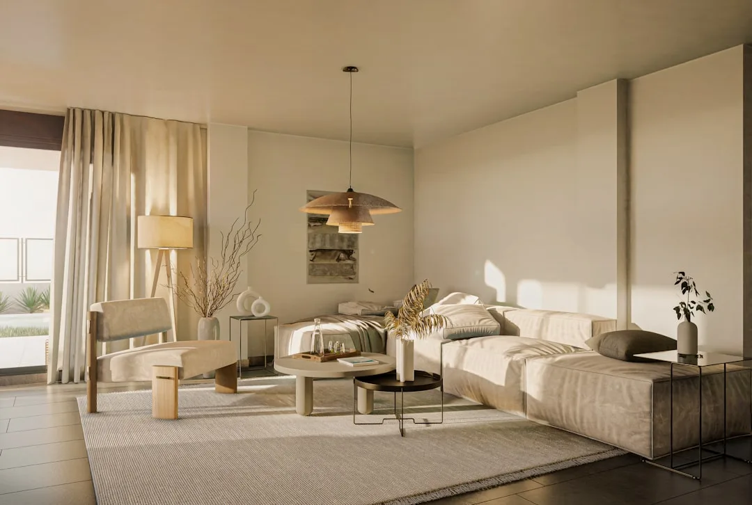
Scandinavian design — particularly the hygge-influenced residential version that became globally popular through the 2010s — prioritizes warmth, comfort, and human wellbeing. It uses layered wool throws, sheepskin rugs, tapered wooden furniture legs, and an intentionally cozy, imperfect quality. It’s warm by design. Minimalism prioritizes spatial clarity, sometimes at the direct expense of comfort cues. A minimalist room might forgo the throw blanket because it introduces visual texture that disrupts the material logic. A Scandinavian room considers that throw blanket essential to the emotional register of the space. Same neutral palette, completely different operating philosophy.
Minimalist vs. Contemporary
Contemporary design is a moving target — it reflects whatever is current in design culture at a given moment, which means it can be maximalist, eclectic, or mixed. Contemporary design in 2018 favored millennial pink and exposed Edison bulbs. Contemporary design in 2024 trends toward curved forms and saturated jewel tones. Minimalism doesn’t move with trends. It’s a fixed philosophy, which means a genuinely minimalist space designed in 1998 shouldn’t need to be redesigned in 2024 — its principles don’t expire.
Minimalist vs. Industrial
Industrial design uses raw, unfinished materials — exposed ductwork, bare concrete, aged steel — as aesthetic statements in themselves. A truly industrial space might have an exposed pipe painted matte black because the pipe looks interesting. A minimalist space might have the same exposed pipe, but only if its presence serves the overall spatial logic and couldn’t be concealed without compromising the room’s structural honesty. The material can be identical; the reason for its presence is completely different.
The clearest diagnostic: a minimalist space feels resolved and complete. A bare or unfinished space feels like something is missing. The distinction isn’t about how many objects are present — it’s about whether every decision in the space was intentional.
Takeaway: If a space feels like it needs more furniture to feel finished, it isn’t minimalist — it’s incomplete.
Why People Actually Choose Minimalist Interior Design (The Honest Motivations)
A 2022 survey by the American Institute of Architects found that 41% of homeowners cited “easier maintenance and cleaning” as the primary reason for choosing a minimalist aesthetic. That’s a more honest answer than most design discourse allows — people don’t always choose minimalism for philosophical reasons. Sometimes they just want fewer surfaces to dust.
The psychological case, though, is well-supported. Minimalist environments reduce decision fatigue and visual stimulation, which matters significantly for people working from home, managing high-stress careers, or navigating neurodiverse sensory needs. When every object in a space was deliberately chosen and has a defined place, the low-grade mental overhead of visual clutter disappears. That’s not a luxury — for some people, it’s a functional necessity.
The financial argument is counterintuitive but real:
- A single well-made sofa from a manufacturer like De Sede or even mid-range brands like Muuto typically outlasts three to four cycles of trend-driven budget upholstery
- Fewer pieces means each purchase can absorb a higher individual budget without increasing total spend
- Integrated storage, while expensive to install, eliminates the recurring cost of organizational furniture purchases
Spatially, minimalist design principles were developed partly in direct response to smaller urban living spaces. The discipline of making every square foot justify itself, of treating negative space as valuable, of hiding storage within the architecture — these aren’t compromises for small apartments. They’re the native logic of that kind of space.
The lifestyle alignment factor is the one most design publications skip. Minimalist design only works long-term if it matches the occupant’s relationship with objects and maintenance habits. A household with young children, active hobbies, and a preference for visual warmth and accumulation will be fighting the design constantly. That’s not a failure of the occupants — it’s a mismatch between design philosophy and lived reality.
Takeaway: Be honest about your actual lifestyle before committing to minimalist design — it rewards occupants whose habits naturally align with its demands, and frustrates those whose don’t.
How to Start Implementing Minimalist Interior Design in Your Own Home
Interior designers consistently report that the most common minimalist design mistake homeowners make is removing objects without addressing storage — resulting in surfaces that become cluttered again within weeks, because there’s nowhere for daily-use items to go. The problem isn’t the objects. It’s the absence of a system for housing them invisibly.
Here’s the sequence that actually works:
1. Start with the architecture
Before buying anything, walk the space and identify what’s structurally worth exposing or emphasizing. A deep window reveal, an original plaster ceiling, a concrete column, well-proportioned door frames — these become your design assets. Know what you’re working with before you decide what to bring in.
2. Edit before you add
Remove everything from the space that can be moved, then apply the subtraction test to each item before returning it. If you can’t articulate why it belongs there, it doesn’t go back. This is brutal to do honestly, but it’s the only way to see the space clearly.
3. Build a material palette first
Choose two to three materials and one to two finish tones before making any purchasing decisions. For example: white oak wood, honed white Carrara marble, and matte off-white plaster — in eggshell and natural. Every subsequent purchase has to fit this palette. If it doesn’t, it doesn’t come in.
4. Budget for storage before visible furniture
Integrated storage — floor-to-ceiling cabinetry with flush hardware, built-in joinery, recessed shelving — is expensive. It’s also non-negotiable in a minimalist space. Allocate budget here before budgeting for sofas or dining tables. The storage makes everything else possible.
5. Introduce objects last, and slowly
Once the material and spatial foundation is in place, live in the space for two to four weeks before adding anything. Let the room tell you what’s missing. A single ceramic piece by a maker like Jono Smart or a hand-knotted rug in a room that genuinely needs grounding — these additions feel different when the space has had time to breathe.
Takeaway: Do the storage work before the furniture shopping. The sequence matters more than the individual pieces.
The Common Criticisms of Minimalist Interior Design (And What They Actually Reveal)
The honest treatment of minimalist design has to include its failures — not hypothetical ones, but the criticisms that landed with real precision.
“It’s cold and uninviting” — This is often valid, but it’s a critique of execution rather than philosophy. When minimalism is applied without material warmth (think polished concrete, white gloss cabinets, and stainless steel without a single natural material to counterbalance), the result is a space that reads as clinical. The philosophy doesn’t mandate coldness. Poor material selection does.
The accessibility critique is harder to deflect. Achieving a truly minimalist space requires either a significant budget for quality pieces, integrated storage, and custom joinery, or extraordinary amounts of time — sourcing, editing, and building the space incrementally. Both are privileges that not every household has. The minimalist aesthetic as presented in editorial design photography requires both. That’s worth naming honestly.
Design critic and author Alexandra Lange has noted in published essays that the dominance of minimalist aesthetics in editorial design photography has created an aspirational image of minimalism that is staged and unlivable — rooms without phone chargers, children’s shoes, mail, or the physical evidence of actual life. This is a meaningful distinction for anyone trying to implement the philosophy in a real home. The version you see in magazines isn’t a documentation of how minimalist spaces are lived in. It’s a representation of the ideal, photographed on a specific morning, for a specific purpose.
The anti-life critique is real in family and multi-use contexts. Spaces designed primarily around visual resolution can struggle to absorb the inevitable visual reality of homework, hobbies, sports equipment, and collections. Minimalism requires ongoing behavioral commitment from every person living in the space — and that commitment isn’t equally realistic for all households.
The honest answer, and the one most design publications are reluctant to give: minimalist interior design is not a universally superior approach. It’s the right approach for specific people, specific spaces, and specific lifestyles. It fails — sometimes expensively — when applied to contexts it doesn’t suit.
Takeaway: If a minimalist room requires constant effort to maintain its appearance, the design isn’t working for the life being lived in it — and that’s a design problem, not a housekeeping problem.
Frequently Asked Questions
Is minimalist interior design the same as having an empty room?
No — and this is the most important distinction in the entire subject. An empty room feels unresolved, like something is missing. A minimalist room feels complete, calm, and deliberate, even if it contains only a few elements. The difference is intentionality. Every surface, material, and object in a minimalist room was chosen because it serves the space’s functional or spatial logic. An empty room simply has things missing. Minimalist design is the result of rigorous decision-making; emptiness is the absence of it.
What colors are used in minimalist interior design?
The common assumption is white, gray, and black only — but that’s the most reductive possible answer. Minimalist design requires tonal restraint and palette coherence, not specific colors. A room in warm stone, sand, and aged linen is minimalist. A room in deep charcoal with matte black joinery is minimalist. Even spaces with a single saturated accent — a terracotta wall, a forest green cabinet — can be minimalist if the overall palette shares consistent saturation and temperature. The rule isn’t about which colors appear; it’s about ensuring every color in the space is in deliberate relationship with every other color, rather than competing for attention.
How is minimalist interior design different from Scandinavian design?
They’re frequently confused because both favor neutral palettes, natural materials, and uncluttered surfaces. The difference is in their core priorities. Scandinavian design — particularly the hygge-influenced residential version — prioritizes warmth, human comfort, and a cozy emotional register. It layers textiles, introduces organic imperfection, and actively designs for the feeling of being looked after. Minimalist design prioritizes spatial clarity and visual resolution, sometimes at the expense of comfort cues. A Scandinavian room would add a chunky wool throw because it makes the space feel welcoming. A minimalist room might leave it out because it disrupts the material logic. Same palette, different philosophy.
Is minimalist interior design expensive to achieve?
Honestly — it can be, and the difficulty is that the expense isn’t always obvious upfront. The most costly element of genuine minimalist design is usually integrated storage: floor-to-ceiling cabinetry, built-in joinery, and concealed systems that keep daily-use objects out of sight. Without this infrastructure, surfaces fill up immediately and the visual logic collapses. Quality individual pieces also matter more in minimalist spaces than in busier ones, because each piece is fully visible and uncompensated for by surrounding objects. That said, minimalist design done gradually — editing existing pieces, investing in storage first, adding furniture slowly and selectively — is achievable at a range of budgets. The expensive version is getting there all at once.
Start here, today: Walk one room in your home and apply the subtraction test to everything in it. Pick up each object — or mentally remove each piece of furniture — and ask whether its absence would make the space feel incomplete. Don’t edit yet. Just look at what passes the test and what doesn’t. That inventory is your actual starting point — and it will tell you more about what the room needs than any mood board will.