Yellow walls fell out of favor for nearly two decades — but the designers who never stopped using them have been quietly right all along, and the data on warm interior color trends in 2025 finally proves it. If you’ve been searching for white kitchen cabinets with yellow walls inspiration and wondering whether the combination actually works in real homes, the short answer is yes — and the longer answer is what this entire article is about. While the rest of the industry was slapping Benjamin Moore Chantilly Lace on every surface and calling it timeless, a small contingent of designers kept returning to warm, saturated walls because they understood something the minimalism wave never addressed: rooms that feel good to live in are not the same as rooms that photograph cleanly. Those two things are often in direct conflict, and nowhere is that tension more visible than in the kitchen.
Quick Answer
Yellow walls fell out of favor for nearly two decades — but the designers who never stopped using them have been quietly right all along, and the data on warm interior color trends in 2025 finally proves it.
This article is not a gallery. It’s a working framework — built from eleven years of actual client kitchens, actual mistakes, and actual paint chips held up against actual cabinet doors in real light.
Why White Kitchen Cabinets With Yellow Walls Keep Coming Back (And Won’t Stop)
In This Article
- Why White Kitchen Cabinets With Yellow Walls Keep Coming Back (And Won’t Stop)
- Are White Cabinets Out of Style in 2026? Here’s the Honest Answer
- The Decision Framework: Which Yellow Actually Works With Your Kitchen
- Countertops, Flooring, and Hardware: Building Around Yellow Walls
- What to Do When the Yellow Is Already There (And You’re Not Sure It’s Right)
There’s a specific kind of design fatigue that sets in around the tenth year of any dominant aesthetic, and the all-white-everything kitchen has officially hit it. Quartz counters, subway tile, flat white shaker cabinets, gray walls — it was a complete sentence, and it got said too many times. What replaced it wasn’t a single trend but more of a corrective instinct: people started wanting their kitchens to feel inhabited again.
Yellow has always been waiting for this moment.
The history here matters more than most trend pieces acknowledge. Yellow kitchens dominated American home design from roughly the 1950s through the mid-1970s — think harvest gold appliances, sunny wallpaper, the kind of kitchen that smelled like coffee and actually looked like someone cooked in it. When that era’s aesthetic became shorthand for “dated,” yellow went with it. Not because yellow was wrong, but because association is brutal in design. It took nearly two decades for the pendulum to swing back far enough that warm kitchens could feel fresh rather than retro.
The psychological case for yellow in a kitchen is remarkably strong. Research in environmental color psychology consistently links yellow hues to increased serotonin production, heightened appetite stimulation, and — critically for a room built around gathering — increased social engagement. These aren’t soft correlations. They’re the reason fast food chains have been using yellow and red together for sixty years.
The 2025-2026 design movement toward warm neutrals and earthy saturated accents is not a coincidence — it’s a direct response to clinical spaces. Pantone and multiple interior trend forecasts identified warm and nature-inspired hues, including yellows and ochres, among the top ten trending interior shades for 2024-2025. That’s institutional validation for something instinctively correct: warm kitchens feel better than cold ones to cook in, eat in, and argue about your day in.
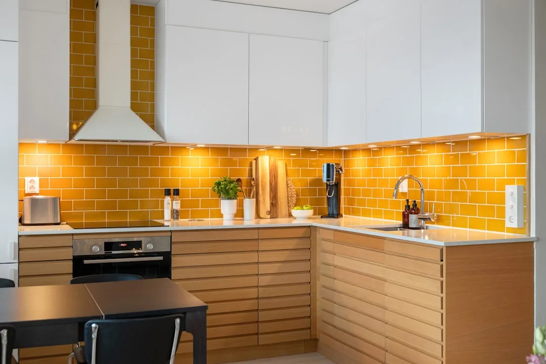
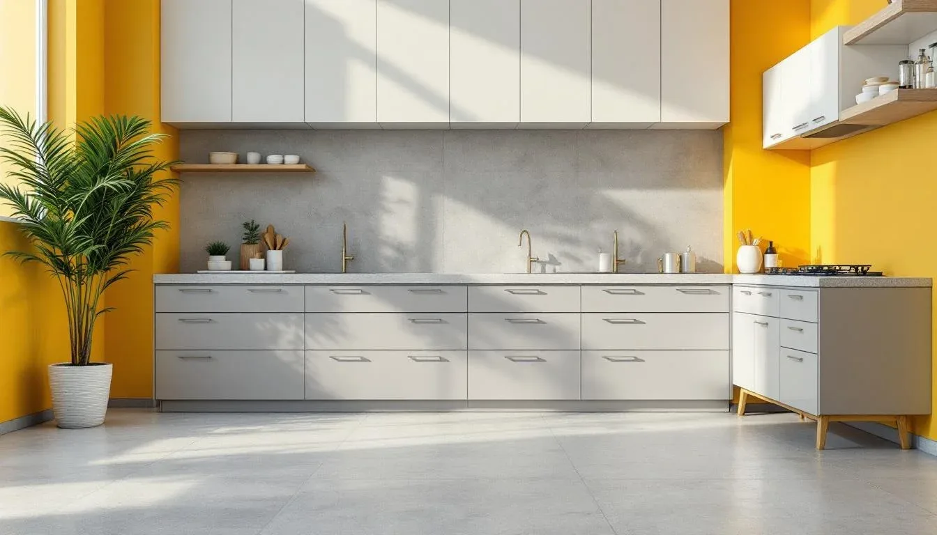
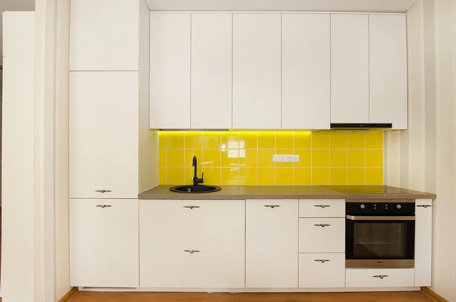
White cabinetry is the specific reason this pairing works where other cabinet colors stumble. White reflects yellow light back into the room rather than absorbing it, which means yellow walls read as warmer and more luminous than they would against, say, navy or green cabinetry. The white acts as an amplifier for warmth without competing for visual dominance. That’s not a styling trick — that’s just how light behaves. It’s also why white kitchen cabinets with yellow walls consistently photograph better than people expect: the contrast is high enough to be readable, but the warmth is unified enough to feel intentional rather than accidental.
Actionable takeaway: Before you dismiss yellow as dated, identify whether your resistance is to yellow itself or to a specific era of yellow. The harvest gold of 1971 and the ochre of 2025 are not the same color, and they don’t produce the same room.
Are White Cabinets Out of Style in 2026? Here’s the Honest Answer
Flat, cold white is having a rough few years. That distinction — between clinical white and warm white — is where most of the confusion about “white cabinets going out of style” actually lives.
The honest answer is this: white cabinets are not out of style, but the specific white matters more now than it ever has. This is not a minor nuance. The difference between Sherwin-Williams Extra White (cool, almost icy) and Benjamin Moore White Dove (warm, slightly creamy) is the difference between a kitchen that fights your yellow walls and one that embraces them.
Here’s how to read white cabinet undertones before you commit:
- Cool whites have blue or gray undertones — they look crisp against cool gray or navy walls but create visual tension against warm yellows
- Warm whites carry yellow, red, or pink undertones — they include linens, ivories, and alabasters, and they are the category you want for yellow wall pairings
- Neutral whites sit in the middle and can be pushed either direction by surrounding colors — test these especially carefully against your specific yellow
The hardware argument for white cabinets in 2026 is strong and practical. Brass, matte black, and aged bronze — all of which are having sustained moments — look dramatically better against white than against any colored cabinet. A set of unlacquered brass pulls on warm white shaker cabinets reads as deliberately modern in a way that the same hardware on gray cabinets simply doesn’t achieve.
There’s also a resale reality worth naming. White or warm white cabinets remain the most universally accepted cabinet finish among buyers, which means they retain their practical value even as aesthetics cycle. That’s not a reason to make design decisions you hate — but it’s worth factoring in if you’re renovating a home you plan to sell.
Actionable takeaway: Pull out a warm yellow swatch (try Benjamin Moore Golden Straw or similar) and hold it directly against your current or planned cabinet sample. If the white looks greenish or grayish next to the yellow, it has cool undertones and will fight your walls. Find a warmer white before you proceed.
The Decision Framework: Which Yellow Actually Works With Your Kitchen
This is where most yellow kitchen content completely falls apart — it shows you beautiful photos and tells you nothing about why those specific yellows were chosen for those specific rooms. I’ve seen clients fall in love with an ochre they found on Pinterest and paint an entire north-facing kitchen with it, only to discover that the same color that looked golden and rich in a south-facing California loft reads muddy and swamp-like in a Minnesota kitchen with one small window. Light direction is not a footnote. It is the primary variable.
Here’s the framework I use with clients before any yellow paint gets approved:
Step one: Identify your light direction and quality
- South-facing kitchens receive warm, direct light through most of the day — they can handle more saturated, deeper yellows like mustard or saffron without the color going heavy
- North-facing kitchens receive indirect, cooler light — they need lighter, more yellow-forward hues with less brown or green in them; ochres that look earthy and sophisticated in a magazine will go gray-green in these conditions
- East-facing kitchens get warm morning light and cool afternoon light — medium-saturation yellows work well, and the room will genuinely shift mood through the day, which many people find appealing
- West-facing kitchens get cool mornings and golden late-afternoon light — this is actually one of the best orientations for dramatic, saturated yellows because the evening light makes them sing
Step two: Identify your yellow’s undertone family
Not all yellows are the same yellow. The three main undertone families in yellow wall paint are:
- Green-leaning yellows — chartreuse-adjacent, fresh and modern but risky in artificial light, where they can read acidic; best for daylight-heavy kitchens with white or very pale cabinets
- Orange-leaning yellows — this is the ochre and saffron family, the warmest and most forgiving, and the best match for warm white kitchen cabinets with yellow walls; they work in almost every light direction with the right saturation
- Pure or neutral yellows — these are the clearest, most traditional yellows; they’re the most sensitive to light conditions and the hardest to pair with hardware and countertops, but when they work, they produce that unmistakable “sunny kitchen” quality
Step three: Test at actual size, not chip size
Paint a minimum of a two-foot-square test patch directly on the wall — not on poster board that you move around, not on a small chip. A color that reads correctly at chip size will behave completely differently when it has four walls of surface area bouncing light around. Leave the test patch up for at least three days, observe it at different times of day, and photograph it both in natural light and under your kitchen’s actual artificial lighting.
Specific yellow paint colors that consistently work well with white kitchen cabinets:
- Benjamin Moore Golden Straw (2152-40) — a soft, warm yellow with minimal green undertone; forgiving in most light conditions
- Sherwin-Williams Antique White (SW 6119) — technically a very pale yellow that reads as warm white; excellent for kitchens where you want warmth without commitment
- Farrow & Ball Dayroom Yellow (No. 233) — a sophisticated, slightly muted yellow that avoids both the sweetness of pastel and the heaviness of ochre
- Benjamin Moore Hawthorne Yellow (HC-4) — an Historic Colors series shade that sits between yellow and cream; one of the most livable yellows for kitchen use
- Behr Sunflower (M300-5) — a stronger, more saturated option for kitchens with confident natural light
Actionable takeaway: If your kitchen faces north or has limited natural light, add the word “muted” to your yellow criteria and remove any candidate with a visible green undertone. These two filters alone will eliminate about 70% of the yellows that photograph well but fail in real rooms.
Countertops, Flooring, and Hardware: Building Around Yellow Walls

Once the yellow and the white cabinets are settled, the supporting elements in your kitchen need to resolve the palette rather than compete with it. This is where most white kitchen cabinets with yellow walls combinations either come together beautifully or tip into visual chaos — and the decisions are more systematic than they seem.
Countertop materials that work:
The wrong countertop choice can make yellow walls look cheap and the right one can make them look intentional and expensive. The key principle is that your countertop should either contain warmth (echoing the yellow) or provide grounding contrast (pulling the eye down and anchoring the room).
- Warm white marble or quartzite — Calacatta Laza, White Princess, and similar stones with warm golden veining are almost purpose-built for this combination; the veining echoes the wall color and the stone grounds the warmth
- Honed butcher block — natural wood countertops read as warm and organic alongside yellow walls; lighter woods like maple keep things airy, while walnut provides grounding contrast
- Cream or ivory quartz — specifically warm-toned quartz without visible gray or cool undertones; Silestone Eternal Calacatta and Cambria Torquay are reliable options
- Absolute black granite — this seems counterintuitive, but a dark, nearly matte black countertop against yellow walls and white cabinets creates a sophisticated three-layer contrast that reads as more designed than expected
What to avoid: Cool gray quartz and white marble with blue-gray veining (like classic Carrara) will fight your yellow walls visually. The cool tones in the stone will make the yellow look aggressive rather than warm.
Flooring options that anchor the combination:
- Wide-plank white oak — the most versatile option; its warm, slightly golden tone connects floor to wall without matching exactly
- Terra cotta or warm-toned tile — particularly good in Mediterranean or farmhouse-adjacent kitchens; the earthy red-orange reads as a warm complement to yellow
- Black and white encaustic tile — a graphic pattern in classic black and white actually settles yellow walls by providing strong visual structure at floor level
- Warm gray limestone — for a more restrained palette, a natural stone with beige-gray undertones reads as neutral without the cold quality of modern gray tile
Hardware that elevates the pairing:
Hardware is where you have significant latitude to push the design in different directions, and the choices are more consequential than most people assume.
- Unlacquered brass — the gold tones in natural brass echo yellow walls without matching them; unlacquered will patina over time and develop a lived-in quality that suits warm kitchens well
- Antique bronze — slightly darker and more complex than brass; reads as more masculine and grounded, good for kitchens where you want the yellow to feel sophisticated rather than sweet
- Matte black — creates crisp contrast against white cabinets; works best in kitchens where the yellow is a warmer ochre rather than a bright clear yellow, since the combination of pure yellow and pure black can feel very graphic
- Satin nickel — technically a cool-toned metal, so use with caution; can work if your white cabinet has cool-to-neutral undertones, but tends to flatten the warmth of the pairing
What to Do When the Yellow Is Already There (And You’re Not Sure It’s Right)
A significant portion of people reading this arrived here because they moved into a house with yellow walls already in place, or they painted yellow two years ago and now they’re second-guessing it. This is a different problem than starting from scratch — and it has its own solutions.
First: diagnose before you repaint. Yellow walls that feel wrong are usually wrong for one of these specific reasons:
- The yellow has too much green undertone for the light in the room
- The yellow is too saturated for the room’s size and window area
- The yellow is fighting cool-toned countertops, flooring, or cabinet hardware
- The white of the cabinets has cool or blue undertones that create visual tension with the wall
Each of these has a different fix, and repainting the walls is only the right answer for the first two. If your yellow is fighting cool-toned surrounding elements, repainting is a waste of money — you need to change the elements that are creating the conflict.
If the yellow has too much green undertone:
This is the most common failure mode. The fix is repainting with an orange-leaning or neutral yellow. You do not need to prime to white first — you can paint directly over a green-leaning yellow with an ochre or warm yellow, and in most cases the new color will cover completely in two coats.
If the yellow is too saturated:
Rather than repainting immediately, try adding visual weight at the bottom of the room first — a dark area rug, darker countertop stools, or even dark lower cabinet hardware. Highly saturated wall colors often feel overwhelming because the room lacks grounding elements, not because the color is inherently wrong. Add weight at floor and counter level before you decide to repaint.
If the cabinets are fighting the yellow:
White kitchen cabinets with yellow walls that feel dissonant are usually dissonant because of white undertone mismatch. The fastest fix is hardware — replacing cool-metal hardware with warm brass or bronze pulls the cabinet color toward warmth and reduces the perception of undertone conflict without touching a paintbrush.
If the countertops or flooring are the culprit:
This is the hardest problem because those are expensive to change. The intermediate solution is to use accessories, textiles, and open shelving to build a layer of warmth between the yellow walls and the cool surfaces — natural wood cutting boards displayed on the counter, warm-toned ceramics on open shelves, linen window treatments in cream or natural — that create visual mediation between the conflicting elements.
Actionable takeaway: Before repainting yellow walls you’re unhappy with, spend one week making the inexpensive changes first — swap hardware to brass, add a warm rug, change your dish towels to natural linen. You may discover that the yellow was never the problem.
Frequently Asked Questions
Q: Do yellow walls make a small kitchen feel smaller or larger?
This depends almost entirely on saturation rather than the yellow itself. A pale, muted yellow — think buttercream or very soft straw — can make a small kitchen feel warmer and more intentional without visually compressing the space. A deeply saturated mustard or ochre in a small, low-light kitchen will feel heavy. The rule is: the smaller and darker the kitchen, the lower the saturation of yellow you should be using. White kitchen cabinets with yellow walls in small kitchens work best when the yellow reads as a warm white-adjacent shade rather than a clearly yellow wall.
Q: What backsplash tile works best with white cabinets and yellow walls?
The three most reliable backsplash approaches for this combination are: plain white subway tile in a running bond or stacked pattern (which lets the yellow and white read without adding a third visual element), natural stone or stone-look tile in warm cream or beige tones (which bridges the yellow and white), and handmade ceramic tile in white or cream with slight color variation (which adds texture without pattern competition). Avoid backsplash tile with cool gray grout — the grout lines will read as blue-gray against your warm walls and create visual friction across the whole kitchen.
Q: Can I use yellow walls with colored or wood-tone lower cabinets and white uppers?
Yes, and this is one of the more interesting directions the white kitchen cabinets with yellow walls combination can go. White upper cabinets against yellow walls maintain the reflective quality that makes the combination work, while wood-tone or colored lowers add grounding weight. Natural white oak lowers with white uppers against yellow walls is a particularly strong approach for 2025-2026 — the wood connects to the warmth of the yellow while the white uppers keep the room light. If you use a colored lower (navy, forest green, or warm charcoal are the strongest options), make sure the color has warm rather than cool undertones so it reads as intentional contrast rather than a color conflict.
Q: How do I handle yellow walls in an open-plan kitchen that connects to cooler-toned living spaces?
This is one of the most common practical challenges for this combination and the design solution is about creating a deliberate transition rather than trying to make the colors match. The approach that works most consistently is using a shared element — flooring, a large area rug, or a piece of furniture — that contains undertones from both spaces. A wool area rug in warm caramel or ochre tones placed in the living area adjacent to the yellow kitchen creates a visual bridge that makes the transition feel designed rather than accidental. Alternatively, painting the connecting wall or kitchen island in a shade that sits between your yellow and your living room color creates a natural gradient instead of a hard stop.
Q: Is yellow a good choice for a kitchen in a home I plan to sell in the next few years?
Honestly — it depends on how saturated and how committed you go. A pale, muted yellow with white kitchen cabinets is a warm neutral to most buyers and will not read as a specific or polarizing choice. A deep saffron or bright sunflower yellow is a bolder commitment that some buyers will love and some will repaint immediately. The practical middle ground if you’re selling within two to three years: choose a muted, low-saturation yellow (something that reads as “warm white with a hint of sunshine” rather than “yellow kitchen”) and keep all the permanent elements — countertops, hardware, flooring — in warm but broadly appealing finishes. You get the warmth you want while maintaining enough neutrality that buyers can see themselves in the space.