Author: designer

  • Top 20 Tourist Attractions of Barcelona

    Top 20 Tourist Attractions of Barcelona

    Who’s going on holiday trip in Barcelona? If after a thorough research of the wonderful places in Europe where you can spend your vacation this year, you’ve finally decided to choose Barcelona, know that you will not regret at all.

    Imagine de Patrice Audet de la Pixabay

    Barcelona, the vibrant capital of Catalunya, is nowadays among aspirants to the title glory in areas such as business, drama, food and design. By exploring the many inflections of the Barcelona’s spirit of the XXI century, you will reveal a lot of interesting buildings, most of them famous landmarks, both historical and contemporary, in an inspired mix of styles. By the way, Spain is renowned worldwide for both its architecture and architects. Spanish architecture is famous due to its geographical and historical diversity, and today Spain is proud to have the second largest number of World Heritage sites in the world after Italy. Iberian architecture impresses by this variety of styles where modern coexist with the old, the illustrious in a very inspirational way.

    There are amazingly many things to engoy in Barcelona and many buildings and places are unique sites, so it’s worth every moment spent in this beautiful city. Here we gathered for you 20 unique sights worth seeing in Barcelona. You should not under any circumstances forget to visit them.

    1. Sagrada Familia

    Imagine de Monica Volpin de la Pixabay

    2. The cathedral (La Seu)

    Imagine de stemark44 de la Pixabay

    3. FC Barcelona museum & Camp Nou stadium

    MARIA ROSA FERRE ✿, CC BY-SA 2.0, via Wikimedia Commons

    Photo by Johannes Plenio from Pexels

    4. The neighborhoods La Ribera and El Born

    Image by Joaquin Aranoa from Pixabay

    5. The Gothic Church Santa Marίa del Mar

    SONY DSC

    6. Montjuïc hill and The Spanish Village (Poble Espanyol de Montjuïc)

    Marco Luzi, CC BY 3.0, via Wikimedia Commons

    7. The Magic Fountain of Montjuïc

    Imagine de Vicens Dorse de la Pixabay

    8. Palau Güell

    Thomas Ledl, CC BY-SA 4.0, via Wikimedia Commons

    9. La Pedrera (Casa Mila)

    Imagine de Monica Volpin de la Pixabay

    10. The Museum of Contemporary Art in Barcelona

    Zarateman, CC0, via Wikimedia Commons

    11. Picasso Museum

    Imagine de Lenny21 de la Pixabay

    12. National Museum of Art of Catalunya

    Filip Maljković from Pancevo, Serbia, CC BY-SA 2.0, via Wikimedia Commons

    13. La Rambla – Barcelona’s most famous walking street

    Edal Anton Lefterov, CC BY-SA 3.0, via Wikimedia Commons

    14. Barrio Gotico  – Gothic quarter of Barcelona’s medieval city

    Gerardo Almeida, CC BY-SA 3.0, via Wikimedia Commons

    15. Tibadabo hill, Sagrat Cor church & Tibidabo amusement park

    Jordiferrer, CC BY-SA 3.0, via Wikimedia Commons

    16. Casa Batlló

    Imagine de dari_fant de la Pixabay

    17. The Monastery of Pedralbes

    Imagine de Manuel Torres Garcia de la Pixabay

    18. The concert hall Palau de la Música Catalana

    Imagine de Bluespicture de la Pixabay

    19. The Gran Teatre del Liceu- one of the most important opera houses in Europe 

    HitchHikersHandbook.com, CC BY-SA 3.0 ES, via Wikimedia Commons

    20. Torre Agbar -the 142 m tall office tower is Barcelona’s latest attraction

    Imagine de Alexander Lesnitsky de la Pixabay
  • How to Use Wooden Furniture in Modern Interiors

    How to Use Wooden Furniture in Modern Interiors

    Wooden furniture is often associated with rustic and English country style interiors. However, this versatile material can be used to balance and decorate even the most modern of living spaces. All it takes is a basic understanding of how to use effectively use wooden furniture, and you can tailor them into your home in an ultra-sleek style. Here are a few tips to keep in mind when introducing wooden furniture into your modern interiors.

    Match the right wood to your style

    Wood-style

    The first thing to consider is the type and colour of wood you are going to use in your room. Smaller sized spaces will benefit from a lighter shade, making pine and oak furniture from Oak Furniture UK an ideal choice. To add a bit more drama into a larger room, opt for a darker and richer shade of wood, such as mahogany or rosewood. Modern interiors usually have a very simple and understated colour palette, so make sure you reflect this with your use of wood. You don’t have to limit yourself to just one type of wood, but in order to avoid giving your room a chaotic and unorganised appearance, try to match wood tones to wall colours. If you want to use multiple types of wood, then it’s best to stick to a more subtle shade.

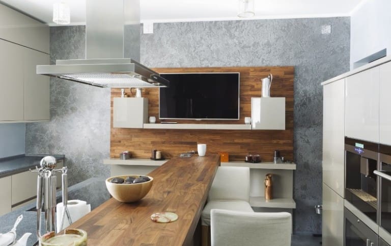
    Keep larger furniture items in the same tone

    Modern-kitchen

    If you do decide to use different types of wood, then make sure you keep it balanced. One way to do this is to keep larger pieces of furniture in a matching shade. You can then use smaller items in a different colour to add an eye-catching style.If you do decide to use different types of wood, then make sure you keep it balanced. One way to do this is to keep larger pieces of furniture in a matching shade. You can then use smaller items in a different colour to add an eye-catching style.

    If you do have furniture in different wooden shades then make sure you integrate them throughout the room. Keeping dark wood on one side and lighter wood on the other will just make an unappealing appearance and leave your room looking disjointed. The modern style is all about a smooth and understated flow. A very easy way to achieve this is to contrast dark woods on a light coloured wooden floor for an instant visual impact.

    Soften darker woods with furnishings

    Softer-darker-wood

    A popular colour choice for modern rooms is light and monochrome shades. This means that darker woods can look very out of place. However, once tied into the room in the right way, they can become a very striking statement piece. To stop your furniture from looking mismatched, simply use upholstery to mimic the wooden tones. If you have a dark coffee table, then place a lighter
    rug underneath or add subtle coloured drapes that pull that bookcase into the room.

    Tie-in furniture using an accent colour

    Dining-room-wood

    Finding wooden furniture in exact matching tones can be a difficult task. Often you can buy a piece that you are sure is a dead match, only to find out once you get home that they differ slightly in tone or finish. This problem can be easily solved by adding some finishing touches in an accent colour. Choose a colour that will stand out against your room. With modern styles, a dark grey, striking white or deep red will usually work well. Then add small items, such as simply styled lamps, vases and cushions, across both pieces of furniture to create an aesthetically pleasing continuation between them.


  • Handmade Origami Pendant Light by blaanc

    Handmade Origami Pendant Light by blaanc

    We always liked origami handmade items for interior design and we never miss the opportunity to show you our discoveries regarding this subject. Talented designers all over the world create amazing objects with intrincate designs using this traditional Japanese art of paper folding called origami, helping in this way homeowners to beautify and personalize their interiors.

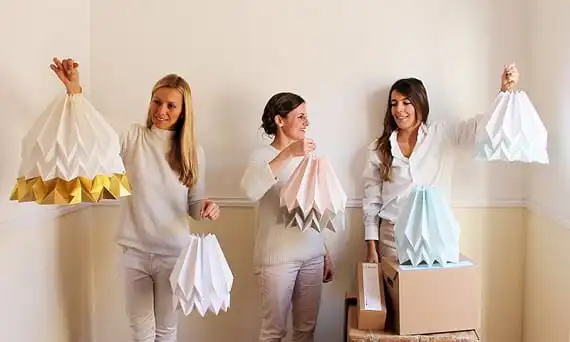
    We recently see Orikomi, a wonderful handmade pendant lamp produced in Portugal and envisioned by a young, international design team called blaanc. It draw attention through its alluring design, elegant and simple in its visual effect, yet complex to create. The suspended lamp create a cosy, warm light in any environment, and the fact that comes in an extensive combinations of colors, makes it suitable for a variety of rooms and styles. Orikomi is made of high quality art paper and cardboard, and it comes with a cord set and mounting instructions. Be aware that such lamps should only be used with an energy saving light (or any similar fixtures with low heat generation).  Take a look on these images!

    Orikomi-by-blaanc

    Polar-White-with-gold-stripe

    Polar-white-with-blue-stripe

    Origami-lighting

    Pastel-pink-with-taupe-stripe

    Photos © blaanc

  • Hot Design – Cool Radiators

    Hot Design – Cool Radiators

    I’d like to start this blog with a confession, in order that we can better understand each other and build trust. I’m aware you’re not a priest (and if you are, I won’t consider this admission binding in a religious sense), but here goes: when I first came into the interiors market many moons ago I didn’t really care about it. Yes, I know. Criminal, isn’t it?

    This story ends well though, as now I find myself the kind of person who is happy to expatiate on why certain toilets are brilliant, or asseverate that thermostatic showers really are the only choice in your bathroom. With knowledge comes responsibility, so they say, so I have taken up another cause as well, that of proving that functional items can play a very big role in the look of your rooms. More to the point, I now feel that radiators are very important stylistic items.

    If you ask me, properly stylish designer radiators came about fairly recently, as designers became more adventurous. I also think radiators became cool due to three separate changes in thought and practice, as below.

    Bathroom-radiators

    Materials

    Seems a strange one to kick off with this but it’s an interesting thought. The shapes and malleability of radiator design has really come about due to the incorporation of low carbon steel to build radiator and towel rail bodies. This metal is of course strong, but relatively lightweight, and its composition means that it is extremely amenable to welding. This means that manufacturers can attempt more exciting, angular designs as they know the joints of the radiators will not come under undue stress.

    Finish

    This was more a change in fashion than anything else. As far as I can think back, radiators were painted into obscurity, to disguise and obfuscate, usually in bland, neutral tones. Now you can get radiators in all manner of hues, from standard white and grey glosses up to glimmering chrome. Perhaps the biggest strides have been made with darker radiators, with black gloss and anthracite finishes demonstrably popular. You can have pretty much anything you want now.

    Horizontal- radiator

    Attitude

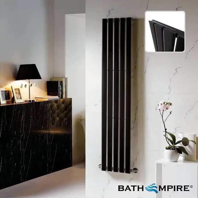
    Radiators have been tipped on their heads, that’s right. Where horizontal radiators took up a heavy proportion of those fitted in homes, in recent times vertical column radiators have really come to the fore. Slimline and upright, these units present a wonderfully fresh aspect, and look very contemporary. This look is only accentuated by flat panels, available on many models, due to the minimalist profile.

    Column-radiators

  • Surfin Bird, a Lovely Birdhouse by dreikant

    Surfin Bird, a Lovely Birdhouse by dreikant

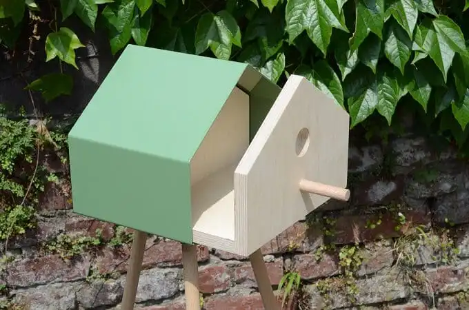
    Here’s something cute for our bird friends. German designers from dreikant called it Surfin Bird and we find the product very interesting both from functional and aesthetic perspective. This birdhouse design is special just by the simplicity it displays, and the combination of wood and metal. Available in five different RAL colors or plain steel, the Surfin Bird easily draw attention because of the small nest box supported by that very tall legs which make it very funny too.

    The wooden housing offers shelter and provides safety for the breed during the spring and summer season, while during winter time the nest box turns into an open feeding ground by simply removing the wooden part. This possibility of separating the two parts makes the cleaning of the inner housing no big deal as it can also be taken out the metal frame easily. A bird fat ball or similar food can be hung up easily just by attaching a strong magnet hook. All pieces of the birdhouse are being treated with wood oil in order to retain the beautiful natural wooden look. Below are some pictures with Surfin Bird. How do you find them?

    Colorful-birdhouse

    Small-nest-box

    Open-nest-box

    Wooden-birdhouse

    Photos © dreikant

  • How to Pick an Architect

    How to Pick an Architect

    No matter what sort of work you are planning on doing – whether it’s a simple bedroom extension over the garage or you have a glorious spectacle of titanium architectural genius in mind – it is more than likely that you should employ the trained mind of an architect to help you out.

    Sometimes, it can seem like employing an architect might be an expensive waste of your money, especially in these current times of economic difficulties. Other people believe that the process of hiring one might be confusing, and are put off trying it for this reason.

    However, you really should get the help of an architect if you’re planning some big changes to your house, especially if you’re not 100% sure of what you’re doing. In fact, sometimes an architect might even be able to save you money! There are, however, some things you should keep in mind.

    Architecture-firm

    Do You Need an Architect?

    If you are genuinely wondering whether or not you should hire an architect, the answer is almost definitely a yes. Take this as your rule of thumb: if it is anything other than a small project which needs no planning permission whatsoever, you should get an architect onside.

    Why? Well, an architect can aid you in your project in myriads ways, from helping you to understand what materials you need to drawing up blueprints, from filing the planning permission application to overseeing the build to the finish.

    How Do You Choose?

    Before doing anything, ask around your friends and family and find out if any of them recently had any architectural work done – if they have, ask whether they’d recommend them or not. If they would, great! You already have an architect and can go on with the job.

    If they’ve not had anything done, or the architect did an awful job, you should visit a few local architecture firms. A good quality architect shouldn’t be too difficult to find – use www.yell.com or search the internet yourself, or simply browse the phone book and make enquiries!

    If you’re not sure about their accreditation, you can check on the Royal Institute of British Architects (RIBA) website, or ask whether they’re on the ARB (Architects’ Registration Board). To be safe, if you’re suspicious, don’t hire them!

    How Much Will You Pay?

    Normally, an architect’s fee would be based on a fixed percentage of the overall construction costs, but it could also depend upon how much time the architect spent working on the job. You may even be able to secure a lump sum fee from the outset of the job, so speak to the architect beforehand to discuss payment options. The initial meeting shouldn’t cost you a penny, so use it wisely.

    If you want a concrete hourly fee, we’d say somewhere around £80. Of course, this might vary wildly depending on which firm you visit, so the only way to find out for sure is by asking around yourself.

  • Why School Furniture Is So Important

    Why School Furniture Is So Important

    Education is important – you know that, we know that, everyone knows that. After leaving school, the rest of your life begins, and where you end up in that life is directly linked to your time spent in education and how you did. It has a greater effect on your life than pretty much anything else.

    The quality of the education you receive has the potential to wildly vary depending on some surprisingly mundane factors. Some of the more obvious ones include the skills and competence of the teachers you find yourself with, how many disruptive children are in your class, and how well you personally pay attention.

    There are, however, more contributing factors than you have probably realised. Some of the more unusual ones include the acoustics of the classroom (yes, really), as well as the lighting, and even the furniture you sit on and write on!

    What’s Changed?

    Just think back to all the changes to schools we’ve had in the last decade or two – teaching styles have been completely revamped, the curriculum itself has been overhauled, and the notorious canteen food has been upgraded courtesy of Mr Oliver. But has anything been done about the furniture?

    The answer to that question is a no. School furniture is pretty much the same as it was back in the ‘50s, with the only major change being made in the construction materials: they’re now made from plastic instead of wood, as it’s cheaper.

    Current education failure, if scaled up and made to adhere to work furniture regulations, would fail on a number of different fronts – it’s high time we changed this.

    Laboratory-furniture

    How Can Furniture Affect Performance?

    Classroom furniture can affect a child’s educational performance in a number of different manners. This makes it of crucial importance that we ensure that we give the very best furniture to our children – we don’t want their education to suffer!

    The modern methods of teaching incorporate numerous different styles, so we need furniture that can adapt to each of these. Schools can no longer afford to build separate rooms for science or for ICT, so we have to ensure that the furniture we use can do it all.

    Children should have furniture which is both ergonomic and comfortable – take a look at Innova Design for some examples – as this will allow them to work to their full potential.

    Why Should Furniture Be Replaced?

    We’re not suggesting all schools should go and replace every last bit of furniture on a whim. That’s expensive. Instead, if a school is already undergoing a redesign or renovation, that’s when changing the furnishings should be taken into serious consideration.

    If the furniture in the class doesn’t fit the kids well, it can cause back and neck pain that could eventually end up doing permanent damage. A lack of comfort also makes it hard to concentrate, thus directly having a negative impact on education. If we want the younger generation to do well, we need to ensure that we give them the best furniture.

    School-furniture

  • How to Spruce Up Your Dining Room

    How to Spruce Up Your Dining Room

    Whether you’re planning a dinner party or just bored with your layout and furniture, sprucing up your dining room is easier than you think. A few simple changes can do wonders to the overall atmosphere of the dining room so your family will enjoy spending time there.

    Before you start overhauling the room, remember that its primary function is for eating, and that should not be affected at any cost. And while minimal is always best, it doesn’t mean that design ideas are limited. Here are a few simple tips for a fabulous dining room.

    Make Your Dining Room Table Shine

    Contemporary-table-for-dining-room

    If your table is looking a little scruffy, or even if you think it’s time for a change, there are numerous styles of dining tables to choose from; visit sites like Made for more ideas.

    From extending tables, to wooden tops and adjustable height tables, choose a piece that will set the tone for the room. Remember that the table should be the main feature in the room, so start there and build your design outwards.

    Invest in a solid but attractive table that you’ll be happy to showcase for a few years.

    Soft Lighting is Your Friend

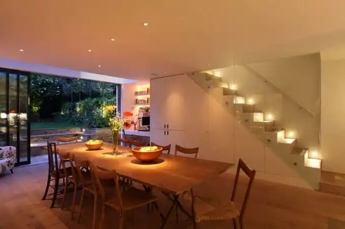
    Soft-lighting-in-dining-room

    Whether you want to have your family dinners surrounded by mood light or want to hide the imperfections in your freshly baked bread, soft lighting is your friend in the dining room.

    Candles and chandeliers are the most obvious ways to create soft light during dinner. The size of the dining room and dining table will dictate whether or not you get a chandelier. For instance, a grand chandelier will not be appropriate if the dining room and the table are small. Instead, you can resort to a small pendant light or a 5-light pendant depending on the size of the table.

    Apart from soft lights, you should outfit the dining room with task lighting and accent lighting on the walls. All fixtures and finishes must complement the overall theme of the room.

    Add a Splash of Color

    Colorful-chairs-in-dining-room

    You can add a pop of color just as effectively as style gurus. A bright but complementary color might be just what you need to rejuvenate and update this very social room.

    A metallic blue or bright green adds a burst of color and interest to an otherwise pale room. Fortunately, there are many simple ways to include color without overpowering the room. Choose one item to carry the color in the room: Paint the chairs, add a bright rug, paint one wall, or add vibrant curtains.

    Another option is the add cushions to the dining room chairs and use the bright colors in a pattern or neutral form.

    Paint or wallpaper, new furniture, area rugs, and clever decorations are your ally when it comes to adding pizzazz to your dining room.

    Use decorations in moderation and change them according to the season. Remember to keep it minimalistic on the dining table. Remember that an attractive dining room starts with a great dining room table- get that right and everything else should fall into place.

    Amy Grimshaw is an interior designer. She loves writing about decor on home design blogs.