Author: designer

  • Beautiful Holiday House Overlooking Lake Lucerne, Switzerland

    Beautiful Holiday House Overlooking Lake Lucerne, Switzerland

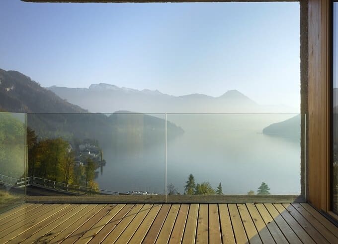
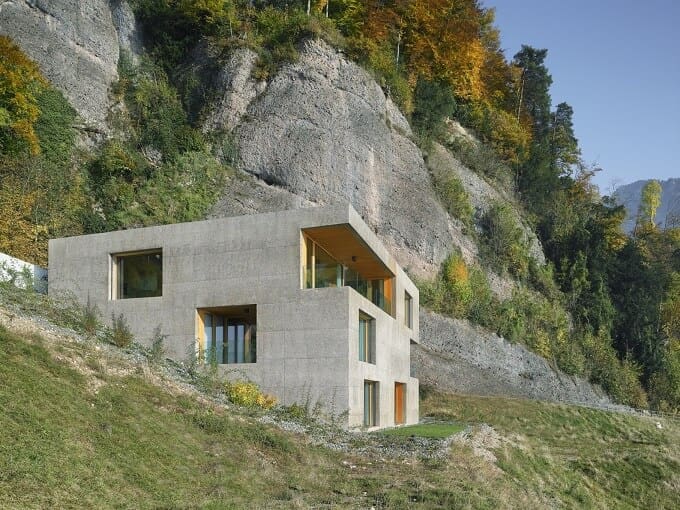
    Showcasing a simple cubic volume integrated directly into the surrounding environment, this gorgeous residence, designed by Lischer Partner Architekten, is a three-storey holiday house located in the splendid mountains of Switzerland, above Lake Lucerne in Vitznau. Taking full advantage of the challenging topography of the site, the project features a highly original layout and offers impressive views of the Lake Lucerne landscape.

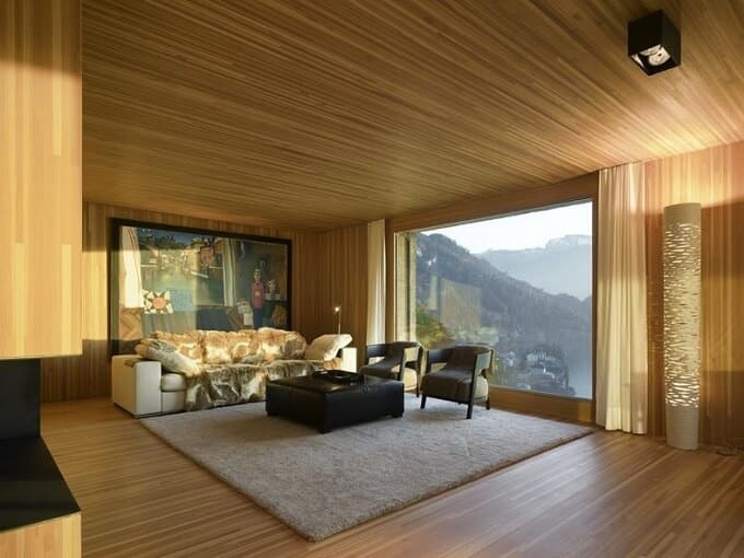
    In order to meet the client’s expectations of having a timber house, but also taking account the exceptional hillside location architects envisioned a solid construction that acts like a hard shell, enveloping and protecting the soft core of the timber house, the natural warm wooden interiors. The prefabricated timber frame cassettes were erected, sealed and insulated on site, then clad with a single skin of concrete.

    House-exterior-architecture

    The exterior concrete appearance of the holiday house was realized in Wesen gravel which take the graininess  and  the reddish colour of the prominent rock face behind the house. The timber structure stands as ‘a house in a house’ and the combination with the hard, concrete shell makes it possible the optimization of its load bearing size as it does not have to resist any shear forces. The main entry is accompanied by a garage, while a bridge leads into the home from an open courtyard

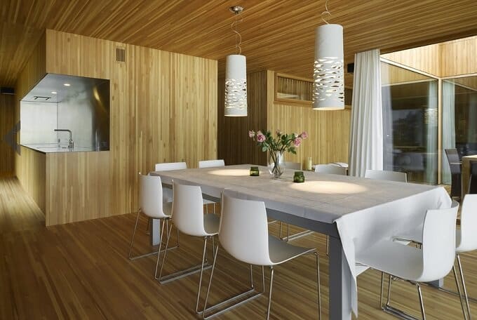
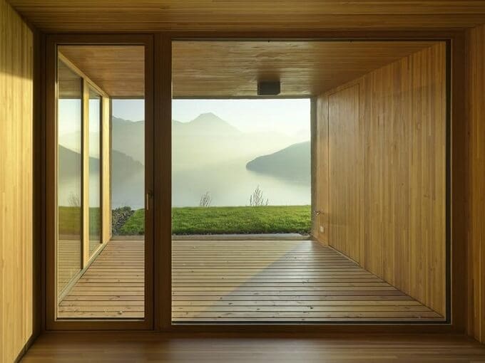
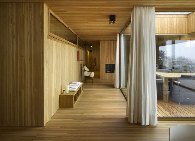
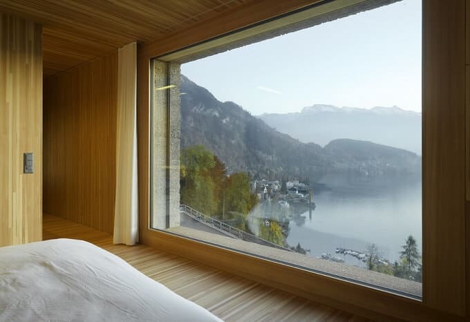
    The interiors are filled with modern furniture pieces and the fact that the entire space  (floors, walls, ceiling) is executed in larchwood block panels ensures a cozy and welcoming atmosphere. The timber can also be seen from outside through the openings and recesses. Fixed floor to ceiling windows framed in larch provides fantastic views of the lake and the mountains. What is the most unique about this cubed project is that it camouflages itself into the rocky mountain on which it’s situated. This boxy abode blends into the surroundings being surrounded by mountainside forests. The family rooms, such as the dining and living rooms, are situated on the top floor. The bedrooms on the two lower floors are accessed by two opposing staircases. This feature creates a corridor through the structure which leads to various rooms that vary in orientation and have different outlooks. Have a look at the pictures below!
    House-exterior-by-Lischer-Partner-Architekten

    Living-room-with-mountain-view

    Beautiful-dining-area

    Amazing-mountain-view

    Ferienhaus-by-Lischer-Partner-Architekten

    Bedroom-with-mountain-view

    Spectacular-mountains-views

    Photos © Roger Frei


    Project details:

    Design team: Lischer Partner Architekten Planer AG
    Client: Christiane und Louis Berns, Luxembourg
    Completed: 2011
    Location: Vitznau, Switzerland
     

  • Minimalist Rounded-Shaped Table for Modern Interiors by Mikhail Belyaev

    Minimalist Rounded-Shaped Table for Modern Interiors by Mikhail Belyaev

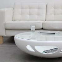
    Exemplifying the modern Russian aesthetic, Mikhail Belyaev‘s works explore a new design language in its pursuit for innovative furniture. Its projects are eccentric and draw attention through original and daring concepts. We love Pebble Table, a furniture piece that will impress you with its simple appeal. The Russian designer has has designed it for Karat and Samsung Staron, for St.Petersburg Design Week 2013. The table is as functional as it is beautiful: futuristic semi-oval round shape inspired from nature with a glass top that reveals a smartly integrated storage space.
    White-living-room-table

    The top transparency gives th item an unexpected lightness, while the glossy finish brightens any room. The compartment below the top-table can be filled up with almost anything, without becoming unesthetic. It is very interesting to observe from every standpoint the creative form. It features lateral gaps in the white material which fulfill both a functional and aesthetic role. With its sleek and minimalist design, it’s suitable for a wide range of interior design schemes, as well as for outdoor leisure rooms.Versatile, the Pebble table can be used as a coffee table or working surface too.

    White-coffee-table

    Round-coffee-table

    Modern-coffee-table

    White-modern-table

    Photos © Evgeny Aquarelich and Mikhail Belyaev

    Mini

  • CRYSTAL – Smart Interactive Light Installation with Hundreds LED Rocks

    CRYSTAL – Smart Interactive Light Installation with Hundreds LED Rocks

    Visitors of the LEXUS Hybrid Art exhibition in Morcow, Russia, had the possibility to see this beautiful and intriguing CRYSTAL artwork and play with light untill 22 August. We decided to share with you guys this amazing project because, like all the other projects ranging from fashion to architecture envisioned by Dutch artist and innovator Daan Roosegaarde, this one also explores the dynamic relation between technology, people and architecture. CRYSTAL is a smart interactive installation with a spacey design thanks to small luminous rocks that instinctively interact with movement.

    Crystal-by-Studio-Roosegaarde

    Seven-hundred LED rocks (variable sizes), that are wirelessly charged via a power mat are designed to create a sensual relation between people, light and technology. This unique site-specific installation  is like a “digital campfire”, where people can share their stories of light in a very public way. Every time they interact with the small LED rocks, they light up, looking like the new Lego from Mars, as Dutch artist Daan Roosegaarde said. The crystals can be added, moved or shared by visitors keeping them curious through their ever changing lighting behaviour from ‘excited’ to ‘bored’. Great interactive design for events or architecture! Check out also the other remarkable works of Studio Roosegaarde.

    Crystal-by-Studio-Roosegaarde-01

    Rock-of-light-by-Daan-Roosegaarde-02

    Crystal-Studio-Roosegaarde

    Rock-of-light-by-Daan-Roosegaarde

    Rock-of-light-by-Daan-Roosegaarde-01

    Photos © Studio Roosegaarde


    Daan Roosegaarde’s CRYSTAL artwork


  • Handcrafted Customizable Workspace for Creative People by Wiktoria Lenart

    Handcrafted Customizable Workspace for Creative People by Wiktoria Lenart

    Everyone has its own way of organizing his home work desk and it’s no longer a secret that we like to be as original as possible, to add a little bit of personal touch to the work environment as well. There are hundred of innovative design ideas on the furniture market nowadays, that you don’t know where to look first and what to choose.

    What we know for sure is that aesthetics and functionality are two main elements that goes hand in hand when we talk about home workspace. In this post, we’re presenting you an awesome project discovered on behance.net that draw immediately our attention. It’s called “WorkNest” and is envisioned by young Polish designer Wiktoria Lenart for those of you who are extremely creative and tend to become disorganized as they are more involved in everyday tasks.

    Wood-work-table-by-Wiktoria-Lenart

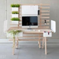
    Designed to improve working conditions, “WorkNest” is a handcrafted customizable desk system that allows you to be messy in an organized way. The idea was to create very simple elements that give the users the ability to control the seeming chaos that marks your desks,  but where everything still remains in its own place. The clean, modular design is made to echo the personality of its user, leaving you to choose between a minimalist desk and several storage structures.

    WorkNest consists of a base unit, a handmade ashwood surface, whose top is carved along the edges with long grooves. Plastic buckets and bent metal panels can be fitted into these to form book and supply containers, writing surfaces, and display boards. Best of all, the containers can be filled with potting soil to hold plants that will brighten up your work environment.  By moving these 15 different accessoires, you can easily addapt the workplace on your creative way, according to your needs. Whatever shape it takes, it will definitely become a great place to work from home, very appealing too. Amazing concept, don’t you agree?

    According to designer, WorkNest will be soon for sale, but it isn’t very sure yet if in a limited or permanent edition.

    WorkNest-detail
    WorkNest-with-accessories
    WorkNest-system-by-Wiktoria-Lenart-01
    Creative-WorkNest
    Modular-work-system
    Table-with-accessories
    Space-divider
    WorkNest-system-by-Wiktoria-Lenart
    Photos © Wiktoria Lenart

    WorkNest by Wiktoria Lenart


  • Versatile Alcove Sofa Family from Vitra

    Versatile Alcove Sofa Family from Vitra

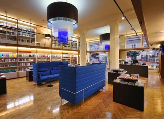
    It was not long ago that we discovered Vitra’s functional and inspiring products for homes, offices and public spaces, and we were pleased to see unique items along with some legendary concepts that marked the international furniture design. The products and concepts that the Swiss company Vitra are developing combines their engineering excellence with the creative genius of leading international designers, so the quality of the furniture items is undeniable, so here is our pick for today’s post: the remarkable Alcove sofa family created some while ago by French designers Ronan & Erwan Bouroullec.

    Alcove-Highback-Sofa

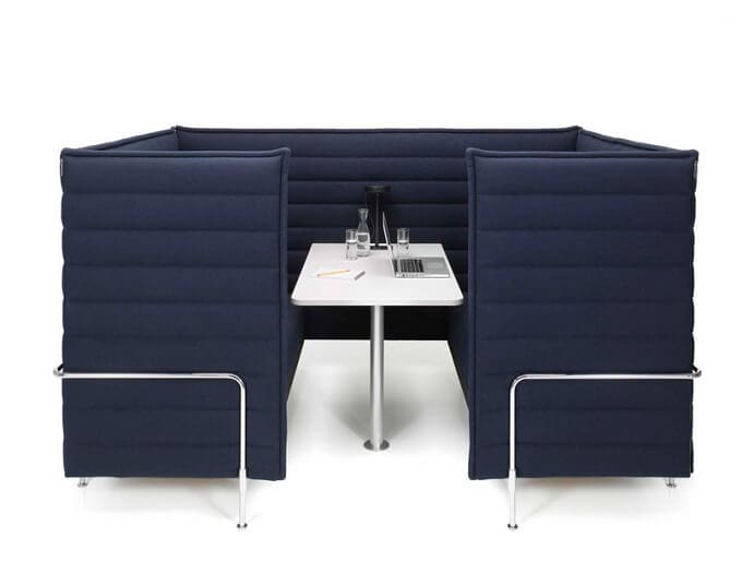
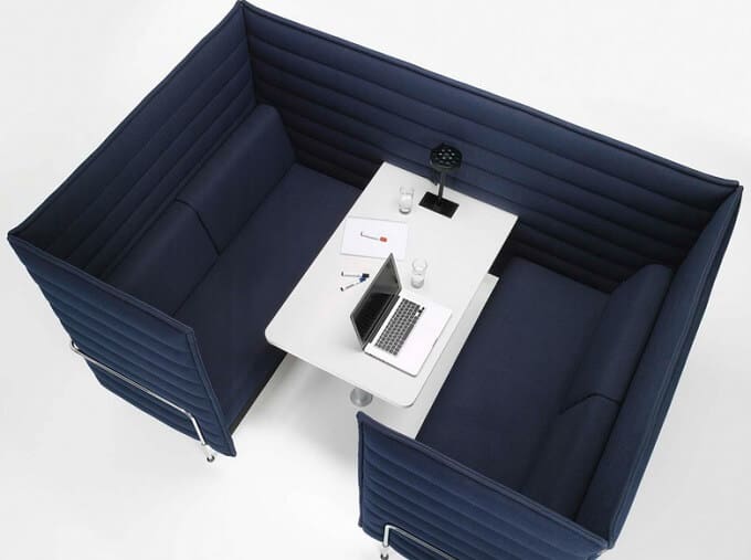
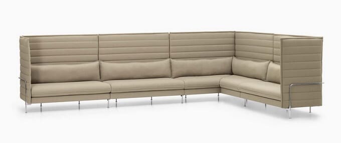
    With the aim to create furniture that adapts to people, and not the other way round, Ronan & Erwan Bouroullec came out with an innovative sofa concept -the “room within a room” – that they developed it together with Vitra. Starting from the idea that a sofa can go beyond a mere piece of furniture to become a room within a room, inside a home, designers imagined a solution that offers flexible, affordable, and comfortable space for use in home interiors as well as office environments: the Alcove Sofa.

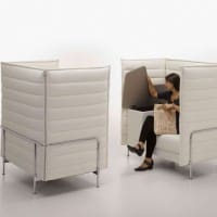
    Its design was initiated by the idea o mobile, micro-architectural elements and was inspired by the Arabic “al-qubba”, being a secluded, upholstered niche, envisioned for lounging, sleeping or private meetings. Alcove Sofa is seen as an environment of its own; both a security zone and a social place with many more advantages than a standard sofa. With a modern minimalist appearance, it features comfortable seat, backrest upholstery and  high, flexible side and back panels transforming it into a perfect retreat, spacious and without noise. For open-plan offices, it is the best alternative because it isn’t a permanent fixture ( can be relocated ) and is much more cost effective than making a separate partitioned meeting rooms with all the facilities they need such as lighting, air conditioning, etc.). Ideal for small meeting groups, for informal chats with your clients or brainstorming with your team, the Alcove sofa family consists of different sofa models with various trendy colors that can be easily combined to suit your needs. Below are some pictures with them. Take a look!

    Alcove-Highback-Sofa-02

    Alcove-Cabin


    Alcove-Cabin-Blue

    Alcove-Highback-System

    Alcove-Highback-Work

    Photos © Vitra

  • Orson Coffee Table, a Sanctuary for Your Coffee Cup

    Orson Coffee Table, a Sanctuary for Your Coffee Cup

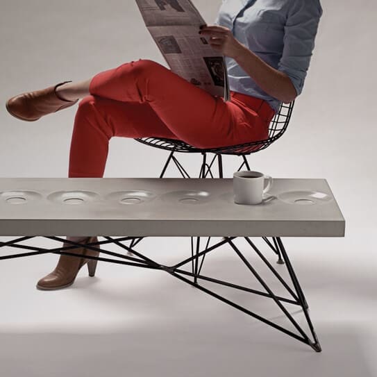
    “Life is too short to make ugly things,” believe designers from Hard Goods. If the cost isn’t the determining factor in a purchase for you, and you value design aesthetic, fine craftsmanship, and unwavering commitment to quality, then the timeless pieces in concrete, wood and steel from Brandon Gore may be what you’ve been looking for. Because the material plays a crucial role in design, those from Hard Woods uses the highest quality materials available, designing creative furniture objects built to last for today’s consumer culture.

    Coffee-table-design

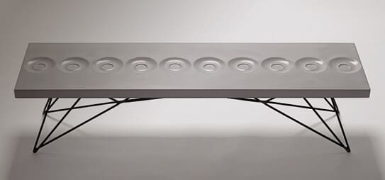
    Their work is the result of countless hours of prototyping, testing, and sometimes scrapping their plans and starting over. Made in the USA, their products are living entities that get better with time and use, showcasing a beauty that lies in the imperfection of natural materials they use. In this post, we want you to meet their Orson coffee table, an interesting, meticulously crafted piece where form and function go hand in hand. Made of highly-engineered composite concrete and raw steel with waxed finish for the legs, the Orson coffee table is definitely an object with a lot of personality that will be a great addition for your home.

    Like a sanctuary for you coffee cup, the table’s design features small holes in the shape of a plate like those for the coffee cup.  Each slab of composite concrete is sealed with a material that will not peel or yellow. In order to serve its purpose for years to come, the steel base is cut, fitted and welded by hand with the utmost care. The base is finished with a wax treatment that fosters a natural patina over time. The client has to options in terms of color for the concrete (Natural Grey and Limestone) and five options for the base color (Caterpillar Yellor Powder Coat, Forest Service Green Powder Coat, Hazard Orange Powder Coat, Lava Black Powder Coat and Glacier White Powder Coat). Besides its initial purpose, the Orson coffee table is great as a laptop workspace, the hub of a brainstorming session, or additional seating in a pinch.

    Coffee-table-design-by-Hard-Goods

    Photos © Hard Goods

  • Futuristic Table Lamp Design -Curl from Luceplan

    Futuristic Table Lamp Design -Curl from Luceplan

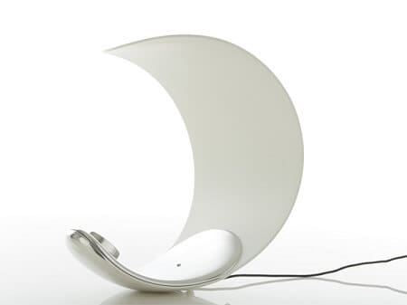
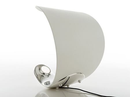
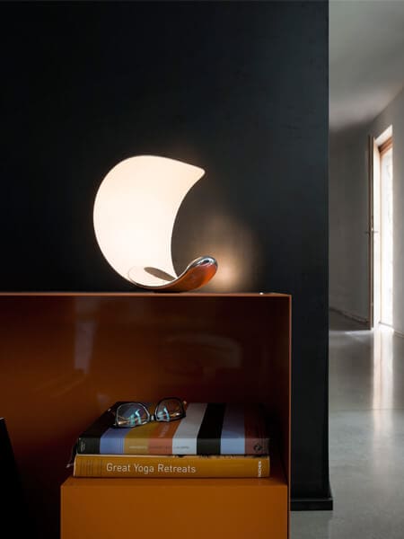
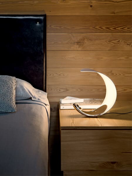
    Designer Sebastian Bergne created last year for Luceplan brand a striking lighting object that expresses complex design thinking where form and function are well balanced. This results into creative, highly original shape that seems to pay tribute to art and practicability in the same time.

    Curl-Lamp

    “Curl”, as it was entitled, is a table lamp with a futuristic design in the form of a half-moon for indoor use. The Curl lamp consists of a special LED module, that allow the user, through a simple rotation of the diffuser, to vary the temperature of the white light, from 2400 to 3500 degrees Kelvin. A dimmer function has also the switch at the center of the base. When the lamp isn’t lit, it’s a stylish white, semicircular object, but when it’s on, “Curl” is very bright, creating a diffused light in the rest of the room. The light, which comes from its base,  illuminates the body in die-cast aluminium, which acts as a reflector due to the opaque technopolymer injection molding. Very interesting, isn’t it?

    Curl-Lamp-01
    Curl-Lamp-02
    White-Curl-lamp
    White-Curl-light
    Photos © Luceplan
  • Bring the Outdoors in with New Zen Collection from Watermark Designs

    Bring the Outdoors in with New Zen Collection from Watermark Designs

    Synonymous with innovative faucet designs, Brooklin-based firm Watermark Designs has been the leading producer of decorative plumbing fixtures, lighting and elegant hardware, and bathroom accessories for the luxury commercial and residential segment, for more than three decades.

    Over time, they worked with some of the world’s finest designers and architects producing remarkable high-quality products and original collections specifically customized to meet client’s precise specifications. Their success is largely due to an intelligent combination of sustainable hands-on designs with an eye towards architectural detail, and state-of-the-industry equipment.

    Zen-rock-faucet-handle

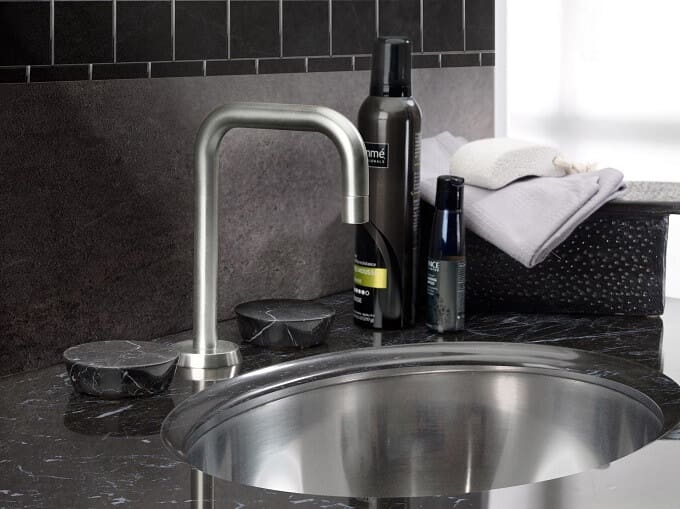
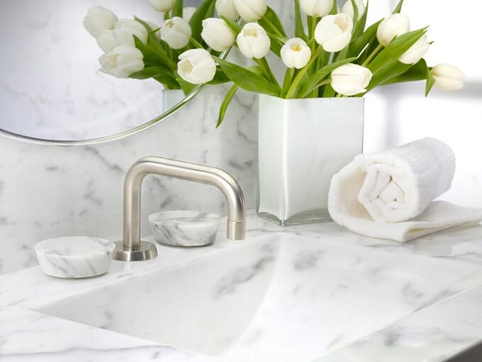
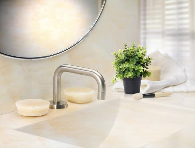
    Drawing inspiration from the surrounding nature, Watermark Designs pushes the edges of faucet innovation and design by enveiling their latest collection of faucet handles entitled “Zen Collection”. The original-looking collection is really something completely new in faucet design, because they were able to utilize rocks and stones in ways never used before.  It’s contains quartz faucet handles, carved by Stone Forest, and rocks hand-picked from the shores of  the Great Lakes in Michigan, ideal to create a spa-like bathroom interior, warm and very inviting. A favorite rock garden of Avi Abel’s was the inspiration in designing the appealing “Zen Collection”.

    Zen-rock-Lt-Harvest

    The idea was to make faucet handles that would be similar to the counter or vanity material as possible, to blend in beautifully that you almost could not tell where the vanity ended and the handles began, so rocks and stone were the perfect choice. The handles are secured to counters using rare earth magnets, eliminating in this way the need to use set screws and improving the look of these handles. Moreover, the shapes of the rocks are rather irregular, so this contributes even more to their organic and natural appearance they have. Therefore, the quartz stone handles seamlessly integrate into the look of the counter, thing that isn’t possible with a traditional brass or nickel handle.

    The “Zen Collection” of handles is available for any Watermark Designs faucet in any configuration, giving designers virtually hundreds of design options. The stones are available in the following colors: Ice White Onyx, Honey Onyx, Nero Marquinha, Carrara Marble and Multi-Color; while the rock colors are: Winter Morning, Harvest Light Beige, Mountain Midnight Dark and Harvest Dark.

    For more faucet designs with distinguished look, check out also the KLUDI BOZZ line.

    Zen-rock-Winter-Morning

    Zen-stone-Black

    Zen-stone-Carra

    Zen-stone-faucet-handel-Honey

    Zen-stone-faucet-handle-Ice-White

     Photos © Watermark Designs