Most bedrooms that feel empty actually have enough furniture — the real problem is that roughly 70% of their visual surface area is completely untreated, and no amount of throw pillows will fix that. If your bedroom feels too empty, the fix is rarely about buying more furniture — it’s about understanding which layers are missing and why. I’ve walked into hundreds of bedrooms over eleven years of design work, and the ones that made clients feel anxious or unsettled weren’t missing furniture. They were missing layers. Specifically: the architectural layer, the mid-height zone, and any evidence that someone had thought about visual weight distribution across the room. The fix almost never costs what people assume it does.
Quick Answer
Most bedrooms that feel empty actually have enough furniture — the real problem is that 70% of their visual surface area is completely untreated, and no amount of throw pillows will fix that.
Why Your Bedroom Reads as Empty Even When It Has Furniture
In This Article
There’s a specific kind of frustration that comes with a room that shouldn’t look empty but does. You’ve got a bed, a nightstand, maybe a dresser — the furniture is there — and yet the space feels like a waiting room in a budget hotel. The problem isn’t quantity. It’s the difference between a room that is physically furnished and one that is visually complete.
Most designers I’ve worked with estimate that the majority of rooms that feel empty already have enough furniture. The issue is scale and visual layering. And three root causes show up constantly — causes that almost no consumer-facing advice bothers to name.
The first is ceiling height perception. Rooms with ceilings above nine feet develop a visual vacuum in the upper third of the space. Standard furniture sits too low to fill it, and the eye registers all that empty vertical air as absence. The second is missing mid-layer objects — the zone between counter height and eye level (standing) that typically holds nothing in a sparse bedroom, making the room read as a collection of flat surfaces rather than a composed space. The third is uneven visual weight distribution, where all the visual mass clusters on one wall — usually behind the bed — and leaves the remaining three walls looking stripped.
Buying more furniture often makes this worse. Not better. I once watched a client spend $800 on a sectional-style bench for the foot of her bed, which blocked the room’s only clear sightline and made the space feel cluttered on one side and still empty on the other. The room needed redistribution, not addition.
Actionable takeaway: Before you buy anything, stand in your bedroom doorway and identify which of the three layers — architectural, furniture, or accessory — is actually broken. That diagnosis changes everything you do next.
How Do I Make My Bedroom Feel Less Empty?
The honest answer to this question is: it depends on which layer is failing, and most people skip the diagnosis entirely. When a bedroom feels too empty, the fix almost always lives in one of three specific places — and identifying which one saves you from spending money in the wrong direction.
Here’s a framework that actually works. Think of your bedroom as three distinct layers that need to function together before the room reads as complete:
- The architectural layer — walls, ceiling, floor. These are your largest surfaces. If they’re all bare, untreated, and uniformly lit, no amount of decorating on top of them will compensate.
- The furniture layer — your anchor pieces. This includes the bed, dresser, nightstands, any seating. These create the structure of the room.
- The accessory layer — texture, color, smaller objects, lighting variety, and groupings. This is where almost every sparse bedroom falls apart.
The accessory layer is consistently the most underdeveloped. Not because people don’t own things, but because the objects they own are either stored away, arranged without intention, or chosen without any sense of how they work together at different heights.
Here’s the diagnostic I use when standing at a bedroom doorway: a well-composed room should have visible elements at four distinct height zones — floor level, seated eye level, standing eye level, and near the ceiling. Most sparse bedrooms are missing at least two of these zones entirely. Usually it’s the floor zone (no rug, or a rug too small to register) and the near-ceiling zone (nothing draws the eye upward).
Ask yourself these questions from the doorway:
- Where does my eye go first, and is that intentional?
- Are there visible elements below knee height, at chest height, at face height, and above?
- Is any single wall completely bare from floor to ceiling?
- Can I identify four different materials or textures from where I’m standing?
If you answer “no” or “I’m not sure” to more than two of these, you have a layering problem — not a furniture quantity problem. Spending money without fixing the layering pattern first means the room will still read as empty after the purchase.
Actionable takeaway: Count your height zones from the doorway right now. If you’re missing two, that’s your starting point — not a shopping cart.
The 60-30-10 Rule for Bedrooms — and Why Most People Apply It Wrong
The 60-30-10 rule is one of those design principles that sounds simple and turns out to be genuinely tricky in bedrooms specifically. In theory, it works like this: 60% of a room’s color comes from the dominant color (usually walls), 30% from a secondary color (larger furniture, bedding), and 10% from accent colors (smaller objects, artwork, lighting). Color theory research consistently shows that rooms using this kind of intentional split are perceived as more complete and visually coherent — even when the total number of objects is identical to a monochromatic room.
The problem is that bedrooms blur these categories in ways other rooms don’t.
Soft furnishings — bedding, curtains, upholstered headboards, throw blankets — occupy enormous visual territory. A duvet can cover 40 square feet of visual surface. That means your bedding choice almost single-handedly determines your secondary color zone, whether you’ve thought about it or not. Most people choose bedding first, paint second, and then wonder why the room feels either chaotic or completely flat.
The second mistake is treating neutrals as non-colors. I’ve seen this so many times: a client insists their bedroom is “just neutral” — white walls, greige bedding, pale wood furniture — and doesn’t understand why it feels cold and unfinished. What they’ve created is a 90-10-0 split. Everything reads as one non-color. The 10% accent is either absent or too small to register, and there’s no secondary zone to create contrast. Flat. Sparse.
Here’s how to apply this rule starting from what you already have:
- Start with your bedding. Whatever color and texture that bedding reads as is your 30% zone. Work from there.
- Assess your walls as the 60% — if they’re white or near-white and your bedding is also near-neutral, you need at least one surface treatment that creates visible separation. A limewash paint effect, a textured wallpaper on a single wall, or even a substantial piece of artwork large enough to register as a secondary color zone can accomplish this without repainting four walls.
- Your 10% accent should appear in at least three different locations around the room — not just in one corner. One lamp, one small object on the dresser, and one element on the opposite nightstand creates the optical illusion of intention even when the objects themselves are simple.
The other place this rule breaks down is in rooms with very low natural light. In a north-facing bedroom or a room with a single small window, color ratios behave differently — darks read darker, and pale neutrals look washed out and flat rather than airy. If your bedroom feels too empty fix attempts have all failed in a low-light room, the problem is almost certainly that you’re applying color ratios designed for brighter spaces. In low-light bedrooms, the 30% secondary zone needs to be noticeably warmer or deeper than you’d instinctively choose — not dramatically dark, but enough to create contrast against the walls even under artificial light.
Actionable takeaway: Find your current split by standing in the doorway and roughly estimating what percentage of your visual field each color occupies. If two of your three zones look identical, you don’t have a 60-30-10 split — you have a 90-10 split and a room that will keep reading as sparse regardless of what you add to it.
The Surfaces Nobody Treats (And Why That’s the Real Problem)

This is the section that most bedroom decorating guides skip entirely, which is why so many bedrooms that follow standard advice still feel unfinished. When people think about treating surfaces, they think about walls. But in a bedroom, there are at least five distinct surface categories — and walls are actually the least likely to be the source of the empty feeling.
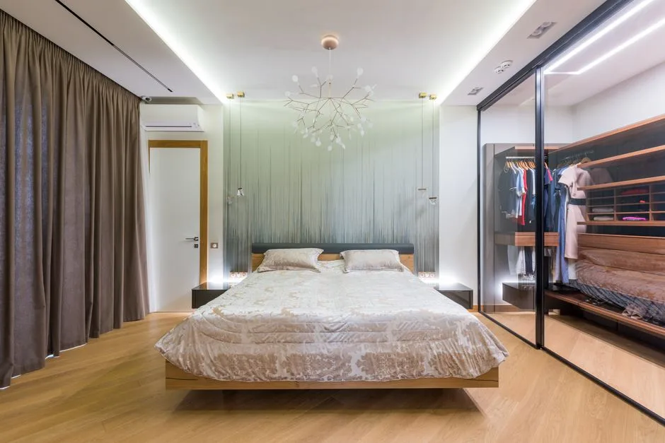
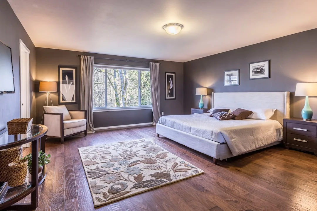
The floor. An under-rugged bedroom is one of the most common bedroom feels too empty fix situations I encounter. People either have no rug, a rug that’s too small (the most frequent error — a 5×8 under a king bed looks like a bath mat), or a rug with no visual weight. The floor in most bedrooms accounts for roughly 60-80 square feet of uninterrupted surface. That’s more visual territory than all four walls combined in a small room. A rug that’s sized correctly — at minimum, large enough that the front legs of all bedside furniture sit on it — anchors the entire room visually and eliminates the floating-furniture problem that makes beds look like they were placed arbitrarily.
The sizing rule I use: for a queen bed, a 8×10 rug is the minimum that reads as intentional. For a king, a 9×12 is the baseline. If you currently have anything smaller, that single change will do more for your room’s visual completeness than any amount of accessories placed elsewhere.
The ceiling. This surface is almost never treated in residential bedrooms, which means it’s almost always missed opportunity. You don’t need crown molding or coffered ceilings to address this — though both work well. A ceiling-hung light fixture with visual mass (not just a standard flush mount), a canopy treatment over the bed, or even a simple painted ceiling in a tone slightly warmer than the walls will activate that dead surface and reduce the visual vacuum effect in rooms with high ceilings.
The backs of doors and the window wall. Both of these are surfaces that get forgotten. The window wall in particular is often treated as a problem to solve (the window is there, so you hang curtains, done) rather than a design opportunity. Curtains hung at ceiling height rather than window height can add twelve to eighteen inches of visual height to a room without any structural change. Hanging them wide — beyond the window frame on both sides — makes the window read as larger and floods the wall with fabric texture that addresses the empty-wall problem without adding anything to the walls themselves.
The space above furniture. The most stripped-looking bedrooms I’ve seen aren’t bare on the walls generally — they’re bare in the zones directly above furniture. A dresser with nothing above it, a nightstand with only a lamp, a chair in the corner with empty wall behind it. These gaps create what I think of as “furniture islands” — pieces that look placed rather than composed. Filling the space above furniture with something — a mirror, a grouping of small frames, a single oversized print, a wall sconce — connects the furniture to the wall and makes the room read as curated rather than arranged by default.
Actionable takeaway: Walk your bedroom and count the surfaces that have received zero intentional treatment. Every untreated surface is contributing to the empty feeling more than any missing object could.
Lighting Is a Layer, Not a Fixture
Most bedrooms have one overhead light and one lamp per nightstand. That’s not a lighting scheme — that’s a starting point that most rooms never move beyond. And it’s one of the main reasons that bedrooms which look reasonably complete during the day feel flat and institutional at night.
The problem with relying on overhead lighting is that it flattens space. Ceiling fixtures cast light downward uniformly, which eliminates the shadows and gradations that give a room visual depth. A bedroom lit only from above will look the same at 10pm as it does at 2pm on a cloudy day — which is to say, slightly clinical. That flatness reads as emptiness even when the room has adequate furniture and accessories, because the objects in the room lose their three-dimensionality under uniform overhead light.
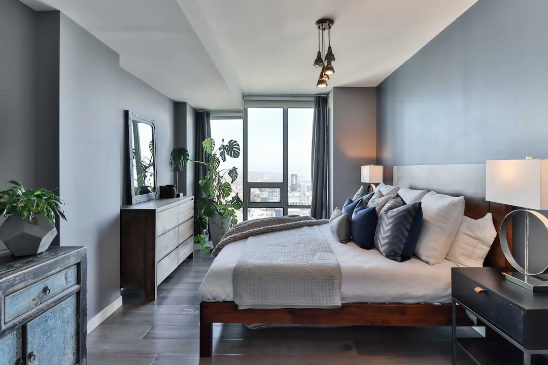
Effective bedroom lighting works in layers, the same way effective decorating does. You need at least three distinct light sources at different heights:
- Ambient light — the overhead source, ideally on a dimmer. This is the fill light that lets you navigate the room, not the primary mood-setter.
- Task light — the nightstand lamps or wall-mounted sconces at bedside. These serve a function, but their shade shape, material, and positioning also affect how the room reads. A linen shade diffuses light warmly and contributes to texture. A clear glass base adds material variety without visual weight.
- Accent light — a floor lamp in a corner, a small table lamp on a dresser, LED strip lighting behind a headboard, or a picture light above artwork. This is the layer almost every sparse bedroom is missing. Accent lighting creates pools of light and shadow that make the room feel inhabited and deliberate, even in areas that aren’t actively being used.
The second lighting issue in sparse bedrooms is color temperature. Bulbs in the 2700K-3000K range (warm white) make walls, wood tones, and textiles read as richer and more present. Bulbs in the 4000K+ range (cool white or daylight) flatten warm tones and make neutral bedrooms look even more washed out. If you’ve never checked the Kelvin rating on your bedroom bulbs, that’s worth doing before anything else — it’s a five-dollar fix that changes how every surface in the room reads after dark.
Actionable takeaway: Count your light sources tonight with only the overhead light off. If the room goes dark or feels unlivable with just the non-overhead sources on, you don’t have enough lighting layers. Add one accent light source before adding any decorative objects — it will make everything else in the room look better immediately.
FAQ: Bedroom Feels Too Empty
Q: My bedroom has furniture but still looks bare. Where do I start?
Start with the diagnosis, not the shopping. Stand in your doorway and identify which of the three layers is broken — architectural (walls, floor, ceiling), furniture (anchor pieces), or accessory (texture, objects, lighting variety). Most rooms that feel empty despite having furniture are missing the accessory layer or have undertreated surfaces — specifically the floor and the zones above furniture. Fix the rug size first if yours is undersized, then address the wall above your bed, then assess your lighting. That sequence solves the majority of sparse bedroom problems before you spend anything significant.
Q: How do I fix a bedroom that feels empty without spending a lot of money?
The highest-impact, lowest-cost changes are almost always: rearranging what you already own to address height zones (move objects from hidden storage to visible surfaces at varied heights), swapping lightbulbs to a warmer color temperature (2700K-3000K), and adding a throw blanket folded over the foot of the bed or a chair. A correctly sized rug is one of the few purchases that genuinely transforms a room, and it doesn’t have to be expensive — a flat-weave rug in the right dimensions does more for a sparse bedroom than a designer rug in the wrong size.
Q: Why does my bedroom feel empty even though I have a lot of stuff in it?
This usually means you have a distribution problem rather than a quantity problem. Objects clustered in one area — typically on or around the bed — leave the remaining walls and floor zones visually empty. A room where 80% of the visual interest is concentrated on the headboard wall will feel sparse on three sides regardless of how layered the bed itself looks. Take inventory of where your objects are physically located and redistribute at least one element to each wall.
Q: What’s the single most effective thing I can do when a bedroom feels too empty? Is there a fix that works for almost every room?
If I had to name one universal bedroom feels too empty fix, it would be addressing the wall above the bed with something that has genuine visual scale. Not a small piece of art, not two tiny floating shelves — something with presence. A large-format print (at minimum 24×36 inches for a queen bed, larger for a king), a grouping of frames treated as a single unit, a fabric wall hanging with texture, or a statement mirror. The wall above the bed is the visual anchor point of the entire room. When it’s bare or undertreated, the eye has nowhere to land and the room reads as unfinished no matter what’s happening elsewhere.
Q: Does a bedroom need curtains to not look empty?
Not strictly, but untreated windows are one of the most reliable contributors to the sparse bedroom look — not because curtains are required, but because windows without any treatment leave a significant surface (the window wall) looking unresolved. The more effective question is whether your windows are visually addressed. Roman shades, curtain panels, woven wood blinds — any of these work. The specific rule that makes the biggest difference is hanging whatever window treatment you choose at ceiling height rather than window height, and extending it wide enough on both sides that the fabric frames the window rather than merely covering it. That one adjustment makes a window wall read as designed rather than defaulted.