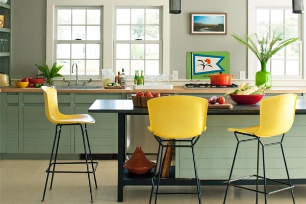
Breakfast bar stools are the ideal seating solution for many homes and kitchens. They can serve your home not just as a functional item of furniture but as part of the décor, enhancing the overall effect of your kitchen’s design. However, choosing the right stools for your own, unique home and kitchen can be a challenge. In particular, it is hard to determine exactly which colour and style you could choose to create the greatest, most impactful visual and aesthetic effect.
There are a number of things you should consider when deciding what colour kitchen stools to purchase for your home.
Does it Really Matter?
The short answer to this question is “yes.” However, that doesn’t mean the question is not one that’s worth considering. When presented with a dazzling array of different colour and style options and struggling to choose between them, you can start to wonder how big a difference your colour choice will really make.
However, breakfast bar stools tend to boast much more eye-catching and delightful designs than most other kinds of seating, and because they will be in regular use they will probably attract a lot of attention. While this is essentially a good thing, it does mean that they will probably become a specific feature of your décor whether you like it or not. Choosing the right colour will make sure they add to your kitchen rather than detract from it. That said, nobody is claiming that colour is the single most important thing to consider. A well-chosen design in the second most suitable colour may well look better than a mediocre design in exactly the right colour.
Other Colours
In figuring out which colours actually will work in your kitchen, you will need to consider which colours are already present. This could mean the colour of the worktops, the cupboard doors and drawers, the walls, or even any very prominent appliances.
There are essentially two routes you can take in choosing stool colours to go with the colours that are already present in your kitchen. The first, which is probably the one that occurs most readily to a lot of people, is to choose matching or complementary colours. These will be the same colours or very similar shades, or else closely related colours that look very at-home together. The other, sometimes overlooked option is to go with a completely contrasting colour. This doesn’t work with 100% of combinations, but it will usually look good and a little bit of mental picturing will probably be enough to tell you whether a particular combination will work well or not. A complete contrast helps different elements to stand out against each other, and avoids the danger of two shades that look like they have not quite been successfully matched.
About Author: Changiz Oskouiefar is an entrepreneur who runs an office furniture sales and supply company. This article was written on behalf of Furniture Bay

