Getting your conversation area living room setup right is the difference between a room where people linger for hours and one where guests make polite excuses by 9pm — and most people never realize the furniture is the reason.
Quick Answer
Most living rooms are accidentally designed to make people stop talking — and the sofa against the wall is only the beginning.
I spent eleven years rearranging living rooms for a living, and the pattern I kept seeing was this: people would describe their space as “not quite working” without being able to say why. The conversation felt forced. Guests left earlier than expected. Nobody lingered. And almost every time, the problem wasn’t the furniture they’d chosen — it was where they’d put it, and what they’d forgotten entirely.
This isn’t about aesthetics. A room can look beautiful in photographs and still feel like a waiting room when you’re actually sitting in it. The conversation area living room setup is a functional problem first, and a visual one second. Get the function wrong and no throw pillow on earth will fix it.
These nine mistakes are the ones I saw most often — across studio apartments in Wicker Park, sprawling brownstones in Brooklyn Heights, and every square footage in between.
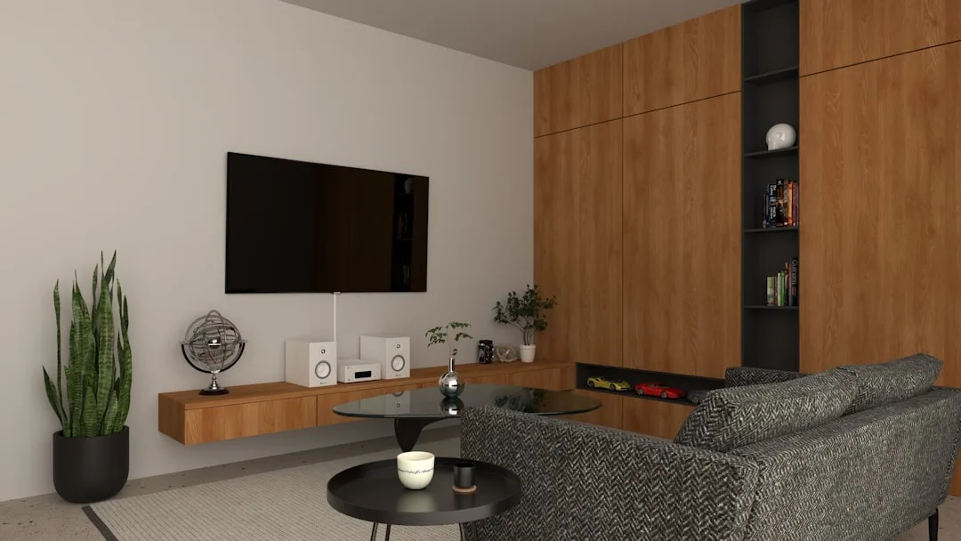
Mistake #1: Anchoring Every Seat to the TV Instead of Each Other
In This Article
- Mistake #1: Anchoring Every Seat to the TV Instead of Each Other
- Mistake #2: Placing the Sofa Flat Against the Wall
- Mistake #3: Choosing a Coffee Table That’s Too Far Away to Use
- Mistake #4: Not Having Enough Seats for the Group You Actually Host
- Mistake #5: Ignoring the Conversation Diameter
- Mistake #6: Getting the Rug Size Wrong
- Mistake #7: Blocking Natural Traffic Flow Through the Space
- Mistake #8: Treating Lighting as an Afterthought
- Mistake #9: Forgetting That Every Seat Needs a Surface
Here’s something most people never consciously notice: the moment you walk into a room, your eyes find the dominant focal point and your body orients toward it. In most living rooms, that focal point is a television mounted at eye level on the primary wall — and every piece of seating has been positioned to face it directly.
The room has been designed for an audience. Not for a gathering.
Research from environmental psychology shows that people seated at 90-degree angles to each other converse roughly 40% more than those seated side-by-side facing the same direction. Think about that for a moment. The physical angle between two people isn’t just geometry — it’s a signal about what the room expects you to do. Side-by-side says watch. Angled toward each other says talk.
The TV should occupy a secondary focal point in any room meant for conversation, not the primary axis around which every chair and sofa orbits. The primary focal point should be something that draws people inward — a fireplace, a window with a view, a piece of art hung at conversation height, or simply the center of the seating group itself.
To test whether your current setup is TV-dominated, try this: sit in your sofa and look straight ahead. Is the TV directly in your sightline, or do you have to turn slightly to see it? If it’s dead center, your room is a theater. If you have to make a small turn, you have a conversation room that also has a TV. That distinction matters more than it sounds.
Creating a dual-focal-point room isn’t complicated — it mostly requires accepting that the TV doesn’t need to be front and center. Mount it on a side wall, place it in a cabinet that closes, or angle it so it’s accessible from the seating group without commanding it.
Actionable takeaway: Do the sightline test today. If your TV is directly forward-facing from your primary sofa, identify one other wall or corner where it could live instead — even moving it 45 degrees changes the dynamic of the entire room.
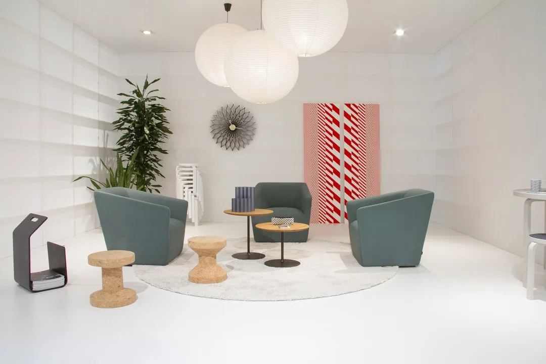
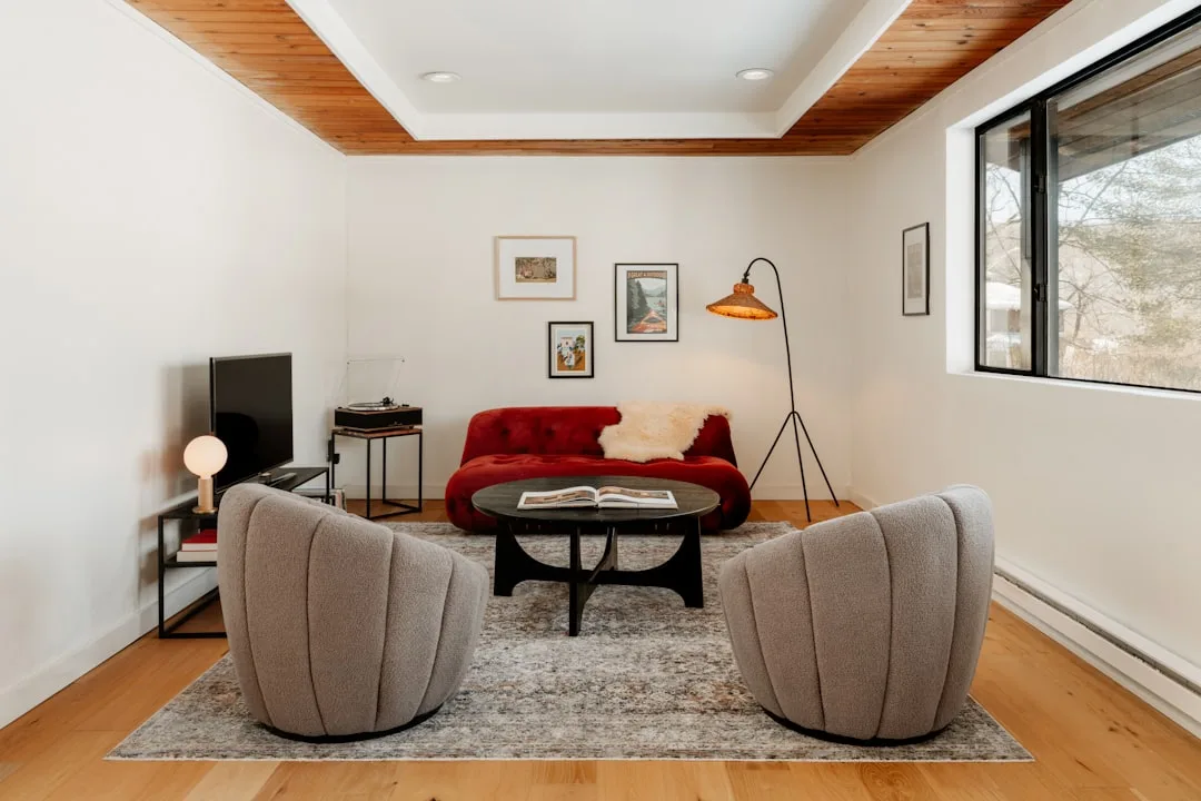
Mistake #2: Placing the Sofa Flat Against the Wall
Every client I’ve ever worked with started in the same place: sofa shoved against the wall, chairs shoved against the opposite wall, coffee table floating in the dead center of the gap like a raft. When I’d ask why, the answer was always some version of “to save space.”
It doesn’t save space. It destroys it.
What pushing furniture to the walls actually does is create a dead zone in the middle of the room — a wide, empty expanse that nobody crosses, nobody uses, and nobody feels comfortable in. The perimeter feels crowded. The center feels abandoned. And the people sitting in the room are as far apart from each other as the room will physically allow.
Interior designers consistently recommend floating furniture a minimum of 18 inches from the wall — and the reason isn’t aesthetic, it’s spatial psychology. When you pull a sofa off the wall, even by 18 to 24 inches, you create visual depth behind it. The room reads as larger, not smaller. More importantly, you pull the seating group inward, which closes the gap between people.
The technique I used most often was what I call float and anchor. Pull the seating away from the walls, then anchor the entire group with a rug underneath. The rug defines the zone — it signals to anyone looking at the room that this cluster of furniture is intentional, that it belongs together, that it is a place rather than a collection of objects.
There is one legitimate exception to this rule: rooms under roughly 120 square feet, where floating furniture actually does eat into the usable floor space in a way that matters. In a very small room, wall-adjacent placement is sometimes necessary — but even then, keeping one piece (usually a single accent chair) pulled slightly inward maintains some of the conversational pull.
Actionable takeaway: Pull your sofa 18–24 inches off the wall and live with it for a week. If you have a rug, make sure it extends under the front legs of the sofa — more on that in Mistake #6. Most people never move it back.
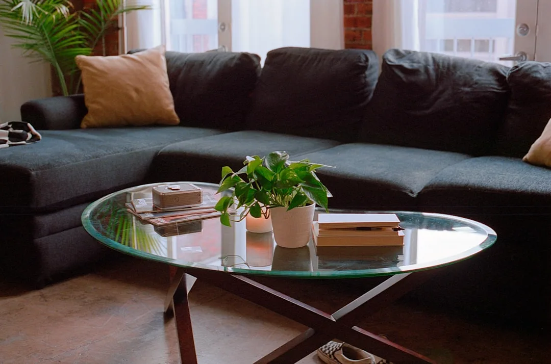
Mistake #3: Choosing a Coffee Table That’s Too Far Away to Use
Nobody talks about coffee table distance, and I think it’s because the coffee table doesn’t seem social. It’s just a surface. But I’ve watched what happens in rooms where the table has been pushed too far from the sofa — guests lean back, their arms cross, they stop reaching forward, and within about fifteen minutes the whole energy of the group shifts toward passive rather than active.
The reason is ergonomic, not psychological. When something you need is out of easy reach, your body registers mild, low-level frustration. You can’t set down your drink without a small effort. You stop gesturing toward the center of the table. You retreat. The standard ergonomic guideline places coffee table height within 1–2 inches of sofa seat height — typically 16 to 18 inches — so that items on the surface are reachable without bending uncomfortably. But height is only half of it.
The gap between the front edge of your sofa and the edge of the coffee table should be 14 to 18 inches. That’s the sweet spot. Close enough that you can reach your glass without leaning far forward. Far enough that you can stand up without banging your shins. I’ve measured hundreds of living rooms and the single most common error is tables positioned 24 to 30 inches out — which sounds like a small difference until you actually try to use the space.
Shape also matters more than most people think:
- Round tables work best for smaller groups of two to four people because they eliminate corners that block sightlines and movement
- Rectangular tables serve longer sofas and larger groups, providing more surface area distributed evenly across the seating group
- Oval tables split the difference — the rounded ends reduce shin collisions and improve traffic flow while still offering the linear surface length of a rectangle
- Nesting tables are underrated for flexible setups: keep them stacked when the room is open, pull them apart when the group expands
- Ottoman-style tables with a tray on top work especially well in rooms where people also put their feet up — the softness lowers the room’s formality, which tends to loosen conversation
Actionable takeaway: Measure the gap between your sofa and coffee table right now. If it’s over 18 inches, push the table closer. If your table is much taller or shorter than your sofa seat, it’s worth replacing — mismatched heights cause more subtle discomfort than most people realize.
Mistake #4: Not Having Enough Seats for the Group You Actually Host
This one sounds obvious until you see how often it gets ignored. A living room set up for two to three people — one sofa, one accent chair — will consistently produce awkward gatherings the moment a fourth or fifth person arrives. Someone ends up on a dining chair dragged in from another room. Someone perches on the arm of the sofa. Someone stands near the bookcase and never quite joins the group.
The person standing near the bookcase leaves first. Every time.
A proper conversation area living room setup accounts for the realistic size of the gatherings you actually host, not just the number of people who live there. If you regularly have four to six people over, your seating plan needs to support four to six people — all of them at roughly the same level, all of them within the conversation circle.
The benchmarks I worked from:
- 2–3 people: One sofa plus one accent chair, angled inward
- 4–6 people: One sofa plus two accent chairs, or one sofa plus a loveseat, arranged in a U or L shape
- 6–8 people: Two sofas facing each other, or one large sectional with additional pull-up seating nearby
- 8+ people: Two distinct conversation clusters rather than one oversized group — conversations become unwieldy past eight people in a single circle anyway
The most practical solution for most homes is a pair of accent chairs that store easily and can be pulled into the main group when needed. They shouldn’t live in a bedroom or a garage — they should be in or near the living space, ready to deploy within thirty seconds.
Actionable takeaway: Count the comfortable seats in your current setup. If that number is lower than the average size of your gatherings, identify where two additional seats could live when not in active use.
Mistake #5: Ignoring the Conversation Diameter
There’s a number that experienced designers refer to constantly and most homeowners have never heard: the conversation diameter. It refers to the maximum distance across a seating group within which people can comfortably talk at normal volume without raising their voices or straining to hear.
That number is roughly 8 feet — 96 inches — from one side of the group to the other.
Beyond 8 feet, something subtle happens. People start speaking louder. The effort required to maintain a conversation increases. Side conversations break out between people who are physically closer to each other. The unified group fragments into smaller clusters — which can be fine at a party, but is usually unintentional in a living room setup.
Common ways the conversation diameter gets broken:
- Oversized sectionals that seat eight people in a horseshoe too wide to talk across
- Two sofas placed on opposite walls in a large room, with 10 or 12 feet of gap between them
- A single sofa facing two chairs where the chairs have been pushed back toward the wall, widening the triangle to the point of strain
- Large coffee tables that push seating outward to maintain clearance, inadvertently expanding the group’s footprint past the comfortable limit
The fix is usually simpler than people expect: measure the widest point of your seating group and see whether it exceeds 8 feet. If it does, pull things inward. A large sectional can sometimes be broken apart and reconfigured. Two facing sofas can be moved closer together. The conversation diameter is a constraint worth respecting.
Actionable takeaway: Measure the widest point of your current seating arrangement. If it’s over 96 inches, identify which pieces can move inward without blocking traffic flow.
Mistake #6: Getting the Rug Size Wrong
The rug is the single most commonly undersized element in a living room, and getting it wrong doesn’t just look off — it actively undermines the cohesion of your conversation area living room setup.
A rug that’s too small does something specific and damaging: it makes the furniture look like it’s floating around an island rather than anchoring a unified space. Visually, the seating group loses its sense of belonging together. Psychologically, people read the room as unresolved — and unresolved spaces make people uncomfortable in ways they can’t articulate.
The standard rule is that all front legs of all major seating pieces should sit on the rug. Not all four legs — just the front ones. This creates the anchoring effect without requiring a rug so large it covers the entire floor.
Size guidelines by room dimension:
- Rooms up to 12×15 feet: 8×10 rug minimum
- Rooms 14×18 feet or larger: 9×12 rug minimum
- Open-plan spaces: Size the rug to the conversation zone, not the room — the rug defines where the living area ends and the rest of the space begins
The second rug mistake — less common but equally damaging — is placing all four legs of all furniture pieces fully on the rug. This only works if the rug is large enough to carry it visually, which usually means a rug that costs significantly more than most people want to spend. Front legs only is the accessible version of the same principle.
Actionable takeaway: Check your current rug against the front-legs rule. If the rug is too small to get the front legs of your sofa onto it, the rug needs to be replaced — not the furniture.
Mistake #7: Blocking Natural Traffic Flow Through the Space
A conversation area fails not just when people are uncomfortable sitting in it, but when people are uncomfortable getting to it. Traffic flow is the invisible architecture of a room — the paths people naturally want to take from the entrance to the seating, from the seating to the kitchen, from the kitchen back to the entrance — and when furniture blocks those paths, it introduces friction that most guests experience as vague unease.
The practical standard is a minimum of 36 inches for a primary traffic path — the main route through the room. Secondary paths, used less frequently, can narrow to 24 inches. Anything under 24 inches and people start turning sideways, excusing themselves, feeling like they’re imposing on the room.
The most common blocking mistakes:
- An accent chair placed directly in the path from the entry to the sofa, forcing guests to route around it before they’ve even sat down
- A large ottoman or oversized coffee table that cuts off the natural path between the sofa and the dining area
- A floor lamp positioned in a walkway because the only outlet is on the wrong wall
- A console table behind the sofa that, combined with the sofa’s floating position, narrows the path behind to less than 18 inches
Walk the path from your front door to your sofa right now. Count your steps. Notice whether you route around anything, squeeze past anything, or automatically take a diagonal path that avoids something. Each of those moments is a friction point — and friction accumulates into the unnamed feeling that a room “doesn’t quite work.”
Actionable takeaway: Walk every traffic path in your living room and measure any point that feels tight. Primary paths need 36 inches. If something is blocking that clearance, it needs to move — even if you love where it is.
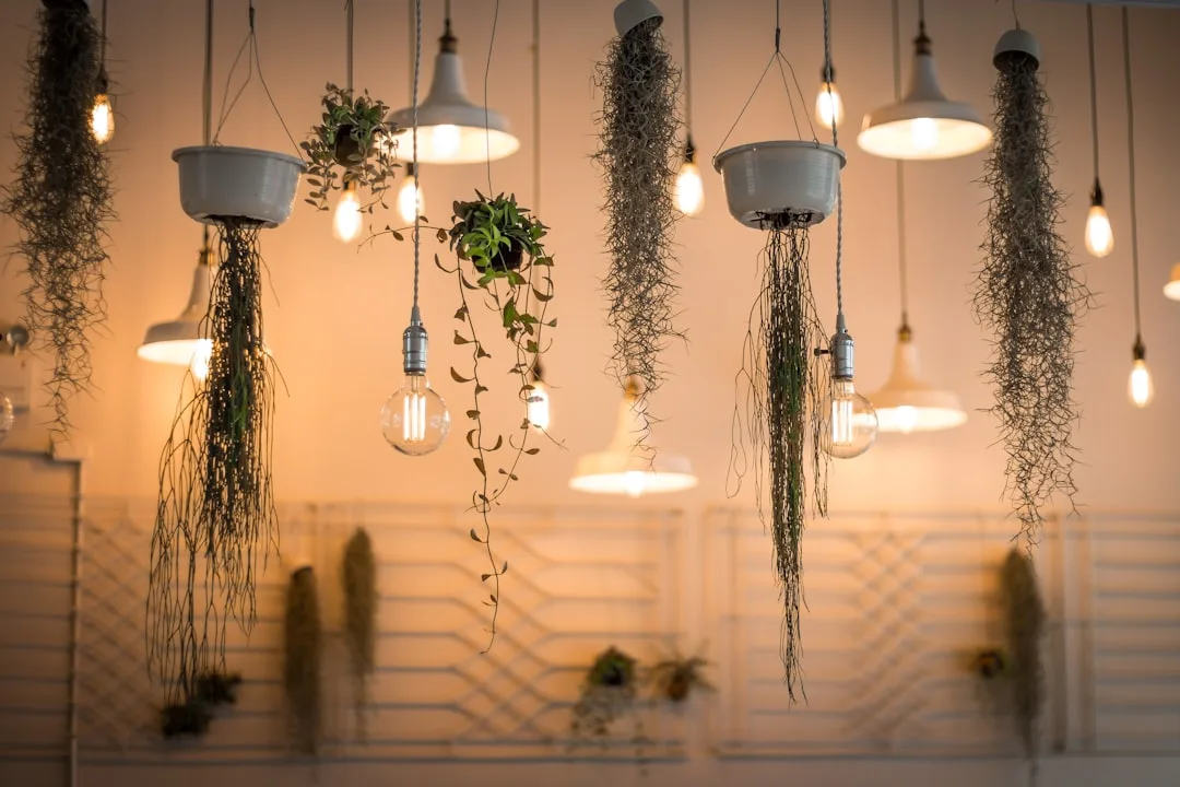
Mistake #8: Treating Lighting as an Afterthought
Overhead lighting — a single ceiling fixture, a recessed grid, a flush-mount in the center of the room — is designed for utility. It illuminates the space evenly, which is useful when you’re cleaning or looking for your keys, and actively hostile to conversation.
Flat, even, overhead light flattens faces. It eliminates shadow and depth. It makes people look like they’re being interviewed rather than relaxing at a gathering. And beyond the visual effect, bright overhead light keeps the nervous system in a state of alertness — the same biological response that bright light triggers in the morning to wake you up. You are, quite literally, keeping your guests awake and alert when you want them to be relaxed and open.
The principle that works is layered lighting at conversation height:
- Table lamps on side tables within the seating group, positioned so the light source sits at roughly seated eye level
- Floor lamps positioned behind or beside accent chairs to create warm pools of light
- Candles or low-profile decorative lighting at coffee table height for the lowest, most intimate layer
- Overhead fixtures on a dimmer so they can be dropped to 20–30% in the evening, providing ambient fill without dominating the room
The target color temperature for a conversation area is 2700K to 3000K — warm white, not cool white or daylight. Cool-toned bulbs (4000K and above) read as clinical and keep the energy of the room functional rather than social.
Actionable takeaway: Check whether your primary living room fixtures are on a dimmer. If not, that’s a one-hour electrician job that will change how every evening gathering in your home feels. In the meantime, turn off the overhead and use only lamps for your next gathering.
Mistake #9: Forgetting That Every Seat Needs a Surface
This is the mistake that reveals itself only during an actual gathering, which is why it’s so easy to overlook during the planning stage. Every person sitting in your conversation area needs somewhere within easy reach to put a drink, set down a phone, or rest a book. If they don’t have that surface, they hold their drink the entire time — and holding a drink for two hours is exhausting in a way that makes people want to leave.
Watch what happens at a gathering where surfaces are scarce: people clutch their glasses, look for places to set them down, feel vaguely tense without knowing why. The person who can’t find a surface for their drink is the person who says “I should probably get going” at 9:15.
The seating-to-surface ratio I used as a baseline: one reachable surface for every 1.5 seats. In a group of six, that means four surfaces distributed around the group. They don’t all need to be formal side tables — the options are wider than most people think:
- Traditional side tables at arm height, positioned at the ends of sofas and beside accent chairs
- C-tables that slide under the sofa arm, useful when there’s no floor space for a full side table
- Ottomans with tray tops that serve double duty as footrests and surface space
- Stacked books or decorative trays on a low shelf nearby — informal, but functional
- The coffee table itself, which counts as a surface for the people seated close enough to use it comfortably
The failure mode here is a living room where the only horizontal surface is the coffee table. Six people, one surface, nobody close enough to use it except the two people on the main sofa. Everyone else is holding their drink for the duration.
Actionable takeaway: Count the reachable surfaces in your seating group. Divide by the number of seats. If the ratio drops below one surface per two people, add a C-table or side table before your next gathering — they’re inexpensive and the difference is immediate.
FAQ
What is the ideal size for a conversation area in a living room?
The most functional conversation areas are sized so that no two people sitting across from each other are more than 8 feet apart. That’s the maximum comfortable talking distance at a normal speaking volume. The minimum usable conversation circle — for two to three people — can work in as little as a 10×10 foot zone, provided the furniture is scaled appropriately and the traffic paths around the outside remain clear. For four to six people, a 12×14 foot zone is more workable.
How do I set up a conversation area in an open-plan living room?
In an open-plan space, the conversation area living room setup depends entirely on definition rather than walls. Use a large area rug to establish the boundary of the zone — it signals where the living area begins and ends without any physical barrier. Float the furniture off the walls and angle pieces inward toward each other. The rug, the furniture arrangement, and consistent lighting work together to create a sense of enclosure even in a space with no enclosing walls.
Can a sectional sofa work in a conversation area?
Yes, but with a specific caveat: the sectional needs to be sized so that the widest point of the seating group doesn’t exceed 8 feet across. Many large sectionals seat eight or more people in a horseshoe configuration that’s 10 to 12 feet wide — too wide for comfortable conversation across the center. If you have a large sectional, consider whether the chaise or extended portion is actually used for sitting during gatherings, or whether it mainly functions as a surface. If the latter, it may be worth replacing with a smaller configuration plus two moveable accent chairs.
How many seats do I actually need in a living room conversation area?
Design for the realistic size of the gatherings you host most often — not the largest gathering you can imagine hosting, and not just the number of people who live there. For most households, a setup that comfortably seats four to six people covers the majority of real-life use cases. Beyond six, consider creating two adjacent conversation clusters rather than one large group, since conversations above eight people tend to fragment naturally anyway.
Why does my living room feel uncomfortable even though it looks good in photos?
Photographs flatten space and remove the lived experience of being in a room. A space can be visually balanced in a photograph while still having furniture placed too far apart for comfortable conversation, surfaces too few for guests to set down drinks, lighting too harsh for a relaxed evening, or traffic paths that create friction every time someone moves. The conversation area living room setup is a problem of use, not appearance — the test isn’t how the room photographs, it’s how long people want to stay in it.