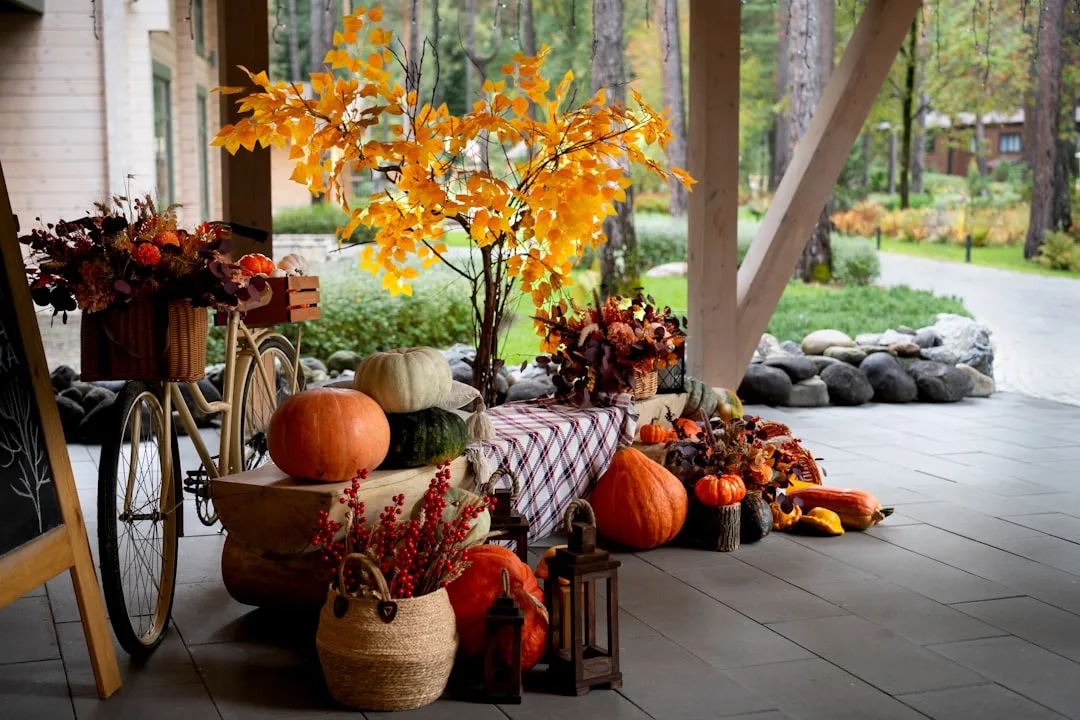
Entry table fall decor is the only category where I consistently watch people with genuinely good taste abandon everything they know about composition — and the entry table is the only surface in your home that every single visitor sees. Most people decorate it for fall by placing three pumpkins on it and calling it done.
Quick Answer
The entry table is the only surface in your home that every single visitor sees — and most people decorate it for fall by placing three pumpkins on it and calling it done.
I spent eleven years watching this happen. Clients who had genuinely good taste in every other room would walk me to their entryway and gesture at a cluster of decorative gourds like they’d fulfilled some seasonal obligation. The table wasn’t styled. It was populated. There’s a meaningful difference, and by the time you’re finished reading this, you’ll be able to feel that difference without me explaining it again.
This guide isn’t about inspiration images. It’s about understanding why entry tables fail — and building yours from the back layer forward so that the first thing anyone sees when they enter your home in September, October, or November actually earns its place.
Why Most Fall Entry Tables Fall Flat (And How to Fix the Root Cause)
In This Article
- Why Most Fall Entry Tables Fall Flat (And How to Fix the Root Cause)
- The Fall Color Architecture That Actually Works on an Entry Table
- Building the Back Anchor: Tall Elements That Frame the Whole Vignette
- The Mid-Interest Layer: Where Fall Entry Table Decor Gets Its Atmosphere
- The Front Story: Small, Personal, Specific
- Transitioning Your Entry Table Fall Decor Through the Season
- The Objects You Already Own That You’re Probably Ignoring
Eight seconds. That’s roughly how long it takes a person to form an emotional impression of an interior space — and that figure comes from environmental psychology research that’s been replicated across hospitality, retail, and residential design contexts. Your entryway doesn’t get a paragraph to make its case. It gets a sentence.
Most people fail the entryway not because they chose the wrong objects, but because they arrange whatever they own horizontally across the surface without any regard for visual hierarchy. Three pumpkins in a row. A candle next to a vase. A small wreath propped against the wall. Each object competes for attention at exactly the same height, the same visual weight, the same distance from the eye — and the result reads as clutter regardless of how individually lovely each piece might be.
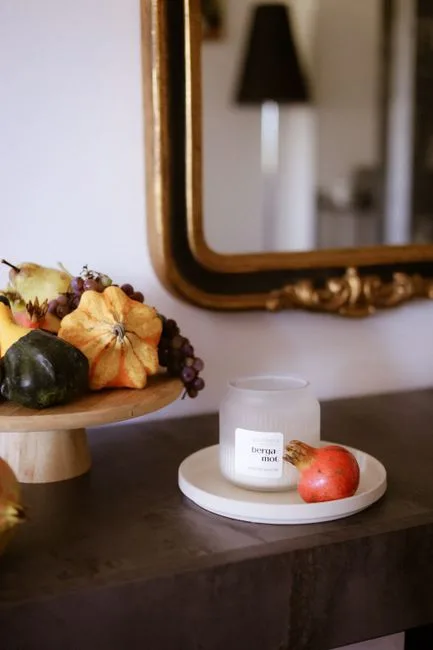
The fix is the 3-zone framework: back anchor, mid-interest layer, and front story. These three zones operate at different heights, different scales, and different levels of personal detail. The back anchor is tall and structural — it frames everything. The mid-layer is textural and atmospheric. The front story is small, specific, and personal. Every section of this guide builds one of those zones. Nothing in this article exists outside that framework.
What I kept seeing, over and over, was decorators skipping the back anchor entirely and starting from the middle. The result is a flat arrangement — nice objects, zero composition. Even expensive pieces look random without vertical structure behind them.
The depth axis matters too. Objects placed at the very front of the table, mid-table, and at the back wall create an implied sense of spatial dimension — almost like a stage set viewed from the audience. Flattening everything to the center collapses that depth entirely.
Actionable takeaway: Before you buy a single fall object, clear your entry table completely and identify your three zones. Mark them with tape if you need to. The back zone is where your tallest element lives. Nothing goes on the table until you’ve decided what anchors the back.
The Fall Color Architecture That Actually Works on an Entry Table
Here is the color advice that most fall decor content skips entirely because it requires you to think rather than shop: your entry table palette needs a dominant tone, a supporting tone, and a tension accent — in roughly a 60/30/10 split.
That sounds abstract until you see it applied. A warm putty or greige plaster tone as the dominant (60%) — expressed in your largest objects like a linen runner, a stoneware vessel, or a ceramic lamp base — reads as the ground color. Deep fig, burnished plum, or aged tobacco as the supporting tone (30%) shows up in a smaller vessel, a candle, a textile draped with intention. The tension accent (10%) is where you introduce something metallic or slightly unexpected — aged brass, oxidized bronze, or tarnished copper.
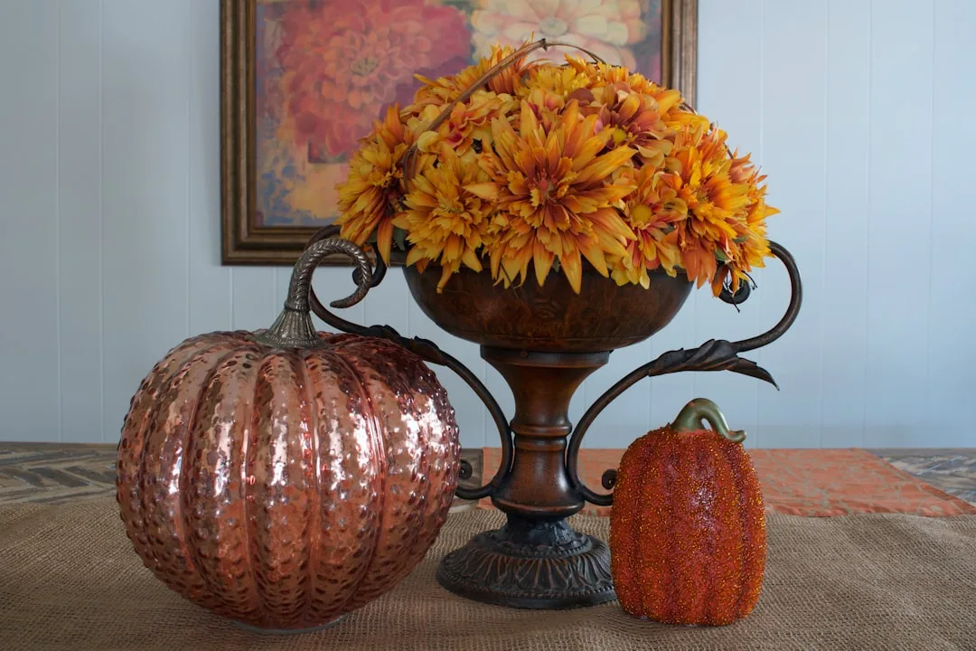
What this approach eliminates is the problem I watched destroy several entryways: the all-orange-everything syndrome. Saturated harvest orange reads as festive for about ten days before it starts looking like a Halloween clearance bin. Pantone’s fall forecasts have tracked steadily away from bright harvest tones since the early 2020s, shifting consistently toward desaturated naturals — ochre, raw umber, smoked plum, and dusty sage. These tones have staying power because they don’t peak and crash visually the way saturated colors do.
Your existing space matters enormously here, and I don’t see enough people accounting for it:
- Dark wood floors pull warm undertones out of everything — lean into deeper burgundies and amber-browns rather than fighting them with lighter neutrals
- White painted trim and walls give you permission to go deeper in your fall objects; contrast does the work that layering does in a neutral-on-neutral space
- Gray or cool-toned walls need fall tones with warm undertones specifically — a muted terracotta or warm sand prevents the gray from flattening the whole vignette into winter prematurely
Actionable takeaway: Pull three paint chips or fabric swatches in your dominant/supporting/accent tones before buying anything. Hold them against your wall and floor simultaneously. This ten-minute step prevents $200 in wrong purchases.
Building the Back Anchor: Tall Elements That Frame the Whole Vignette
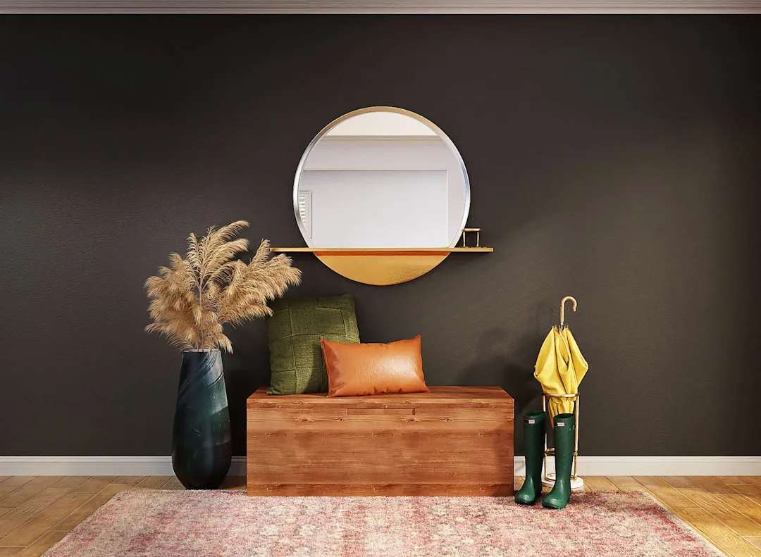
Start here. Always. This is the single piece of advice that would have saved my clients the most grief — including the time a woman in Lincoln Park spent $400 on beautifully curated mid-layer objects that looked like a jumble sale because there was nothing tall behind them to give the arrangement a frame.
The back anchor exists to create the visual ceiling of your vignette. It tells the eye where the arrangement ends and the wall begins. Without it, objects float. They have no context. Interior designers consistently identify lack of height variation as the most common mistake in vignette styling — a flat arrangement reads as clutter regardless of how carefully you’ve chosen each piece.
There are two categories of back anchor, and which one you choose should depend on your hallway:
- Hard anchor: A large framed piece of art with autumn tones, a statement mirror, or a leaning canvas. These have geometric edges that create a crisp backdrop. Best for smaller hallways where a soft element might feel overwhelming.
- Soft anchor: An oversized dried pampas bundle, a wheat sheaf, dried eucalyptus branches, or a tall arrangement of preserved autumn foliage in a stoneware vessel. These have organic edges that add warmth but require more horizontal space to read clearly.
Proportion rule: your back anchor should reach approximately two-thirds of the height of the mirror or wall space above your table. Not taller — a back anchor that exceeds this feels top-heavy and anxious. Not shorter than half — anything lower collapses back into mid-layer territory and loses its anchoring function entirely.
One more thing worth knowing about back anchors that most styling guides leave out: the anchor should be positioned slightly off-center, not dead-center. A perfectly centered back anchor turns your entry table into a symmetrical altar, which reads as formal and static. Shifting the anchor one third of the way toward either end creates asymmetric tension that the eye finds naturally more interesting — and it opens up compositional room for your mid-layer objects to breathe rather than crowd into the remaining space symmetrically.
Actionable takeaway: Identify your back anchor before touching anything else on the table. If you already have a mirror mounted above the table, treat it as a permanent part of the back anchor and select your tall soft element to complement its frame rather than compete with it.
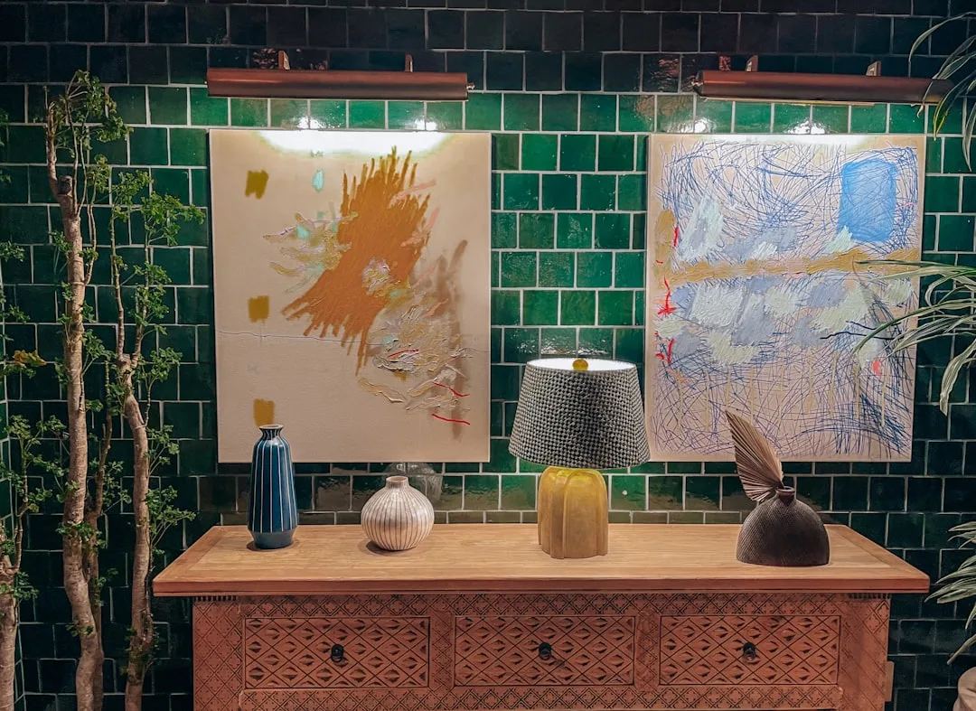
The Mid-Interest Layer: Where Fall Entry Table Decor Gets Its Atmosphere
If the back anchor is the frame, the mid-layer is the painting. This is where seasonal atmosphere actually lives — where texture, organic material, and gathered objects create the feeling of fall rather than simply referencing it.
The mid-layer operates at roughly tabletop-to-eye-level-minus-one-third height. Think of it as everything taller than your front story objects but shorter than your back anchor. Its job isn’t to be a single statement — it’s to create a field of interest that rewards closer inspection.
What belongs in the mid-layer of fall entry table decor:
- A stoneware or ceramic vessel in a matte, earthy glaze — ideally holding dried botanicals like preserved magnolia leaves, cotton stems, dried thistle, or burgundy amaranth. The vessel itself contributes shape; what’s inside contributes movement and organic texture.
- A pillar candle or taper in a substantial holder — taper candles add height variation within the mid-layer itself without competing with the back anchor. Beeswax tapers in unbleached or dark honey tones read as genuinely autumnal without relying on orange.
- A small stack of books with spines in your dominant or supporting palette tone. This is not a cliché if done deliberately — two or three hardcovers with muted linen or cloth covers add mass, horizontal geometry, and an implied human presence that purely decorative objects can’t provide.
- A textile element — a folded linen napkin, a small piece of naturally dyed fabric, or a textured runner that spills slightly over the front edge of the table. Textiles do something ceramic and wood objects cannot: they soften the horizontal plane and add tactile warmth that reads from across a room.
The mid-layer mistake I saw most often: people filled this zone with too many objects at exactly the same height. Seven small vessels at eight inches tall don’t create a mid-layer — they create a crowded row. Vary the heights within this zone deliberately. One object at nine inches, one at six, one at four. The variation itself creates rhythm.
Actionable takeaway: Limit your mid-layer to four to five objects maximum. More than that and the zone becomes visually exhausting rather than atmospherically rich. Edit ruthlessly — the objects you remove are as important as the objects you keep.
The Front Story: Small, Personal, Specific
This is where most styling guides end — and where the most meaningful work actually happens.
The front story is the zone closest to the viewer’s body. It’s what someone reaches toward if they’re waiting for you to come downstairs. It’s what registers at hip height when you walk past your own table seventeen times a day. It should be small in scale, close in detail, and specific enough to belong to you and not to a catalog.
What works in the front story layer:
- A single small vessel — a bud vase, a tiny ceramic cup, a vintage inkwell — holding one or two stems. One dried poppy head. Two sprigs of rosehip. Three stems of preserved olive. The smallness is the point.
- A natural object with genuine texture — a cluster of acorns arranged in a shallow wooden bowl, a single large pinecone, a piece of raw quartz or calcite, a small beeswax object. These hold the eye because they have surface complexity that manufactured objects rarely achieve.
- A functional object you actually use — a small tray that holds your keys, a single taper candle in a brass holder you light on weekday evenings. The front story layer is where your entry table connects to the life happening in your house, not just the aesthetic impression it makes on visitors.
What kills the front story: miniature replica fall scenes. Tiny fabric pumpkins arranged in a row. Small felt leaves scattered across the table surface. These read as decoration performing autumn rather than a real space inhabited by people who live through autumn. The specificity of a single interesting natural object does more atmospheric work than a collection of seasonal trinkets.
Transitioning Your Entry Table Fall Decor Through the Season
One thing that rarely gets addressed in fall styling guides: September’s entry table should not look identical to November’s. The season moves, and your entry table fall decor should move with it — not through complete overhauls, but through small, intentional shifts within the framework you’ve already built.
Early fall (September through mid-October):
Keep the palette in its warmer, lighter register. Dried botanical arrangements can include greener elements — preserved eucalyptus still holding some sage tone, dried grasses with golden rather than deep brown coloring. Fresh elements work here: a small pumpkin or two in pale ivory or muted sage rather than saturated orange. The atmosphere should feel like the end of something warm rather than the beginning of something cold.
Mid-fall (mid-October through early November):
Shift toward deeper tones in your supporting color. Swap lighter taper candles for something in a deeper beeswax or near-black. If you’ve been using a lighter textile runner, layer a darker one beneath it or replace it entirely. Remove any fresh elements that have dried past their useful life and replace them with purely preserved or dried material. The arrangement should feel more interior, more sheltered — less sun, more firelight.
Late fall (November):
This is where your entry table transitions away from harvest imagery and toward something that can bridge into early winter without feeling stranded. Deep burgundy, smoked plum, and aged brass can carry straight through to December without reading as Christmas. Remove any obviously autumnal elements — wheat sheaves, dried corn, gourd references — and let the textile, vessel, and botanical elements do the work. A dried magnolia branch with its silver underside showing reads as late fall and early winter simultaneously.
Actionable takeaway: When you build your initial fall entry table decor arrangement, buy your mid-layer and front story objects in two rounds — one for early-to-mid fall, one for the November transition. The back anchor and any large vessels stay constant. Only the smaller, more seasonal objects rotate. This approach costs less than starting over and produces a more intentional result.
The Objects You Already Own That You’re Probably Ignoring
Before you spend anything, I want you to walk through your house and collect these specific categories of objects — because in eleven years of doing this professionally, I found that most people had at least two-thirds of what they needed already:
From your kitchen: stoneware crocks, wooden cutting boards that can be leaned vertically as mid-layer texture, ceramic mixing bowls that work as organic vessel shapes, linen dish towels in neutral tones that read as intentional textiles on an entry table.
From your dining room: taper candle holders that you only put out for dinner parties, cloth napkins in autumn-adjacent tones, a bread basket that can hold dried botanical cuttings.
From your garden or yard: dried seed heads from late-summer perennials, branches from trees turning color, rosehips if you have a climbing rose, any dried grass that’s gone to seed, pinecones. These are genuinely better than purchased dried botanicals because they have the irregular texture of actual living things rather than the uniform texture of commercially processed material.
From storage: books with cloth or linen spines in the right palette tones (pull them from your shelves — they’re not doing compositional work in a bookcase the way they will on your entry table), any natural fiber baskets that can function as vessels, candleholders you’ve been saving for a special occasion.
Actionable takeaway: Do this collecting exercise before looking at a single product online. You may find that you need to purchase only your back anchor and one or two specific accent pieces — not a complete seasonal refresh.
FAQ: Entry Table Fall Decor
How wide should an entry table be for fall styling to work properly?
The three-zone framework works on any width, but the minimum comfortable working width is about 30 inches. Below that, the mid-layer and back anchor start crowding each other. If your table is narrower than 30 inches, collapse the mid-layer and back anchor into a single combined zone — one tall element that also carries textural interest — and let the front story do more work than usual. Very narrow console tables (under 24 inches) work best with a hard back anchor like a mirror or framed piece rather than a soft botanical element that needs horizontal room to read.
Can I do entry table fall decor without a back wall to lean things against?
Yes, but you need a freestanding back anchor. A tall stoneware vessel or a weighted brass candlestick at significant height can function as the structural anchor without requiring wall support. The key is that whatever you choose must be stable — something that creates a visual terminus for the vignette without needing to lean. If you have a floating console with no wall directly behind it (in an open-plan space, for instance), treat the back anchor as the tallest object in the arrangement and position it about two-thirds of the way toward the back edge of the table surface.
How do I style fall entry table decor when my entryway is very small?
Small entryways actually benefit from fall styling because warm, textural objects make tight spaces feel intentional rather than cramped. The adjustment is scale, not framework. Use one dominant object in the back zone instead of a collection, keep the mid-layer to two objects maximum, and make the front story a single strong element rather than a small grouping. Avoid anything that extends beyond the table surface horizontally — branches and pampas that overhang the edges of the table read as cluttered in a small space even when they’d read as lush in a larger one.
When should I put up fall entry table decor and when should I take it down?
Put it up when you’re genuinely ready to stop thinking of it as summer — for most people this is the first week of September rather than the official start of autumn. Take it down when the arrangement stops looking like a choice and starts looking like something you forgot about. In practical terms, this usually means removing obviously harvest-coded elements by mid-November and transitioning into the late-fall register described above, then making a final decision about whether the late-fall version can carry through to your winter approach or whether you want to start fresh in December.
Is it worth buying new objects every fall, or should I invest in pieces that last?
Invest in your back anchor and your primary vessels — these are the structural and large-scale objects that don’t need to change year to year. Rotate your front story objects annually or seasonally because small objects at close range are where the freshness of the arrangement lives. Dried botanicals are the one category where buying new each year is genuinely worth it, because dried material that’s been stored tends to look dusty and fragile rather than intentionally preserved. Everything else — candleholders, textiles, ceramic vessels — should be chosen to last.