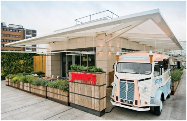
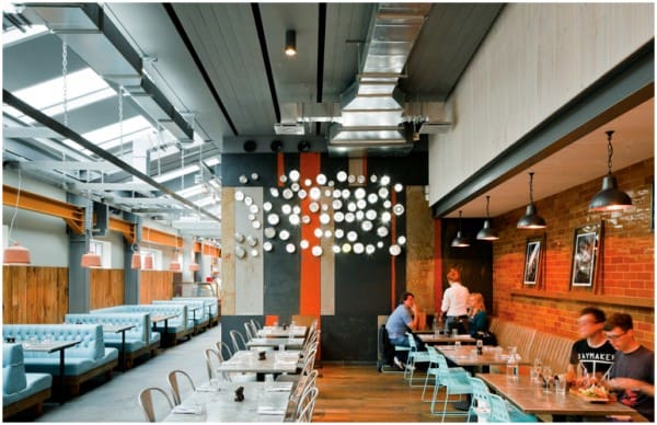
Creative Blacksheep London Agency designed a stylish and fresh look for Jamie’s Italian site situated in Westfield shopping centre, London. The space design emphasizes a warm atmosphere, friendly and casual. Where is the perfect. The distinctive outward sign of the restaurant of an old Citroën refurbished is parked near the entrance. The building is surrounded by a shaded terrace and bordered by pots with herbs, to which the interior can be completely open. The space is organized on an area of 610 square meters, with the kitchen in the centre. Access is directly in the center of the restaurant (Piazza), delimited in different areas just by finishing walls, furniture and lighting model and with a background of a wall on which are located in a random drawing Vespa lights which are probably the most the urban design touch intended to emphasize the idea of Piazzetta, the inner city.
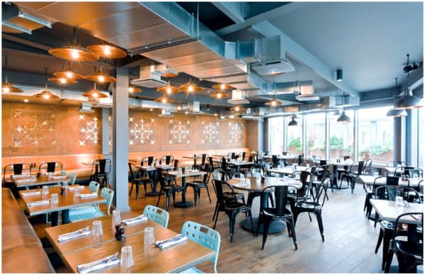
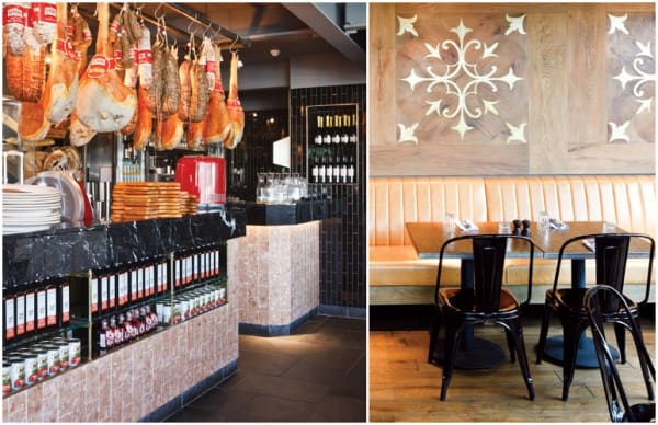
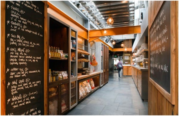
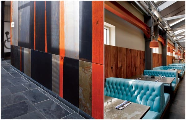
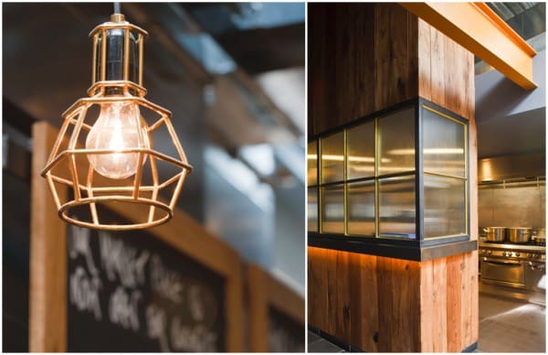
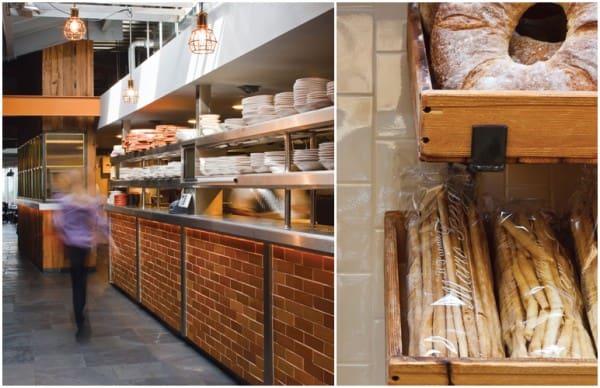
Because of Market Place which is a narrow area, bustling and noisy, customers can see the kitchen, the pasta preparation and their storage spaces, and displays of books, wine and fresh products. Trying to combine the image of typical Italian with subtle British accents, they created an industrial look which is given by the apparent appearance of metal structure enhanced by ventilation routes, but offset by the warm tone of wood floors and walls. For wall panels Blacksheep chose wood, metal or brick and stone for Market chose, most materials being refurbished. Not to forget about lighting that are very diverse from “industrial” lamps to glass sophisticated chandeliers.

Leave a Reply