The largest visual surface in your home office isn’t your monitor — it’s the wall behind it, and most people have never once thought about what it’s doing to their brain.
Quick Answer
The largest visual surface in your home office isn’t your monitor — it’s the wall behind it, and most people have never once thought about what it’s doing to their brain.
Not the hue they chose because it looked nice on a chip. Not whether it’s “calming” in some abstract, lifestyle-magazine way. What it’s actually doing — to your cortisol levels, your attentional bandwidth, your ability to stay in a task for four hours without feeling inexplicably drained and not knowing why. I spent eleven years watching people make expensive, well-intentioned choices about their workspaces, and the wall color conversation almost never happened. The standing desk conversation happened constantly. The monitor arm conversation. The ergonomic chair that cost $1,400. Meanwhile, the thing occupying their entire peripheral vision — 200 square feet of a color their brain was processing every second of the workday — went completely unconsidered.
That stops here.
Why Wall Color Affects Your Work Performance More Than Your Setup Does
In This Article
- Why Wall Color Affects Your Work Performance More Than Your Setup Does
- The Problem With Generic ‘Blue Equals Focus’ Advice
- How to Read Your Room Before You Pick Any Color
- Wall Colors That Support Deep Focus Work (And Why They Work)
- Wall Colors That Support Creative and Generative Work
- The Colors That Are Quietly Sabotaging Your Work Sessions
- How Finish, Trim, and Adjacent Colors Change Everything
- Testing Before You Commit: A Smarter Approach to Sampling
- Your Next Step — Today
Most productivity advice treats the home office as a hardware problem. Better gear, better output. What it almost completely ignores is that your visual environment is running in the background of every cognitive task you perform, influencing how hard your brain has to work before you’ve typed a single word.
Color isn’t decorative stimulus. It’s environmental input that your nervous system processes automatically, below the threshold of conscious awareness. The pattern I kept seeing, across dozens of client spaces in Chicago and New York, was that people would describe feeling vaguely tired or unfocused in rooms where the setup was technically correct — good light, good chair, good monitor placement — and the wall was an aggressive charcoal they’d picked because it looked dramatic on Instagram. Every time. Not always charcoal, but always a color decision made purely on aesthetics with zero consideration of how it would perform over a six-hour workday.
A 2009 study by Elliot and Maier, published in Annual Review of Psychology, established that color-cognition relationships are measurable and replicable across real-world environments — not just controlled laboratory conditions. That matters because it means this isn’t theoretical. The mechanism involves three interacting pathways:
- Cortisol signaling — saturated, high-contrast colors maintain a mild stress-response state that feels like alertness but functions like drain
- Circadian rhythm input — the eye uses ambient color temperature to calibrate wakefulness; cool blue-spectrum walls can disrupt afternoon focus in rooms that already receive low natural light
- Attentional bandwidth — visually busy or high-contrast environments force your brain to constantly filter stimulation, leaving less capacity for actual cognitive work
Your desk setup controls maybe 20% of your productive environment. Your walls control the rest.
Takeaway: Before you optimize anything else, look up from your monitor. What you see in your peripheral vision during every work session is not neutral.
The Problem With Generic ‘Blue Equals Focus’ Advice
Here’s the thing about the “blue equals focus” rule that gets repeated in every design article, every paint brand blog, every productivity newsletter: it originated from a genuinely narrow body of research conducted in controlled lab environments using standardized color stimuli under consistent artificial lighting. Then it got simplified, stripped of every qualifier, and repeated until it became received wisdom.
I’ve put blue walls in four client offices. Two of them worked beautifully. One felt cold and institutional within a week — the client was working in a north-facing room with LED recessed lighting that leaned cool, and the blue read as flat and slightly oppressive rather than calm. The fourth client repainted within a month. Same color recommendation. Completely different results.
The reason this happens is that saturation and value matter far more than hue, and almost no popular advice addresses this. A muted, grayish-blue with an LRV of 62 performs completely differently than a bright cobalt with an LRV of 28, even though both are “blue.” One recedes and softens. One visually advances and demands attention. They are not interchangeable despite sharing a color family.
Light compounds this further. Research from the Lighting Research Center at Rensselaer Polytechnic Institute found that the color rendering index (CRI) of your light source changes how wall colors are perceived — the same Benjamin Moore blue can read as slate gray under a low-CRI LED and as a bright, clear azure under high-CRI daylight-balanced lighting. Paint brand guides don’t mention this. They can’t — they’re written to move product, not to account for the specific lighting conditions in your home.
What the “blue = focus” shortcut actually tells you is this:
- Blue is associated with reduced arousal, which supports sustained attention tasks
- But reduced arousal in the wrong context becomes disengagement
- The translation of that research into your actual room depends on your orientation, your light source, and your personal stress baseline
Generic. Doesn’t.
Takeaway: Before you reach for a blue, figure out what your light is actually doing to your walls — paint a large sample and look at it at 7am, 12pm, and 8pm before you commit to anything.
How to Read Your Room Before You Pick Any Color
Diagnosis before prescription. This is the step that makes everything else work, and it’s the step that no one tells you to do — because it requires slowing down before making a purchase, which is bad for commerce and good for you.
Start with your room’s directional exposure:
- North-facing rooms receive indirect, cool-toned light all day. If you put a cool color on these walls, the room will almost certainly feel cold and flat. These rooms need warm-toned neutrals — creams, warm whites, greiges, or muted terracottas — even if your color instinct pulls toward cool tones.
- South-facing rooms get abundant warm, direct light for most of the day. They can handle cooler, more saturated colors without reading as institutional.
- East-facing rooms are warm in the morning, cooler by afternoon — they’re actually the most forgiving for a range of tones.
- West-facing rooms flip that pattern; afternoon sessions get intense warm light that can make saturated warm colors feel aggressive.
Then look up. Ceiling height is a factor most people never think about. Rooms under eight feet with dark or medium-dark walls create a degree of visual enclosure that produces a mild stress response in sustained-work conditions — it’s not dramatic, but over a full workday it accumulates. Rooms with nine-foot or higher ceilings can carry grounding, deeper tones without that compression effect.
The concept of optimal stimulation theory, established by Mehrabian and Russell in 1974, is still the most useful framework I’ve encountered for this: every person has an individual arousal threshold, and the goal of your environment should be to move you toward that threshold — not above it, not below it. A person who already runs anxious and overstimulated needs a different wall than a person who runs slow-to-start and needs environmental energy to engage.
Ask yourself honestly:
- Do you do deep focus work — writing, coding, analysis, contracts? You need lower stimulation.
- Do you do generative work — design, strategy, brainstorming, pitching? You can tolerate and may benefit from slightly higher stimulation.
- Do you end most workdays feeling depleted and overstimulated, or flat and unmotivated? One suggests your environment is too hot; the other, too cool.
Takeaway: Map your room’s exposure, measure the ceiling height, and honestly categorize your primary work mode before you look at a single paint chip.
Wall Colors That Support Deep Focus Work (And Why They Work)
This is not a list of pretty colors with poetic names. This is a functional breakdown of which characteristics support sustained, low-stimulation cognitive work — and why.
Muted blue-greens — teal-adjacent, low saturation — are consistently the strongest performers for focus work in my experience. They reduce ambient arousal without tipping into the coldness of primary blues. The desaturation does most of the work here; the slight green component adds a biophilic quality the brain recognizes as natural rather than institutional.
Sage and eucalyptus greens work through a similar mechanism. The visual cortex associates desaturated, slightly grayed greens with natural environments — forests, fields, morning light through leaves — and that association lowers ambient arousal in a way that no amount of “add a plant” advice actually achieves. One real wall painted sage does more than twelve potted plants on a shelf. I’ve seen it. Repeatedly.
Warm whites and off-whites — cream, linen, pale greige — outperform stark bright white in screen-heavy work environments because they reduce contrast fatigue. Every time your eye moves from a bright screen to a stark white wall, it’s making a light-level adjustment. Do that several thousand times over a workday and you’ve burned attentional energy on a purely mechanical visual task. Warm whites sit closer to the middle of the light spectrum and ease that transition.
What to look for technically when evaluating colors for focus work:
- LRV (Light Reflectance Value) between 55 and 70 — available on every major paint brand’s website; a pure black is LRV 0, pure white is LRV 100; this range gives you enough brightness to avoid depression-adjacent dimness without the fatiguing glare of very light colors
- Chroma below 30 on the Munsell scale, or a low saturation reading in digital tools — this is the “grayness” of the color and it’s the most important variable for sustained focus
- Warm undertones in any neutral — beige rather than silver-gray, cream rather than white-white
Takeaway: Find colors with an LRV between 55–70 and low chroma before you consider hue — the technical specs will narrow your field faster than any color name will.
Wall Colors That Support Creative and Generative Work
Creative work requires a different neurological state than deep focus work. It benefits from slightly elevated arousal — the kind that feels like mild energy, not anxiety — and that’s where warmer, slightly more saturated tones earn their place.
Warm ochres and terracottas have come up repeatedly in biophilic design research as simultaneously grounding and stimulating. They reference earth tones the nervous system associates with safety and physical presence — the sensory equivalent of solid ground. In practice, I’ve seen terracotta walls produce an almost immediate shift in how people hold themselves in a room: less hunched, more upright, more engaged. That’s not scientific data; it’s eleven years of watching clients in their spaces.
Dusty rose and muted coral provide warmth and gentle stimulation without touching the anxiety-triggering register of bright reds or oranges. They’re particularly effective in rooms where the work involves interpersonal elements — client calls, recorded content, collaborative sessions — because they read as warm and approachable without being loud.
The accent wall strategy deserves serious consideration here. Painting one wall — typically the wall you face rather than the wall behind you — in a more saturated tone while keeping three walls neutral gives your brain a stimulation target without surrounding it entirely in high-energy color. The effect is directional. You look toward the interesting wall; it provides gentle stimulation. You sit within neutral walls; they provide recovery.
Research from the University of British Columbia found that red environments improved performance on detail-oriented tasks while blue improved creative output — a counterintuitive finding that suggests the type of creative work matters. Detail-heavy creative work (copyediting, technical illustration, precise design execution) may actually benefit from warmer-toned walls. Open-ended ideation benefits from cooler ones.
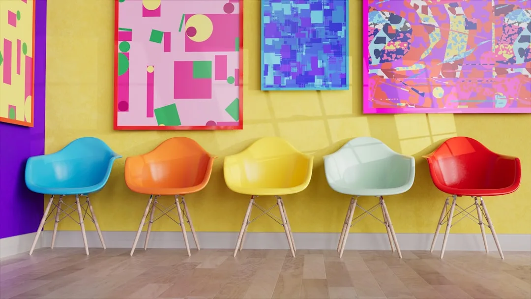
Yellow. People always ask about yellow. It works — but only in its muted, warm-toned variants: dusty gold, aged mustard, soft amber. Bright chrome yellows are genuinely problematic for sustained work; they raise physiological arousal faster than almost any other color and the peak burns out quickly, leaving fatigue.
Takeaway: If your work is generative, explore terracotta, warm ochre, or dusty coral — and strongly consider the accent wall approach so you can orient stimulation without surrounding yourself in it.
The Colors That Are Quietly Sabotaging Your Work Sessions
No one wants to write this section. It risks offending people who’ve just painted their offices. I’ve been there — I once pushed a dark slate-blue on a client’s home office because the mood board was gorgeous and I believed my own enthusiasm. Eight weeks later she was calling me to tell me she dreaded going in there. That was an expensive lesson in the gap between beautiful and livable.
Stark white — pure white with no warm or cool undertone — is one of the most common home office colors and one of the least functional for screen-heavy work. The contrast between your monitor and a bright white wall forces constant pupil adjustment. Crisp. Clean. Exhausting.
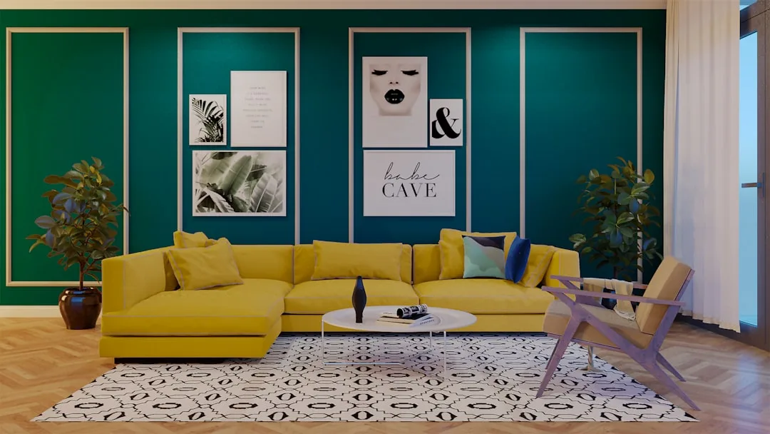
Bright, highly saturated colors in any hue — including the jewel tones that have dominated design media for the past several years: deep emerald, cobalt, saturated burgundy — are psychologically stimulating in short doses and genuinely depleting over a full workday. Research published in Color Research & Application found that highly chromatic environments increase beta brain wave activity, associated with alert focus — but that extended exposure produces cognitive fatigue significantly faster than low-chroma environments. Short meetings in a jewel-toned room: fine. Eight hours of writing: not fine.
Gray deserves its own warning. It has dominated office interiors for over a decade and it may be the most psychologically ambiguous color to work in. Without a clear warm or cool undertone to anchor it, gray reads as neutral to the eye but registers as contextually ambiguous to the brain — and there’s consistent evidence linking gray-dominant environments to reduced motivation in workspace contexts. Greige (gray-beige) works. Blue-gray works. Pure middle gray, especially at medium saturation? Worth reconsidering.
Black accent walls — and I know they look extraordinary in photos — create an extreme LRV contrast that causes continuous eye adjustment strain every time your gaze moves from your screen to the wall. In a photography studio, shot in controlled conditions, for thirty seconds: stunning. As the wall you look at for six hours a day: genuinely problematic.
Colors to approach with serious caution in home offices:
- Pure bright white (LRV 90+)
- Saturated jewel tones in any hue
- Bright primary yellow or orange
- Undifferentiated medium gray
- Black or near-black on any wall you face during work
Takeaway: If your current wall color falls into one of these categories and your workday feels harder than it should, that’s not a coincidence.
How Finish, Trim, and Adjacent Colors Change Everything
Here’s where most people lose the thread. They pick the right color, get it on the walls, and something is still slightly off — and they can’t figure out what. It’s almost always finish, trim, or the ceiling.
Matte finish vs. eggshell changes how your wall interacts with light during the workday. Matte finishes absorb more light, which means less glare and less visual noise during video calls and screen-heavy work. Eggshell adds a slight sheen that becomes visible under direct light and can create subtle distracting reflections on walls perpendicular to windows. For home offices, particularly those used for video calls, matte is functionally better in most cases — the durability trade-off is real, but it’s manageable.
Trim color creates a visual frame around your wall that changes the perceived saturation of the paint. White trim makes wall colors look more saturated — it provides high-contrast edges that the eye reads as intensification. Off-white or greige trim softens that edge and makes the wall color read closer to its actual chip value. If you’ve painted a muted sage and it feels more vivid than expected, look at whether your trim is stark white.
The ceiling is the most underestimated variable in this entire equation. Bright white ceiling paired with a warm-toned wall creates a jarring light-to-dark boundary at the top of your visual field — your peripheral vision catches it constantly, and the eye works to reconcile the contrast. A ceiling painted one to two shades lighter than your wall color creates a continuous tonal environment that requires significantly less visual processing effort throughout the day.
Interior designers use the 60-30-10 proportion rule — 60% dominant color on walls, 30% secondary color in furniture and flooring, 10% accent — but home offices require an adaptation. The functional demands of screen work push toward lower overall contrast ratios than standard residential decorating allows. Your 10% accent should be genuinely restrained. A single throw pillow. A lamp base. Not a saturated gallery wall facing your monitor.
What to audit in your existing space:
- Finish: Is your wall paint matte, eggshell, or satin? Satin on walls is almost always too much sheen for screen work.
- Trim: Is it the same white as your ceiling, or slightly warmer? They should coordinate, not compete.
- Ceiling: Is it pure white above a warm wall? Test a slightly warmer ceiling tone before dismissing this.
- Floor value: Dark floors with medium walls and a light ceiling create the most visually restful ratio for sustained work.
Takeaway: Don’t evaluate your wall color in isolation — the finish, trim, and ceiling are part of the same visual system, and changing one changes how all the others read.
Testing Before You Commit: A Smarter Approach to Sampling
The 2-inch paint chip is one of the more persistent design myths that the industry happily perpetuates because it keeps people guessing and repainting. Nobody chooses the right color from a 2-inch chip held against their wall under store fluorescents. Nobody. That’s not how color perception works.
Paint large sample swatches — minimum 12×12 inches, and bigger if you can manage it — directly on the wall you’re testing rather than on white card stock. Card stock adds reflected light from the paper surface that doesn’t exist on your actual drywall or plaster. The color will look different on the card, and not in a useful way.
Then observe it at three specific moments:
- Morning natural light, before your artificial lighting turns on
- Midday or afternoon, at the peak of whatever natural light your room receives
- Evening, under your actual work lighting — the lamps and overhead fixtures you’ll be using during real work sessions
Most people skip the evening observation entirely. This is the single most common mistake I saw clients make, and it’s the one that leads to “I loved it in the store and now I hate it” conversations six weeks after painting.
Paint two shortlist colors adjacent to each other on the same wall. Colors reveal their undertones most clearly when placed next to something they have to compete with. A color that looked perfectly neutral in isolation will suddenly show whether it leans green, pink, or yellow when it has a neighbor. That knowledge is worth more than any amount of chip-staring.
Peel-and-stick paint sample services — Samplize being the most widely available — offer 12×12 inch repositionable swatches that you can move around, live with for a week, and evaluate in all your actual lighting conditions before touching a paintbrush. For renters who are working around landlord restrictions or for anyone who just doesn’t trust their instincts yet, this is genuinely useful. It removes the commitment barrier entirely.
One final calibration: factor in your actual work hours. If your sessions regularly run six hours or longer, choose conservatively toward the lower saturation end of your shortlist. Every color that feels energizing in a one-hour test will feel different at hour five. That gap is where most people get into trouble — not because they picked the wrong color, but because they tested it for the wrong duration.
Takeaway: Buy 12×12 inch samples, paint them directly on your target wall, observe them at morning and evening lighting, place two competitors side by side, and live with them for at least a week before you commit.
Frequently Asked Questions
What is the best wall color for a home office with no natural light?
Warm-toned neutrals almost always perform better here than cool colors, regardless of your color preferences. North-facing rooms and windowless spaces receive ambient light that leans cool and flat — adding a cool wall color compounds that effect until the room feels genuinely oppressive over a workday. Cream, warm white, light greige, or a very muted warm sage (one that leans toward yellow-green rather than blue-green) tend to work well. The LRV should stay above 60 to prevent the room from feeling dim. Pair your wall color with high-CRI bulbs (90 or above) in your task and ambient lighting — this matters as much as the color itself in light-starved spaces. Avoid gray entirely in these rooms; gray needs natural light to read as anything other than flat and slightly depressing.
Does wall color actually affect how productive you are while working from home?
Yes — but not always in the ways the simple “blue = focus” articles suggest. The mechanism isn’t that you look at the wall and feel inspired. It’s subtler and more pervasive: your nervous system is processing your visual environment continuously throughout the workday, and that processing either consumes attentional resources or conserves them. A wall with high visual contrast, high saturation, or extreme brightness is constantly pulling low-level attention that would otherwise be available for your actual work. Over a two-hour session, the effect is minimal. Over a six-hour session, it accumulates into genuine fatigue that most people attribute to the work itself rather than the room. The research on color-cognition relationships, including Elliot and Maier’s 2009 review, is substantive enough that dismissing this as pseudoscience requires ignoring a meaningful body of evidence.
Should my home office be a different color than the rest of my house?
Not necessarily different, but purposefully chosen rather than matched. The most common mistake is painting a home office the same color as the adjacent hallway or living room for visual continuity — which is a decorating decision, not a functional one. Your home office has specific demands that your living room doesn’t: sustained visual focus, screen interaction, cognitive performance over hours rather than minutes. If your living space uses jewel-toned accent walls or high-contrast drama, your office probably needs to be calmer than that. If your home is already full of warm, muted, low-saturation tones, you may be able to carry those through. The test is always function first: does this color support what I need to do in this room for multiple hours at a time?
How do I choose a wall color if I use my home office for both focused work and video calls?
This is a more nuanced problem than most color advice addresses. For video calls, your wall color behind you — what appears on camera — needs to read as professional and non-distracting for the person on the other end of the call. Muted, warm neutrals and soft greens consistently read well on camera. Stark white causes exposure problems for whoever is filming you; very dark colors make you visually harder to read on screen. For the wall you face during focus work, you have more freedom. The most practical solution I’ve found: keep the wall behind your camera position (the wall your back faces during calls) in a muted, medium-toned warm neutral, and use the wall you face during work as your functional color choice. This way you optimize both surfaces for their actual use.
Your Next Step — Today
Pick one wall. Not the whole room. One wall — ideally the one you face most during your workday — and look at it right now as though you’ve never made a decision about it. What’s its LRV? Most paint brands list this on their website if you can identify the color. Is it above 70, meaning you’re likely dealing with contrast fatigue during screen work? Is it below 45, meaning the room is absorbing light and creating a low-energy environment? Is it a pure gray with no undertone, sitting in that ambiguous middle zone that offers your brain nothing to orient to?
Order two 12×12 peel-and-stick samples from Samplize or paint two large swatches directly on the wall. Observe them tonight under your actual work lighting. Then observe them again tomorrow morning.
That’s it. That’s the whole next step. You don’t need to repaint anything today — you need to start seeing the wall you’ve been ignoring. Everything else follows from there.