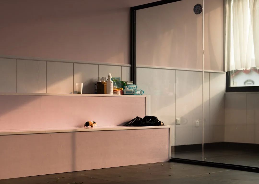
Forty-six percent of renovated homes have open-plan kitchens — yet most homeowners admit they never intended for the dirty dishes to be the focal point of every dinner party. If you’ve been searching for kitchen dining room divider ideas that actually hold up in real life, the problem isn’t the open plan itself. It’s that nobody told you an open floor plan isn’t finished when the wall comes down — it’s only started, and everything that comes after requires you to rebuild the sense of separate zones using a completely different toolkit.
Quick Answer
Forty-six percent of renovated homes have open-plan kitchens — yet most homeowners admit they never intended for the dirty dishes to be the focal point of every dinner party.
I spent eleven years placing furniture and building layouts for clients in Chicago and New York, and the most common mistake I saw wasn’t choosing the wrong sofa or the wrong tile. It was treating an open plan as a single room when it actually needed to function as two or three. The kitchen-dining boundary — specifically — is where most open plans quietly fall apart, because there’s no natural threshold to signal where one activity ends and another begins.
These nine strategies are the ones I came back to again and again. Not because they look good in photos, but because they actually work when you’re cooking dinner and your guests are already at the table.
1. Half-Wall Breakfast Bars That Double as a Visual Stop Between Spaces
In This Article
- 1. Half-Wall Breakfast Bars That Double as a Visual Stop Between Spaces
- 2. Open Shelving Units That Let Light Pass Through While Defining Each Zone
- 3. Sliding Barn Doors and Pocket Panels for When You Need the Option to Close
- 4. Ceiling-Hung Curtain Panels That Define Without Committing
- 5. Kitchen Islands Extended Into Dining Territory
- 6. Flooring Transitions as Invisible Dividers
- 7. Statement Lighting as a Zone Signal
- 8. Planted Room Dividers and Living Screens
- 9. Architectural Columns and Pillar Additions That Signal a Threshold
The knee-high half-wall with a cantilevered overhang is still the most structurally satisfying divider solution I’ve ever used, and I’ve used it in apartments ranging from 700 square feet to 3,200. What makes it work isn’t the wall itself — it’s the fact that it creates a seating ledge, a lighting opportunity, and a material transition all in one gesture.
Here’s how a half-wall actually earns its place in a layout:
- The cantilevered overhang extends 12–15 inches past the wall face, creating knee clearance for barstool seating without eating into kitchen floor space
- Pendant lights hung directly above — ideally on a separate circuit from the kitchen overheads — establish a lighting zone boundary that reinforces the spatial division even at night
- The dining-facing side of the wall is often tiled, shiplap-wrapped, or finished in concrete, treating it as part of the dining room’s visual identity rather than as a kitchen surface
That last point is one most people miss entirely. The dining side of your half-wall doesn’t need to match your kitchen cabinets. It should match your dining room. When I designed a layout for a client in Lincoln Park, she’d had a builder finish her breakfast bar in the same white-painted drywall as her kitchen walls, and the result was a space that felt like one very large, purposeless room. We re-clad that dining-facing surface in zellige tile — green, slightly irregular — and overnight the dining zone had its own identity.
Worth flagging: open-plan layouts remain dominant in renovated homes, and purposeful zone definition is consistently the top design challenge homeowners report when those layouts don’t feel right after the build is complete. A half-wall with real material investment on both faces solves that problem at the physical level, not just the aesthetic one.
Actionable takeaway: Before you build, decide what material the dining-facing side of your half-wall will wear — and choose it to match your dining room, not your kitchen.
2. Open Shelving Units That Let Light Pass Through While Defining Each Zone
Freestanding open shelving gets recommended constantly, and the advice is usually vague enough to be useless. “Add some open shelves between the spaces!” doesn’t tell you what height, what material, what depth, or — critically — how to style each face so the unit actually reads as a boundary rather than a cluttered freestanding bookcase that wandered into the wrong room.
The detail that makes open shelving function as a real divider is double-sided accessibility. A unit you can reach from both the kitchen and the dining room becomes a shared object that belongs to both zones simultaneously — and that shared ownership is exactly what signals a boundary.
A few things I’ve learned from doing this badly first:
- Height is everything. Shelving that stops at 60–66 inches (eye level for most adults) keeps the space feeling open and connected — light passes over the top, you can see movement on both sides. Floor-to-ceiling units function more like a wall, which is sometimes exactly what you want, but not always.
- Style each face for its zone. Kitchen-facing shelves hold pantry essentials, olive oil, coffee equipment. Dining-facing shelves hold ceramics, small plants, the books that are actually decorative. Two distinct identities, one piece of furniture.
- Metal-frame units in steel or blackened iron perform especially well in industrial and Scandinavian interiors because the open frame maintains visual lightness while the material reads as intentional rather than improvised.
- IKEA’s KALLAX system is the most common starting point for budget-conscious clients — the standard unit can be modified, painted, or fitted with custom steel legs to step up considerably in appearance.
One thing I’d push back on is the assumption that open shelving only works for renters or budget builds. Some of the most intentional dividers I’ve specified have been custom steel-and-oak open units in renovated brownstones — permanent, built-in, and treated architecturally.
Actionable takeaway: Measure 60–66 inches on your wall before you buy anything. Mark it with tape. Stand back and look. That line tells you whether you want your shelving to be a soft edge or a hard stop.
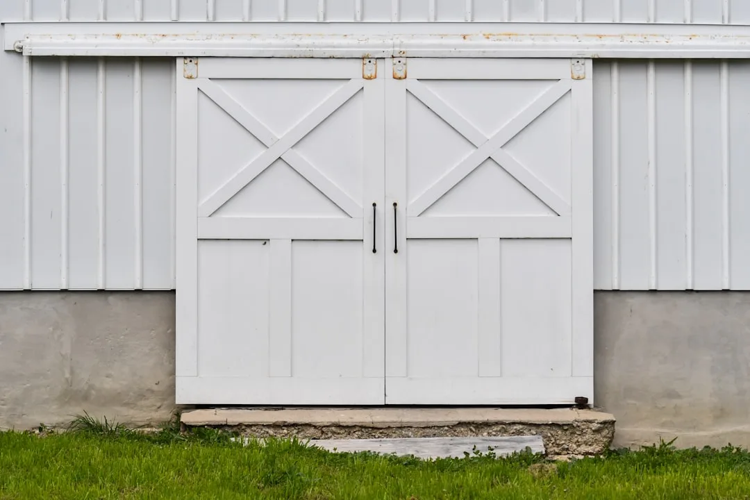
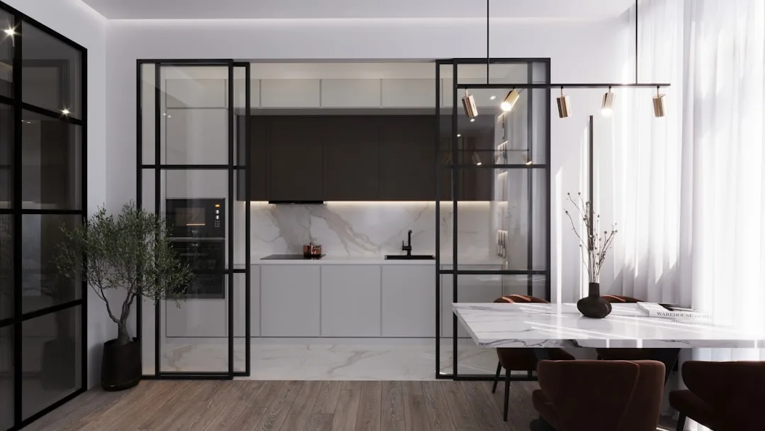
3. Sliding Barn Doors and Pocket Panels for When You Need the Option to Close
There’s a category of client I worked with regularly — usually someone who entertains six times a year and wants the open plan for those events, but also wants to be able to hide a disastrous kitchen cleanup for the other 359 days. Flexible dividers are the right answer for that person, and the options have gotten genuinely better in the last five years.
The barn door on a wall-mounted track remains the most renter-friendly version of this solution, because it requires no structural modification — you’re anchoring hardware to studs, not removing or building anything. But not all barn doors are created equal, and the material choice changes everything about how the closed position feels:
- Solid wood panels offer acoustic dampening and a warm, furniture-like presence when closed, but they block all light and can feel heavy in smaller spaces
- Frosted glass panels on a sliding track maintain light flow even when closed — this matters more than most people realize, because a closed solid door in a small apartment can make the adjacent space feel like a corridor
- Bi-fold and accordion panels fold completely flat against one wall when open, which is the least obtrusive option if your space is under 600 square feet and every inch of clear floor counts
- Finish coordination: match your door hardware metal — hinge finish, track finish, and pull hardware — to at least one other metal already present in the adjacent spaces. A brushed brass track reads as intentional. A chrome track next to matte black cabinet pulls reads as an afterthought.
Among all the kitchen dining room divider ideas that offer genuine flexibility, sliding and pocket panels are the only ones that let you fully toggle between open and closed configurations without committing to either permanently. That’s a real advantage in homes where how you use the space shifts depending on the season, the occasion, or who’s living there.
4. Ceiling-Hung Curtain Panels That Define Without Committing
Ceiling-mounted curtain tracks are chronically underused as kitchen-dining dividers, and the reason is almost always aesthetic snobbery — curtains feel temporary, domestic, unserious. That reaction usually fades the moment someone sees a well-executed version in person.
What makes a ceiling-hung panel work as a zone divider rather than a sad attempt at privacy:
- The track must be ceiling-flush or recessed. A visible curtain rod mounted below the ceiling line reads as window treatment logic applied incorrectly. A flush-mounted or recessed ceiling track reads as architectural.
- Floor-to-ceiling drop is non-negotiable. Panels that stop 6 inches above the floor look like they’re too short. Panels that pool slightly on the floor look intentional. There’s almost no middle ground that works.
- Fabric weight matters more than fabric pattern. A heavy linen or velvet panel has physical presence even when pushed to one side — it reads as a divider even in the open position. A lightweight polyester panel disappears into irrelevance when drawn back.
- Multiple panels on a continuous track give you modular control — you can close off half the boundary, create an angled partial screen, or push everything flat against the wall for full openness.
The practical advantage over every other divider on this list: ceiling curtain panels are the only solution that costs under $300 to execute well and can be removed in twenty minutes if you change your mind.
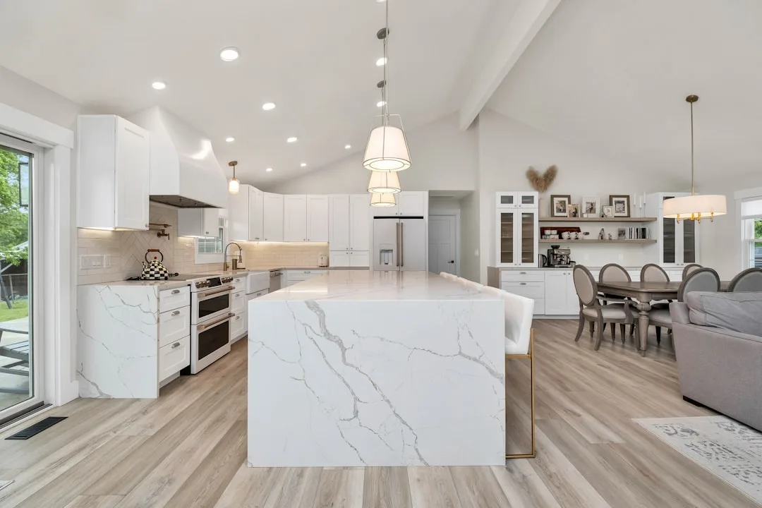
5. Kitchen Islands Extended Into Dining Territory
The kitchen island that doubles as a dining table edge is one of the most spatially efficient kitchen dining room divider ideas available, particularly in homes where square footage makes every piece of furniture count twice.
The version that works best isn’t a standard island with stools pushed against it — it’s an island designed from the outset to perform two functions simultaneously, with the dimensions and material choices reflecting both:
- Counter height versus bar height: A 36-inch standard counter height with counter stools creates a more casual, cafe-like dining experience. A 42-inch bar height with bar stools creates more visual separation but can feel imposing in lower-ceilinged rooms.
- Waterfall edge on the dining side: Extending the countertop material down the dining-facing side as a full waterfall panel creates a furniture-quality finish that justifies the island as a dining boundary rather than a kitchen appliance.
- Overhang depth for knee clearance: You need a minimum 12-inch overhang on the dining side for comfortable seating — 15 inches is better. Anything under 10 inches forces sitters to angle sideways, which they’ll tolerate exactly twice before they stop sitting there.
- Pendant placement: Pendants hung over the dining end of the island should be on a separate switch from kitchen task lighting. The ability to dim the dining end independently while the kitchen overhead stays bright is the single detail that makes an island-as-divider feel like two rooms rather than one.
6. Flooring Transitions as Invisible Dividers
This one doesn’t require any vertical element at all, which makes it useful in spaces where anything above counter height would feel claustrophobic or block the sightlines you’ve specifically chosen to preserve.
A material transition at floor level — wood to tile, concrete to wood, one tile pattern to another — registers spatially even when no one consciously notices it. You step across a threshold that isn’t physically marked anywhere above knee level, and your nervous system still processes it as a zone change.
A few specifics on executing this well:
- The transition line should align with something overhead. A ceiling beam, a change in ceiling height, the edge of a pendant grouping, the boundary of a rug in the adjacent zone. When the floor transition lines up with an overhead element, the zone division reads as deliberate. When it lines up with nothing, it reads as a budget decision.
- Herringbone or pattern-change within the same material is subtler than a full material swap and works well in spaces where a hard contrast would feel too abrupt. Running the same oak plank in standard horizontal in the dining zone and herringbone in the kitchen zone creates definition without discontinuity.
- Grout color in tile zones should be chosen to complement the adjacent flooring material, not just the tile itself. A warm-toned grout in a kitchen tile zone reads better next to warm-toned wood in the dining zone than a stark white grout would.
7. Statement Lighting as a Zone Signal

If you do nothing else from this list, change your lighting. It is the fastest, least invasive, and most underestimated of all kitchen dining room divider ideas — and it works because it operates on a psychological level that furniture arrangement and flooring transitions simply can’t reach in the same way.
The principle: two spaces with two distinct lighting schemes feel like two spaces, regardless of what’s between them. Two spaces lit identically by recessed cans feel like one space no matter how much furniture you stack between them.
What this looks like in practice:
- The dining zone gets a chandelier or pendant grouping hung at 30–34 inches above the table surface — low enough to feel intimate, high enough to clear sightlines across the table. This fixture is always on a dimmer.
- The kitchen zone keeps its task lighting — under-cabinet strips, recessed cans over the work surfaces — but those fixtures are on a separate circuit or at minimum a separate switch from the dining pendant.
- Color temperature divergence is the detail most people miss: dining zones benefit from warmer light (2700K–3000K), which flatters skin tones and food. Kitchen zones can tolerate slightly cooler light (3000K–3500K) for task clarity. Even a 300K difference between adjacent zones registers as a different “feel” when you cross from one to the other.
- The scale of the dining fixture matters as much as its style. A fixture that’s too small for its zone will look like it drifted there by accident. For a standard 36×72-inch dining table, the pendant or chandelier diameter should be between 24 and 36 inches.
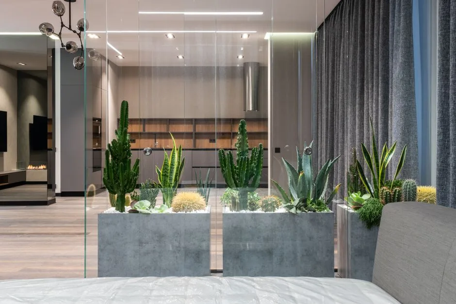
8. Planted Room Dividers and Living Screens
Greenery as a room divider gets dismissed faster than almost any other approach, usually because the mental image is a collection of mismatched houseplants lined up awkwardly on the floor. The version that works doesn’t look anything like that.
An effective planted divider is a system, not a collection:
- Planter troughs on casters running parallel to the kitchen-dining boundary — typically 12–18 inches deep, 12–16 inches wide, and at whatever height you need — create a living screen that can be repositioned and changes with the seasons. Tall grasses, phormium, and ficus varieties all hold their shape well in indoor conditions.
- Hanging planters from ceiling track systems define space overhead rather than at floor level, which is particularly effective in rooms with high ceilings where the usual zone-definition tools run out of visual reach.
- Built-in planter boxes integrated into a half-wall or shelf unit combine structural division with living material — the plants become part of the architecture rather than an accessory placed in front of it.
- Maintenance reality check: Any planted divider requires a plan for watering, light, and replacement. If your kitchen-dining area has limited natural light, choose plants accordingly — pothos, ZZ plants, and cast iron plants are all tolerant of low-light conditions and hold their visual mass well enough to do the job.
9. Architectural Columns and Pillar Additions That Signal a Threshold
Adding a column or pair of columns to mark the boundary between kitchen and dining is the most architectural of all the approaches on this list — and the most permanent. It’s also the one that tends to age the best, because it makes no reference to current trends and reads as a genuine structural decision rather than a styling choice.
Columns work as kitchen dining room divider ideas because they create a threshold without enclosing it. You pass between them the way you’d pass through a doorway, but there’s no door — just the implied frame of the opening:
- Paired columns flanking the transition point create a portal effect that’s stronger than either column alone. The spacing between them should typically be 36–48 inches — wide enough to feel open, narrow enough to feel marked.
- Material options: Painted drywall columns are the most affordable and blend seamlessly into modern interiors. Fluted wood columns reference traditional architecture and work especially well in older homes or spaces with classical detailing. Steel structural columns left exposed (in renovations where they’re structurally present anyway) do the same work with an industrial result.
- Integrated lighting: A column is an excellent place to route electrical for a wall sconce at mid-height — this adds both function and the zone-marking effect of a distinct light source within the threshold itself.
- Scale relative to ceiling height: Column diameter should be roughly 1/12th of their height. An 8-foot ceiling column reads well at 8 inches in diameter. A column of the same diameter in a 10-foot space will look undersized and spindly.
The honest caveat: adding columns requires permits in most jurisdictions if they’re structural, and even decorative columns require proper anchoring at floor and ceiling. This is not a weekend DIY project — it’s a contractor conversation.
Frequently Asked Questions
What is the most budget-friendly kitchen dining room divider idea?
Lighting is the answer almost nobody expects. Swapping recessed-can uniformity for a statement pendant over the dining zone costs $150–$400 for a decent fixture and an hour of an electrician’s time. It does more spatial work than most furniture solutions that cost three times as much. Ceiling-mounted curtain panels are the runner-up — a quality track system with linen panels can be fully installed for under $300 and removed without leaving a trace.
Do open shelves between kitchen and dining make a space feel smaller?
Done correctly, the opposite. A double-sided open shelving unit at 60–66 inches height maintains visual connection between zones while creating a defined boundary — light and sightlines pass over and through the unit. What makes a divider feel space-reducing is solid mass at or above eye level with no visual permeability. Open frames, glass panels, and low half-walls all preserve the sense of openness while still doing the zone-definition work.
How do I divide kitchen and dining without permanent changes in a rental?
Three approaches work well without structural modification: ceiling-mounted curtain tracks (anchored to studs, holes patchable on move-out), freestanding open shelving units, and barn doors on wall-mounted tracks. Of these, the curtain track is the least visible evidence of intervention. Flooring transitions aren’t possible in most rentals, and column additions obviously aren’t either — but lighting changes, if you’re replacing and storing the original fixtures, are typically permitted and reversible.
What height should a half-wall divider between kitchen and dining be?
The functional range is 36–42 inches. At 36 inches, the half-wall is counter height — it hides kitchen counter clutter when you’re seated at a dining table but feels low when you’re standing. At 42 inches, it provides more visual separation and is better for hiding a messy kitchen entirely from a seated dining area. The cantilevered overhang on the dining side needs a minimum 12-inch projection for barstool knee clearance regardless of wall height.
Can a kitchen island work as a full dining table replacement in a small space?
Yes, with specific conditions. The island needs to be long enough to seat the number of people you actually host — typically 24 inches of linear space per person, which means a four-person seating arrangement requires a 96-inch island minimum on the seating side. The overhang must be at least 12 inches for comfortable knee clearance. And the stool height must be matched to the counter or bar height — counter-height stools (24–26 inches) for 36-inch surfaces, bar-height stools (28–30 inches) for 42-inch surfaces. A mismatch of even two inches makes the seating uncomfortable enough that people stop using it.