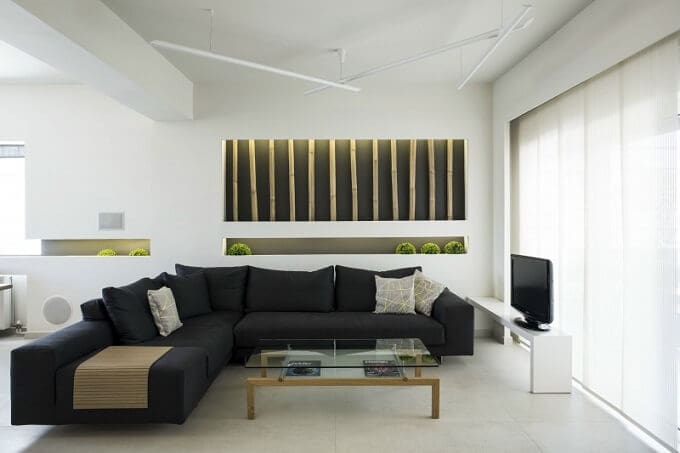
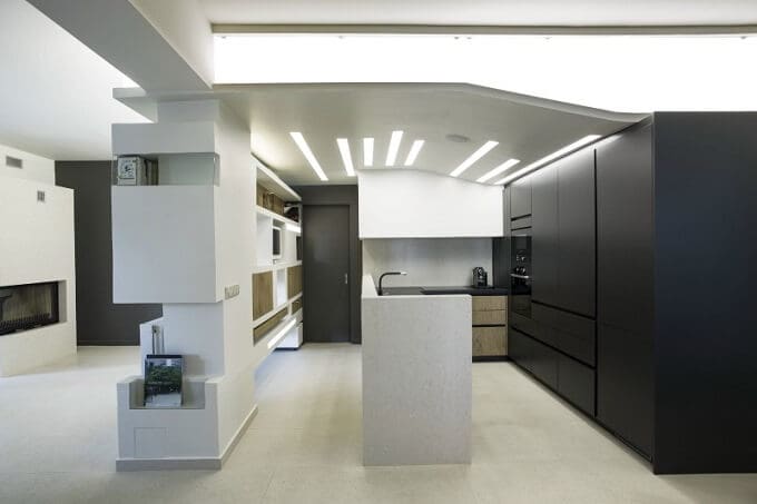
We’ve recently discovered the portofolio of those from Studio NL – Architecture and Design, and we like very much their original and modern design approach of both macro environments and micro environments. We decided to share with you one of their works, Erosion Apartment, for which they received “Bronze A’ Award Design 2013”. Nestled behind a mature lush garden, on the ground floor, this apartment is such a wonderful place to live in! Although the striking contrast between grey and white doesn’t create actually a very warm feeling when you look at it, the creative way it is designed makes you love it from the beginning.
Seeing this extraordinary result after it was completely gutted and transformed, we can’t help but wonder how it was before this convertion. The 915 sq.ft. apartment showcases a dynamic and modern environment where minimalist style is combined with industrially inspired design elements. Harmony is one of the words that defines the entire apartment’s concept and style: everything matches both in form, function and color, creating a perfect balance throughout the entire design.
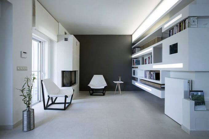
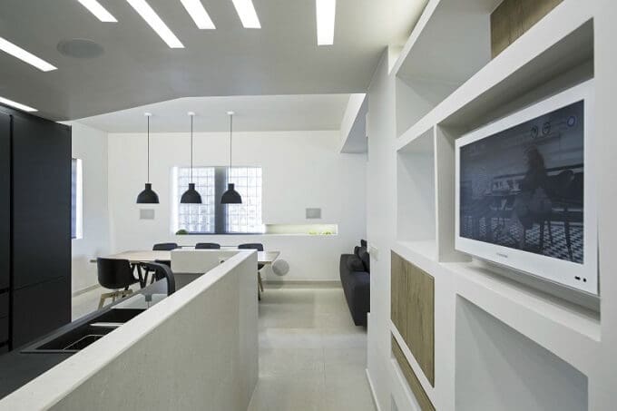
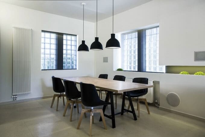
The Erosion Apartment accomodates a living area connected with the dining room and the open kitchen, one bathroom and a bedroom too. Its layout distinguishes through custom architectural designs with which the architects manage to accomplish interactive perspectives, crucial for the harmony of the apartment’s space; the use of natural materials (like wood and travertine) which in combination with the neutral palette create a sober, yet still youthful, stylish and contemporary design.
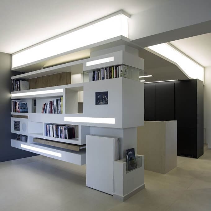
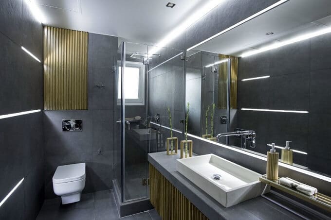
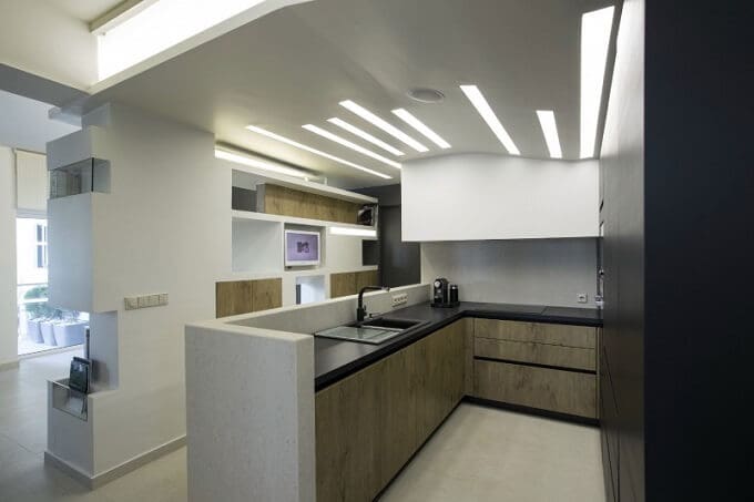
The bold grey paint is used in all the rooms helping to create dimension. It gives a formality that is subtle elegance. This color is softened by plenty of natural light and highlighted with concealed and exposed LED lighting, plus some items with industrial design. The result is a clean and refreshing appearance. The main feature of the apartment is the hanging bookcase with a concealed work desk that really draws attention. This one of a kind, custom designed and site-built unit literally hangs from the ceiling and was made with gypsum board and metal square tubing.
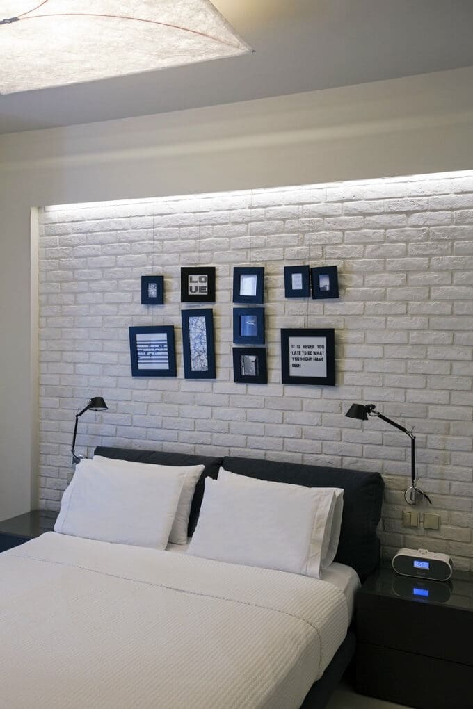
It divides the passageway and the kitchen, acting on one side as bookcase and as hidden storage spaces on the other side with flat-screen LCD TV facing the kitchen and all the AV equipment for the multi-room sound system. Smartly built with high-quality materials and products, Erosion Apartment integrates white walls and simplistic volumes, exhaling openess and a peaceful atmosphere. The overall aspect is like an architectural collage achieved through various cutouts, along with the different textures in material (white brick, grey lacquer) and lighting effects.
Photos © Nancy Leivaditou

