Most neutral rooms fail before a single piece of furniture arrives — because the person designing them picked colors without understanding undertones, and no amount of texture or styling fixes a palette built on mismatched warmth. I spent eleven years watching this happen in client apartments from Wicker Park to the West Village, and the wreckage always looked the same: a beige sofa that somehow looked orange against a “warm” wall that was secretly pink, a gray rug that turned the whole room cold, a space where nothing was technically wrong but everything felt off. The 3-5-7 rule — applied specifically to neutral palette interior design — is the structural fix most people never try because they don’t know it exists for this purpose.
Quick Answer
Most neutral rooms fail before a single piece of furniture arrives — because the person designing them picked colors without understanding undertones, and no amount of texture or styling fixes a palette built on mismatched warmth.
What Actually Counts as a Neutral Palette (It’s Not Just Beige)
In This Article
- What Actually Counts as a Neutral Palette (It’s Not Just Beige)
- What Color Is Replacing Grey in 2026 — and Why Warm Neutrals Won
- What the 3-5-7 Rule in Interior Design Actually Means (and How to Apply It to Neutrals)
- The Layering Method: Why Texture Does the Job Color Usually Does
- Lighting Changes Everything: How to Test a Neutral Before You Commit
- The 6 Neutral Combinations That Professional Spaces Keep Using
- Three Mistakes That Make Neutral Rooms Look Cheap Instead of Calm
- Start Here, Today
Neutrals are not a color. They are a behavior. A color behaves like a neutral when it lacks strong saturation — when it recedes, supports other elements, and doesn’t demand to be the subject of the room. That definition is broader than most people realize, and it matters.
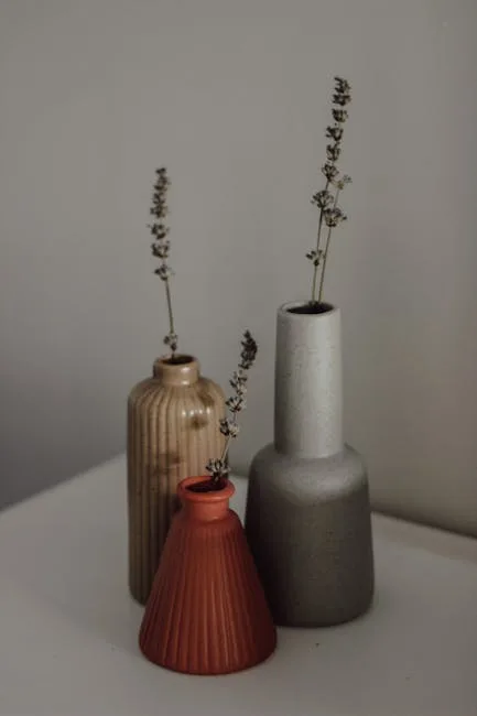
True neutrals — white, black, and the full spectrum of grays — are the obvious ones. But near-neutrals are where the interesting work happens: warm taupes, greiges (that gray-beige hybrid that refuses to be either), earthy ochres pulled so far toward tan that they lose their yellow intensity, dusty sage desaturated to the point where it reads as a warm gray with a memory of green, and terracotta at a low enough chroma that it functions more like a clay tone than an actual color statement. These are all neutrals. None of them are beige.
The single concept that separates a sophisticated neutral room from a flat one is undertone consistency. Every neutral has one — and they are not always obvious. That “pure white” from the hardware store? It might be pulling pink. That warm greige? Could be reading green under certain lighting. The problem is that people choose neutrals in isolation, hold a paint chip up to a wall, say “yes, that looks right,” and move on — and then every new element they bring in either harmonizes or quietly fights, without them ever knowing why.
The difference between a boring neutral room and an expensive one is almost never the budget. It is almost always undertone coherence. I once worked on a Park Slope apartment where the previous owners had spent real money on furniture — a $3,200 sofa, good rugs, proper lighting — but the room felt like a waiting room. Every neutral they’d chosen was technically in the same beige family. But half pulled warm and half pulled cool, and the result was a space that vibrated with low-grade visual anxiety.
Worth knowing for 2026: the cool gray dominance of roughly 2015–2023 is functionally over. Paint industry forecasters — including the trend teams at Sherwin-Williams, Benjamin Moore, and Dulux — have been pivoting toward warmer undertones for their 2025–2026 forecasting cycles: warm putty, clay, dirty white, and what some trend reports call “baked” tones. Cool grays served the clean-line aesthetic that felt aspirational for nearly a decade. But they’re reading dated now, and the market has noticed.
Actionable takeaway: Before picking any neutral, identify its undertone by placing it next to a true white. If the neutral suddenly looks yellow, pink, green, or purple — that’s the undertone. Build from there.
What Color Is Replacing Grey in 2026 — and Why Warm Neutrals Won
Cool gray’s reign was long, and it made a certain kind of sense. It was the photogenic neutral — it looked clean in listing photos, worked with stainless appliances and glass-front cabinets, and carried the minimalist aesthetic that aspirational interiors spent most of the 2010s chasing. But here’s what it didn’t do: it didn’t feel good to be inside.
I’ve been in hundreds of gray-on-gray apartments, and the pattern I kept seeing was that people would stage them beautifully and then quietly hate living there after six months. Something about cool gray at scale is relentlessly clinical. It doesn’t hold warmth. Under low natural light — which describes half the apartments in Chicago and most of Brooklyn — it tips toward institutional.
Warm putty, greige, raw linen, and clay are the direct successors. For the 2026 cycle specifically: Sherwin-Williams named “Afterglow” — a warm, peachy nude with terracotta undertones — as a trending direction in their forecast work. Benjamin Moore’s 2025 Color of the Year was “Cinnamon Slate,” a warm, complex tone that fuses earthy brown and muted purple — nothing like the cool grays that preceded it. Dulux similarly anchored their 2025–2026 direction in warm, organic tones. These aren’t individual choices. They’re coordinated signals that warm neutrals have fully displaced the cool gray era.
The psychological logic is straightforward. Post-2020, a significant shift happened in how people relate to their homes — the space went from backdrop to primary environment. Cool gray was an aesthetic about projecting cleanliness and restraint. What replaced it is an aesthetic about actually being comfortable. Warm putty wraps a room. Clay grounds it. Dirty white — that off-white with a slight yellow or beige push — reads like natural light even when there isn’t much.
Practically speaking, if you’re living in a gray room right now and want to transition without a dramatic repaint:
- Start with a warm white as a bridge — paint the trim and ceiling first; it immediately shifts how the gray walls read
- Introduce warm-toned textiles — a raw linen throw, a jute rug, a boucle cushion in oat or cream will push the room warmer without touching a wall
- Swap cool-toned light bulbs for 2700K warm white; this alone changes a gray room more than most people expect
Don’t jump from cool gray straight to terracotta. The bridge matters. Warm white, putty, or greige is where you land first — it gives the room time to breathe while you figure out where you’re actually going.
Actionable takeaway: If you’re repainting a cool gray room in 2026, pull Benjamin Moore’s “White Dove” or Sherwin-Williams’ “Alabaster” as a warm white starting point — both read creamy rather than stark, and they work as a genuine transitional neutral.
What the 3-5-7 Rule in Interior Design Actually Means (and How to Apply It to Neutrals)
Here’s where people get confused: they encounter both the 3-5-7 rule and the 60-30-10 rule and assume they’re interchangeable. They’re not quite the same thing, and the distinction matters when you’re working in a neutral palette.
The 60-30-10 rule is a color distribution formula. Sixty percent of the room is your dominant color, 30% is a secondary, 10% is an accent. It works for rooms with actual color contrast — where that 10% accent is a statement piece in a clearly different hue.
The 3-5-7 rule is a proportion guideline about the number of elements and their visual weight. It says: use groupings of odd numbers — three, five, seven — rather than even numbers, because odd groupings feel balanced without being static. More importantly, it distributes visual interest unevenly, which creates natural hierarchy. In a neutral palette, this rule does the work that color contrast can’t.
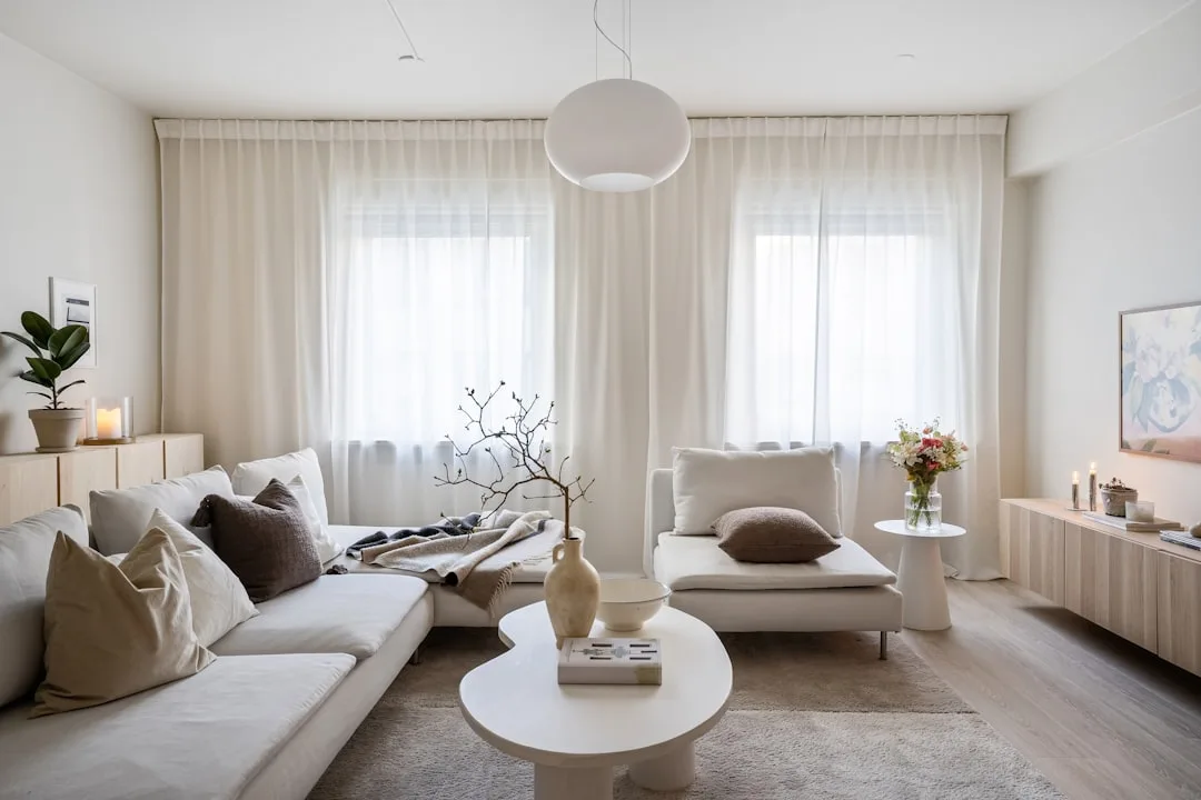
Here’s how it plays out when you’re working with neutrals specifically. Your dominant neutral — let’s say a warm white — covers roughly 70% of the visual field: walls, ceiling, large upholstery. Your secondary neutral — a mid-tone linen or soft greige — covers roughly 20%: rugs, secondary seating, drapery. Your accent neutrals — darker shades within the same family, maybe a walnut wood tone or a warm charcoal — cover the remaining 10%: a console, framed objects, a lamp base. Three tones. Different visual weights. None of them fighting.
The most common mistake I see is three neutrals at equal weight — equal amounts of the same beige on the wall, the sofa, and the rug. The room doesn’t look cohesive. It looks unfinished. Like someone forgot to make a decision. Scale and proportion become your only tools for visual interest when you’re not using color contrast, and distributing them unevenly — the 3-5-7 principle — is how you create a room that holds attention.
In a living room, this might look like:
- Dominant (70%): Warm white walls + off-white linen sectional
- Secondary (20%): Mid-tone jute rug + natural oak shelving
- Accent (10%): Dark walnut console + a pair of aged brass pendants + one deep terracotta ceramic
In a bedroom, the ratios shift because the bed takes dominant visual weight. A white linen headboard against a warm putty wall, with a dark wood frame as the anchor, and a wool throw in a tone two shades deeper than the walls — that’s the 3-5-7 logic applied without ever naming it.
Actionable takeaway: Look at your current neutral room and count how many shades you’re using — then check whether they’re distributed unevenly. If your three neutrals appear in roughly equal amounts, redistribute: amplify the lightest, reduce the middle, and use the darkest sparingly as an anchor.
The Layering Method: Why Texture Does the Job Color Usually Does
Every design article tells you to add texture to a neutral room. Almost none of them tell you how it actually works mechanically, which means most people do it wrong — they pile up soft things and wonder why the room still feels empty.
Texture works in neutral rooms because the eye needs variation to stay engaged, and in the absence of hue contrast, variation comes from light absorption and reflection. A matte surface absorbs light. A sheen surface bounces it. A rough surface scatters it in multiple directions. When you put those three behaviors next to each other, the eye moves across the room the same way it moves across a room with color — there’s just enough difference to create interest without disruption.
The three texture categories that should appear in every neutral room are:
- Hard textures — stone, ceramic, polished or brushed metal, lacquer, glass. These create reflective moments that anchor the eye and read as deliberate.
- Soft textures — linen, wool, velvet, boucle, cotton. These absorb light and create warmth. They’re why a neutral room feels like somewhere you want to sit down.
- Natural/organic textures — rattan, wood grain, jute, woven grass, unfinished clay. These carry visual irregularity that reads as alive. Without at least one organic texture, neutral rooms tend to feel corporate.
The formula is not about matching materials within a category — it’s about contrast between categories. A rattan pendant (organic) over a lacquered dining table (hard, reflective) with linen seat cushions (soft) is three categories in one cluster, and it works.
Matte versus sheen deserves its own mention because most people don’t think of it as texture. It is. A flat matte wall next to a lacquered cabinet next to a raw linen cushion creates depth without any change in color — the depth comes entirely from surface behavior under light.
The layering order I always followed with clients:
- Architecture and fixed surfaces first — the undertone of your walls, the material of your floor
- Large upholstery second — your sofa, your bed frame, your primary chairs
- Rugs third — the material matters as much as the color; wool and jute read completely differently even in the same shade
- Drapery and curtains fourth — often overlooked but they cover huge wall surface area
- Smaller textiles and objects last — this is where you introduce the organic category if it hasn’t appeared yet
The luxury hospitality world has been doing this systematically for decades. Spend any time in a hotel that gets consistent coverage from spaces recognized by Architectural Digest or similar — the ones where a neutral lobby photograph feels obviously expensive rather than empty — and you’ll find all three texture categories present and deliberately sequenced. Nothing in those spaces matches. Everything coheres. The secret is categorical contrast, not color.
Actionable takeaway: Walk through your current neutral room and check for all three texture categories. If you’re missing organic texture, a single jute rug or rattan object will change the feel of the room before you spend money on anything else.
Lighting Changes Everything: How to Test a Neutral Before You Commit
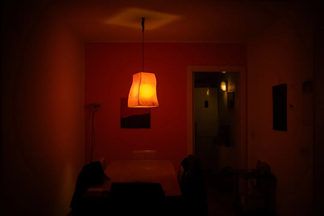
Neutrals are uniquely vulnerable to light. A saturated color — say, a deep navy or an emerald — is going to read as that color across a fairly wide range of lighting conditions. A neutral doesn’t have that luxury. Neutrals have low chroma, which means any shift in light temperature shifts their apparent color significantly — and what looked like a sophisticated warm white on the chip turns pink at 7pm under your overhead fixture.
I learned this the hard way on a Bucktown project where I approved a wall color based on samples I’d reviewed under the showroom’s lighting, which was cool and even. The client’s apartment faced north — low, flat light all day — and the warm white I’d chosen pulled distinctly yellow by afternoon and then orange under her existing warm bulbs at night. It cost her a repaint. It cost me a relationship.
Natural light direction is the underappreciated variable. North-facing rooms receive indirect, cool-toned light all day — warm neutrals can read muddy and saturated, while cool neutrals tip toward icy and stark. South-facing rooms receive warm, direct light for most of the day and are the most forgiving of any neutral. East-facing rooms are warm in the morning and cool by afternoon. West-facing rooms reverse that. Your room’s orientation should directly inform whether you choose a warm or cool neutral — not your personal preference for beige versus gray.
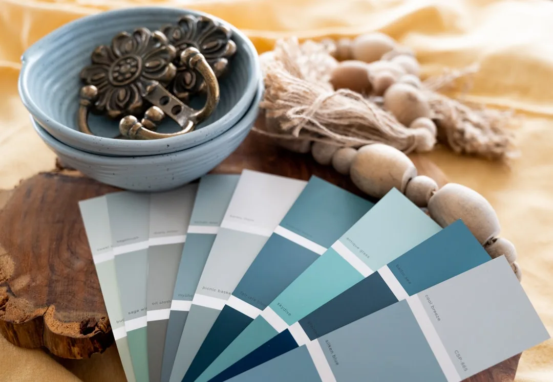
The sample testing process that actually works:
- Paint your sample on a large piece of white foam board or poster board — at least A3 size (11″ x 17″), not a 3-inch chip
- Move it around the room and prop it against the walls at different heights
- View it at morning light, midday, late afternoon, and under your actual evening lighting setup
- Don’t judge it immediately — professional color consultants widely recommend viewing a paint sample across at least 24 hours and multiple lighting conditions before committing; this is the standard for good reason
- Check it against your fixed elements — your floor, your existing furniture, anything you’re keeping
Bulb temperature is where most DIY projects collapse. The standard guide:
- 2700K (warm white): Flatters warm neutrals — putty, cream, warm greige, clay
- 3000K (soft white): A middle-ground that works with warm or slightly cooler neutrals
- 4000K (cool white/neutral white): Works with cool grays and true greiges; will make warm neutrals look sallow
Mismatching bulb temperature to paint undertone is probably the most common reason a freshly painted neutral room feels wrong — and it costs nothing to fix if you catch it before you’ve bought forty bulbs.
One more thing: digital screens lie. Monitor calibration varies so significantly across devices that the same paint color can look two shades different on an iPhone versus a laptop versus a color-calibrated design studio screen. Never select a neutral solely from a website. Full stop.
Actionable takeaway: Before your next paint purchase, buy three sample pots of your top candidates, paint them on large foam boards, and live with them for 48 hours across morning, afternoon, and evening light. It takes two days. It costs under $30. It prevents a $400 mistake.
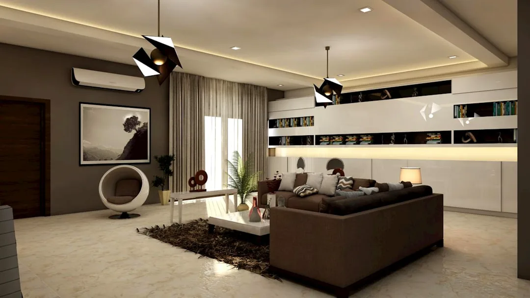
The 6 Neutral Combinations That Professional Spaces Keep Using
Abstract advice about neutrals is everywhere. Here are six combinations that actually recur in well-executed professional spaces — with notes on which ones look good in photographs versus which ones feel better to live inside. That distinction matters, and almost no one makes it.
Combination 1: Warm White + Raw Linen + Dark Walnut
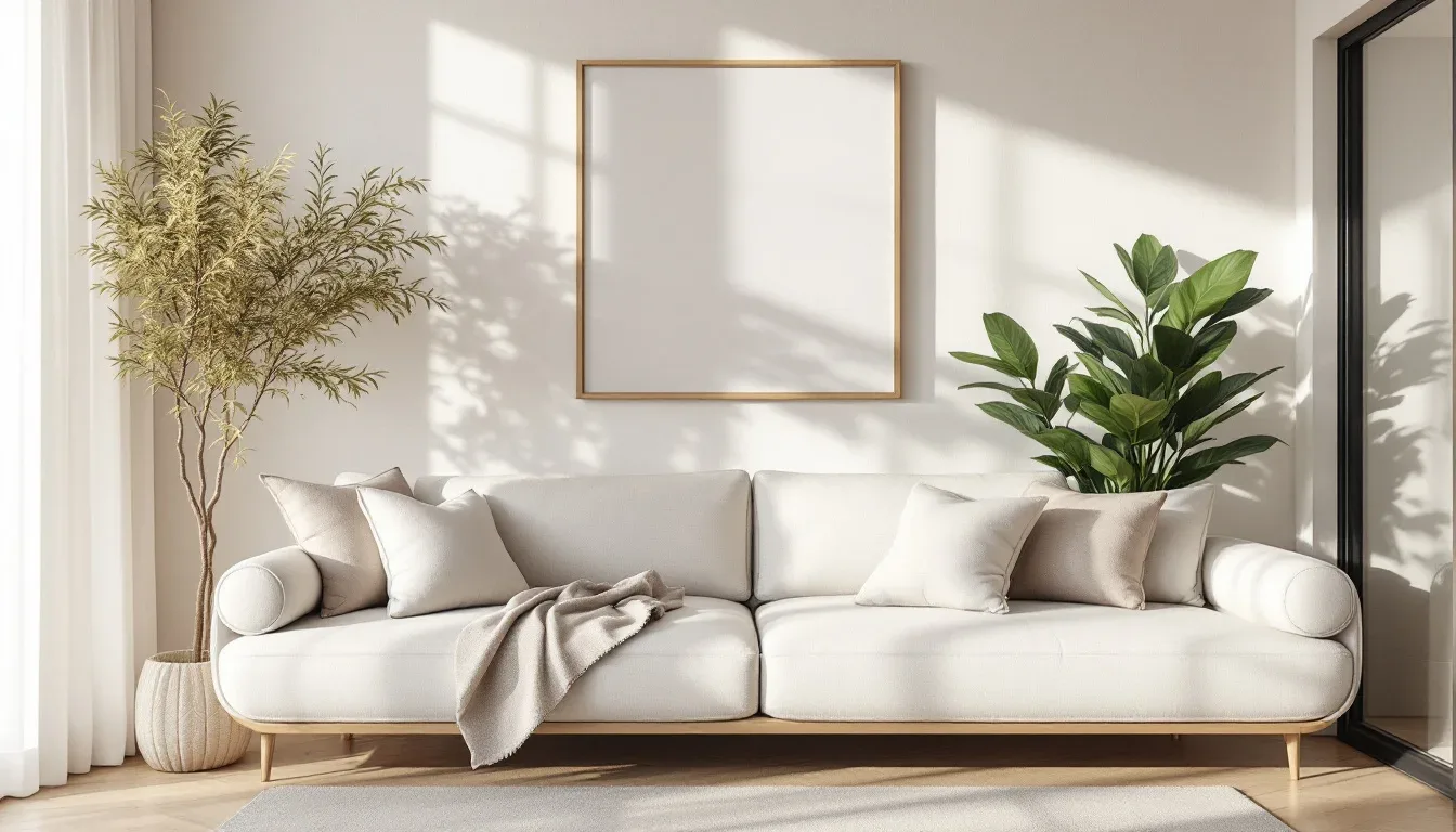
The foundational Scandinavian warmth palette. Warm white on the walls — something with a slight yellow push, like Benjamin Moore “White Dove” — raw linen on the sofa or primary textile, and dark walnut for the wood elements. This photographs clean and bright, which makes it popular in staging contexts. It also genuinely feels comfortable to live with. One of the few combinations that works equally in both columns.
Combination 2: Warm Putty + Terracotta + Bleached Oak
The 2026 combination. Warm putty walls — think Sherwin-Williams “Accessible Beige” pushed warmer — with terracotta as a ceramic or textile accent and bleached or whitewashed oak for the floor and furniture. This is earthy and grounded in a way that photographs warmly but is even better to live in. The terracotta reads as a neutral at low saturation. Best for south- or west-facing rooms where the warm tones don’t tip muddy.
Combination 3: Greige + Soft Black + Aged Brass
Elevated and genuinely timeless. Greige at the dominant level, soft black (not harsh matte black but a slightly warm charcoal-black) as the anchor in furniture or framing, and aged brass in hardware and light fixtures. This combination photographs exceptionally well — the contrast is high enough for editorial contexts — and also holds up in daily living. It works in modern, transitional, and even some traditional spaces. Strong resale staging option.
Combination 4: Chalk White + Cool Gray + Slate
The one cool combination on this list, and it belongs here because some spaces need it. Chalk white — a slightly dusty, matte white with a cool undertone — paired with a soft mid-gray and slate in stone or ceramic. This only works in south-facing rooms with strong natural light. In a north-facing room, it will feel like a doctor’s office. Photographs beautifully for listing shots, which is why staging professionals use it, but it requires the right light to live with.
Combination 5: Stone Beige + Cream + Natural Jute
Organic and tactile. Stone beige on the walls, cream in the upholstery and soft elements, and natural jute in the rug and smaller textiles. This combination doesn’t photograph as dramatically as the others — the value contrast is low — but it is one of the most physically comfortable palettes to inhabit. Suits coastal, rustic, and relaxed-contemporary spaces. Choose this one if you care more about how the room feels than how it looks in a photo.
Combination 6: Off-White + Dusty Sage + Warm Oak
Possibly the most livable neutral combination that exists. Off-white — something with a yellow-green push rather than a pink one — paired with dusty sage at low saturation and warm oak in the floors or furniture. The sage reads as a neutral because its saturation is so low, but it prevents the all-beige monotony that flattens similar palettes. This combination photographs well and lives even better. Works across virtually every room orientation and architectural style.
Actionable takeaway: Pick the combination closest to your existing fixed elements (floor tone, existing furniture you’re keeping) rather than starting from scratch. You’re not building from zero — you’re finding which of these six your room is already closest to, then completing it.
Three Mistakes That Make Neutral Rooms Look Cheap Instead of Calm
Neutral rooms go wrong in predictable ways. After seeing the same failures repeat across dozens of apartments, the pattern is clear: it’s almost never a bad color choice that ruins a neutral room. It’s a bad distribution choice. Here are the three I saw most often.
Mistake 1: Every neutral is the same temperature.
When every element in a room pulls warm — warm beige walls, warm sand sofa, warm cream rug, warm wood floors — there is nothing for the eye to land on. The room reads as a single undifferentiated blob. This is the neutral equivalent of a room with no focal point, and it happens constantly because people assume “staying in the warm family” means everything should match temperature exactly. It doesn’t.
The fix is one cooler or darker anchor piece — a soft charcoal lumbar cushion, a dark-framed mirror, a cool linen drapery in a tone a full shade deeper than the walls. That one temperature shift gives the eye a place to rest and suddenly makes every warm element read as intentionally warm rather than accidentally monotonous.
Property staging professionals address this problem specifically when preparing neutral homes for resale — they routinely introduce one cooler-toned element (often dark metal hardware, a cool-toned artwork, or a deep gray throw) into an otherwise all-warm room specifically because it creates the contrast that reads as “designed” in listing photography and in-person walkthroughs.
Mistake 2: Matching values too closely.
A beige sofa against a beige wall with a beige rug does not read as cohesive. It reads as unfinished. Value contrast — the difference between light and dark within a palette — must exist even inside a single neutral family. You can use three versions of beige as long as one is clearly light, one is clearly mid-tone, and one pushes toward dark. The 3-5-7 rule handles this when applied correctly: your dominant neutral should be your lightest, your secondary your mid-tone, your accent your darkest.
Mistake 3: Ignoring the fifth wall.
The ceiling is almost always painted the same white as the trim, which does two unflattering things simultaneously: it flattens the perceived volume of the room and it creates a stark, hospital-bright contrast to any warm neutral on the walls. A ceiling painted even one shade deeper than the walls — or in a slightly warmer version of the same neutral — adds perceived height through a phenomenon called visual enclosure, and it makes the entire room feel more intentionally designed.
I once had a client who’d repainted her living room three times trying to get a color to “feel right,” and it never did. The walls were fine. Her ceiling was brilliant white under warm lighting, which was blasting visual cold downward into an otherwise warm room. We painted the ceiling one shade deeper than the walls. She called it the best decision she’d made in the apartment. She’d already spent $900 on paint before we got there.
Actionable takeaway: Look up. If your ceiling is the same white as your trim and your walls are any shade of warm neutral, you have a fast, high-impact fix available. Take your wall color, add about 25% white to it, and paint the ceiling with the result. If mixing custom isn’t your preference, ask your paint shop to mix the wall color at 50% depth — it’s a standard request.
Frequently Asked Questions
What is the 3-5-7 rule in interior design?
The 3-5-7 rule is a proportion guideline, not a color formula. It holds that groupings and distributions in a room should follow odd numbers — three, five, seven — rather than even ones, because odd groupings create visual hierarchy that feels balanced without being static. In practical terms, it means: don’t use two of anything at equal scale. Use three, placed unevenly. Don’t create four identical accent moments — use three or five. The rule is especially useful in neutral palette interior design because, without color contrast, proportion and scale become the primary tools for visual interest. When everything in a neutral room is the same visual weight, the room disappears. The 3-5-7 rule forces distribution: one dominant, one secondary, one (or more) accent — each at a different scale.
For clarity: the related 60-30-10 rule is a color distribution formula (60% dominant color, 30% secondary, 10% accent) rather than a grouping principle. The two rules are compatible and often applied together, but they’re not the same thing, and you’ll find both referenced across design content without much distinction being made.
What colors are in a neutral palette?
A neutral palette includes any color low enough in saturation that it supports rather than competes with the visual field. True neutrals — white, black, and the full range of grays — are the obvious core. Near-neutrals expand the palette significantly: warm taupes, greiges (gray-beige hybrids), earthy ochres at low saturation, dusty sage, warm terracotta at clay intensity, raw linen tones, and warm putty all qualify. The key is that the color lacks strong chroma — it doesn’t announce itself.
What most people miss is that two neutrals can be in the same family but still clash — specifically through undertone mismatches. A neutral that pulls pink and a neutral that pulls green will fight visually even if both are technically beige. Building a neutral palette means first identifying the undertone of your dominant surface (usually the walls or floor) and then selecting all remaining neutrals to either match or deliberately contrast that undertone, not accidentally oppose it.
What color is replacing grey in 2026?
Warm putty, greige, clay, raw linen, and dirty white are the primary successors to the cool gray that dominated interior design for roughly a decade. The 2026 paint forecasts from Sherwin-Williams, Benjamin Moore, and Dulux all pivot toward earthy, warm-toned palettes — baked tones, terracotta-adjacent selections, and complex nudes with yellow-brown rather than blue-green undertones. Benjamin Moore’s 2025 Color of the Year, “Cinnamon Slate,” exemplifies the direction: warm, layered, nothing like the clean cool grays that preceded it. Sherwin-Williams’ trend direction for 2025–2026 similarly anchors in peachy, warm neutrals like “Afterglow.”
The shift is partly aesthetic and partly psychological. Cool grays served the clean-line minimalist aesthetic that aspirational design favored from 2015 onward. That aesthetic now reads dated in most resale and editorial contexts. What replaced it is an interior vocabulary that prioritizes warmth, tactility, and comfort over visual restraint — and warm neutrals are the color language of that shift.
How do you make a neutral room look more expensive?
Four things move a neutral room from flat to expensive-looking, and none of them require significant budget:
Undertone consistency. This is the biggest one. When every neutral in the room shares the same underlying warmth or coolness, the palette reads as considered rather than accidental. Mismatched undertones are what make a well-furnished room feel off without anyone being able to explain why.
Value contrast. Within your neutral palette, you need a clear light, a clear mid-tone, and a clear dark. A room where everything sits in the same middle range of light-to-dark reads as unresolved. One dark anchor — a walnut console, a black-framed mirror, a deep charcoal throw — does more for perceived quality than almost any decorative purchase.
Categorical texture contrast. At least one hard surface, one soft textile, and one organic material should be present in any neutral room. The contrast between surface behaviors — matte versus sheen, smooth versus rough, reflective versus absorptive — is what the eye reads as richness. Matching materials within the same category (all soft, all smooth) flattens the room regardless of quality.
Ceiling treatment. A ceiling painted one shade deeper or warmer than the walls adds perceived depth and makes the room feel enclosed in the good sense — contained and considered, not cavernous. It’s the change that staging professionals make in high-value properties and that almost no one makes in their own homes.
Start Here, Today
Pull out your phone and take a photo of your living room or bedroom in your normal evening light. Look at the photo — not the room itself, the photo — and identify whether your neutrals read warm or cool. Then find the element that’s fighting: the rug that’s suddenly reading purple, the wall that’s tipping yellow, the sofa that’s gone weirdly pink under the overhead light. That’s your undertone mismatch, and it’s almost certainly what’s making the room feel unresolved.
Before you buy anything, change anything, or repaint anything — fix the undertone first. Everything else in this article compounds from there. The 3-5-7 distribution, the texture layering, the ceiling depth — all of it works harder in a room where the palette is internally consistent. Start with the foundation. The rest will follow.