Getting your furniture arrangement in an open floor plan right is harder than it looks — and the gap between how these spaces photograph and how they actually live is where most homeowners get stuck. The open floor plan was supposed to make your home feel bigger, so why does it feel like you’re arranging furniture inside an airport terminal? Nailing furniture arrangement in an open floor plan is less about taste and more about understanding a specific set of spatial rules that nobody ever explains out loud.
Quick Answer
The open floor plan was supposed to make your home feel bigger — so why does it feel like you’re arranging furniture inside an airport terminal?
That specific feeling — vast, directionless, oddly exhausting — is something I spent years diagnosing in client homes across Chicago and New York. The floor plan wasn’t the problem. The arrangement always was. And there are patterns to these failures, which means there are patterns to fixing them.
Why Most Open Floor Plan Arrangements Fall Apart (And What’s Actually Going Wrong)
In This Article
- Why Most Open Floor Plan Arrangements Fall Apart (And What’s Actually Going Wrong)
- The Floating Furniture Trap: Why Pushing Everything Against the Walls Ruins the Space
- How to Arrange Furniture Around Traffic Flow Without Sacrificing Style
- Scale and Proportion: The Invisible Reason Your Furniture Arrangement Feels Off
- Zone Definition: How to Create Distinct Areas in an Open Floor Plan Without Building Walls
- The Anchor Piece Strategy: How to Ground Every Zone in Your Open Floor Plan
Open floor plans now appear in over 70% of newly built American homes, according to tracking by the National Association of Home Builders — and they consistently rank among the most frustrating decorating challenges homeowners report. That gap between prevalence and satisfaction is enormous. You’d think we’d have figured this out by now.
The reason we haven’t is that open floor plans don’t fail randomly. They fail in three specific, predictable ways: no visual anchors to organize space around, traffic flow treated as an afterthought, and furniture scaled to a different room than the one it’s in. Remove any one of those three problems and the space improves. Fix all three and you get a room that actually functions.
The visual anchor problem is the least visible but the most damaging. Without walls to organize against, furniture floats. The eye sweeps the room and finds nothing to rest on — no moment that says “this is where the living zone begins.” I once watched a client rearrange the same set of furniture six different ways over three weeks, all of them wrong, because she kept moving accent pieces around an anchor that was never properly established in the first place.
Pinterest makes this worse. Staged rooms for photography are arranged around ideal camera angles, not around how anyone actually moves through a space. Columns get cropped out. Windows get styled around rather than considered. The natural light angle that makes a room glow at 2pm in the photo makes your north-facing apartment feel like a dentist’s office at the same time of day.
What you’re actually dealing with when an open floor plan fails isn’t aesthetic failure — it’s diagnostic failure. The room has problems that haven’t been named yet.
Common diagnostic questions to ask before rearranging anything:
- Does the room feel empty in the center but cluttered around the edges?
- Do you naturally hesitate before choosing which direction to walk when you enter?
- Can you identify a clear “living zone” versus “dining zone” from the doorway?
- Does your eye land somewhere specific when you walk in, or does it keep moving without stopping?
- Does furniture from one zone bleed visually into the next with no clear boundary?
Actionable takeaway: Before rearranging anything, identify which of the three root problems — anchors, traffic flow, or scale — is causing the most friction. Name it. Then work from there.
The Floating Furniture Trap: Why Pushing Everything Against the Walls Ruins the Space
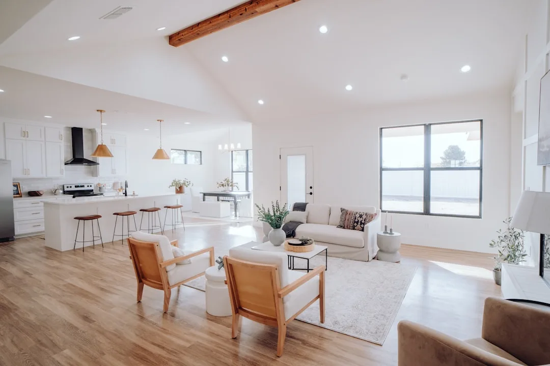
Every single piece of furniture against the wall. Sofa on one wall, chairs on the opposite, console against the third. Wide open center. Looks orderly. Feels like a waiting room.
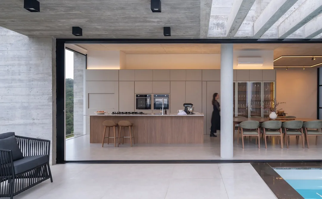
This is the most universal beginner mistake I ever saw in my practice — and I saw it constantly, in apartments, in townhouses, in beautiful open-plan homes that felt inexplicably wrong the moment you stepped inside. The instinct makes psychological sense: walls feel safe, defined, known. But pushing furniture against them in an open floor plan creates what designers often call the “roller rink effect” — a hollow, echoing center that reads as empty no matter how much furniture surrounds it.
The fix is counterintuitive: float your furniture toward the center of each zone. Interior designers broadly recommend leaving at least 18 inches of breathing room between the back of a sofa and the nearest wall in rooms exceeding 300 square feet — because that gap, which seems wasteful, is what transforms a waiting room into a living room. The space behind the sofa becomes a visual breath. The furniture grouping becomes a destination rather than a perimeter.
Here’s a quick test for whether your arrangement is wall-dependent:
- The conversation circle test: Sit in your primary seating. Can you have a normal-volume conversation with someone in every other seat without leaning forward? If not, the seating is too spread out — which usually means it’s hugging walls.
- The 3-foot rule: Stand at your room’s entry point and walk straight toward the center. Do you walk more than 3 feet before encountering any furniture? That center void is the problem.
- The photo test: Take a wide-angle photo from the room’s main entry point. If every piece of furniture is touching a wall in the photograph, you have a wall-hugging problem regardless of how it feels standing inside it.
For specific furniture types, the floating distances that work in practice:
- Sofas: 18–24 inches from the wall in rooms over 300 square feet
- Accent chairs: Can go closer to walls when used as the outer boundary of a floating grouping — but should still angle slightly inward, toward the center of the conversation zone
- Console tables: Genuinely useful as zone dividers when placed back-to-back with the sofa, creating a defined zone edge without walls
- Coffee tables: Should sit 14–18 inches from the sofa’s front edge — close enough to reach easily, far enough not to be a shin hazard
- Dining tables: Need a minimum of 36 inches of clearance on all sides for comfortable chair pull-out and circulation
I spent $800 of a client’s budget on a sectional that we then placed — at her insistence — flush against the back wall of her 400 square foot living zone. The room never recovered. The sectional looked like it was trying to escape through the drywall. We eventually pulled it 22 inches forward and the entire space rearranged itself around that single move.
Actionable takeaway: Pull your sofa off the wall by at least 18 inches today and sit with it for 48 hours. What feels wrong at first usually feels right by day two.
How to Arrange Furniture Around Traffic Flow Without Sacrificing Style
Most guides mention traffic flow. Almost none of them actually map it. That’s the gap — and it’s the gap where most open floor plan arrangements break down in daily use.
There are two clearance standards worth knowing and actually applying. The 36-inch rule governs primary pathways — the main routes between rooms or zones, the paths people take automatically without thinking. The Americans with Disabilities Act codifies 36 inches as the minimum for accessible passage, and professional space planners cite it as the gold standard for residential comfort too. Secondary pathways within a zone — the path from sofa to coffee table, from dining chair to sideboard — need a minimum of 24 inches.
Before you move a single piece of furniture, do the masking tape floor test:
- Roll out masking tape along the natural entry and exit points of every zone — front door to kitchen, kitchen to dining, dining to living, any path to a bathroom or bedroom.
- These tape lines are your non-negotiable primary corridors. Nothing furniture-sized goes across them.
- Now look at what’s left. Those remaining floor areas are your arrangement zones.
- Mark the approximate center point of each zone with a small piece of tape. This becomes your anchor point — the invisible stake everything else orients toward.
- Measure and note the dimensions of each zone before moving anything. This prevents the common trap of mentally over- or underestimating how much room you actually have.
The three most common open plan configurations behave differently under this logic:
- L-shaped layouts: Traffic naturally cuts across the inner corner — that corner becomes the most contested real estate in the room. Almost every L-shaped arrangement mistake involves placing a primary seating piece exactly where the traffic diagonal wants to pass. Keep the inner corner of the L clear or assign it to a low piece like a coffee table or ottoman that traffic can visually pass over.
- Galley-style open plans (long and narrow, kitchen on one side): The central corridor instinct is even stronger here. Resist it. Anchor the living zone to one end and the dining zone to the other, with clear furniture edges — a sofa back, a console, a bench — marking the boundary between them rather than open floor.
- Great room layouts (kitchen, dining, and living all visible from a single vantage point): These need the strongest zone definition of the three configurations because there are no architectural transitions at all. Rugs become load-bearing decisions. Each zone needs its own rug, its own light source, and at least one piece of furniture that faces into the zone rather than across it.
Actionable takeaway: Map your traffic corridors with tape before the next time you rearrange. The corridors you discover often explain why every previous arrangement felt subtly wrong.
Scale and Proportion: The Invisible Reason Your Furniture Arrangement Feels Off
Scale mistakes in open floor plans are quiet failures. The room doesn’t look obviously broken — it just never feels quite settled. Something is always slightly off, but pinpointing it is genuinely hard because scale errors don’t announce themselves the way a blocked doorway does.
The core problem is that most furniture is sized for rooms with walls. A sofa that fills a 14-foot living room wall appropriately becomes a visual footnote in a 28-foot open living zone. A dining table that seats six comfortably in a closed dining room can look like it’s apologizing for existing in an open plan where it has to hold its own against a full kitchen and living area.
The most common scale mistakes in furniture arrangement for open floor plans:
- Undersized rugs: This is the single most common scale error, and it’s nearly universal. A rug should be large enough that all primary seating pieces have at least their front legs on it. In most open-plan living zones, this means a minimum of 8×10 feet — and in larger zones, 9×12 or larger. A 5×8 rug under a full seating arrangement looks like a place mat.
- Too many small pieces instead of fewer larger ones: Three small accent chairs do not equal one substantial sofa in visual weight. Open plans need furniture that can hold visual mass across distance.
- Low furniture in high-ceiling spaces: Furniture with a seat height under 17 inches tends to disappear visually in rooms with ceilings above 9 feet. The proportional relationship between ceiling height and furniture height matters more in open plans than in closed rooms.
- Lighting scaled to a smaller room: A single overhead fixture appropriate for a 12×12 room is visually inadequate for an open zone twice that size. Scale up lighting deliberately — pendants over the dining zone, a floor lamp anchoring the reading corner, table lamps adding warmth at eye level across the living zone.
A practical calibration tool: photograph your room from the primary entry point, then reduce the image to thumbnail size on your phone. At thumbnail scale, visual weight problems become obvious immediately. Pieces that disappear are undersized. Pieces that dominate are potentially oversized. This test strips away the context clues your eye uses to compensate for scale errors when you’re standing inside the space.
Actionable takeaway: Measure your rug first. If it’s under 8×10 in a full living zone, replace it before adjusting anything else. The rug fix alone transforms scale perception more reliably than any other single change.
Zone Definition: How to Create Distinct Areas in an Open Floor Plan Without Building Walls
The reason zone definition matters so much in furniture arrangement for open floor plans is that humans are neurologically oriented toward bounded spaces. We feel more comfortable, more focused, and more relaxed in spaces that have legible edges — even implied ones. Open floor plans strip away the architectural edges, which means the furniture has to create them.
There are five tools that create zone definition without walls:
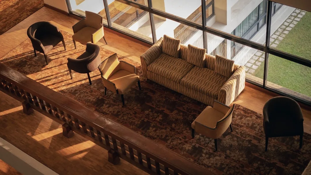
- Rugs: The most powerful zone-definition tool available. Each zone gets its own rug, sized to contain the primary furniture of that zone. The gap between rugs — even just 12 to 18 inches of bare floor — reads as a zone transition to the brain.
- Furniture backs: The back of a sofa is a wall. Orienting it to face into a zone while its back faces another zone creates a clear boundary. This is one of the most underused spatial moves in open-plan design.
- Lighting zones: A pendant over the dining table, a floor lamp in the reading corner, a table lamp on the console behind the sofa — each light source signals a different zone even when the ceiling is continuous.
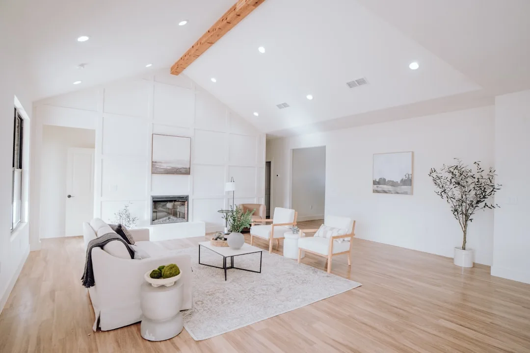
- Ceiling treatments: Beams, a tray ceiling, a coffered section, or even a painted ceiling rectangle over the dining zone can delineate zones architecturally without construction. If your space allows for even minimal ceiling differentiation, it does zone-definition work that no amount of furniture can fully replicate.
- Vertical elements: Bookshelves, open shelving units, and even tall plants create implied walls that the eye registers as zone boundaries without blocking light or sightlines.
The most important thing to understand about zone definition is that the boundaries don’t need to be opaque or physical — they just need to be consistent. If your living zone has a rug, a defined overhead light source, and furniture facing inward, the brain registers it as a room even without walls. If it has only one of those three things, the zone feels incomplete regardless of how carefully the individual pieces are arranged.
Actionable takeaway: Audit your current arrangement against all five zone-definition tools. Most struggling open-plan arrangements are missing at least three of them in each zone.
The Anchor Piece Strategy: How to Ground Every Zone in Your Open Floor Plan
Every zone in a well-arranged open floor plan has one piece that everything else orients toward — one visual and functional anchor that establishes where the zone exists and what it’s for. In the living zone, it’s almost always the sofa. In the dining zone, it’s the table. In a home office nook within an open plan, it’s the desk.
The mistake most people make is not the anchor piece itself — it’s the orientation. Anchor pieces get placed parallel to the nearest wall by default, which is the wrong instinct in open plans. The anchor piece should orient toward the center of its zone and toward whatever focal point serves that zone — a fireplace, a window, a television, a view.
How to identify and place your anchor piece correctly:
- Stand at the entry point to the zone and identify what your eye naturally wants to look at. That’s your focal point.
- The anchor piece faces the focal point, not the wall.
- Every other piece in the zone supports the anchor — chairs angle toward it, side tables flank it, the rug is sized to contain it and its supporting pieces.
- The anchor piece should be the largest single piece in the zone. If your coffee table reads as visually heavier than your sofa, your scale is off.
One configuration that consistently works in open plans of 500 square feet or more is what designers informally call the “campfire arrangement” — seating grouped in a rough circle or U-shape around a central anchor point (usually the coffee table or fireplace), with all pieces angled slightly inward. The arrangement communicates gathering. It resists the wall-hugging instinct. And it scales up gracefully as rooms get larger.
Actionable takeaway: Identify the anchor piece in each zone before the next rearrangement. If you can’t immediately name it, the zone lacks one — and that’s the first problem to solve.
Frequently Asked Questions About Furniture Arrangement in Open Floor Plans
How do I arrange furniture in an open floor plan when I can’t agree where zones should go?
Start with the fixed points — the kitchen, the windows, the fireplace if you have one — and let those dictate zone placement rather than trying to impose zones onto blank floor space. Kitchens always anchor one end of the plan. Natural light sources pull seating toward them. Fireplaces almost always become the focal point of the living zone. Once you’ve identified the fixed anchor points, zone placement typically becomes obvious. The disagreements usually dissolve once people stop trying to decide in the abstract and start mapping against what the room already provides.
What size rug do I need for furniture arrangement in an open floor plan living zone?
The minimum functional size for a living zone rug in an open floor plan is 8×10 feet for standard seating groups (sofa plus two chairs). If your seating group is larger, or your zone is over 400 square feet, move to 9×12. The test is simple: with all primary seating in place, the front legs of every piece should rest on the rug. If any piece is fully off the rug, the rug is too small. When in doubt, go one size larger than feels right — in open plans, rugs almost always read smaller than they measure because they’re competing with significantly more floor space.
Can I do furniture arrangement in an open floor plan with a sectional sofa?
Yes, but sectionals require more deliberate placement than standard sofas because they carry more visual weight and commit more firmly to a single configuration. In open plans, an L-shaped or U-shaped sectional works best when it faces clearly into the zone, with the open side of the L or U oriented toward the room’s entry point or primary traffic path. Avoid placing sectionals with their longest side against a wall — that’s the wall-hugging trap at its most expensive. The sectional should float, with all sides accessible and the back of the piece clearly defining the zone’s boundary.
How do I separate living and dining zones in furniture arrangement for an open floor plan without using a divider or screen?
The most effective separation without physical dividers uses three tools in combination: a rug under each zone (with clear floor visible between them), a lighting fixture above each zone (pendant over the dining table, floor or table lamp in the living zone), and at least one piece of furniture with its back oriented between the two zones. The sofa back facing the dining zone is the most common version of this last tool. Together, these three elements create a perceived boundary that registers as a zone transition even with fully open sightlines.
Why does my open floor plan furniture arrangement look good in photos but feel wrong to live in?
Photography compresses space and flattens depth, which means arrangements optimized for photography tend to fail in daily use. The most common version of this problem: furniture pulled close together for a cozy photographic composition that, at full scale, makes it physically awkward to navigate through the space. The reverse also happens — arrangements that photograph as spacious but feel hollow and directionless when you’re inside them. The test for a livable arrangement isn’t how it photographs from a fixed corner angle. It’s how the room feels when you walk in from the front door, when you sit down in the primary seating, and when you move between zones during normal activity. Those three experiential moments reveal what photos hide.