The most common mistake people make when choosing paint colors that work with wood floors has nothing to do with the shade they picked — it’s that they looked at the floor under the wrong light before they ever picked up a chip.
Quick Answer
The most common wood floor decorating mistake has nothing to do with the paint color you chose — it’s that you looked at the floor under the wrong light before you ever picked up a chip.
I know this because I made the mistake professionally. A client in Wicker Park had beautiful red oak floors, and I confidently recommended a warm greige based on what I’d seen during a Tuesday afternoon site visit. She called me three days after painting to say the walls looked pink. She wasn’t wrong. The room faced west. By 5pm, the light coming through those windows hit the floor at an angle that pulled every warm undertone out of everything — walls, floors, furniture. I had assessed the floor at 10am, in a completely different quality of light. The room wasn’t the same room.
That’s what this article is actually about.
Stop Starting With the Paint Chip (Start Here Instead)
In This Article
Wood floors do not have a fixed undertone. This is the thing no one tells you, probably because acknowledging it complicates the very straightforward “find your undertone, find your color” system that makes most paint advice easy to write and nearly useless to follow.
What your floor actually has is a light-reflection behavior — and that behavior changes throughout the day based on how ambient light enters the room, bounces off walls, and hits the floor’s finish at different angles. The same red oak plank that reads warm gold at noon reads gray-brown by dusk. The same maple floor that looks nearly white on an overcast morning develops a honey tone when afternoon sun crosses it at a low angle. These are not subtle differences. Research on color perception shows that lighting conditions can shift a color’s perceived hue by up to 30 degrees on the color wheel — meaning your floor’s apparent warmth or coolness can change dramatically between morning and evening in the same room.
This matters enormously before any paint decision is made. Here’s why: if you choose your wall color based on how the floor reads at noon, and you spend most of your waking hours in that room after 5pm, you’ve effectively decorated for a version of your floor that you barely see.
What I now tell anyone who asks: spend one full day in the room before you look at a single chip. Sit in it at 8am. Come back at noon. Come back at 4pm. Come back after you’ve turned on every light source you normally use in the evening. Take photos at each point — not because they’ll tell you the answer, but because the differences between them will show you exactly how much range you’re working with.
A few things to track during that observation:
- Does the floor shift warm or cool as direct sunlight fades? Floors with orange-gold stain tend to go muddy-brown in diffuse light. Floors with gray undertones often look richer in artificial light than in daylight.
- Is there a time of day when the floor looks its best? Design for that moment — it’s usually the time of day the room gets used most.
- Does the floor’s sheen create glare at certain angles? High-gloss polyurethane bounces light in ways that will affect wall color perception — more on that in the next section.
- What does existing furniture look like in the evening light? If you have pieces you’re keeping, they’re already telling you whether the room reads warm or cool at the hours that matter.
- Does the floor color flatten or deepen when clouds pass overhead? This tells you whether your floor is highly reactive to diffuse versus direct light — which matters if your room relies on natural light rather than artificial sources.
- How does the floor read against the baseboard or trim? The contrast between floor and trim shifts throughout the day and gives you a reliable reference point for tracking tonal change.
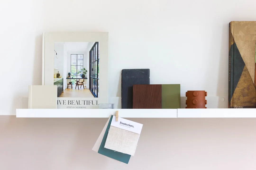
Choosing paint colors that work with wood floors without doing this observation first is like buying a sofa online using only the thumbnail image. The information you need exists — you just have to be in the room long enough to see it.
Actionable takeaway: Before you open a paint deck, document your floor at three specific times — morning, midday, and dusk — in the actual room. Note whether it shifts warm or cool. That shift range is your real design constraint, and it should inform every color decision you make after it.
What Your Wood Finish Is Doing to Every Color You Put Near It
Here’s a variable that almost no one in the “wood floors and paint colors” space talks about, and I genuinely don’t understand why — because I’ve watched it derail good color choices more times than I can count.
The finish on your floor is not just a protective layer. It’s an optical layer. It changes how every color in the room reads, including your walls.
High-gloss polyurethane amplifies contrast. It reflects light back into the room, which means wall colors appear more saturated and edges between surfaces look sharper. This is the finish that makes a soft sage green look vivid and a cream wall look crisp. If you want a calm, quiet room, you often have to compensate by going softer on the wall than you think you need to — because the floor is turning up the volume on everything.
Matte and oiled finishes work in exactly the opposite direction. They absorb light rather than redirecting it, softening the visual relationship between floor and wall. Matte finishes can reduce light reflectance by 60–80% compared to high-gloss — which is not a small number. What that means practically: a color that feels almost too bold as a 12×12 painted sample might feel perfectly grounded on a wall above a matte-finished floor, because the floor isn’t bouncing it back at you.
Waxed floors — which I see constantly in pre-war Chicago buildings and older brownstones — have a specific problem that I’ve never seen addressed in mainstream paint advice. Wax develops an amber cast over time, particularly on lighter wood species. That amber cast turns cool whites yellow. I have walked into countless rooms with waxed parquet or waxed pine and found that the walls — painted what the homeowner described as “bright white” — looked the color of old newspaper. They weren’t a bad choice. The finish had simply eaten the cool bias right out of them.
A practical trick I started using after figuring this out the hard way: photograph your floor in natural midday light, then open the image in any photo editor and fully desaturate it. What you’re left with is the floor’s true tonal value — light, medium, or dark — stripped of the color and finish distractions. That tonal value tells you more about contrast decisions than any undertone analysis will.
To keep this clear:
- Gloss finish + pale wall = walls will read brighter and more saturated than your sample suggests
- Matte/oiled finish + bold wall = wall will read softer; you have more latitude than you think
- Waxed finish + cool white = the white will yellow; choose warm whites deliberately rather than by accident
- Satin finish falls in the middle and is the most forgiving — it’s also the most common in homes refinished after 2000
- Water-based polyurethane stays clearer over time and doesn’t add the amber cast that oil-based formulas develop, which means cool paint colors will hold their bias longer and more reliably
- Hardwax oil finishes (common in Scandinavian-style flooring) have very low sheen and tend to read slightly cooler than their wood species suggests — which can make warm wall colors feel more necessary than the raw wood tone alone would indicate
Actionable takeaway: Before settling on any wall color, identify your floor’s finish type. If it’s high-gloss, dial your wall color choice one shade softer than your instinct. If it’s waxed, test any white or near-white in the actual room before committing — and test it at night under your artificial lighting, not just in daylight.
How Wood Species Changes the Rules Entirely
Most paint advice for wood floors treats “wood” as a single category. It isn’t. The species under your feet has a more fixed color character than the stain applied over it, and that underlying species color doesn’t disappear — it pushes through, especially as finishes wear and age.
Here’s what I’ve observed species by species, and what it means for choosing paint colors that work with wood floors:
Red oak is the most common floor in American homes built between 1950 and 1990. It has a natural pink-orange undertone that no stain fully eliminates. Even a gray or walnut stain on red oak will have a warmer read than the same stain applied to white oak or maple. With red oak floors, genuinely cool paint colors — true blue-greens, clear grays with blue bias — tend to clash because they fight the floor’s warmth rather than working alongside it. Warm neutrals, earthy greens, and ochre-adjacent colors tend to agree with the floor rather than argue with it.
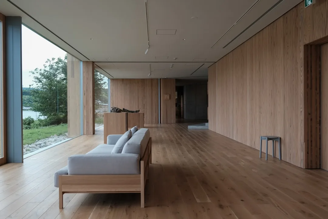
White oak is flatter and more neutral. It has a slight olive or khaki undertone rather than a pink one. This is the species that genuinely accepts cool gray paint colors without tension — which is likely why white oak floors became standard in contemporary interiors around 2015, right as the gray wall trend peaked. If your floors are white oak, you have more latitude on the cool side than the usual wood floor advice suggests.
Maple reads nearly blonde in natural light and has very little inherent color bias — which sounds easy but creates its own problem. With low-contrast floors, wall colors carry the entire visual weight of the room. There’s no warmth or depth in the floor to anchor a bold wall color, so bold choices can feel ungrounded. Medium-value walls in dusty, muted tones tend to work better than either very light or very saturated options.
Pine — common in older New England homes and cottages — has strong yellow undertones and ages to a deep amber. Cool paint colors look wrong against pine almost universally. Historically, pine floors were paired with cream, butter yellow, sage green, and barn red for exactly this reason. Those aren’t arbitrary traditional choices; they’re colors that don’t fight the floor’s insistent warmth.
Walnut is the darkest common species. Dark floors create a high-contrast relationship with almost any wall color, which means your paint choice reads more intensely than it would above a medium or light floor. Very deep, saturated walls can work beautifully above walnut because the floor provides a visual anchor — but pale or pastel walls can look washed out by comparison, like a painting hung in the wrong frame.
A quick reference by species and general color direction:
- Red oak: warm neutrals, earthy greens, muted terra cottas, cream — avoid stark cool grays
- White oak: wide latitude; handles cool grays, warm whites, dusty blues with equal ease
- Maple: mid-value muted tones; avoid very pale walls or high-chroma colors
- Pine: warm palette only — cream, sage, warm gold, muted red-brown
- Walnut: high contrast works; deep jewel tones, rich neutrals, warm charcoals all viable
The Contrast Problem Nobody Explains Clearly
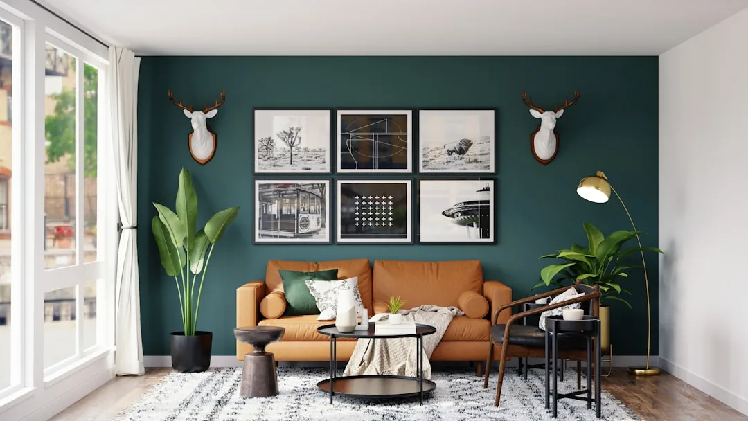
There’s a principle underlying all paint-and-floor decisions that rarely gets named directly: value contrast. Not undertone. Not warmth or coolness. The lightness-to-darkness relationship between your floor and your wall.
Value contrast is what your eye registers first, before it processes color. Walk into a room with dark floors and white walls and your brain reads “high contrast” before it registers anything else. Walk into a room with medium-brown floors and warm beige walls and your brain reads “unified, low contrast.” Neither is wrong — but each creates a completely different spatial experience, and paint advice that focuses only on undertones without addressing contrast is leaving out the more fundamental variable.
Here’s how to think about it practically:
- Determine your floor’s tonal value using the desaturation trick described earlier — is it light (LRV roughly 50+), medium (LRV 25–50), or dark (LRV below 25)?
- Decide whether you want the room to read as high contrast or low contrast. High contrast is energetic and defined. Low contrast is cohesive and calm.
- Choose your wall color’s value accordingly. For high contrast: go significantly lighter or darker than your floor. For low contrast: stay within a similar value range, even if the colors differ.
- Test the value relationship before testing the color. Paint a large sample, photograph it in black and white, and look at whether the contrast reads the way you intended. If the black-and-white photo shows the relationship you want, the color version almost always follows.
- Adjust for ceiling height. In rooms with low ceilings, high contrast between floor and wall can feel choppy. In rooms with high ceilings, it tends to feel dramatic in a good way.
The reason this matters for finding paint colors that work with wood floors is that most color failures aren’t undertone mismatches — they’re contrast mismatches. The wall color reads wrong not because it’s the wrong hue, but because it’s the wrong value. A dark sage green on the wall above medium-brown floors might fail because both surfaces are competing at the same tonal level, leaving the room feeling heavy and undefined. Lighten the sage or darken the floor treatment and the same hue suddenly works.
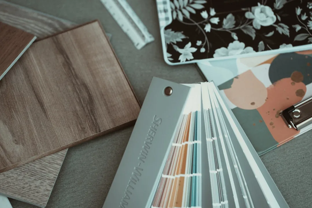
Testing Paint Samples the Right Way (Most People Do This Wrong)
The standard advice is to buy sample pots and paint swatches directly on the wall. That’s better than nothing. But there are a few things about how most people execute this step that undermine the whole exercise.
The size problem. A 4×4 inch swatch tells you almost nothing useful. Color behaves differently at scale — a slightly blue-green gray that looks fresh and quiet as a small sample can feel cold and institutional across an entire wall. Minimum useful sample size is 18×24 inches. Better is a full 4-foot-wide floor-to-ceiling strip in a corner, where you can see how the color reads against both ceiling and baseboard simultaneously.
The placement problem. Most people paint their sample in the center of the wall, in the spot with the most even light. This is exactly where you should not put it. Paint your sample in a corner and on the wall adjacent to the window. These are the areas with the most extreme light conditions in the room — darkest shadow and brightest reflection. If the color holds up in both spots, it will work across the whole room.
The backdrop problem. If you paint a sample over an existing dark or strongly-colored wall, the old color bleeds through and compromises your reading. Use white primer on the sample area first, let it dry fully, then apply two coats of the test color. What you’re evaluating is the paint color itself, not the paint color filtered through whatever came before it.
The time problem. Look at your samples at these specific moments — and not just once each:
- Early morning with no artificial lights on
- Midday with natural light at peak
- Overcast afternoon, when light goes flat and colors shift
- Evening with all your normal artificial lighting on
- Night with only lamps (no overhead), if that’s how you typically use the room
A color that passes all five of those conditions is genuinely a good choice for your space. A color that only looks good at one or two of them is a color you’ll eventually stop liking.
The chip-to-sample gap. Paint chips are photographed and printed under controlled conditions. The actual paint, on your actual wall, in your actual light, will not look identical to the chip — and the gap is often larger than people expect. Always test the real paint. Chips are useful for narrowing a field of twenty options down to three or four. They are not useful for making a final decision.
Frequently Asked Questions
My floors are a very orange-toned red oak and nothing I try looks right. What am I actually fighting?
You’re fighting the pink-orange undertone in the wood itself, which sits beneath whatever stain was applied. Colors that have any pink, magenta, or cool blue in them will clash with that undertone directly — the two competing warm-but-different tones create a visual vibration that reads as “off.” The paint colors that work with wood floors this orange tend to be ones that don’t compete: warm whites with a yellow or green bias (not pink), olive and sage greens, muted golds, and earthy mid-tone browns. Avoid anything in the gray family unless you’ve verified it has a strong warm or green undertone rather than a blue or purple one.
Can I use a cool gray wall color with warm wood floors?
Yes, but it requires more specificity than “cool gray.” A gray with a blue undertone will clash with most warm-toned wood floors. A gray with a green or taupe undertone will read as cooler than a warm beige without creating the same clash. The key is to look at the gray’s undertone, not just its temperature. Test it in your actual room rather than assuming that a color described as “warm gray” on the manufacturer’s website will behave that way in your specific light conditions.
How do I handle a room with mixed floor tones — some lighter, some darker boards?
Stop trying to find a wall color that matches the most prevalent board tone. Instead, identify the medium tonal value across the whole floor and work with that. Floors with variation actually give you more flexibility, not less — the eye averages the variation and reads a blended tone rather than any single plank. What tends to fail above a varied floor is a wall color that’s very close to one of the extremes. Very light walls will emphasize the darker boards; very dark walls will emphasize the lighter ones. Mid-value walls let the floor’s natural variation read as texture rather than inconsistency.
I painted the walls and now they look completely different than the sample. What happened?
Three things commonly cause this. First, scale — color intensifies at room scale compared to a small sample. Second, light conditions — you probably evaluated the sample at a different time or under different lighting than you’re seeing the finished room in. Third, the sample was too small or painted over an existing color that biased your reading. The fix going forward: larger samples, tested over white primer, at multiple times of day. If the paint is already on and you dislike it, try living with it for a week before repainting — color perception adjusts, and rooms that feel wrong on day one often feel right by day seven once your eye recalibrates.
Does it matter whether I choose my paint color before or after refinishing the floors?
It matters more than most renovation timelines acknowledge. If you’re refinishing, you have a real opportunity to choose a stain that complements the paint direction you want — rather than picking paint to work around whatever stain was already there. If you know you want a cool, quiet room with gray walls, this is the moment to consider a floor stain that leans toward gray-brown rather than orange-brown. The two decisions are genuinely interdependent, and making them separately — floors first, then paint, or paint first, then floors — means one choice always ends up constrained by the other. If the sequence is unavoidable, let the floors go first and choose paint after, since floor refinishing is the larger and less reversible commitment.