Using ceiling paint color same as walls is the single most overlooked decision in any room — covering 100% of your floor plan, and most people haven’t touched it since they moved in. Not because they don’t care. Because no one has ever given them a framework that makes the decision feel manageable instead of irreversible. This article is that framework.
Quick Answer
The single most overlooked surface in any room is the one covering 100% of your floor plan — and most people haven’t touched it since they moved in.
I’ve repainted ceilings in roughly sixty apartments across Chicago and New York, and I can tell you that the ceiling-paint decision causes more second-guessing than almost any other choice in a room — more than sofa color, more than tile. The reason is simple: you can’t look away from it. It’s everywhere. So when it goes wrong, it’s catastrophically wrong. And when it goes right, the room feels like it was designed rather than assembled.
Is it a good idea to paint your ceiling the same color as your walls?
In This Article
Honest answer: sometimes yes, sometimes no, and the difference between those two outcomes has almost nothing to do with the color you’ve chosen. It has everything to do with your ceiling height, your room’s natural light, and whether the undertone of your chosen color behaves differently on a horizontal plane. Most people skip all three of those variables and go straight to picking a shade they like from a swatch. That’s where the trouble starts.
The ceiling-height threshold is the most reliable filter. Professional designers I worked alongside in Chicago consistently used 8.5 feet as the lower boundary for a full wall-to-ceiling color match. Below that, a matched ceiling compresses the room — not in a cozy way, in a way that makes people feel slightly uneasy without knowing why. Standard new construction in the US sits at 9 feet, based on National Association of Home Builders data, which means newer homes generally clear the threshold. Older urban apartments, row houses, and most pre-1960s construction often don’t.
Rooms below 8 feet account for the vast majority of “it felt like a cave” complaints I’ve heard from clients who attempted a full color match without consulting anyone first. That’s not a guess — that’s a pattern I watched repeat itself across multiple projects before I started screening for it upfront.
Where a matched ceiling genuinely works:
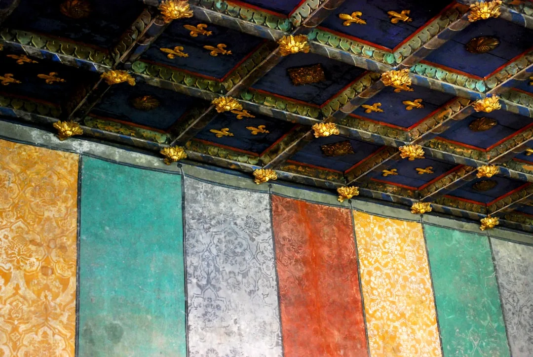
- Rooms with architectural detail — coffered ceilings, exposed beams, or heavy crown molding get unified rather than flattened by a color match; the detail reads as sculptural instead of fussy
- High-ceiling spaces (9 feet or above) where the color match creates enclosure without compression
- Rooms with generous natural light — south- or east-facing rooms that receive direct sun for several hours a day can carry a chromatic ceiling without feeling oppressive
- Spaces used primarily for relaxation — bedrooms, sitting rooms, and reading nooks benefit from the cocooning effect that ceiling paint color same as walls creates, especially in warmer hues
- Narrow rooms or hallways where you want to de-emphasize the tight width and draw the eye upward instead
- Rooms with high-contrast furniture — when your furnishings are bold, a matched ceiling creates a neutral surround rather than competing visually from above
Where it backfires:
- Low-ceiling rooms with limited windows, where any color overhead will feel oppressive and the room will read as smaller than its floor plan suggests
- Rooms with visible ceiling imperfections — color amplifies every ridge, patch, tape seam, and roller texture that flat white would quietly forgive
- Spaces you use actively for cooking, bathing, or task work, where a heavy overhead color can feel disorienting or make accurate color-matching for grooming or food preparation harder
- Rooms with north-facing light only, where cool-toned colors on the ceiling will shift noticeably green or gray under natural light and become difficult to correct without repainting
- Rental properties or homes you plan to sell within two years — a matched ceiling is harder for buyers to visualize past than a standard white, and it limits your buyer pool without necessarily adding perceived value
The decision hinges on three variables — ceiling height, room function, and undertone behavior under your specific lighting — not on personal taste alone. Personal taste is the last thing you apply, not the first.
How to evaluate your room before committing:
- Measure your ceiling height. Under 8.5 feet, reconsider a full match and look at a tonal variation instead.
- Identify your primary light source — natural direction, hours of daylight, and your artificial lighting color temperature (warm bulbs below 3000K behave very differently from daylight bulbs at 5000K).
- Paint a 12-by-12 inch test patch on the ceiling — not just the wall — and observe it at three different times: morning, afternoon, and late evening with your artificial lights on.
- Check the undertone on the ceiling patch specifically. Blue-based grays will shift purple overhead under warm incandescent light. Green-based neutrals will deepen dramatically on the ceiling compared to the wall.
- Live with the test patch for at least five days before ordering full quantities.
Actionable takeaway: Before choosing a color, measure your ceiling height and stand in the room at 9 PM with only your existing artificial lighting on. If the room already feels dim, a matched ceiling will make it feel smaller. If it feels fine or spacious, you have room to work with.
What is it called when you paint the walls and ceiling the same color?
Two terms get used interchangeably and shouldn’t be. Color drenching refers to the complete immersion of a room in a single hue — walls, ceiling, trim, and sometimes doors all painted the same color. A “wrapped ceiling” or “enveloped ceiling” effect is something different: walls and ceiling match, but trim stays white or contrasting. These are not the same technique, and conflating them is the reason so many DIY attempts look unresolved.
Color drenching entered mainstream design vocabulary largely through Farrow & Ball’s marketing push around 2018–2019, when the brand began actively promoting the idea of painting every surface — including woodwork and doors — in a single estate color. The concept itself is older, rooted in historic English country house interiors and mid-century Scandinavian design, but the terminology stuck because Farrow & Ball had the brand weight to make it travel.
The practical distinction matters more than the vocabulary. A true color drench requires:
- Consistent sheen management — flat or matte on ceiling, eggshell or satin on walls, with trim in a semi-gloss that reads as the same color family despite the higher reflectivity
- Color formula precision — trim paint should be the same color but adjusted for the sheen differential; what looks identical in flat will look lighter in semi-gloss if you don’t compensate
- Surface preparation commitment — every wall, ceiling, and trim imperfection becomes visible when you remove the visual interruption that contrasting colors provide
- Lighting audit before committing — a full drench amplifies the effect of every light source in the room; a warm amber sconce that looked charming against white walls will cast strong orange tones across a color-drenched surface
- Furniture and textile editing — a fully drenched room demands that soft furnishings either complement or deliberately contrast the envelope color; neutrals that worked against white walls can disappear entirely in a drenched room
A wrapped ceiling is the entry-level version, and here’s what it involves:
- Walls and ceiling matched in the same color and the same formula
- Trim — baseboards, door casings, window frames — left in white or a warm off-white
- Ceiling sheen kept at flat or matte regardless of wall finish
- No adjustment required for trim formula since trim stays in a separate color family
A wrapped ceiling is more forgiving, more reversible, and more appropriate for anyone attempting ceiling paint color same as walls for the first time. I’d recommend starting here before committing to a full drench — and I say that as someone who has executed both and watched clients regret the drench version when they hadn’t accounted for their trim condition.
Color drenching reads as deliberate and sophisticated. Color drenching with damaged trim reads as a mistake.
Actionable takeaway: If you’re testing this technique for the first time, start with a wrapped ceiling — match walls and ceiling, leave your trim white. Assess it for two weeks before deciding whether to extend the color to woodwork and doors.
What is the current trend for painting ceilings?
Trends are useful context and terrible decision-making frameworks. With that said — here’s what’s actually happening in 2026, and why some of it will still look good in a decade.
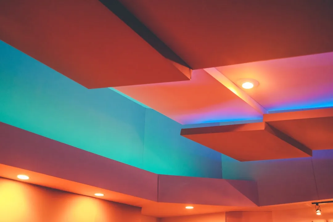
The flat-white default ceiling is losing ground in three distinct directions. First: tonal matches, where the ceiling gets a shade slightly lighter or slightly warmer than the wall color rather than an exact match or a stark white. Second: bold contrast ceilings — deep navy, forest green, or charcoal overhead against white or light-toned walls, which creates a dramatically lowered visual sky without committing to full drenching. Third: full color drenches in earthy, saturated mid-tones, driven partly by the same maximalist impulse that brought back dark walls and pattern-on-pattern layering.
Warm off-whites and greige tones are replacing stark bright white on ceilings even in rooms where the walls stay white — a shift that’s subtle on paper but noticeably warm and flattering in person. Benjamin Moore’s Chantilly Lace, which became the default “bright white” ceiling color for a generation of designers, is increasingly being substituted with warmer alternatives like White Dove, Pale Oak, or even the lightest tint of a room’s wall color at 25% saturation.
Specific color directions gaining traction in 2026:
- Terracotta and warm clay tones on ceilings in dining rooms and kitchens — they read as candlelit and intimate even under overhead lighting
- Soft sage and eucalyptus greens in bathrooms and bedrooms, where ceiling paint color same as walls creates a greenhouse-like calm
- Limewash treatments on ceilings — not paint, but a mineral finish that creates texture and movement overhead without committing to a single flat color
- Deep charcoal and near-black in home offices and media rooms, where a dark ceiling eliminates glare and creates the same focused atmosphere as a dimmer switch
- Blush and pale dusty rose in primary bedrooms, particularly in older homes where the slightly irregular plaster ceiling takes on a warmth that new construction drywall can’t replicate
What’s falling out of favor:
- Stark bright white ceilings in rooms with warm-toned walls — the contrast now reads as an oversight rather than a neutral choice
- Ceiling medallions painted in a contrasting accent color — a trend from the mid-2010s that hasn’t aged well
- Gloss or semi-gloss ceiling paint in residential spaces — the reflectivity emphasizes imperfections and creates unflattering overhead glare
- Ceiling paint color same as walls executed in cool gray tones without undertone adjustment — a look that dominated 2015–2020 and now reads as dated rather than timeless
The trend with the most staying power is the tonal approach: rather than an exact ceiling-to-wall match or a stark white contrast, choosing a ceiling color that sits in the same family as your walls but reads as lighter or slightly warmer. This approach works in rooms that don’t clear the ceiling-height threshold for a full match, it forgives more imperfections than a true color drench, and it photographs well — which matters both for resale and for the way most people now experience and share their homes.
Actionable takeaway: If you’re trend-averse but want to move past flat white, start with a 25% tint of your wall color on the ceiling. It’s the lowest-commitment version of ceiling paint color same as walls, it reads as considered rather than neutral, and it’s the easiest to repaint over if you change direction.
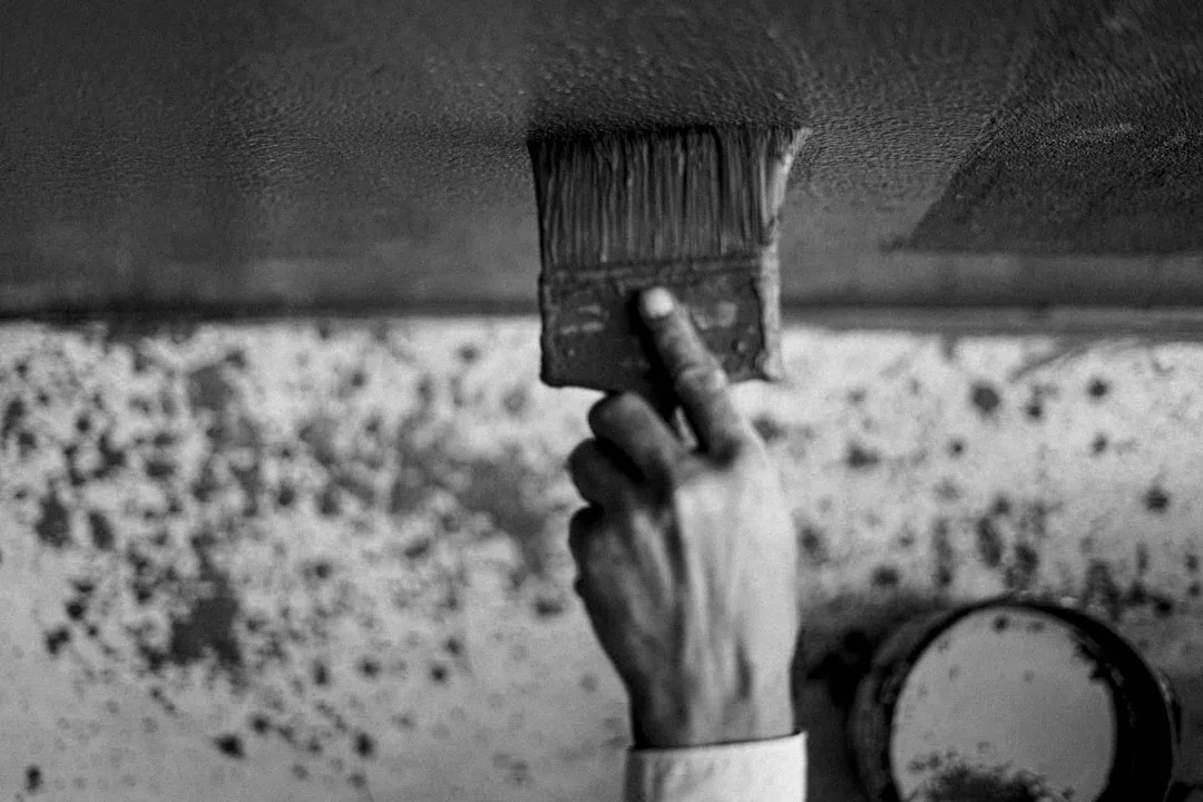
How to execute a ceiling-to-wall color match without common mistakes
Most guides stop at color selection. The execution is where projects succeed or fail, and there are specific technical decisions that determine which outcome you get.
Before you open a can:
- Fill every ceiling crack, nail pop, and texture inconsistency with lightweight spackle and sand to 150 grit. Imperfections that are invisible under flat white become features under a colored ceiling.
- Prime any patches separately — unprimed spackle absorbs paint differently than surrounding drywall and will show as a dull spot through the finish coat.
- Clean your ceiling. Cooking grease, dust, and nicotine residue prevent adhesion and cause color to appear uneven regardless of how many coats you apply.
- Remove or mask your smoke detectors, vents, and light fixtures rather than cutting around them. A clean edge at every penetration is the difference between a professional-looking result and a cautionary tale.
Paint selection:
- Ceiling paint is formulated to be thicker and more spatter-resistant than wall paint, but it doesn’t come in custom colors at every paint counter. Ask for your wall color to be mixed into a ceiling-specific base, or use a flat-finish wall paint and accept the trade-off.
- Order more than you think you need. Ceilings are harder to touch up than walls because the angle of light overhead makes any sheen variation immediately visible. Buy an extra quart minimum, keep the formula on file, and store it labeled with the room and date.
- Use the same brand for walls and ceiling if you’re going for an exact match. Different brands use different pigment bases, and the same color name from two manufacturers will not match on adjacent surfaces.
Application:
- Roll in one direction only — north to south or east to west, and maintain that direction for both coats. Changing roller direction between coats creates a cross-hatch texture that shows under raking light.
- Keep a wet edge at all times. Work in sections no larger than four feet wide and maintain overlap with your previous section before it begins to set.
- Two thin coats always outperform one thick coat — on the ceiling especially, where heavy application leads to drips, lap marks, and uneven sheen.
- Paint ceiling before walls. This gives you the freedom to be slightly imprecise at the ceiling perimeter, which you’ll then cover cleanly when you cut in the wall color.
Frequently Asked Questions
Should I use the exact same paint formula on the ceiling as the walls, or adjust it?
For a wrapped ceiling — walls and ceiling matched, trim left white — use the exact same formula but specify a flat or matte finish for the ceiling even if your walls are in eggshell or satin. The finish change is intentional: flat ceilings disguise texture and imperfection, and the slight difference in light absorption between flat ceiling and eggshell walls reads as natural rather than inconsistent. For a true color drench that includes trim, you’ll need three separate finish orders from the same formula: flat for ceiling, eggshell or satin for walls, semi-gloss for trim. Ask your paint desk to compensate the trim formula slightly for the sheen increase — otherwise the trim will read lighter than the walls even though it’s technically the same color.
Does painting the ceiling the same color as the walls make a room look smaller or larger?
It depends entirely on the ceiling height and the color chosen. In rooms above 9 feet, a color match creates an enclosed, intentional atmosphere without meaningfully reducing perceived space — the room feels designed rather than compressed. In rooms below 8.5 feet, a matched ceiling will make the space feel lower and tighter, especially in darker or more saturated colors. If your ceilings are on the lower end but you still want ceiling paint color same as walls, use a lighter tint of your wall color rather than an exact match — the visual boundary disappears without the compression effect.
What colors work best for painting the ceiling the same as the walls?
Mid-tone earthy neutrals perform most consistently — warm taupes, soft greens, dusty blues, and terracotta tones. These colors have enough chroma to read as intentional without darkening a room aggressively. Pure whites and very pale colors tend to make a matched ceiling look like an accident rather than a decision. Very dark colors — navy, charcoal, forest green — work well in rooms with high ceilings and strong artificial lighting, and they create a dramatic sky effect that photographs exceptionally well, but they’re unforgiving of ceiling imperfections and difficult to reverse without a full primer coat.
How many coats of paint does a ceiling need when matching the wall color?
Two coats minimum, always. On ceilings that were previously painted in flat white, you may be able to achieve full coverage in two coats with a mid-tone color. Dark colors going over white, or any color going over a ceiling that hasn’t been painted in several years, typically require three coats for even saturation. Factor this into your quantity estimate — ceiling paint absorbs more than wall paint because most ceiling surfaces have a slightly more porous texture. Never try to extend coverage by thinning the paint; this reduces hiding power and creates uneven sheen.
Can you use regular wall paint on the ceiling, or do you need a specific ceiling paint?
You can use wall paint on the ceiling, and in many cases it’s the better choice — particularly when you need ceiling paint color same as walls in a specific custom color that isn’t available in a ceiling-specific formula. The trade-off is spatter resistance: ceiling paint is formulated to stay on the roller and release onto the surface rather than flinging droplets during application. If you use wall paint on a ceiling, use a high-quality low-nap roller cover (3/8 inch nap for smooth ceilings, 1/2 inch for textured), load it thoroughly before each pass, and roll slowly. Wearing safety glasses is not optional.
Is ceiling paint color same as walls appropriate for every room in a house?
No, and a room-by-room assessment is worth doing before committing to the technique throughout a home. Bedrooms and sitting rooms are the most forgiving environments — lower activity levels, softer lighting, and a desire for enclosure make matched ceilings feel intentional. Kitchens and bathrooms present more challenges because steam, grease, and task lighting create conditions where a dark or saturated overhead color can feel oppressive during daily use. Entryways and hallways are excellent candidates if ceiling height allows — the compression effect that’s a problem in a bedroom becomes a feature in a transitional space where you want visitors to feel the architecture before they enter the main rooms.
Should I use the exact same paint formula on the ceiling as the walls, or adjust it?
For a wrapped ceiling — walls and ceiling matched, trim left white — use the exact same formula but specify a flat or matte finish for the ceiling even if your walls are in eggshell or satin. The finish change is intentional: flat ceilings disguise texture and imperfection, and the slight difference in light absorption between flat ceiling and eggshell walls reads as natural rather than inconsistent. For a true color drench that includes trim, you’ll need three separate finish orders from the same formula: flat for ceiling, eggshell or satin for walls, semi-gloss for trim. Ask your paint desk to compensate the trim formula slightly for the sheen increase — otherwise the trim will read lighter than the walls even though it’s technically the same color.
Does painting the ceiling the same color as the walls make a room look smaller or larger?
It depends entirely on the ceiling height and the color chosen. In rooms above 9 feet, a color match creates an enclosed, intentional atmosphere without meaningfully reducing perceived space — the room feels designed rather than compressed. In rooms below 8.5 feet, a matched ceiling will make the space feel lower and tighter, especially in darker or more saturated colors. If your ceilings are on the lower end but you still want ceiling paint color same as walls, use a lighter tint of your wall color rather than an exact match — the visual boundary disappears without the compression effect.
What colors work best for painting the ceiling the same as the walls?
Mid-tone earthy neutrals perform most consistently — warm taupes, soft greens, dusty blues, and terracotta tones. These colors have enough chroma to read as intentional without darkening a room aggressively. Pure whites and very pale colors tend to make a matched ceiling look like an accident rather than a decision. Very dark colors — navy, charcoal, forest green — work well in rooms with high ceilings and strong artificial lighting, and they create a dramatic sky effect that photographs exceptionally well, but they’re unforgiving of ceiling imperfections and difficult to reverse without a full primer coat.
How many coats of paint does a ceiling need when matching the wall color?
Two coats minimum, always. On ceilings that were previously painted in flat white, you may be able to achieve full coverage in two coats with a mid-tone color. Dark colors going over white, or any color going over a ceiling that hasn’t been painted in several years, typically require three coats for even saturation. Factor this into your quantity estimate — ceiling paint absorbs more than wall paint because most ceiling surfaces have a slightly more porous texture. Never try to extend coverage by thinning the paint; this reduces hiding power and creates uneven sheen.
Can you use regular wall paint on the ceiling, or do you need a specific ceiling paint?
You can use wall paint on the ceiling, and in many cases it’s the better choice — particularly when you need ceiling paint color same as walls in a specific custom color that isn’t available in a ceiling-specific formula. The trade-off is spatter resistance: ceiling paint is formulated to stay on the roller and release onto the surface rather than flinging droplets during application. If you use wall paint on a ceiling, use a high-quality low-nap roller cover (3/8 inch nap for smooth ceilings, 1/2 inch for textured), load it thoroughly before each pass, and roll slowly. Wearing safety glasses is not optional.