There’s something so charming about delicately designed houses and furniture that captivates oceans of audiences on Instagram.
It’s no secret that everyone appreciates a good kitchen, but the diversity in interior design’s Instagram fans is truly on another level.
Since many big names on the ‘gram spend so much time and money targeting the best niche for their brand, it’s borderline envious when they are greeted with an industry that is open to everyone.
In other words, beauty in art and design really has no limits.
In this blog, we want to frame that seemingly limitless business and show you how to prosper as an ambitious interior designer.
Feed Aesthetic & Style
Since interior design is wholeheartedly visual, on an even more visual platform – the looks of all your posts together is very important. To say the least.
Some like to stick to three to four colors and coordinate all their posts. Others, like to switch up the palette by doing the “rule of threes”. The rule is very simple – you can pick a color or a theme and post three photos within that idea. You do the same thing for every three posts.

This way, you can add some structure to a naturally messy idea. If you don’t want to just push one color or style narrative, this is the best route for you.
When potential audience members take a look at your profile – the visible effort spent on your feed is what will make them stay. And the more buzz your page gets, the more you’ll want to know how to monetize instagram! Just like that, the looks of your page can make or break your success.
Feed aesthetic is something to always keep in mind, as you can see.
The Importance of Instagram Stories
In addition to permanent posts we have on our feed, Instagram Stories disappear after 24h. This gives us a window of opportunity to keep our audiences entertained but not overwhelmed by everyday content.

@roomporn does an incredible job with their daily Instagram Stories. For example, they have a daily voting series where they ask their audience to vote on which kitchen or bedroom design they prefer.
It’s both creative and entertaining because it’s almost irresistible to not participate in it! Check them out, their page is surely one of the interior design greats.
Here are more Story ideas for your profile:
- Interior design Before & Afters
- Short house tour videos
- Walkthroughs
- “Yay or Nay” voting polls
- Asking for opinions and questions!
There’s many more but these are just some you can really benefit from.
Listen to your Audience & Progress Tools
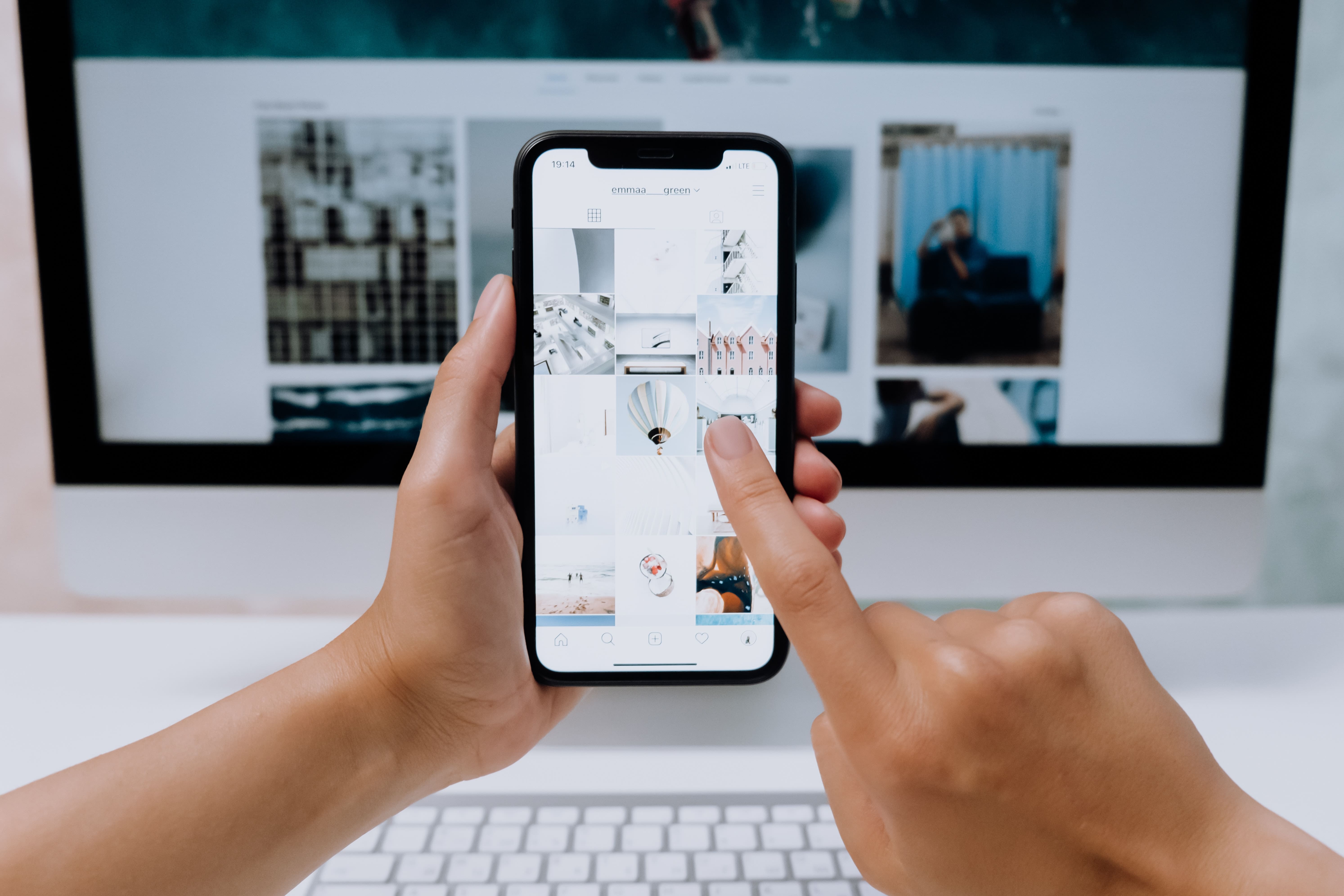
Business page tools such as Insights give us significant growth information. Things such as what posts did best numbers and when is our audience most active are just some of the most important ones.
Checking when your followers will most likely interact with your post tells you when to post, obviously. However, checking which pieces of content did the best numbers shows you what your audience wants to see the most.
For example, if they prefer the Before & After pics, try adding more of those to your page. Don’t spam their feeds with only that type of content, but gradually increase the posting of it.
It’s great for engagement, plus, it’ll grant you more organic followers. Usually, your most popular type of content is being shared amongst your audience members and their friends. That’s the best kind of growth you could ask for!

Conclusion
Interior design is a huge market on Instagram. Every industry that heavily emphasizes some form of creative work has a lot of space for all kinds of audiences. And that’s extremely handy because it gives you, the creator, a lot of space to be creative and expressive.
And everything in between is tips, tools, and Instagram tricks to hopefully give you a helping hand on your road to interior design stardom.


