The 2013 study everyone cites about blue bedrooms and better sleep studied hotel rooms under warm, dimmed lighting — not the crisp, saturated navy accent wall you’re about to paint. That distinction matters enormously, and almost every bedroom color guide online ignores it completely. If you’ve been searching for bedroom color ideas for sleep and landing on the same recycled advice about “calming blues” and “restful greens,” you’re missing the variables that actually determine whether your walls help or hurt your sleep.
Quick Answer
The 2013 study everyone cites about blue bedrooms and better sleep studied hotel rooms under warm, dimmed lighting — not the crisp, saturated navy accent wall you’re about to paint.
Here’s what those guides won’t tell you: hue is the least important part of the equation. The color your brain actually responds to when it’s trying to wind down isn’t determined by whether you chose blue or green or terracotta. It’s determined by how saturated that color is, what finish it’s painted in, which direction your bedroom faces, and what bulbs you’re running at 10pm. Get those variables wrong with the “right” color and your walls will actively work against your sleep. Get them right with an “unconventional” color and you’ll sleep better than you have in years.
This isn’t about swapping navy for sky blue. It’s about understanding why your nervous system responds to walls the way it does — and then making paint choices that actually reflect that.
What Color Bedroom Is Best for Sleep? (The Science Might Surprise You)
In This Article
- What Color Bedroom Is Best for Sleep? (The Science Might Surprise You)
- What Color to Avoid Before Bed? The Spectrum Ranked by Stimulation
- How Lighting Conditions Change Everything About Your Wall Color
- The Bedroom Colors That Actually Work: A Room-by-Room Breakdown
- The Finish, Texture, and Undertone Details Most People Overlook
Most sleep and decor advice treats color like a simple ranked list: blue first, green second, yellow somewhere in the middle, red at the bottom. That framework misses the point almost entirely.
Hue is only one-third of the color equation. The other two variables — saturation (how pure or vivid the color is) and lightness (how much white or black is mixed in) — have a greater impact on how your nervous system reads a room than the hue itself. A dusty, heavily greyed terracotta will calm you more effectively than a bright cobalt. A pale, washed lavender outperforms a saturated sage. The hue gets all the credit; saturation and lightness do most of the work.
The Travelodge study is real and worth understanding correctly. In 2013, Travelodge surveyed 2,000 UK hotel guests and found that people sleeping in blue-toned rooms averaged 7 hours 52 minutes of sleep — more than guests in any other room color. But those rooms were furnished with soft, muted blues under warm, dimmed lighting. The conditions were specific. The finding has since been applied universally to any blue — including deeply saturated, cool-toned versions that share almost none of the visual properties of the original rooms studied.
Your nervous system responds to visual noise the way it responds to audio noise — as a low-level alerting signal. High-saturation, high-contrast walls create the same neurological arousal as scrolling a busy social media feed. The brain has to process competing stimuli. That processing takes energy and delays the parasympathetic response you need to fall asleep.
Here’s the practical implication: muted, desaturated versions of almost any hue can support sleep. You’re not locked into a narrow band of acceptable colors. You’re locked into a narrow band of acceptable saturation levels — roughly the range where the color still reads as itself but has clearly been “quieted” with grey, white, or warm neutral.
When you’re evaluating bedroom color ideas for sleep, the most useful filter isn’t “what hue should I choose” but “what does this color look like on the wall at 9pm under my actual lighting.” A color that photographs beautifully in a sunlit design magazine may read as flat and cold in your north-facing bedroom at night, or as agitated and bright in a room that gets strong western sun until 7pm. The same paint chip behaves like a completely different color depending on those conditions.
Actionable takeaway: Before choosing a hue, find its desaturated equivalent on any paint brand’s website by filtering toward their “muted” or “nature-inspired” collections. Benjamin Moore’s Affinity line and Farrow & Ball’s full range are built almost entirely on desaturated versions of classic hues — they’re not expensive for the pigments, they’re expensive because someone already did the desaturation math for you.
What Color to Avoid Before Bed? The Spectrum Ranked by Stimulation
The honest answer isn’t “avoid red, orange, and purple.” The honest answer is: avoid high-saturation versions of any color, and understand that a few hues have physiological effects that make them harder to rehabilitate even when muted.
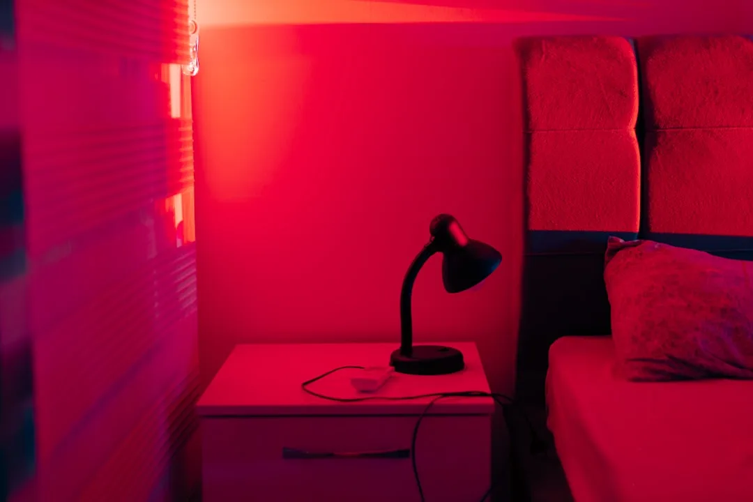
Pure, high-chroma red is the one color with the strongest physiological evidence against it for sleep environments. Research published in Frontiers in Psychology found that red-lit environments significantly elevated arousal states and disrupted perceived time — and those effects persisted even at lower intensities compared to blue or green environments. Red activates the sympathetic nervous system, measurably raises heart rate and blood pressure, and signals urgency at a primal level that overrides most contextual cues. Even a terracotta-adjacent red that’s been muted still carries more stimulation risk than other hues at equivalent saturation levels.
Bright white with a cool undertone (anything above 5000K in color temperature equivalence) is a worse choice than most people expect. Cool whites mimic the spectral quality of daylight, signal to the brain that it’s daytime, and actively suppress melatonin production. A stark, cool-white bedroom isn’t neutral — it’s physiologically alerting. Warm whites (with yellow or pink undertones) behave completely differently and are among the most sleep-compatible choices available.
Colors to reconsider — and their safer swaps:
- High-saturation purple → dusty plum or pale lavender (the saturation is the problem, not the hue)
- Bright orange → warm clay or washed adobe (deeply greyed versions become earthy and grounding)
- Cool, bright yellow → antique cream or warm straw (yellow-greens are especially problematic under incandescent light, reading as sickly)
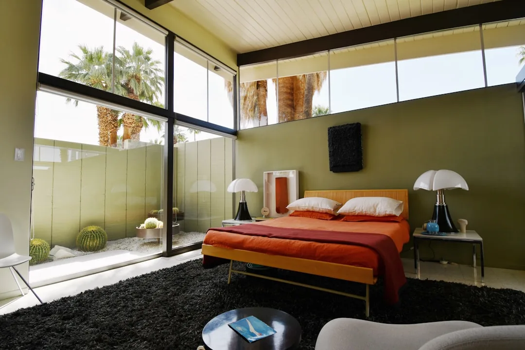
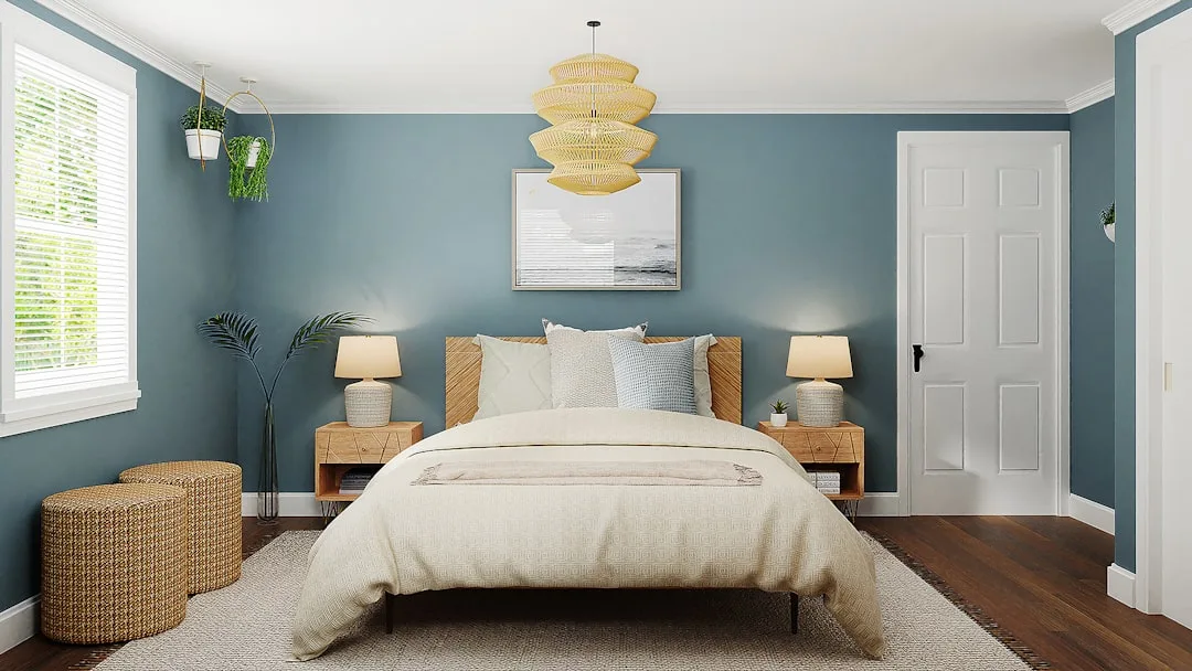
- Crisp navy → soft slate or grey-blue (navy reads as high-contrast in most bedroom lighting conditions)
- Cool grey → greige or warm taupe (cool greys under low-wattage warm bulbs shift toward lavender-grey, which can work, but the margin for error is small)
- Bright white → warm off-white or linen (cool whites above 5000K equivalence suppress melatonin production actively)
- Jewel-toned emerald → sage or eucalyptus (the richness of jewel tones creates the same visual noise problem as saturated reds)
One underrated factor: glossy paint finishes on any color increase visual stimulation by reflecting light erratically from multiple angles. A muted sage in high-gloss reads more stimulating than the same sage in flat matte. This isn’t a minor adjustment — it can shift a sleep-friendly color into alerting territory, especially in rooms with multiple light sources. Bedrooms deserve matte or eggshell finishes for the same reason they deserve soft lighting: the surface itself should absorb visual energy, not bounce it.
Actionable takeaway: If you’re attached to a bold color, don’t abandon it — find its greyed, muted equivalent in the same hue family. Almost every paint brand has a “quiet” version of every popular color. That version, in a flat or eggshell finish, is the one that belongs in your bedroom.
How Lighting Conditions Change Everything About Your Wall Color
This is the variable that bedroom color guides almost universally skip, and it’s the one that determines whether your carefully chosen paint color actually performs the way you expect it to.
Paint colors are formulated and photographed under controlled lighting conditions that have nothing to do with your bedroom at 9:30pm. The chip you approved at the store, the swatch you pinned from that design blog, the color card the brand mailed to your house — all of those were evaluated under lighting conditions that differ dramatically from what your room produces at night.
The practical reality of bedroom lighting:
- A 2700K warm bulb (the standard “warm white” LED) shifts every color toward yellow-orange, making cool blues appear greener and greying out any colour with pink or red undertones
- A 3000K bulb (labelled “soft white”) is close to incandescent and is broadly the safest choice for bedroom-compatible color rendering
- Anything above 4000K pushes into daylight territory and will make muted, desaturated wall colors look flat and cold rather than cocooning
- Dimmer switches change the color temperature of most LED bulbs as they’re lowered — warm bulbs get warmer when dimmed, cool bulbs shift in unpredictable directions
How room orientation affects your color throughout the day:
- North-facing bedrooms receive cool, indirect light all day, which amplifies any blue or grey undertone in your walls — a pale lavender in a north-facing room can read as distinctly blue-grey by evening
- South-facing bedrooms get warm, direct light for most of the day, which makes cool colors read more accurately but can make warm neutrals look slightly washed out
- West-facing bedrooms receive intense warm light in the late afternoon and evening — the exact time you’re trying to wind down — which means warm terracottas and ochres get amplified rather than subdued right when you need them quietest
- East-facing bedrooms have the most forgiving evening light because the intense direct sun has already moved on by the time you’re preparing for sleep
The testing protocol that actually works:
- Apply a large sample of your chosen color (at least 12 inches square) directly on the wall — not on a card held against the wall
- Observe it at three specific times: midday, at 6pm, and at 9pm with only your nighttime lighting on
- Notice whether it reads warmer, cooler, lighter, or darker at each interval
- If it looks wrong at 9pm under your actual bulbs, it will work against your sleep regardless of how perfectly it photographs in the afternoon
This is why designers who specialize in bedroom color ideas for sleep will always ask about your bulb type and room orientation before recommending a specific paint number — not because it’s a consultative formality, but because the same paint code produces genuinely different visual results across different rooms.
The Bedroom Colors That Actually Work: A Room-by-Room Breakdown
Knowing the theory is one thing. Having a starting point for your specific room type is considerably more useful. These aren’t universal prescriptions — they’re evidence-based starting points filtered through the saturation and lighting principles above.
For rooms with warm, south or west-facing light:
- Dusty blue-grey (Benjamin Moore’s Quiet Moments, Farrow & Ball’s Mizzle)
- Pale sage with grey undertones (not yellow-green sage — the variety that reads almost silver in warm light)
- Warm stone or limestone tones that absorb rather than amplify the golden-hour light coming in late afternoon
- Soft terracotta — counterintuitively, heavily muted terracotta in a warm-light room reaches equilibrium rather than amplification because the warm light and the warm pigment normalize each other
For rooms with cool, north or east-facing light:
- Warm greige or linen tones that compensate for the cool ambient light with built-in warmth
- Pale blush or dusty rose (these read as sophisticated putty rather than pink in north-facing light — the coolness of the room neutralizes the pink undertone)
- Soft warm white with a clear cream or yellow lean — in a north-facing room this reads as a clean, cocooning neutral rather than a yellow room
- Avoid cool greys and blue-greys in north-facing rooms unless you specifically want the room to read as crisp and slightly clinical
For small bedrooms where wall color has outsized impact:
- Lighter values of your chosen hue — in small rooms, medium-to-dark shades concentrate visual weight in a way that can feel enclosed rather than cocooning
- A single-tone approach where walls, trim, and ceiling are all the same color or within one or two tones of each other — this creates a seamless envelope that reads as restful rather than visually busy
- Avoid strong contrast between wall and trim colors, which creates visual edges the eye tracks repeatedly
For large, open bedrooms:
- Medium-depth muted tones that give the walls enough presence to feel enclosing without becoming dominant
- Consider using a slightly deeper tone on the wall behind the bed (without going full feature-wall contrast) to create a visual anchor
- Warmer hues work better in large bedrooms because the additional air volume means colors lose some of their intensity — what reads as a warm terracotta in a small room may read as a pale peach in a large one
The Finish, Texture, and Undertone Details Most People Overlook
Choosing the right color is only part of what makes bedroom color ideas for sleep actually work in practice. Three finish-level decisions have more impact on sleep quality than most people expect.
Paint finish — the most underrated decision:
- Flat/matte: Absorbs light completely, produces no reflection, makes colors read at their truest and most settled. The best choice for bedroom ceilings and walls if you can accept that marks are harder to clean
- Eggshell: Slight sheen that adds warmth without reflecting light erratically. The practical compromise for most bedrooms — wipeable but still visually soft
- Satin: Starts to reflect light enough to create visual activity on the wall surface. Acceptable for trim and doors but too reflective for large wall surfaces in a sleep environment
- Semi-gloss and gloss: Reserved for trim, furniture, and architectural details only in a bedroom. Never on the main walls
Undertone awareness — the detail that makes or breaks a color selection:
Every paint color has an undertone — a secondary hue that emerges when the color is surrounded by other colors and specific lighting. The undertone is often invisible on the chip but dominant on a large wall surface. Common undertone surprises:
- Greige that looks perfectly warm on the chip can shift distinctly purple-grey on a large wall under warm lighting
- Sage greens frequently carry yellow undertones that read as lime-adjacent under daylight but settle into something muddier under warm evening light
- “Greyed” blues sometimes carry violet undertones that become obvious on four walls but invisible on a small sample
How to identify undertones before committing:
- Hold the chip against a pure white surface — any color shift from what you expected is the undertone revealing itself
- Hold it against a warm grey — undertones with pink or purple lean will amplify against the grey background
- Paint a large sample on the actual wall and observe it surrounded by your existing furnishings — the undertone responds to every other color in the room
Ceiling color as a sleep variable:
Most people paint their bedroom ceiling white by default. In a sleep-focused room, that default deserves reconsideration. A stark white ceiling reflects every light source downward, increasing the overall luminosity of the room and creating contrast with the walls. Options that work better:
- Paint the ceiling the same color as the walls (the cocoon effect — enveloping and calming)
- Use a ceiling-specific paint that’s one to two values lighter than the wall color — this maintains the sense of height while reducing the contrast between surfaces
- Warm, cream-toned whites on the ceiling (never cool whites) if you want a traditional white ceiling that doesn’t fight the walls
Frequently Asked Questions About Bedroom Color Ideas for Sleep
Does the color of my bedroom really affect how well I sleep, or is this mostly subjective?
Both things are true, but in different proportions than most people assume. There are measurable physiological responses to color — saturation levels and hue families do affect autonomic nervous system arousal in ways that have been documented in controlled research. However, personal associations and psychological comfort layer on top of those baseline responses and can either amplify or override them. Someone who grew up sleeping in a red room and associates it deeply with safety and comfort may sleep better in muted red than in a blue room they find cold and unwelcoming. The physiology sets the floor; your personal history operates above it. For most people with no strong color associations, the physiological baseline is the most reliable guide.
I’ve already painted my bedroom a color that might be too stimulating. Do I have to repaint?
Not necessarily. The wall color is one variable in a system, and adjusting the other variables can partially compensate. Switching to warmer, lower-wattage bulbs (2700K or below) dampens the saturation of most colors under evening lighting. Adding soft textiles — heavy curtains, a textured rug, linen bedding — absorbs visual energy and reduces the impact of the wall color. Lowering your lights significantly in the hour before sleep reduces the stimulation effect of any color. These adjustments won’t fully neutralize a truly problematic wall color, but they can move a borderline situation into acceptable territory without a full repaint.
Is there a universally “safe” bedroom color that works across all room types and lighting conditions?
The closest thing to a universal safe choice is a warm, muted greige — a grey with a clear warm or sandy undertone — in a flat or eggshell finish. Warm greige reads as neutral without the melatonin-suppressing properties of cool white, has low enough saturation to avoid visual noise, and adapts reasonably well across different lighting conditions and room orientations. It’s not the most interesting bedroom color ideas for sleep recommendation, but it’s the one that consistently performs without surprises. If you need something with more presence, a desaturated blue-grey or pale sage with warm undertones covers similar functional ground with slightly more personality.
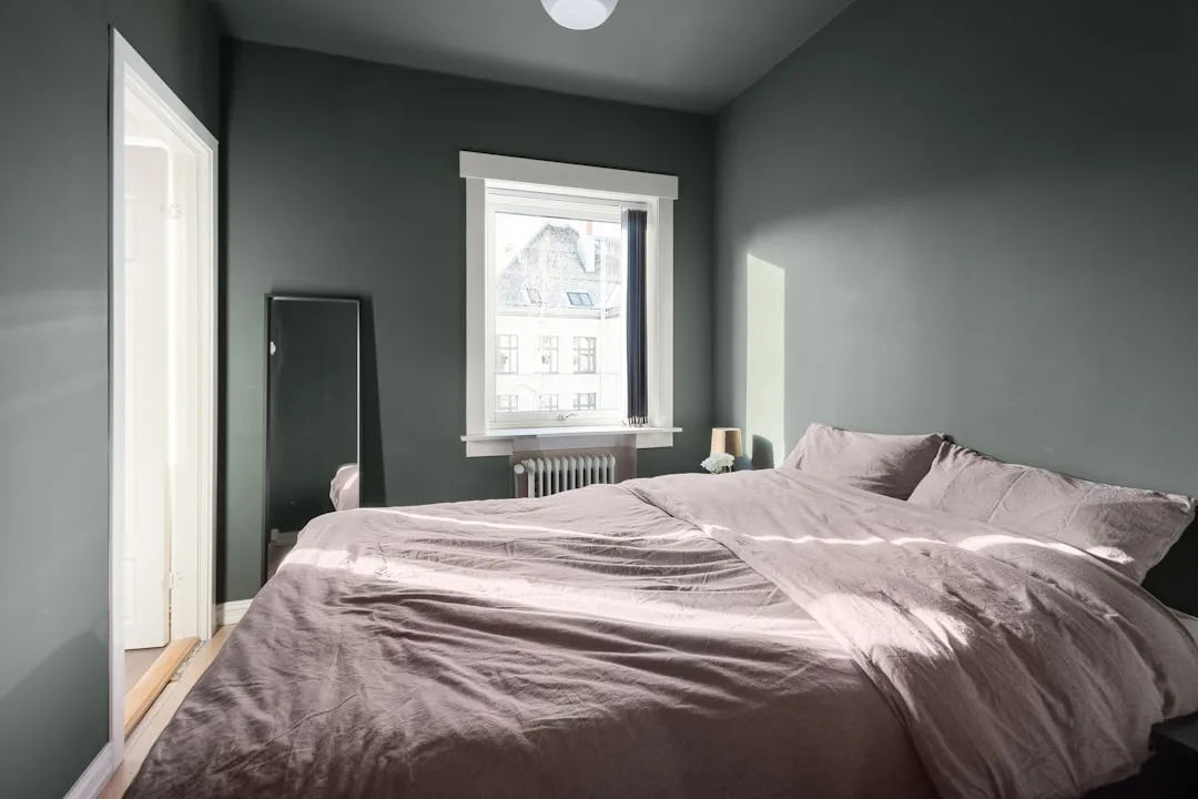
What about darker bedroom colors — do they automatically disrupt sleep?
Not automatically, but they require more precision. Deeply saturated darks (jewel tones, true navy, forest green) carry the same high-saturation problem as their brighter counterparts and are generally not recommended for sleep environments. However, deeply muted, almost-greyed darks — think the colour of a storm cloud, or charcoal with a clear warm brown undertone — can create an enveloping, cocooning effect that some people find extremely conducive to sleep. The key variables are the same: the colour must read as quiet rather than vivid, the finish must be matte or eggshell, and the lighting must be warm and low. Dark rooms also require more attention to ceiling treatment — a dark ceiling can feel either dramatically cocooning or claustrophobic depending on the room’s volume and the warmth of the undertone.
How much does the colour of my bedding and furniture affect the equation?
More than most bedroom color ideas for sleep guides acknowledge. The wall colour is the largest surface area, but it operates within a total visual environment. High-contrast bedding (bright white against a dark wall, or a busy pattern against a neutral wall) creates the same kind of visual noise problem as a high-saturation wall colour. Furniture with reflective surfaces — lacquered pieces, mirrored furniture, glossy finishes — increases the room’s overall luminosity and stimulation level regardless of what colour the walls are. A well-chosen wall colour surrounded by high-contrast, high-saturation, or reflective elements will underperform. The bedroom works as a system: muted walls, soft textiles in a consistent tonal range, and low-reflectivity surfaces all reinforce each other.
What color bedroom is best for sleep?
Does the color of my bedroom really affect how well I sleep, or is this mostly subjective?
What color to avoid before bed?
Both things are true, but in different proportions than most people assume. There are measurable physiological responses to color — saturation levels and hue families do affect autonomic nervous system arousal in ways that have been documented in controlled research. However, personal associations and psychological comfort layer on top of those baseline responses and can either amplify or override them. Someone who grew up sleeping in a red room and associates it deeply with safety and comfort may sleep better in muted red than in a blue room they find cold and unwelcoming. The physiology sets the floor; your personal history operates above it. For most people with no strong color associations, the physiological baseline is the most reliable guide.
What is the 60 30 10 rule for bedrooms?
I’ve already painted my bedroom a color that might be too stimulating. Do I have to repaint?
What color room makes you sleepy?
Not necessarily. The wall color is one variable in a system, and adjusting the other variables can partially compensate. Switching to warmer, lower-wattage bulbs (2700K or below) dampens the saturation of most colors under evening lighting. Adding soft textiles — heavy curtains, a textured rug, linen bedding — absorbs visual energy and reduces the impact of the wall color. Lowering your lights significantly in the hour before sleep reduces the stimulation effect of any color. These adjustments won’t fully neutralize a truly problematic wall color, but they can move a borderline situation into acceptable territory without a full repaint.