If there is one thing we’ve learned from a quarter-century of attendance on this revolving ball of rock we call earth it’s that you should never underestimate the stupidity of some people. Perhaps we’re being a little harsh here, as we all make mistakes at some time or other…
Yes, nobody is immune, and we’re afraid that includes you and other designers when it comes to putting together a bathroom suite. Whether these are for public or private use, bathrooms are – first and foremost – a functional space, and thus require technical thought to assure they are as practical as possible. As we’ll see from the below examples though, this is not always the case – learn from their mistakes.
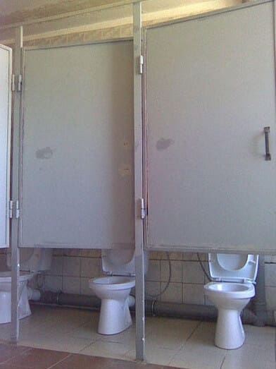
Get Your Measurements Right
You could be forgiven for feeling a little bit exposed, here. We can’t tell if this is a mismatch of measurements or merely the maladroit locating of hinges, but either way it’s a disaster. Be sure to measure up components and plan properly when researching your bathroom, as this kind of thing can happen. Actually, while we’re here, just get a professional to fit it – the extra expense would be worth it to avoid a catastrophe.
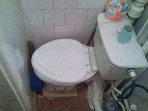
Make the Most of Available Space
In some ways you have to admire this person, who has not allowed the fact that this room isn’t big enough to swing a gnat, never mind a cat, to put him off. Only a gymnast would be able to use this toilet. The lesson here is to be flexible in smaller bathrooms. Fit storage cupboards to a wall to create floor space, for instance, or install a small cloakroom basin in the corner as opposed to stuck obstructively in the middle of the wall. Also, to make this plain, do not wedge your toilet into a corner where nobody can access it, as the object has not so much been defeated there as trounced. Similarly, do ensure your solid metal shower heads go in the shower enclosure…
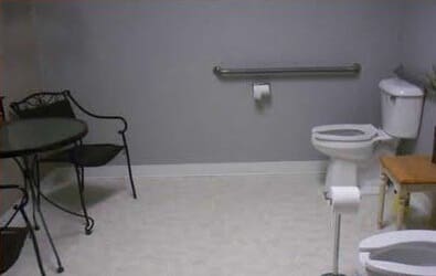
Don’t Confuse Functions
This isn’t as gross as it sounds, honest. We mean room functions, not – ahem – never mind. The example above is a good exemplification of designing at cross-purposes. Those chairs and that table are for sitting out on the veranda, perhaps sipping a glass of chilled white wine with a book in your lap, the sun gently warming your face. Instead, the setup here seems to be for the exhibitionist, who simply cannot visit the toilet without a rapt (though comfortable) audience. There are plenty of other rooms of the home, so don’t try and ram all sorts in the bathroom.
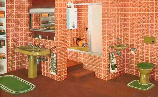
Think Carefully About the Look
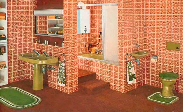
We admit to tiptoeing slightly here, as there is nothing more invidious than making strident opinions about something as subjective as taste. However, we urge you to think long and hard about what you want to put in your bathroom. Granted, a putrid pink wall with a dazzling array of green stars on it might look modish (to you) now, but in five years are you going to want to tear it all out – at the expense of money and time – when you are being laughed at by all and sundry and the design is making you want to hold your head under when in the bath. We bet the person who installed the bathroom in that photo thought the mucus-hued ceramics and explosion-in-a-baked-bean-factory walls were wacky and unique, but I’m afraid they were just badly, badly wrong. This isn’t anything cool LED shower heads or a set of trendy vertical radiators can even rescue. Future-proof your design, for the sake of your wallet and sanity.
