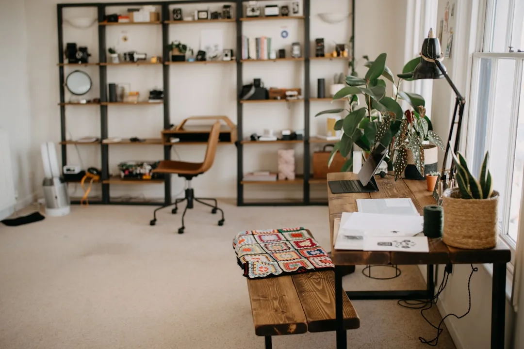
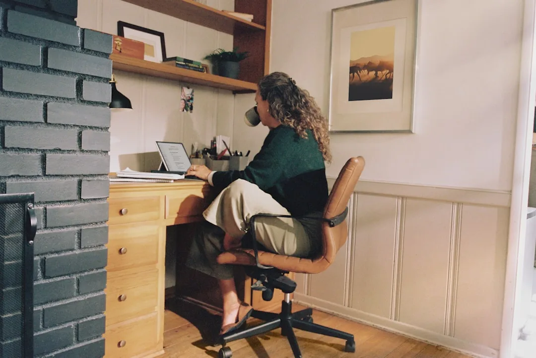
The shelf behind you on your next video call will tell your colleagues more about your design instincts in three seconds than anything you say in the meeting — and right now, most home office shelves are telling the wrong story. If you’ve been searching for home office bookshelf styling ideas that actually explain why things work instead of just showing you pretty pictures, you’re in the right place. Not because people have bad taste. Because nobody ever taught them that a bookshelf is a designed surface with its own compositional logic — and that logic is completely learnable.
Quick Answer
The shelf behind you on your next video call will tell your colleagues more about your design instincts in three seconds than anything you say in the meeting — and right now, most home office shelves are telling the wrong story.
I spent eleven years doing this work with actual clients in actual apartments, and the single most consistent thing I saw was shelves treated like overflow storage that happened to be visible. The fix almost never required buying anything new. It required understanding why the shelf was failing structurally before a single object was placed on it.
That’s what this article is about. The framework first. The objects second.
Why Most Home Office Shelves Fail Before You Add a Single Book
In This Article
- Why Most Home Office Shelves Fail Before You Add a Single Book
- The Triangle Method: A Styling Framework That Works on Any Shelf
- How to Use Books as a Design Element, Not an Afterthought
- Color, Material, and Texture: The Three Variables That Control Visual Temperature
- The Video Call Test: Styling Your Shelf Specifically for Remote Work Visibility
- A Simple Decluttering Protocol Before You Style Anything
Research in environmental psychology has demonstrated for decades that visual clutter — even when it sits at the edge of your peripheral vision rather than directly in your sightline — measurably degrades cognitive performance during focused work tasks. Which means the chaotic shelf behind you isn’t just an aesthetic problem. It’s actively working against you every hour you sit at that desk. A well-organized home office shelf is a productivity investment, not a styling exercise.
But here’s what nobody explains: most shelves fail structurally, not decoratively. The problem isn’t that you chose the wrong objects. It’s that every object on your shelf currently competes for visual attention at roughly the same scale, the same height, and the same visual weight. When everything competes, nothing wins — and the eye reads the whole surface as noise.
The first shift that changes outcomes is a conceptual one. Stop treating your bookshelf as storage that happens to be on display, and start treating it as a designed surface that happens to hold storage. Those are functionally opposite approaches. The first one produces what you currently have. The second produces shelves that look intentional because they were designed with intention.
Starting with objects before establishing a layout system is where most people go wrong — and I say this having watched clients spend real money on beautiful ceramics that made their shelves look worse, not better, because there was no compositional logic holding them. A $40 object placed within a clear framework outperforms a $200 object dropped onto a crowded shelf every time.
The framework I return to repeatedly is the 60-30-10 rule applied to shelf composition:
- 60% books or tall vertical anchors — these are your structural mass
- 30% decorative objects — these add material texture and visual interest
- 10% negative space — deliberately left empty, not accidentally unfilled
That last category is the one people resist. Empty space on a shelf feels unfinished until you’ve seen the difference it makes — and then you can’t unsee it.
Actionable takeaway: Before touching a single object, look at your shelf from across the room and ask whether any single bay has a clear visual “winner.” If everything reads at the same weight, the structure is broken regardless of how nice the individual pieces are.
The Triangle Method: A Styling Framework That Works on Any Shelf
Most styling advice gives you a list of objects to buy. This gives you a spatial system that works with whatever you already own — which is a fundamentally different proposition and one worth understanding before you spend a dollar. It’s also one of the most transferable home office bookshelf styling ideas you’ll find, because the underlying geometry works regardless of shelf size, budget, or the objects you already own.
The triangle method works by creating invisible diagonal lines between objects of varying heights so your eye travels intentionally across the shelf rather than scanning flatly across a row of same-height items. Interior designers refer to the underlying principle as “dynamic symmetry” — a concept borrowed from classical composition theory that traces back to ancient Greek architecture and was formalized for interior application by design schools in the mid-twentieth century. The reason it still works is that human visual perception hasn’t changed. Our eyes are wired to follow diagonal movement.
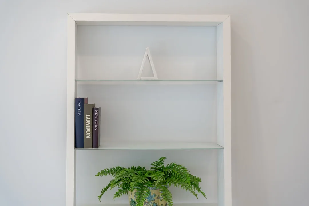
Here’s how to apply it practically. On any single shelf bay, you need three height categories:
- Tall anchors (the peak of your triangle): vertically stacked books, a leaning framed print, a tall vase, or a ceramic vessel with height
- Medium elements (the midpoint): horizontal book stacks used as pedestals, small sculptures, a low framed photo, a compact plant in a substantial pot
- Low punctuation (the base point): a single candle, a small stone object, a short succulent, a meaningful artifact
The triangle connects these three heights diagonally — tall on the left, medium in the center-right, low on the far right, or any variation — and the result is that the eye moves across the shelf rather than stopping cold.
Apply one triangle per shelf bay, not across the whole unit at once. Trying to balance a five-tier freestanding unit as a single composition before you’ve stabilized individual bays is how people end up staring at their shelf for an hour and moving things in circles without progress.
The method scales cleanly. A single floating shelf with three objects can execute a perfect triangle. A full floor-to-ceiling built-in uses the same logic bay by bay, with the additional opportunity to create a macro-diagonal across the whole unit by varying which bay carries the tallest element on each tier. That’s advanced work. Start with one bay.
Actionable takeaway: Choose one shelf bay today and identify your three height anchors — tall, medium, low. Place them so your eye moves diagonally from one to the next. Everything else in that bay supports those three points without competing with them.
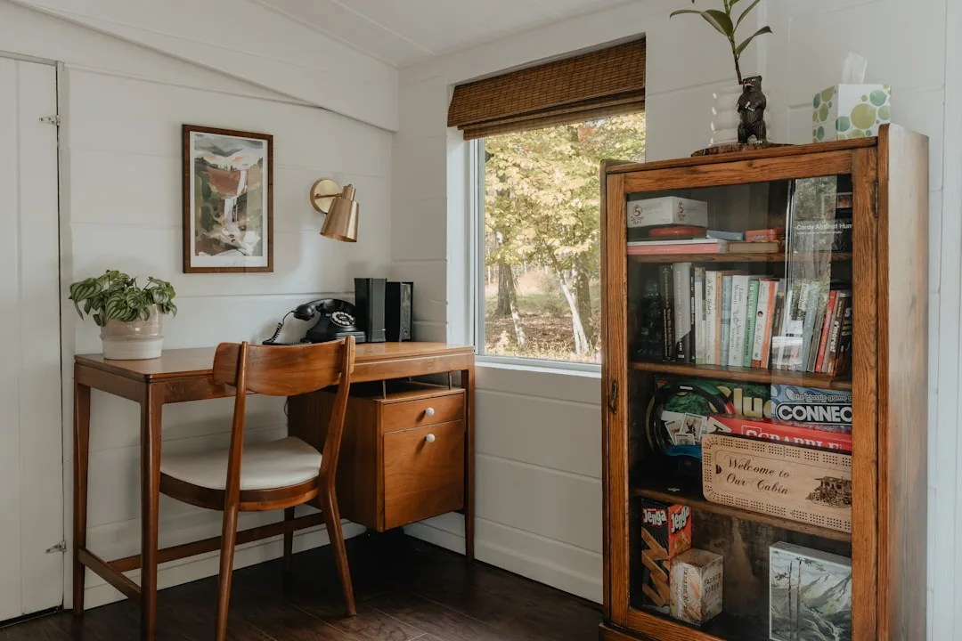
How to Use Books as a Design Element, Not an Afterthought
Here is a contradiction worth naming directly: hardcover book sales have grown steadily over the past decade, meaning most households have more physical books than they did ten years ago — and yet the dominant trend in interior design advice is to minimize books, hide them spine-in, or replace them with objects. That is backwards. Books are the most versatile, highest-impact tool you have on a bookshelf, and they cost you nothing because you already own them. When people ask me for home office bookshelf styling ideas that don’t require a shopping list, books are always the starting point of my answer.
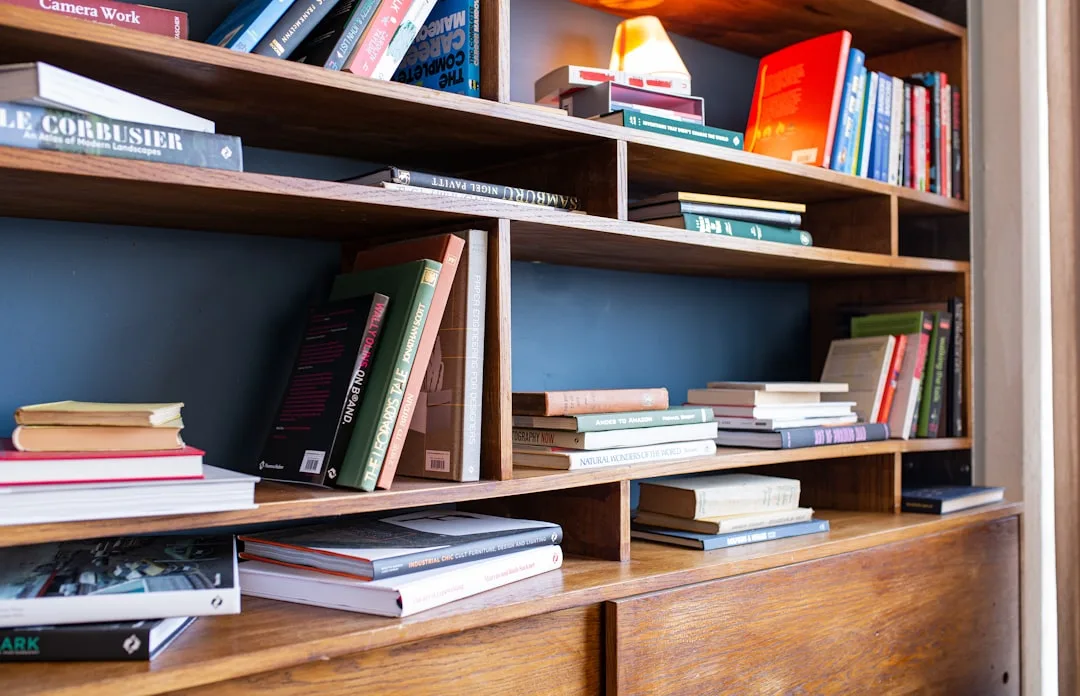
There are exactly four ways to position books on a shelf, and understanding when to use each one is what separates a styled shelf from a stored one:
- Vertical spine-out — the default. Works for visual mass. Group books by approximate height rather than exact height to create a slightly varied roofline that reads as intentional rather than rigid.
- Horizontal stacked — the most underused technique. A stack of three to five books laid flat creates an instant pedestal for any object placed on top, adds a horizontal counterpoint to all that vertical energy, and changes the perceived depth of your shelf dramatically.
- Spine-in — use this only for books whose spines actively fight your color story. Turning them creates a block of uniform texture (usually white or cream page edges) that reads as a deliberate design choice rather than an attempt to hide something ugly.
- Leaning — a single book leaned diagonally against a stack or wall creates immediate visual casualness. One is charming. Three is messy. Know the difference.
Color grouping is the technique that gets the most attention in home office bookshelf styling ideas online, and it genuinely works — but with a caveat most articles skip. Grouping books by color works only when you have enough books in a given color family to create a critical mass. Three red books grouped together look intentional. Two red books separated by other colors look like you ran out of red books. The threshold is roughly five books minimum per color group for the technique to read as a choice.
If your collection doesn’t support full color grouping, use a modified approach:
- Group by tone (warm neutrals together, cool neutrals together) rather than specific color
- Use horizontal stacks to interrupt color runs and prevent the shelf from reading as a spectrum chart
- Allow one shelf bay to be fully color-grouped as a focal point while keeping other bays organized by subject or size — this gives you the visual payoff without requiring an entire collection to cooperate
One more technique that never appears in listicles but works consistently: vary the direction books face within a single vertical group. Most people line up all their vertical books facing the same direction. Pull one book out by two inches so it protrudes slightly from the row, or turn one book so its cover faces outward instead of its spine. These micro-variations prevent the “library stacks” reading that makes a shelf look institutional rather than personal.
Actionable takeaway: Pull every book off one shelf tier. Sort them by approximate height into three piles — tall, medium, short. Rebuild the tier using at least one horizontal stack of three to five books as a pedestal. Notice how much that single horizontal element changes the energy of the entire tier.
Color, Material, and Texture: The Three Variables That Control Visual Temperature
Once the structural framework is in place — the 60-30-10 ratio, the triangle method applied bay by bay, the books used deliberately rather than just stored — the question becomes which objects to place in the 30% decorative zone and how to make them feel cohesive rather than collected at random. This is where most home office bookshelf styling ideas stop at “add plants and candles,” which is fine as far as it goes but misses the underlying variable that actually determines whether a shelf feels pulled-together: visual temperature.
Visual temperature on a shelf is controlled by three variables working simultaneously:
- Color — warm (amber, terracotta, ochre, warm white) versus cool (gray, navy, sage, cool white)
- Material — organic (wood, stone, ceramic, linen, dried botanicals) versus industrial (metal, glass, lacquer, acrylic)
- Texture — matte versus reflective, rough versus smooth, dense versus open
A shelf that reads as cohesive almost always has a consistent temperature across these three variables. A shelf that reads as random almost always has mixed temperatures — a cool gray ceramic next to a warm wood frame next to a chrome bookend next to a terracotta pot. Each individual object might be beautiful. Together they argue.
The fix is not to eliminate variety — variety is what makes a shelf interesting. The fix is to pick a dominant temperature and let the minority elements accent rather than compete.
Here’s how this plays out in practice for a home office context:
Warm-dominant shelf:
- Books in tan, brown, cream, warm red, and orange spine tones grouped together
- Ceramic objects in terracotta, sand, or warm white
- Wood elements — a small turned bowl, a wooden bookend, a light oak frame
- One metallic accent in brass or brushed gold, not chrome
- Plants with warm-toned pots (terra cotta, warm cream, matte black as a grounding note)
Cool-dominant shelf:
- Books in navy, gray, green, and white grouped together
- Ceramic objects in matte white, sage, or slate
- Metal elements in brushed nickel, matte black, or dark bronze
- Plants in gray, white, or dark green pots
- One warm accent — a single piece of natural wood or a warm-toned textile — to prevent the shelf from reading as cold
The single most common mistake I saw in client consultations: mixing metallics without a clear hierarchy. Brass and chrome on the same shelf fight each other at a frequency that reads as unresolved even to people who can’t articulate why. Pick one metallic family and let it appear in two or three places — this creates visual repetition, which the eye reads as intention.
Actionable takeaway: Walk your current shelf with fresh eyes and ask only one question: does each object read as warm or cool? Count them. If the split is roughly even, you have a temperature conflict. Pull the minority-temperature objects and either relocate them or replace them with items that reinforce your dominant direction.
The Video Call Test: Styling Your Shelf Specifically for Remote Work Visibility
This section exists because home office bookshelf styling ideas live in a specific functional context that general shelf styling advice ignores entirely: your shelf will be seen on camera, at a specific angle, compressed into a rectangle, on screens of varying quality, in conditions you cannot fully control. That changes the design brief in ways that matter.
A shelf that looks beautiful in person can read as flat noise on a video call. A shelf styled specifically for camera visibility consistently outperforms the in-person-optimized version in the context where it matters most for professional perception.
Here are the specific adjustments that translate well to video:
Increase contrast deliberately. The camera compresses your color range. Objects that appear clearly differentiated in person can blend into a gray middle value on screen. Place light objects next to dark objects, matte surfaces next to reflective ones. The contrast that looks slightly overdone in person usually looks right on camera.
Favor larger, simpler objects over small, intricate ones. A small collection of detailed objects — a group of miniatures, a cluster of small framed photos, a set of tiny figurines — reads as texture-noise on camera rather than as detail. A single substantial ceramic piece reads clearly. Scale up wherever possible.
Check your shelf on your own camera before your next call. Open your video conferencing app, position yourself as you would for a meeting, and look at what appears in frame. Specifically look for:
- Objects that blend into each other at this compression level
- Any single object that draws the eye so strongly it competes with your face
- Whether the overall shelf reads as calm and intentional or as chaotic background
- Whether the color temperature of the shelf fights or complements your typical on-screen lighting
Limit the number of items visible in frame to roughly seven to twelve discrete visual elements. Below seven looks sparse on camera. Above twelve starts to read as cluttered at video resolution. This is a different number than what works for in-person viewing, where the eye can resolve more detail.
One deliberate focal point at camera height works harder than ten interesting objects spread across five tiers. Identify the shelf tier that sits closest to your eye level when you’re seated at your desk. This is the tier your camera captures most directly. Style this tier first and most carefully — it’s doing the most work in every video call you take.
Actionable takeaway: Before your next video call, spend ten minutes looking at your shelf specifically through your camera. Move or remove anything that reads as noise at that compression level. Add one higher-contrast element to the tier at camera height if it currently reads as flat.
A Simple Decluttering Protocol Before You Style Anything
Everything in this article assumes you’re working with a shelf that has been edited — meaning the objects on it have been chosen rather than accumulated. If your shelf is currently in full accumulation mode (which is where most home office shelves live), no styling system will rescue it. You have to edit before you compose.
This protocol works in under an hour and doesn’t require you to make permanent decisions about anything:
- Remove everything from the shelf entirely. Every object, every book, every paper, every cord, every thing. Put it all on the floor or a table. Start from zero.
- Sort into three categories: Keep (you want this on the shelf), Store (belongs in the office but not on display), Remove (doesn’t belong in the office at all).
- Apply a hard cap to your Keep pile. Count the total number of shelf bays you have. Multiply by four. That’s your maximum object count for the first round — books count as one unit per group, not per book.
- Return only the Keep objects to the shelf, using the structural framework from earlier sections. Leave the Store objects in a box until you’ve finished styling — then find closed storage for them.
- Live with it for forty-eight hours before adding anything back. The impulse to fill empty space is strong and almost always wrong. Give the negative space time to stop feeling unfinished.
The objects that make the hardest cut tend to be the ones that have been on the shelf the longest — not because they belong there, but because they’ve become invisible through familiarity. Ask of each item: if I found this in a store today for free, would I choose to put it on my shelf? If the answer is no, it shouldn’t survive the edit just because it’s already there.
Actionable takeaway: Set a timer for sixty minutes this week and run this protocol on your shelf before applying any other technique in this article. Everything else works better on an edited surface.
Frequently Asked Questions About Home Office Bookshelf Styling
How many objects should I actually put on a single shelf tier?
The number depends on the length of the tier, but a useful rule is to aim for three to five distinct visual groupings per tier rather than counting individual objects. A grouping might be a vertical stack of books, a horizontal stack with an object on top, or a single large ceramic piece with a small accent beside it. Three to five groupings per tier gives you enough visual interest without tipping into clutter. For a standard 36-inch shelf tier, four groupings with deliberate negative space between them tends to hit the right balance.
Do I need to buy new things, or can I style a shelf with what I already own?
Almost always what you already own. The single most effective home office bookshelf styling ideas require zero new purchases — editing down, repositioning what remains, changing the orientation of existing books, and using horizontal stacks as pedestals. The cases where buying something new genuinely helps are specific: when you have a strong color story and lack the right bookends to contain it, when every object you own is roughly the same height and you need a tall anchor, or when your shelf has no organic material at all and reads as cold. In those cases, one targeted addition fixes the specific gap. Shopping without diagnosing first is how shelves become more cluttered, not less.
My shelf is being used as actual storage — files, equipment, supplies. Can it still look good?
Yes, with one condition: the storage elements need to be containerized rather than sitting loose. A row of identical file boxes in linen or kraft paper reads as a designed element. A pile of loose folders does not. The same principle applies to equipment: cables coiled and tied, stored inside a basket or box, read as intentional. Cables lying loose across a shelf tier read as unfinished regardless of what surrounds them. Invest in three to five matching storage containers — baskets, boxes, or bins in a consistent material — and use them to contain all functional storage. Everything functional goes inside a container; everything decorative sits outside one. That single rule resolves most mixed-use shelf problems.
What plants actually work on a home office bookshelf, and which ones don’t?
The ones that work consistently are those with strong silhouettes that read clearly at a distance: a trailing pothos or string of pearls that drapes over a shelf edge, a compact snake plant with its strong vertical lines, a small fiddle leaf fig cutting, or a sculptural succulent in a substantial pot. What doesn’t work: small plants in small pots that read as pebbles from across the room, plants that require so much care they’re always slightly wilted, and plants grouped so densely that they read as a single green blob rather than individual forms. One or two well-chosen plants do more work than six mediocre ones. Also: the pot matters as much as the plant. A beautiful plant in a plastic nursery pot undermines the entire shelf. Repot into something that fits your color and material story before the plant goes on display.
How often should I restyle my home office bookshelf?
The shelf shouldn’t need frequent restyling if the underlying structure is sound. What it does need is periodic editing — roughly every three to four months — to remove objects that have migrated onto it without invitation, replace anything that’s looking tired or damaged, and reassess whether the overall composition still reflects how you want your workspace to feel. A full restyle (taking everything off and rebuilding) is worth doing once after reading something like this article, and then again whenever a major life change means the shelf no longer represents you accurately. The goal is a shelf that stays right with minor maintenance, not one that requires constant intervention to look decent.