The reason your first apartment looks temporary has nothing to do with your budget — it’s because you’re subconsciously decorating for the place you’re moving to next, not the one you’re actually living in right now.
That’s the real problem. Not the IKEA furniture. Not the white walls. Not the fact that you’re renting. The stepping-stone mentality is doing more damage to your space than any budget limitation ever could, because it shows up in every decision you make — the furniture you don’t commit to, the art you don’t hang, the curtains you don’t bother buying. The result is a room that looks exactly like what it is: provisional.
Here’s the thing. Reddit communities like r/malelivingspace and r/femalelivingspace are flooded every summer with first-move-in posts from users in Chicago, Portland, Amsterdam, Brussels — people who spent real money and still ended up with a space that looks assembled rather than designed. The struggle is identical across every budget, every city, every square footage. Which means the solution isn’t more money. It’s a different way of thinking about the space you have right now.
Why First Apartment Decor Almost Always Looks Temporary (And How to Break the Pattern)
There are three visual tells that reveal a space as temporary to anyone who walks through the door. Floating furniture with no relationship to each other. Objects that are all the same visual weight. And the absence of a single anchor piece that the room orbits around. These aren’t budget problems. They’re decision problems.
The stepping-stone mentality produces all three. When you’re mentally already in your next apartment, you buy a sofa that’s “fine for now,” a rug that’s “just temporary,” and a bed frame you’ve been meaning to replace. None of those pieces were chosen in relationship to each other, so they don’t work together visually. The room looks like three different people made three different decisions in the same space.
What separates a $500 furnished room that looks designed from a $5,000 room that looks thrown together is intentionality — and intentionality is a skill, not a budget category. It means every piece in a room was chosen in deliberate relationship to the other pieces. The sofa color was chosen after the rug. The lamp was chosen after the sofa. The art was chosen last, to complete something that already had a logic to it.
Experienced interior designers describe this as “visual coherence” — the quality that makes a room feel resolved. It has nothing to do with how much you spent and everything to do with whether your decisions had a sequence and a filter.
The three visual tells of a temporary space:
- Furniture pushed against every wall with no breathing room between pieces
- A mix of scales where a tiny rug sits under a large sofa, or a massive bookshelf overwhelms a corner with nothing to balance it
- No single piece that “earns” the room — nothing that makes you think someone actually chose this space
Actionable takeaway: Before you buy anything else, walk through your apartment and identify which single piece is the most intentional thing you own. If you can’t find one, that’s your first purchase — not another accent piece.
The Anchor Furniture Rule: The One Piece That Makes Small Apartment Decor Look Intentional
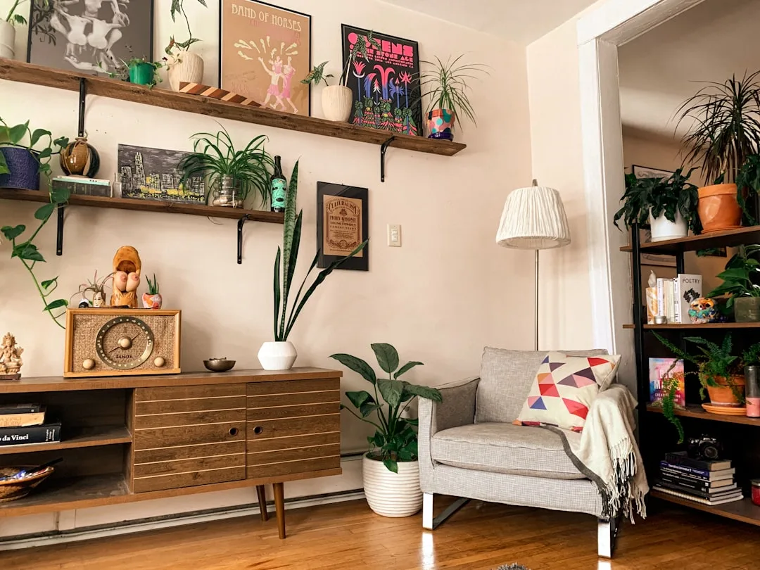
Every well-designed room has one piece that everything else defers to. Interior designers consistently apply a principle where 60% of a room’s visual budget — whether actual dollars or perceived quality — sits in the anchor piece, with the remaining 40% distributed across everything else. That math is the reason a room with a beautiful sofa and budget accessories looks designed, while a room with a mediocre sofa and expensive accessories looks confused.
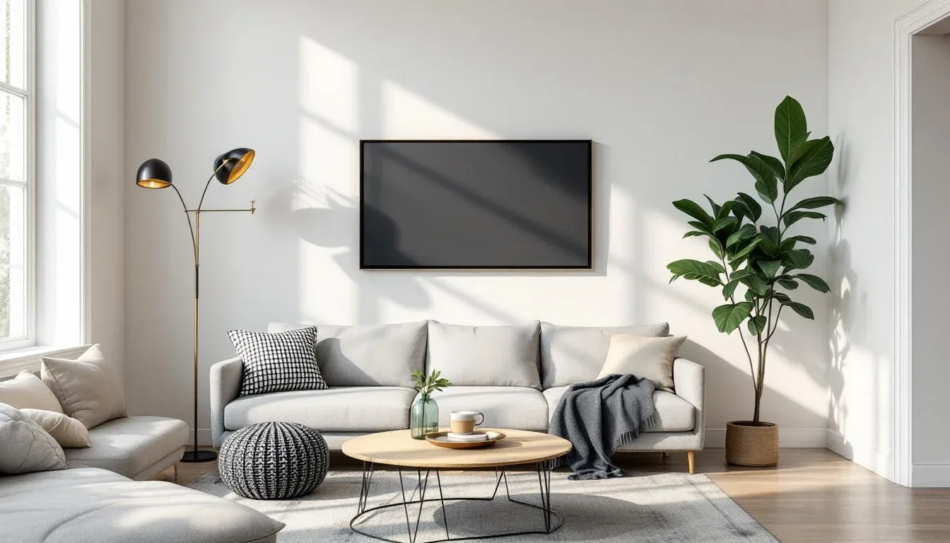
An anchor piece has three requirements: it’s the largest item in the room, it carries visual weight (mass, color depth, or material quality), and it’s something you’d keep across multiple apartments rather than abandon with the lease. In a living room, the sofa is almost always the anchor. In a bedroom, it’s the bed frame. In a studio or combined dining-living space, it’s often the dining table — a piece that earns disproportionate attention because it sits at eye level and hosts the most activity.
Scale matters more than price. A West Elm Haven sofa in a 200-square-foot room isn’t an anchor — it’s an obstacle. The right anchor for a small apartment is one that fits the room’s proportions while still carrying enough presence to anchor the space. For a living room under 250 square feet, a two-seat sofa in the 72–80 inch range is typically correct. Most people default to the 90-inch three-seater because it looks more substantial in the store, then wonder why their apartment feels like a furniture showroom.
Common anchor mistakes:
- Treating a TV stand as the room’s anchor (it never is — it’s a support piece)
- Anchoring to a bookshelf that isn’t floor-to-ceiling (partial bookshelves read as storage, not architecture)
- Choosing a rug that’s too small to anchor — a rug only works as an anchor if it’s large enough to pull all other furniture into its orbit, typically 8×10 feet minimum in a standard living room
- Buying the anchor piece last, after you’ve already filled the room with other furniture
Actionable takeaway: Identify your anchor piece for each room before you buy anything else. Allocate your best budget there, then work outward with everything else.
The One Splurge, One Save Method Interior Designers Use for Rental Transformations
The all-cheap trap is real and it’s subtle. It’s not that budget furniture looks cheap in isolation — it’s that when every single element in a room is budget, the cumulative effect reads as unintentional. There’s no contrast, no hierarchy, nothing to catch the eye and signal that someone made a deliberate choice.
The one splurge, one save method fixes this by building contrast directly into your purchasing decisions. The rule is simple: pair every significant room element with one splurge item and one deliberate save. Never two saves in the same visual pairing. The splurge anchors the pairing with quality, and the save recedes behind it without dragging it down.
In practice, this looks like:
- Bedroom: Quality linen bedding (Cultiver or Parachute, from $150–$220 for a full set) paired with a budget bed frame. The bedding is what you see. The frame is what you don’t.
- Living room: A designer throw pillow (Amber Lewis for Anthropologie, around $68–$88) on an IKEA Söderhamn sofa. The pillow carries visual weight far beyond its cost.
- Dining area: A solid wood side table or credenza (the splurge) next to an affordable pendant light from Amazon or Wayfair — because the light hangs in the air and draws attention, it should be chosen carefully, but it doesn’t need to be expensive.
Lighting is the highest-ROI splurge category in any small apartment. Interior design professionals consistently note that lighting accounts for 20–30% of a room’s perceived quality — yet it’s almost always the last thing first-time decorators spend on. The ceiling fixture that came with your apartment is doing active damage to your space. A $75 plug-in pendant from Schoolhouse or a $55 arc floor lamp from Target’s Studio McGee line will do more for a room than any new piece of art.
What to always splurge on, regardless of budget:
- Textiles that touch skin (bedding, bath towels, throw blankets) — cheapness here is felt literally
- Lighting fixtures that are always visible — never invisible in use
- The single piece of art in a room — one real piece outperforms twelve cheap prints every time
Actionable takeaway: For your next purchase, name your splurge item before your save item. Never choose the save without knowing exactly what it’s paired with.
Layering Techniques That Make Small Apartment Decor Look Professionally Styled
The reason professionally styled rooms look different isn’t the furniture — it’s the layers. Most first apartments have furniture. They’re missing the layers that make furniture look intentional.
The three-layer framework:
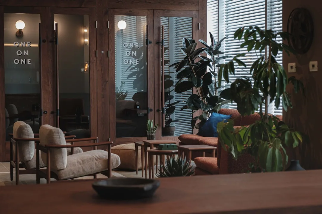
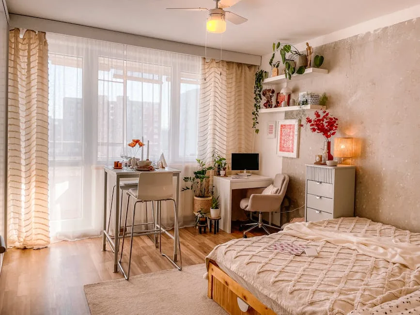
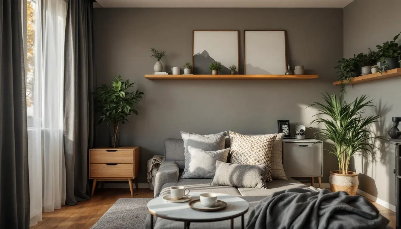
- The architectural layer — rugs, curtains, and light fixtures. These are the bones of the room. They set scale, define zones, and give the space a sense of permanence that no amount of furniture can manufacture. Most first apartments skip this layer entirely.
- The furniture layer — your anchor piece and supporting pieces. This is the layer most people have, because it’s the most obvious.
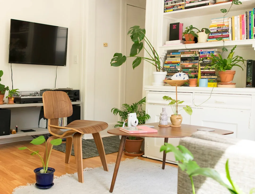
- The object layer — books, plants, ceramics, candles, textiles. This is the layer that makes a room feel lived-in rather than staged. Most people either skip it or wildly overdo it.
The reason layering works is that rooms with all three layers have visual depth — your eye moves through the space rather than landing on one thing and stopping. Visual merchandising research confirms this: negative space — the deliberate absence of objects — increases the perceived value of surrounding items by making them feel curated rather than crowded. The same principle that makes a luxury retail display feel elevated applies directly to your coffee table.
For textiles in a small space: three textures, maximum two patterns. Linen and boucle consistently read as high-end regardless of price point — a $40 boucle throw from H&M Home carries the same visual signal as one that costs $200. Velvet and leather read as rich when used sparingly and overwhelming when overdone. Cotton and polyester blends disappear visually, which is why cheap bedding looks cheap even when the color is right.
How to style using negative space:
- Coffee table: maximum three objects, grouped asymmetrically, with one taller element
- Shelf: books laid flat to create a platform, then one object on top — the object earns its place
- Nightstand: one lamp, one practical item, one beautiful item. Nothing more.
Actionable takeaway: Audit your object layer first by removing everything from one surface, then adding back only what genuinely earns its place. Live with the edit for a week before adding anything back.
Rental-Friendly Upgrades That Look Permanent Without Costing Your Security Deposit
Renters often accept the builder-grade apartment as a fixed condition. Beige walls, overhead lighting, hollow-core cabinet doors, stock hardware. None of it has to stay. Almost all of it can be changed in an afternoon for under $200 total, and every change is reversible.
The single highest-impact, zero-damage change available to any renter is curtain placement. Home staging research consistently shows that mounting curtain rods 4–6 inches below the ceiling rather than directly above the window frame can make an 8-foot ceiling read as 10 feet. This is a free perceptual upgrade that requires only a tension rod or two small Command hooks if you want to avoid drilling. The curtains themselves should be floor-length — pooling slightly at the bottom, not hovering above it. Linen curtains from IKEA’s Lill or Dytåg lines run $15–$40 per panel and hang beautifully when steamed.
Other reversible changes with permanent visual impact:
- Hardware swaps: Cabinet pulls, faucet handles, and light switch plates are the three places where builder-grade rental units scream “rental” most loudly. Swapping all three costs under $50 total. Black or brushed brass cabinet pulls from Amazon Basics or CB2 take fifteen minutes per cabinet and require only a screwdriver. Store the originals in a zip-lock bag taped inside a cabinet for move-out.
- Temporary wallpaper: Used on one wall — not four — temporary wallpaper from Chasing Paper or Tempaper creates a focal point that reads as architectural intention. A 12-roll treatment on a single bedroom wall costs around $150–$200 and peels off cleanly.
- Limewash-effect peel-and-stick panels: Brands like Wallpops and Roommates now make textured panels that, when installed on a single wall, read almost identically to real limewash paint from across a room. The effect is dramatic against a white apartment backdrop.
Actionable takeaway: This weekend, rehang your curtains six inches higher. That one change will do more for your apartment than anything else you could do in an afternoon.
The Small Apartment Decor Mistakes That Make a First Home Look Like a Dorm Room
Budget isn’t what makes a first apartment look like a dorm room. These specific, correctable mistakes are.
1. Furniture against every wall
The instinct to push furniture to the perimeter to “maximize space” is the single most common decorating mistake in small apartments. It does the opposite of what you want — it empties the center of the room, makes the space feel like a waiting area, and eliminates any sense of intimacy or intention. Floating a sofa 18–24 inches from the wall with a console table behind it creates a room that feels curated, not cramped.
2. A rug that’s too small
Rug sizing is cited as the most commonly repeated mistake across design publications. The standard guidance is consistent: most people buy one size too small. A rug that doesn’t extend under the front legs of the sofa, or doesn’t reach the foot of the bed, reads as decorative rather than architectural. In a small living room, 8×10 feet is almost always the minimum. In a bedroom, the rug should extend 24–36 inches beyond both sides of the bed. A large rug in a small room makes the room feel bigger. A small rug in a small room makes both the room and the rug feel wrong.
3. A single overhead light source
The ceiling fixture that came with your apartment was designed by someone who was not thinking about ambience. Relying on it as your only light source is the fastest way to make a space feel institutional. Floor lamps, table lamps, and plug-in sconces are available for under $80 each and transform the atmosphere of a room more dramatically than any furniture change. The goal is light at three different heights — ceiling, mid-room, and surface level — so the room has depth after dark.
4. Art hung at the wrong height
The standard rule — center of artwork at 57–60 inches from the floor — exists for good reason. Art hung too high reads as decorative filler. Art hung at eye level reads as intentional. And one large piece reads as more sophisticated than a cluster of small ones, regardless of what each individual piece cost.
Actionable takeaway: Check your rug size today. If it doesn’t extend under the front legs of your sofa, it needs to go up a size — or it needs to go.
How to Build a Small Apartment Decor Plan That Grows With You (Without Starting Over)
The best purchases you’ll make for your first apartment aren’t the ones that look perfect in this space — they’re the ones that still work in five years, in three different apartments, in rooms you can’t predict yet. That’s the portability test, and it should govern every significant purchase.
The portability test in practice: A classic Togo sofa by Ligne Roset, a marble bistro table, a rattan chair, a solid oak dresser — all of these translate across spaces, styles, and decades because their forms are resolved rather than trend-dependent. An ultra-specific sectional designed around one wall configuration, a novelty bookshelf in a particular color, a bed frame that only works in a large room — these fail the portability test and will be abandoned with the lease.
The six-month purchase sequence:
Interior designers who work on rental transformations consistently report that clients who establish a written design brief before purchasing spend approximately 30% less overall — because the brief eliminates impulse buys that don’t serve the larger vision.
- Month 1–2: Anchor piece. This is the one commitment. Everything else waits.
- Month 2–3: Lighting. Fix the overhead problem before you add anything else.
- Month 3–4: Textiles. Bedding, curtains, one quality throw. The room will feel finished.
- Month 4–6: Objects. By now you know what the room needs. Buy slowly.
Waiting on objects is actually a design advantage — it gives you time to find pieces that have meaning rather than filling space with things that don’t. The ceramics you discover at a market, the book stack that actually reflects what you’re reading, the plant you’ve kept alive for three months — these create authenticity that no styled shelfie can manufacture.
Creating your one-page apartment brief:
Before you buy anything else, write this down:
- Color palette: Maximum three colors. One dominant, one secondary, one accent.
- Two dominant materials: Oak and linen. Marble and brass. Rattan and cotton. Two materials give a space coherence.
- One design word: Calm. Layered. Moody. Warm. This is the filter every future purchase goes through. Does this lamp feel calm? Does this rug feel layered?
Actionable takeaway: Write your one-page brief today — three colors, two materials, one word — before your next purchase. Print it and tape it inside a cabinet. It’ll save you more money than any sale ever will.
Frequently Asked Questions
How do I make my first apartment look like it was professionally decorated on a tight budget?
The single most effective thing you can do on a tight budget is stop buying small things and save for one anchor piece. A room with one genuinely good sofa and very little else looks more intentional than a room crammed with fifteen budget items. After the anchor piece, prioritize lighting — a $60 floor lamp and a $45 table lamp will transform a room more dramatically than new art, new pillows, or new decorative objects. Then textiles: quality linen bedding from brands like Parachute’s basics line or IKEA’s Nattjasmin runs $80–$120 and makes a bedroom feel finished. The last thing to buy is everything else.
What furniture should I buy first when decorating a small apartment?
Buy your anchor piece first — the sofa in a living room, the bed frame in a bedroom, the dining table in a combined space. Every other purchase should be made in relationship to it, which means you need it before you can make good decisions about anything else. Don’t buy a rug before you’ve chosen the sofa, because the sofa determines the scale and color range of the rug. Don’t buy lamps before you’ve chosen the furniture layout, because placement determines what kind of lamp you need. The sequence matters: anchor, then supporting furniture, then lighting, then textiles, then objects.
How do I decorate a rental apartment without losing my security deposit?
The highest-impact changes require no damage at all. Rehang your curtains at ceiling height using tension rods or Command strips rated for the weight. Swap cabinet hardware using a screwdriver and store the originals for move-out. Use removable wallpaper on one accent wall — brands like Chasing Paper and Tempaper apply cleanly and remove without residue. For art, 3M Command picture-hanging strips hold up to 16 pounds per pair and leave zero damage on painted walls. The only intervention that risks your deposit is paint — and even that is negotiable with many landlords if you offer to repaint before leaving. Ask before you assume the answer is no.
What is the biggest decorating mistake people make in their first apartment?
Buying a rug that’s too small. It’s cited more consistently than any other single mistake across design professionals and publications, and it’s the error that most immediately signals inexperience to anyone who walks in. A rug that doesn’t extend under the front legs of your sofa, or doesn’t reach beyond the sides of your bed, reads as decorative rather than architectural — it looks like an afterthought placed on top of the floor rather than a foundational element of the room. In most small living rooms, 8×10 feet is the minimum. Buy the larger size. It will always look better.
Here’s what you can do right now, before this tab closes: write three words on a piece of paper. One color. One material. One design word that describes how you want your apartment to feel. That’s the beginning of a brief, and a brief is the beginning of a space that actually looks like someone chose it. Not someone passing through. Someone who decided to live here — fully, intentionally, right now.