If you’ve been searching for budget decorating tips for a small living room, the most useful thing you can read first is this: the average small living room isn’t cramped because of square footage — it’s cramped because of nine very specific, very fixable decorating decisions most people make without realizing it. The frustrating part? Most of these mistakes are invisible until someone points them out. Then you can’t unsee them.
Quick Answer
The average small living room isn’t cramped because of square footage — it’s cramped because of nine very specific, very fixable decorating decisions most people make without realizing it.
None of these fixes require a renovation. Several cost nothing at all. What they do require is understanding why a small room feels small — and that answer almost never has anything to do with the room’s actual dimensions.
Here’s what’s really going on.
Mistake #1: Pushing All Your Furniture Against the Walls
In This Article
- Mistake #1: Pushing All Your Furniture Against the Walls
- Mistake #2: Buying a Sofa That’s One Size Too Big
- Mistake #3: Treating the Ceiling as Dead Space
- Mistake #4: Choosing the Wrong Paint Color for the Wrong Reason
- Mistake #5: Using Too Many Small Accessories Instead of a Few Large Ones
- Mistake #6: Ignoring the Power of Mirrors (and Using Them Wrong)
- Mistake #7: Buying a Rug That’s Too Small
- Mistake #8: Relying Entirely on Overhead Lighting
- Mistake #9: Decorating Without a Budget Decorating Strategy for Your Small Living Room
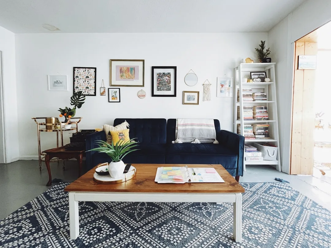
Every instinct you have in a small room says: push everything back. Hug the walls. Create open floor space in the center. It feels logical. It’s also one of the most reliable ways to make a room feel like a bowling alley.
When every piece of furniture is pinned to a perimeter, the center of the room becomes a void — an empty, purposeless stretch of floor that emphasizes the room’s limitations rather than disguising them. The eye reads the empty middle as wasted space, not open space. There’s a difference.
Floating your sofa 6–12 inches away from the wall is the single most impactful free change you can make to a small living room, according to experienced interior designers who consistently rank furniture placement — not square footage — as the highest-impact spatial adjustment available. Moving a sofa off the wall creates visual depth, defines a conversational zone, and gives the room a sense of intention that wall-hugging never achieves.
Here’s how to make a floating arrangement work on a budget:
- Anchor the float with a low-profile area rug. It unifies the seating group and creates a room-within-a-room effect that signals the arrangement is deliberate, not accidental.
- Angle a single side chair slightly — even 15 degrees off parallel — to add architectural interest without buying anything new.
- Leave the wall behind the sofa visible. That small gap creates a layer of depth that reads as space, even when it’s only a few inches.
- Add a narrow console table directly behind the floating sofa. It fills the gap purposefully and gives you a display surface without crowding the room.
The bowling alley effect isn’t about room size — it’s about furniture geography. Change the geography, and the room changes with it.
Actionable takeaway: Pull your sofa 8 inches off the wall today. Don’t buy anything. Just move it and live with it for 48 hours. The visual shift will be immediate.
Mistake #2: Buying a Sofa That’s One Size Too Big
The average small living room in a U.S. apartment measures between 160–250 square feet. Most standard three-seater sofas are designed for rooms at least 50% larger than that. This isn’t a minor mismatch — it’s a proportionality trap that throws off the spatial logic of everything else in the room.
A sofa should occupy no more than two-thirds of the wall it sits against. That’s the rule. Violate it, and no amount of clever accessorizing will save the room. The sofa will dominate, the remaining furniture will feel like an afterthought, and the traffic flow will feel tight regardless of how much floor space technically exists.
A few things most budget decorators don’t know about sofa sizing:
- The loveseat + accent chair combination consistently outperforms a sectional in rooms under 200 square feet. You get the same seating capacity with better visual balance and infinitely more flexibility.
- Legs matter more than most people realize. A sofa with exposed legs — even simple wooden or metal ones — visually lifts off the floor and lets light pass beneath it. This reads as more space. Sofas with skirted bases or hidden legs sit heavy and read as anchored objects rather than furnishings. On the secondhand market, mid-century and Scandinavian-style sofas with tapered legs are abundant and often significantly cheaper than new.
- The 18-inch traffic clearance rule between your sofa and coffee table isn’t just ergonomic — it’s visual. Less than 18 inches and the seating zone feels compressed. More than 24 inches and the pieces feel disconnected.
Before buying any new sofa, tape out its footprint on your floor with painter’s tape. Stand at the entry point of the room and look at that tape. If it fills more than two-thirds of the wall, it’s too big — no matter how much you love it in the showroom.
Actionable takeaway: Measure your current sofa against the two-thirds rule right now. If it’s oversized, repositioning and pairing it with fewer additional pieces can mitigate the impact while you plan a longer-term swap.
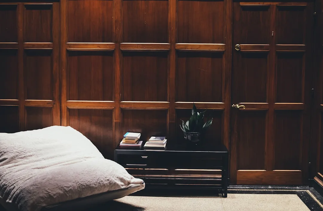
Mistake #3: Treating the Ceiling as Dead Space
Small-space decorating is almost entirely a ground-floor conversation. Rugs, sofas, coffee tables, TV units — the entire design vocabulary sits below the 4-foot mark. Which means every time you ignore the ceiling and upper walls, you’re leaving half the room’s visual potential completely untapped.
Curtains mounted 4–6 inches below the ceiling line rather than at the window frame can make an 8-foot ceiling read as nearly 10 feet tall. This is a proven technique used in model home staging, and it costs nothing extra if you’re already buying curtains. The rod goes higher, the panels go longer, and the window — and the room — suddenly feels dramatically more substantial.
The vertical strategy extends well beyond curtains:
- Tall, narrow bookshelves (think IKEA Billy at full height, or a 72-inch ladder shelf) exploit vertical space without consuming floor area. A bookshelf that runs floor-to-ceiling draws the eye upward and creates a sense of volume, even in a 10-foot-wide room.
- Vertical gallery walls — a column of frames rather than a wide horizontal spread — pull the gaze up and create height perception without requiring a single extra square foot.
- A single pendant light or swag light hung over the seating area costs less than most floor lamps, eliminates the floor footprint entirely, and anchors the space from above. Plug-in swag pendants start around $40 and require no electrician.
- Paint or wallpaper applied to the ceiling as a fifth wall (even a soft contrast color) draws attention upward and gives the room a curated, intentional quality that looks expensive but isn’t.
The vertical plane is where small-room decorating separates the people who’ve thought about it from the people who haven’t.
Actionable takeaway: Move your curtain rods up. If they’re currently mounted at window height, relocate them to within 4 inches of the ceiling. This is a 30-minute change that permanently alters how tall your room feels.
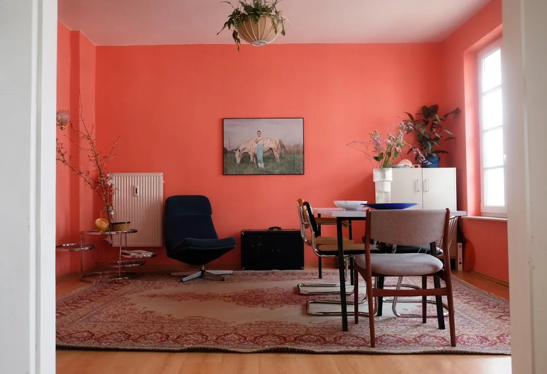
Mistake #4: Choosing the Wrong Paint Color for the Wrong Reason

Most people pick paint colors based on what they love in isolation — a swatch that looks beautiful at the hardware store, a shade that photographs well on Pinterest. What they don’t account for is how that color behaves inside a specific room, under specific light conditions, surrounded by specific furniture. In a small living room, this disconnect is where a lot of decorating budgets go sideways.
The instinct is almost always to go light. White walls, pale greys, soft creams — the logic being that lighter rooms feel larger. That instinct isn’t wrong, but it’s incomplete. A cool, flat white in a north-facing room with limited natural light doesn’t read as airy — it reads as grey and cold. The room shrinks. The furniture looks dull. Everything feels slightly off, and most people can’t identify why.
Undertones determine how a color behaves in your specific room, not the color itself. A warm white with yellow or pink undertones will feel open and inviting in low-light conditions. A cool white with blue or green undertones will feel clinical and compressed in the same conditions. Testing paint swatches at 12-inch square minimum — and observing them at morning light, midday, and evening lamplight before committing — is not optional in a small space. It’s the entire decision.
What actually works in small living rooms, and why:
- Warm whites and off-whites (Benjamin Moore White Dove, Sherwin-Williams Alabaster) work across most light conditions and make small rooms feel considered rather than defaulted.
- Dusty, muted mid-tones — sage green, warm terracotta, soft blue-grey — can make a small room feel more intentional and cozy rather than cramped, provided there’s adequate natural or artificial light. The mistake is assuming only light colors work.
- A single dark accent wall behind the sofa or TV can create the illusion of depth by making that wall recede visually. It sounds counterintuitive. It consistently works.
- Painting trim and walls the same color eliminates visual breaks and makes the room read as a single continuous surface — a technique that reliably makes small rooms feel less chopped up.
Actionable takeaway: Before repainting, buy three sample pots in the tones you’re considering. Paint 12×12-inch swatches directly on the wall. Check them across three different lighting conditions over two days. What you see then is what you’ll live with.
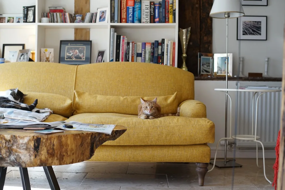
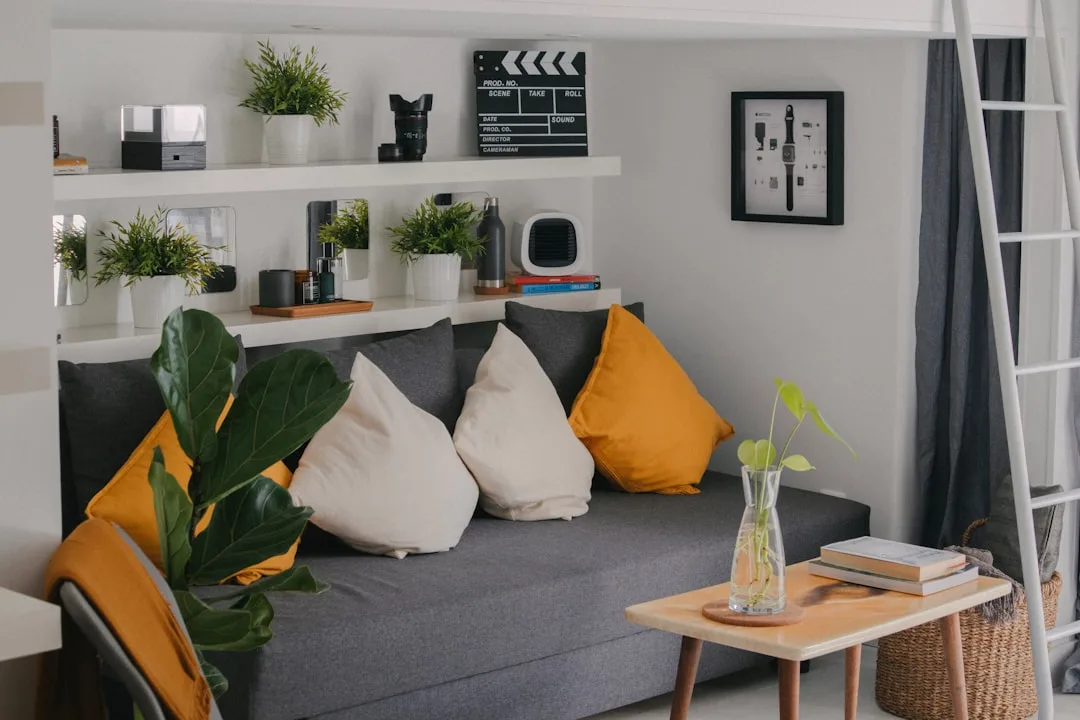
Mistake #5: Using Too Many Small Accessories Instead of a Few Large Ones
This is the mistake that feels the most like the opposite of a mistake. Small room, small things — it seems proportional. It isn’t. A cluster of small accessories reads as clutter, not curation. The room gets visually noisier without getting more interesting, and noise in a small space always reads as cramped.
One large piece of art — even a single canvas or oversized print — does more visual work than a gallery of smaller frames. It anchors the wall, gives the eye somewhere to land, and signals confidence. Small frames dotted around a wall in a small room create a Where’s Waldo effect: the eye searches for a focal point and never finds one.
The same principle applies across every category of accessory:
- One large throw pillow on each end of the sofa reads cleaner than four small ones. Four small ones look like you ran out of storage.
- A single statement lamp with an interesting base does more for a room than three small decorative lamps in different styles.
- A large tray on the coffee table, used to corral smaller objects, turns clutter into a vignette. The tray creates a boundary. Boundaries signal intention.
- One oversized plant — a fiddle-leaf fig, a monstera, a tall snake plant — commands space the way furniture does, adds vertical interest, and costs less than most decorative accessories. Three small succulents on a windowsill do none of that.
Editing is the skill most budget decorators don’t practice enough. Before buying anything new, remove half of what’s currently on display and live with the reduction for a week. What you miss going back is what earns its place. What you don’t notice was probably the problem.
Actionable takeaway: Identify the three smallest, most forgettable accessories in your living room right now. Box them. If you don’t reach for them in 30 days, they were part of the problem.
Mistake #6: Ignoring the Power of Mirrors (and Using Them Wrong)
Mirrors are the most overrecommended and least correctly implemented tool in small-space decorating. Every guide tells you to use them. Almost none of them tell you where and why — which means most people hang a mirror that does absolutely nothing for the room’s sense of space.
A mirror works spatially when it reflects something worth reflecting. A large mirror hung opposite a window reflects natural light back into the room and effectively doubles the visual depth of the space. A mirror hung on a wall that faces another wall reflects more wall. The spatial impact is zero.
The placement logic for mirrors in a small living room:
- Opposite or adjacent to a window is the only position that genuinely amplifies light and space. The larger the mirror, the more dramatic the effect.
- At eye level when seated, not mounted high. A mirror you can see yourself in when sitting in your seating area makes the room feel inhabited and alive. A mirror mounted at 6 feet reflects ceiling and upper wall.
- Leaning rather than hanging — a large floor mirror leaned against a wall — is one of the cheapest ways to get the visual impact of an architectural feature. Oversized mirrors at HomeGoods, TJ Maxx, and secondhand stores regularly appear for $30–$80. Hung on the wall, the same mirror would feel like furniture. Leaned, it feels like an intentional design choice.
- Mirrored furniture surfaces (a mirrored tray, a glass-topped coffee table, metallic side table legs) scatter light through the room at low levels and contribute to spatial openness without the dominance of a large wall mirror.
The mistake isn’t using mirrors — it’s hanging them on whatever wall has available space and expecting the result to be transformative.
Actionable takeaway: Find the window in your living room. Walk to the wall directly opposite it. That’s where your largest mirror should live.
Mistake #7: Buying a Rug That’s Too Small
Undersized rugs are one of the most common and most damaging mistakes in small living rooms — and one of the most common budget decorating tips for small living rooms is to go smaller on the rug to save money. This is backwards advice. A rug that’s too small doesn’t save the room — it fragments it.
The front legs of every piece of seating furniture should sit on the rug. That’s the minimum standard. If your rug only fits under the coffee table with nothing else touching it, it reads as a decorative mat, not as a grounding element. The seating group floats disconnected from the room, the floor space looks divided rather than unified, and the room feels more chaotic, not less.
What the right rug size actually does in a small living room:
- It defines the seating zone as a room within the room. In open-plan spaces or multi-use small rooms, this is how you create the sense of separate functional areas without walls.
- It makes the room look larger by unifying the floor plane. A rug that connects all the furniture anchors them as a cohesive group. The eye reads the group, not the gaps between pieces.
- It absorbs sound, which matters more in hard-floored small spaces than most people realize. Echo makes a small room feel more chaotic and somehow smaller.
Standard size guidance: in a room under 200 square feet, an 8×10 rug is almost always better than a 5×8. If an 8×10 feels out of budget, layering a smaller rug over a larger natural fiber jute rug (which costs very little) achieves the same visual grounding at a fraction of the price.
Actionable takeaway: Tape out an 8×10 rectangle on your floor using painter’s tape before buying any rug. See how it reads in the actual room with actual furniture. Most people are surprised by how right it looks.
Mistake #8: Relying Entirely on Overhead Lighting
The overhead light fixture that came with your apartment or house was chosen by a contractor optimizing for cost and code compliance. It was not chosen for your room, your furniture arrangement, or any consideration of atmosphere. Using it as your sole light source in a small living room is one of the fastest ways to make the space feel institutional rather than livable.
Overhead lighting illuminates from above and casts downward shadows — shadows that emphasize the boundaries and corners of a room rather than dissolving them. Layered lighting from multiple sources at different heights does the opposite: it blurs the edges, creates warmth, and makes the room feel dimensionally larger by eliminating the hard contrast between lit space and dark corner.
The layered lighting approach for small living rooms on a budget:
- A floor lamp in a dark corner pushes light into dead space and visually extends the room’s depth. Torchiere-style floor lamps that cast light upward onto the ceiling are particularly effective in low-ceiling rooms.
- Table lamps at sofa height (on end tables or a console) create warm pools of light at the level where human activity happens — seated conversation, reading, watching TV. This is the light that makes a room feel lived-in.
- Plug-in wall sconces (no electrician required) add architectural interest and light at mid-wall height — a layer that’s completely absent in most small living rooms. They install with a single screw and an outlet, and they read like built-ins.
- Candles or LED candle clusters on the coffee table cost almost nothing and add the warmest, most flattering light available at the lowest possible point in the room.
Actionable takeaway: Turn off your overhead light tonight and use only lamps. The difference in how the room feels will be immediate enough that you won’t want to go back.
Mistake #9: Decorating Without a Budget Decorating Strategy for Your Small Living Room
The final mistake isn’t a single decision — it’s the absence of a system. Most people decorate reactively: they see something they like, they buy it, they find a place for it. In a large room, this approach produces a slightly eclectic result. In a small living room, it produces clutter, visual noise, and the persistent feeling that the room is almost working but never quite does.
Budget decorating tips for a small living room only compound each other when they’re applied as part of a deliberate plan, not dropped in piecemeal. The floating sofa only works if the rug is the right size. The right rug only reads correctly if the furniture isn’t oversized. The layered lighting only feels intentional if the accessory count has been edited down. These decisions are a system, not a checklist.
What a functional small-room decorating strategy actually looks like:
- Establish one dominant focal point before buying or moving anything. It’s the TV wall, the fireplace, the window, or a single piece of art. Everything else in the room should serve or support that focal point, not compete with it.
- Limit your furniture count to what the room can accommodate at 18-inch clearances. Count the pieces currently in the room. If traffic flow requires turning sideways anywhere, you have at least one piece too many.
- Assign every surface a function before it gets decorated. A coffee table is for setting down a drink and housing one tray grouping. A side table is for a lamp and one small object. Surfaces without assigned functions accumulate clutter by default.
- Set a refresh budget per season, not per impulse. Swapping two or three accessories every few months keeps the room feeling current without the accumulation spiral that kills small-space decorating over time.
- Shop secondhand first, always. Facebook Marketplace, Craigslist, and local thrift stores are where the best small-room furniture finds live — pieces with legs, pieces in neutral tones, pieces that were built before the era of fast-furniture maximalism. Budget decorating in a small living room is genuinely easier when you’re not locked into what’s currently available at retail.
The rooms that consistently look larger than their square footage share one trait: every decision in them was made deliberately. That’s not an expensive quality. It’s just an intentional one.
Actionable takeaway: Before your next purchase for this room, write down the focal point, the current furniture count, and the one spatial problem you’re trying to solve. If the purchase doesn’t directly address that problem, it’s probably making the room smaller, not larger.