The room felt off for two years before the designer changed a single bulb — not the furniture, not the paint, not the layout — just swapped one 4000K recessed light for a 2700K equivalent, and suddenly the entire space made sense.
That story isn’t unusual. It happens in beautifully furnished rooms with expensive paint and carefully chosen materials, and it keeps happening because most people are trying to solve the wrong problem. They’re thinking about which temperature to use when they should be thinking about how temperatures work together. Here’s what changes when you understand the real framework.
Why the Warm vs Cool Lighting Debate Is the Wrong Question to Ask
Most lighting mistakes don’t happen because someone chose 2700K instead of 4000K. They happen because someone chose one temperature and applied it everywhere — to every recessed can, every lamp, every under-cabinet strip — treating the whole room as a single undifferentiated space.
That’s the actual problem.
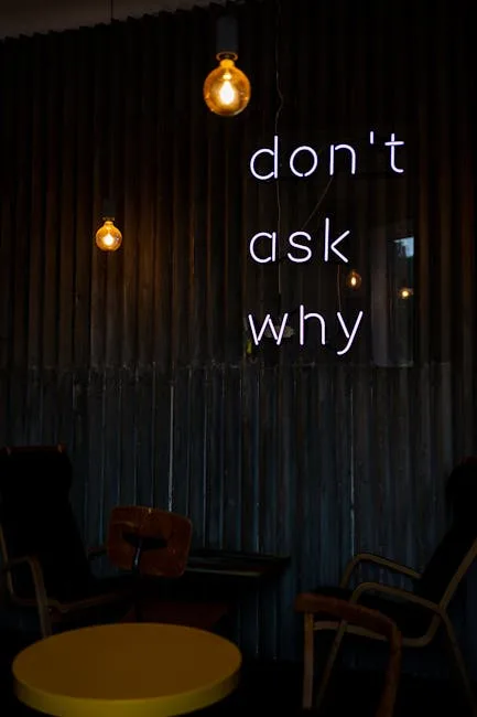
Professional interior designers rarely declare a team. They don’t pick warm or cool and call it done. They design lighting zones with deliberate temperature tension, using warm and cool sources the way a painter uses contrast — to create depth, direct attention, and signal how a space should be used. The choice isn’t warm OR cool. It’s which temperature leads, which one supports, and exactly where they hand off to each other.
The American Lighting Association has documented this gap clearly: 68% of homeowners report dissatisfaction with their lighting, yet most blame brightness rather than color temperature. So they buy brighter bulbs, add floor lamps, install dimmer switches — and still feel like something’s wrong. The diagnosis never changes, so neither do the results.
Here’s why that matters practically: once you stop thinking about warm versus cool as a binary choice, you start seeing your rooms differently. The ambient ceiling fixtures, the reading lamp by the sofa, the pendant above the kitchen island, the undercabinet strip in the bathroom — these aren’t interchangeable light sources. They’re different instruments, and they can play different notes.
- Ambient layer: sets the dominant temperature and emotional tone of the space
- Task layer: can run a contrasting temperature because it serves a specific function, not a feeling
- Accent layer: amplifies materials and architecture, and often benefits from a warmer temperature regardless of the room’s overall direction
The real decision is about hierarchy, not selection.
Actionable takeaway: Before you buy a single new bulb, write down the three lighting layers present in each room — ambient, task, and accent — and note what temperature each one currently runs. That map will show you exactly where the conflict lives.
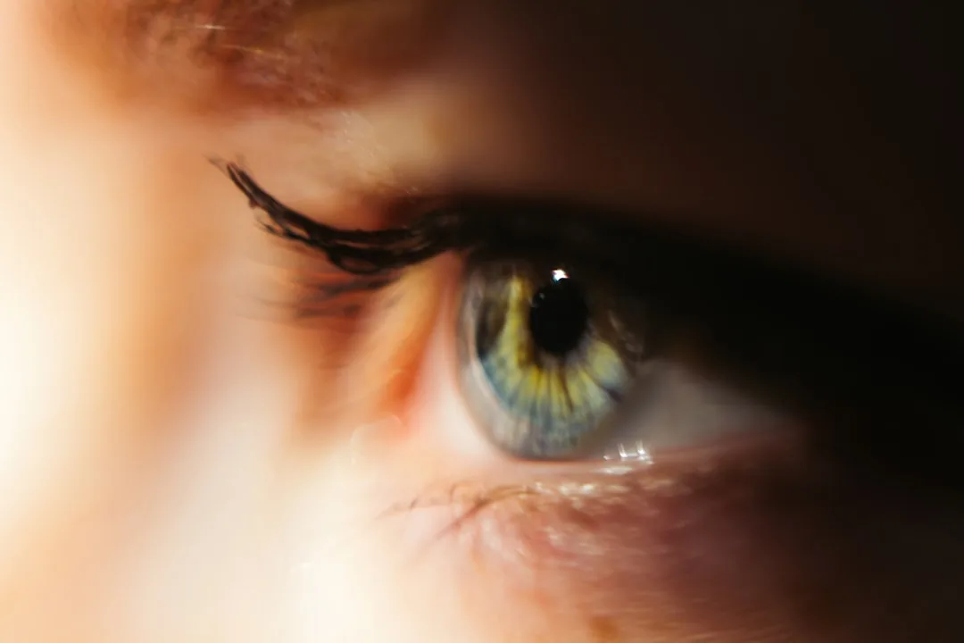
What Your Eye Actually Perceives — The Psychology Behind Warm and Cool Light in Decor

Light temperature isn’t aesthetic preference dressed up in science. It’s actual neuroscience, and the mechanisms are specific enough to be useful.
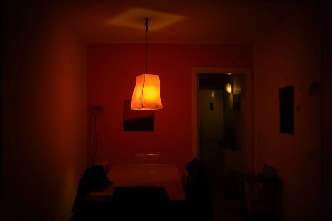
Warm light in the 2700–3000K range mimics late-afternoon sunlight — the light your nervous system has been reading as “day is ending, slow down” for hundreds of thousands of years. Your cortisol drops. Your jaw unclenches. This is genuinely useful to understand, because it means placing a 2700K fixture in a home office where you need sustained alertness isn’t just a style choice — it’s working against your own biology.
Cool light at 4000–5000K does the opposite. It reads as midday sun. Alertness increases. It also does something interesting to spatial perception: cool light increases perceived ceiling height and makes rooms read as larger — both in person and on camera. Real estate stagers know this. It’s why vacant homes photographed for listings often feel more spacious than they do during the in-person walkthrough, where warmer bulbs have been swapped back in.
A 2022 study published in Frontiers in Psychology found that participants in warm-lit rooms rated their social interactions as more intimate and reported higher emotional comfort scores than those in cool-lit environments — and this held regardless of room size. The room didn’t need to be small and cozy to produce that effect. The light alone shifted how people felt about each other.
Skin rendering is another dimension most people haven’t considered:
- Warm light (2700–3000K) flatters most skin tones by amplifying warm undertones and softening texture
- Cool light (4000K+) renders color more accurately — it doesn’t flatter, it reveals
- This is why makeup artists, surgeons, and forensic specialists work under cool, high-CRI light, while dinner party hosts and portrait photographers reach for warmth
The implication for home decor is direct. A dining table lit with a 2700K pendant isn’t just creating ambiance — it’s making every person at that table look better, which makes the whole experience feel better, which you then attribute to the food or the conversation.
Actionable takeaway: For any room where you want people to linger — dining rooms, living areas, primary bedrooms — default your ambient layer to 2700–2800K and see if the space starts working harder for you socially.
How Warm vs Cool Lighting Interacts With Your Paint Colors, Furniture, and Materials
This is where expensive decorating mistakes get made, and almost no one talks about it plainly.
Light temperature doesn’t just illuminate your surfaces. It chemically interacts with them — shifting hues, suppressing undertones, and transforming finishes in ways that can make a $90-per-gallon paint choice look like a mistake when it’s actually a lighting problem.
Warm bulbs saturate reds, oranges, and yellows while actively muting blues and greens. That sage green you agonized over at the paint store? Under a 2700K recessed light, it can read gray, brown, or khaki — nothing like what you saw on the swatch. The green wavelengths are being underlit. The paint color isn’t wrong. The light is just not rendering it.
Benjamin Moore’s color research team has noted that over 40% of paint return requests are linked to lighting conditions at the time of application — not the paint color itself. The paint looks different on the wall than it did in the store because most showrooms run 4000K or higher, which reveals cool undertones accurately. You bring that swatch home, put it under 2700K ambient light, and the undertone you chose it for disappears.
Cool bulbs have their own distortions. They’re often recommended for kitchens because they reveal food color accurately, but they’ll strip the warmth out of wood cabinetry, make white marble look blue-gray, and turn cream walls stark. Context matters.
Metallic finishes behave in ways that surprise most people:
- Brushed gold and unlacquered brass read richer, more complex, and more luxurious under cool-to-neutral light (3500–4000K) — the contrast between the warm metal and cool light creates visual interest
- Chrome and polished nickel glow warmly and look their best under incandescent-temperature sources around 2700K
- Matte black is relatively neutral and doesn’t shift dramatically between temperatures, making it a safer finish in mixed-lighting environments
Actionable takeaway: Before committing to a paint color, hold the swatch under the actual bulb you’ll be using — not natural light, not your phone flashlight. The color you’re approving needs to be the color under your specific light source.
The Layered Lighting Method: How to Use Warm and Cool Together Without It Looking Chaotic
Here’s the framework that separates rooms that feel considered from rooms that feel random.
The layered lighting method isn’t new — designers have been using it for decades — but the part that rarely gets explained is how temperature assignment works within those layers. Knowing you need ambient, task, and accent lighting doesn’t help you if you’re assigning temperatures randomly.
Establish a dominant temperature for your ambient layer, then use the secondary temperature only at the task or accent layer. For most living and sleeping spaces, warm ambient (2700–3000K) leads. For kitchens, bathrooms, and home studios, cool-neutral ambient (3500–4000K) often makes more sense. Once you’ve established that dominant temperature, you can introduce the contrasting one intentionally at a lower layer — a cool under-cabinet strip in a warm-ambient kitchen, a warm table lamp in a cool-ambient home office.
The 80/20 rule for mixed-temperature rooms works like this: 80% of your total lumens should come from one temperature category. The remaining 20% can come from the contrasting temperature. This gives you definition and contrast without creating visual dissonance — the sensation of wrongness that you feel before you can name it.
The Illuminating Engineering Society recommends a Color Rendering Index (CRI) of 90 or higher for residential spaces at any temperature. This specification almost never appears in consumer-facing lighting guides, but it’s responsible for a significant portion of “off” rooms. A CRI of 80 — the standard for most budget LEDs — means 20% of the color spectrum isn’t being rendered accurately. That affects how your walls look, how your fabrics read, how your skin tones render. Go to 90+ and the room comes alive even before you touch the Kelvin.
Key principles for layering warm and cool without chaos:
- Pick a temperature leader — one Kelvin value dominates your ambient fixtures throughout the room
- Give your task lighting permission to contrast — a 4000K desk lamp in a 2700K room is doing its job correctly
- Use dimmability as a transition tool — a 3000K bulb dimmed to 20% shifts perceptually toward 2200K, giving you a warm-to-warmer range within one fixture
- Never mix temperatures at the same layer — two recessed cans at different Kelvin values in the same ceiling plane create visual noise you’ll feel but won’t be able to identify
- Match CRI first, then Kelvin — a high-CRI bulb at a non-ideal temperature will still outperform a low-CRI bulb at the “correct” one
Actionable takeaway: Audit your ambient fixtures first. If any room has recessed cans or ceiling fixtures running at two different Kelvin values, correcting that single issue will likely produce the biggest perceptible improvement before you change anything else.
Room-Specific Lighting Decisions That Go Beyond the Standard Checklist
The warm-for-bedrooms, cool-for-kitchens formula isn’t wrong. It’s just incomplete. Here’s what it misses.
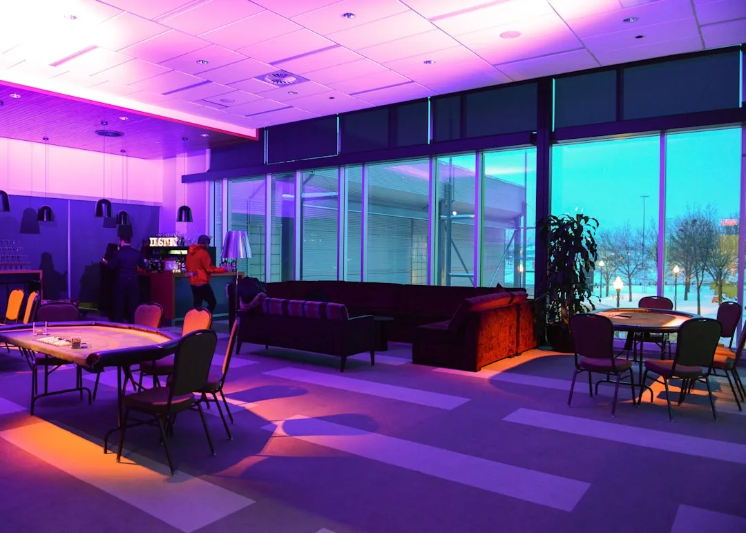
Open-plan spaces are where the checklist breaks down most visibly. A combined living-dining-kitchen floor plan can’t run a single temperature coherently. Warmer ambient tones in the lounge zone (a 2700K floor lamp, warm-temperature pendant over the dining table) create a subconscious psychological boundary — the light itself tells you where relaxation happens. Cooler tones above kitchen islands (a 3500–4000K pendant or recessed can) signal function. You haven’t built a wall, but you’ve created spatial separation that the brain reads clearly.
Home offices are the most misunderstood room in the house. Pure cool light (4000K+) does increase alertness — but it also creates problems. Under cool overhead light with no warm fill, video calls tend to flatten your appearance and make the space look institutional. More practically, it increases eye strain over long sessions because there’s no visual variation to rest against. A hybrid approach works better: cool-neutral task lighting (a 3500–4000K desk lamp pointed at your work surface) paired with warm fill from a floor lamp or wall sconce behind or beside you. Cornell University ergonomics research found that workers in offices with tunable lighting — able to shift between warm and cool temperatures — reported 26% less eye fatigue and higher sustained concentration than those working under fixed-temperature setups.
Bathrooms are genuinely two rooms functioning in one:
- Vanity lighting for grooming needs high-CRI, cool-neutral light at 3500–4000K, positioned at eye level on either side of the mirror — not overhead, where it creates shadows across the face
- Overhead and decorative fixtures can run warmer (2700–3000K) to prevent the room reading as clinical
- The vanity layer dominates when grooming; the ambient layer sets the tone the rest of the time
Primary bedrooms perform best with the most layered approach of any room — warm ambient (2700K), reading task lighting that’s slightly cooler (3000K with high CRI for extended reading comfort), and very warm accent lighting (2200–2400K for beside-table candle-effect fixtures) that signals the final wind-down stage. The temperature gets progressively warmer as you move through the room from door to bed.
Actionable takeaway: If you have an open-plan space that feels like it has no distinct zones, try changing just the pendant light over your dining or kitchen area to a temperature that contrasts with your living area. The spatial division often appears immediately.
Choosing Bulbs, Fixtures, and Smart Systems for Warm and Cool Lighting in Real Homes
Strategy is only useful if you can execute it at the hardware store. Here’s what to actually buy, and what to watch for.
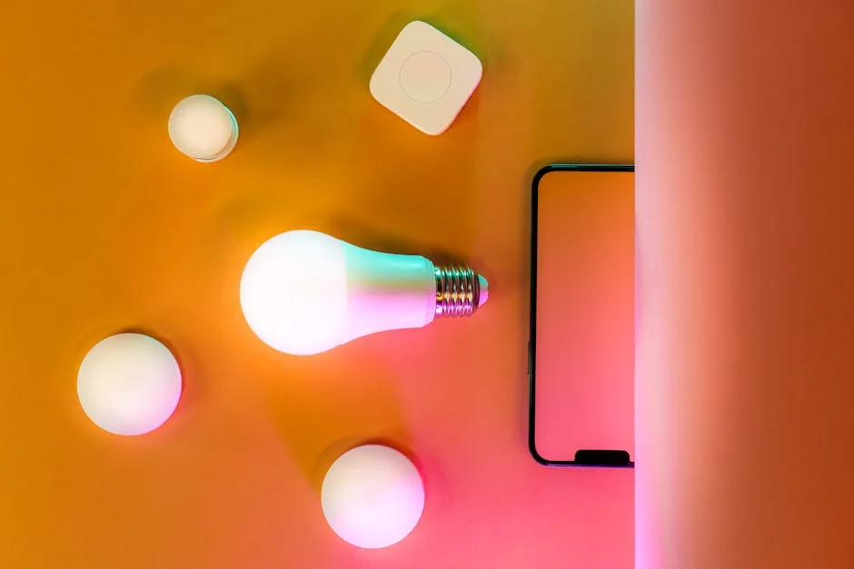
LED binning variation is a real problem that nobody mentions in lifestyle content. Two bulbs both labeled 2700K from different manufacturers — or even different production batches from the same manufacturer — can look noticeably different side by side. The “2700K” label describes a target range, not a precise result. The practical solution: buy in bulk from the same SKU number, check for ENERGY STAR certification (which enforces tighter binning tolerances), and look for bulbs that state their color temperature range explicitly (e.g., “2700K ±200K” versus just “2700K”).
Brands worth specifying by name:
- Philips Hue White Ambiance and LIFX A19 for tunable white smart systems
- Cree Lighting and GE Reveal (CRI 90+) for fixed-temperature high-CRI options in standard sockets
- Soraa for CRI 95+ in spaces where color accuracy is genuinely critical, like art display or makeup areas
Tunable white smart bulbs — those that adjust Kelvin value rather than just brightness — are the most practical upgrade for rooms that serve multiple functions. A single fixture in a kitchen-diner can run at 4000K for meal prep at noon and shift to 2700K for dinner at seven without touching the fixture. The technology has become affordable; Philips Hue White Ambiance bulbs are available for around $15–$25 per bulb, with the bridge system adding an upfront cost that amortizes quickly across a whole home.
Fixture material changes the perceived output temperature more than most people account for:
- An amber or smoke glass shade absorbs blue wavelengths and shifts the apparent temperature warmer — sometimes significantly warmer than the bulb’s rating suggests
- A white diffuser shade normalizes the output toward the bulb’s true Kelvin value
- An open metal shade with a dark interior concentrate the beam and can make any bulb read harsher
The global smart lighting market is projected to reach $38.68 billion by 2030, according to Grand View Research, driven largely by residential tunable white adoption. Fixed-temperature lighting is trending toward being the budget default, not the standard — which means the tools to implement warm-cool layering properly are becoming genuinely accessible.
Actionable takeaway: If you’re replacing bulbs in a room that serves multiple functions, the upgrade to tunable white smart bulbs is worth the price premium specifically because it eliminates the need to choose one temperature and live with it permanently.
Common Warm and Cool Lighting Mistakes in Home Decor — and How to Diagnose Yours
Most people know their lighting feels wrong before they know why. Here’s the diagnostic framework.
Mistake 1: Mixing color temperatures at the same ceiling plane. This is what lighting designers consistently identify as the single most common mistake in residential projects. Two recessed cans running different Kelvin values in the same ceiling create a visual interference pattern — a hum of wrongness that most people feel as vague discomfort without being able to point at the cause. It doesn’t show up in product photography. It’s immediately apparent in a lived-in room. Fix: standardize every fixture at the same layer to one Kelvin value.
Mistake 2: Ignoring the natural light color shift throughout the day. Daylight isn’t a fixed temperature. Sunrise and sunset hover around 2000–2200K. Midday outdoor light runs 5500–6500K. A room with significant window exposure will have natural light that shifts by more than 4000K across a single day. A fixed artificial temperature will clash with that incoming light for part of every day. Rooms with large east- or west-facing windows are particularly vulnerable — the warm sunrise or sunset light pouring in next to a cool artificial source creates visible temperature conflict. Tunable systems solve this; if you’re using fixed bulbs, lean toward 3000–3500K as a neutral compromise in high-natural-light rooms.
Mistake 3: Trying to warm up cool bulbs with dimming. Dimming a 4000K bulb does not make it warmer. It makes it dimmer and still cool — which in many cases reads harsher, because the reduced lumen output doesn’t compensate for the blue-white cast. The perceived warmth shift from dimming is real but modest: a 3000K bulb dimmed aggressively reads closer to 2700K. A 4000K bulb dimmed the same amount reads closer to 3700K. The Kelvin value compresses slightly, but the color character of the light doesn’t transform.
Mistake 4: Shopping for bulbs under store lighting. Home improvement stores typically run 4000–5000K overhead lighting to make the space feel bright and clean. Every bulb you evaluate there looks different than it will in your living room. Buy one bulb to test in your actual space before purchasing the full quantity.
Quick self-diagnostic checklist:
- Do any two ceiling fixtures in the same room run at different Kelvin values? → Fix the temperature mismatch first
- Does the room feel worse at noon than at 7pm, or vice versa? → You likely have a natural light conflict
- Did you try dimming a cool bulb to make it feel warmer, and it didn’t work? → The bulb temperature needs to change, not just the brightness
- Does a room you repainted recently look different than expected? → Check the Kelvin value of your bulbs against the paint undertone
Actionable takeaway: Take your phone into each room and photograph the space at night under artificial light only. The camera’s white balance will often make temperature mismatches more visible than your eye does, because your brain adapts to color casts while the camera records them literally.
Frequently Asked Questions
Can you mix warm and cool lighting in the same room without it looking wrong?
Yes — but the key word is intentional. The mixing that looks wrong happens when two different temperatures appear at the same layer (two ceiling fixtures, two matching table lamps) because the eye reads that as an error rather than a decision. Mixing temperatures across layers is not only acceptable but desirable. A warm ambient source paired with a cooler task light is a well-established technique that creates depth and visual interest. The rule: same layer, same temperature. Different layers can contrast deliberately. Keep the dominant temperature responsible for at least 80% of your total lumen output, and you’ll maintain visual coherence while benefiting from the contrast.
What color temperature is best for living rooms that also serve as home offices?
This is exactly the scenario where tunable white smart bulbs earn their cost. If you’re committed to fixed-temperature bulbs, 3000K is the most functional compromise — warm enough for evening relaxation, alert enough for daytime work, and neutral enough not to clash dramatically with either morning or afternoon natural light. Layer it with a dedicated 3500–4000K desk lamp that you can switch off when you’re not working. The task light signals “work mode” when it’s on and disappears when it isn’t, giving you psychologically meaningful separation between the room’s two functions without requiring two different sets of ambient fixtures.
Why does my paint color look different at night under artificial light than it did in the store?
Almost certainly because the store and your home are running different color temperatures — and possibly different CRI levels. Most paint showrooms and hardware stores use 4000K or higher overhead lighting, which renders cool undertones clearly. If your home runs 2700–3000K ambient lighting, the warm light suppresses blue and green wavelengths, shifting cool-undertoned whites toward cream or yellow, muting sage greens toward gray, and making greige walls read browner than expected. This isn’t a defect in the paint — it’s physics. The fix going forward is to evaluate paint swatches under your actual home lighting before committing. For paint already on your walls, adjusting your bulb temperature toward 3000–3500K often recovers the color you thought you were getting.
Do smart tunable white bulbs actually replace the need to plan lighting temperature in advance?
They reduce the stakes considerably but don’t eliminate the planning entirely. Tunable white bulbs let you adjust Kelvin value after installation, which means a wrong initial temperature choice becomes correctable rather than permanent. But you still need to think about fixture placement, CRI rating, lumen output, and the interaction between your light sources and your surfaces — none of which smart bulbs solve automatically. Think of tunable white as giving yourself the ability to fine-tune after installation rather than having to get it perfect at the hardware store. For rooms that shift functions throughout the day, they’re genuinely close to essential. For single-function rooms like a dedicated guest bedroom or a home theater, fixed-temperature high-CRI bulbs at the right Kelvin are simpler and often cheaper.
One Thing You Can Do Right Now
Go into the room that’s bothered you the longest — the one that never quite works no matter what you do to it — and find one bulb. Not every bulb. One. Check its Kelvin rating (it’s printed on the base or the box) and look at what it’s supposed to be doing: ambient light for a whole room, task lighting over a specific surface, accent light hitting a wall or object.
Then ask whether that temperature is right for that job, based on everything above.
If it’s a 4000K bulb trying to create warmth in a living space, swap it for a 2700K equivalent with a CRI of 90 or higher. If it’s a 2700K bulb over a kitchen counter where you’re chopping and reading labels, try a 3500K replacement. One bulb at a time is a legitimate strategy — it’s slow, but it’s how you learn what’s actually happening in your space before you spend money on a whole-house overhaul.
The room that felt off for two years didn’t need a renovation. It needed someone to look at it more carefully.