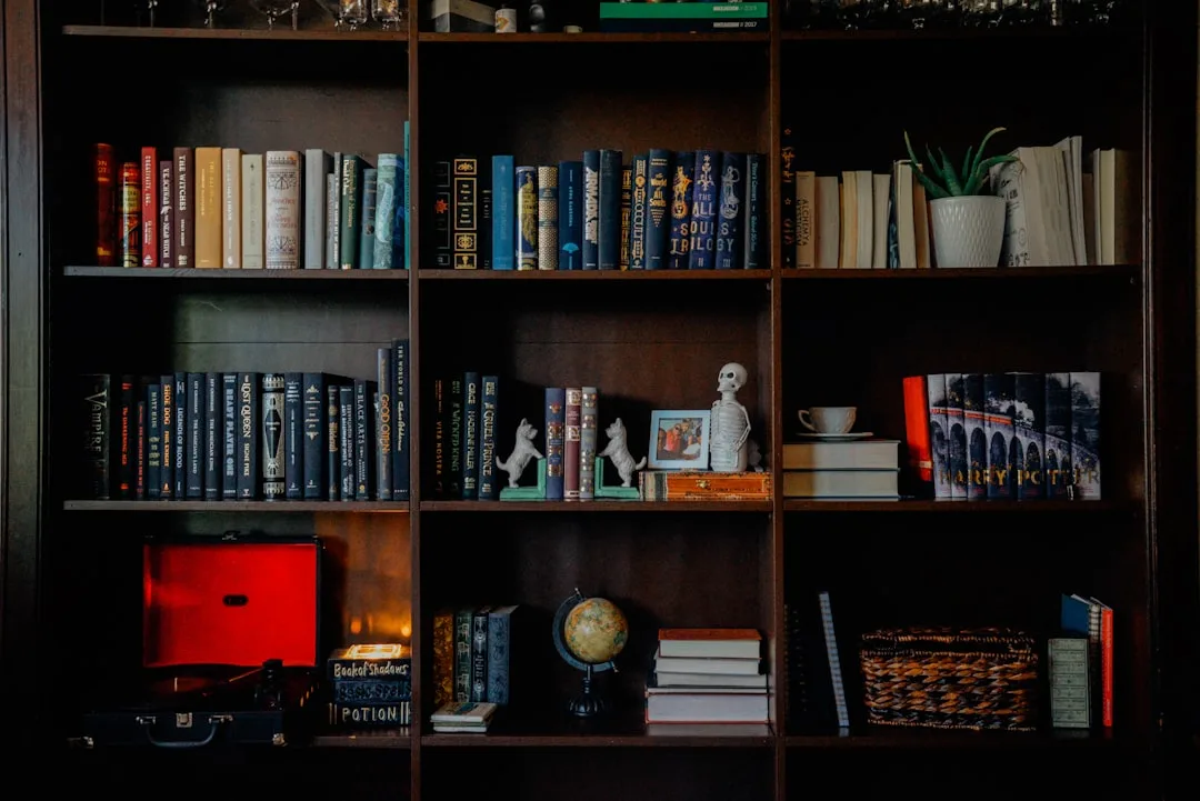
The shelf you spent a weekend styling is quietly making it harder to focus — and if you’ve been searching for bookshelf styling home office ideas that actually hold up past the first week of real work, you already sense the problem: most advice out there was written for photographers, not people who have to work in front of these shelves every day.
Quick Answer
The shelf you spent a weekend styling is quietly making it harder to focus — and the problem isn’t your taste, it’s that no one told you the rules for styling bookshelves were written for photographers, not people who actually have to work in front of them.
Most bookshelf advice treats a shelf like a still life painting. Something to look at. Something to be admired from a specific angle, in good light, with a clear backdrop. That framing made sense when the goal was a magazine spread. It makes no sense when you need to find last quarter’s project folder in under thirty seconds while you’re on a deadline.
This article is for people who actually work at their desks.
Why Most Styled Bookshelves Look Good in Photos But Feel Wrong in Real Life
In This Article
- Why Most Styled Bookshelves Look Good in Photos But Feel Wrong in Real Life
- The Shelf Zoning Method: Treat Your Bookshelf Like Real Estate, Not a Gallery
- Choosing a Shelf Unit That Actually Fits How You Work (Not Just How Your Room Looks)
- How Bookshelf Styling Home Office Ideas Go Wrong (And What to Do Instead)
- The Visual Calm Framework: Making a Functional Shelf Look Intentional
- Choosing a Shelf Unit That Actually Fits How You Work (Not Just How Your Room Looks)

Here’s something I figured out after years of staging client home offices and watching them fall apart within three weeks: the moment a shelf is designed to be looked at rather than used, it starts working against the person in the room. The coffee table books stacked at a diagonal. The all-white spines turned backward. The three perfectly proportioned ceramic objects that gather dust while the person who lives there jams their actual notebooks on a different surface because they can’t bear to disturb the arrangement.
Social media styling conventions weren’t developed in working environments. They evolved from editorial photography, where the goal is a two-dimensional image captured in a few frames. Symmetry reads well on camera. Pops of accent color create visual interest in a grid. Overcurated vignettes with a single candle, a trailing plant, and a hardcover with a clever title photograph beautifully — and feel performative and cold to sit in front of eight hours a day.
The psychological cost is real, not just aesthetic. A 2022 study published in the Journal of Environmental Psychology found that visually complex backgrounds in workspaces increased error rates in detail-oriented tasks by up to 15% compared to visually calm environments. Which means the effort you put into making your shelf look full and interesting is actively competing with your ability to do careful work. That’s a bad trade.
What I kept seeing in client spaces — and what I eventually had to be honest about in my own studio — is that the paralysis people feel about shelf styling comes from conflating two completely different goals. Styling a shelf so it looks good. Organizing a shelf so it works. Most people try to do both at once and end up with neither. The solution isn’t to abandon aesthetics. It’s to sequence the decisions correctly: function first, then visual refinement within the constraints function sets.
The distinction that changes everything: a styled shelf is designed for a viewer; a functional shelf is designed for an occupant.
Start by asking not “how does this look” but “what do I reach for in this room, and how fast can I reach it.”
The Shelf Zoning Method: Treat Your Bookshelf Like Real Estate, Not a Gallery
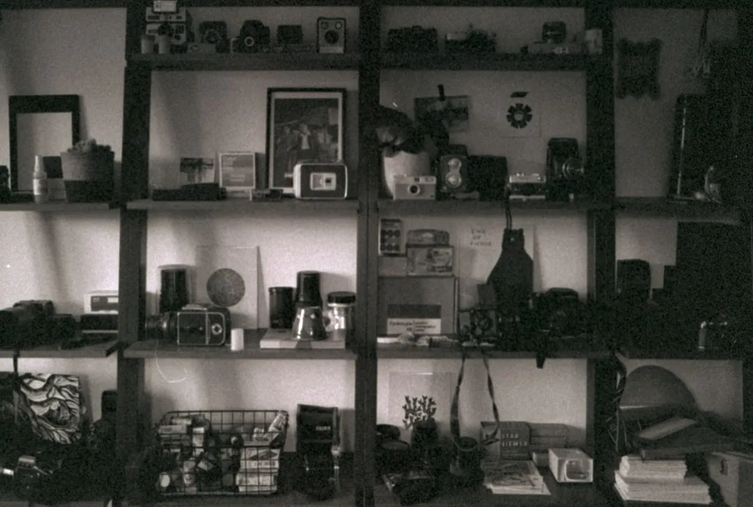
Every piece of real estate has a value based on location, and your bookshelf works exactly the same way. The shelves directly at your eye level when seated are prime real estate — the highest cognitive traffic, the most frequently accessed, the zone where visual noise does the most damage. The shelves at the very top or very bottom are the equivalent of a storage unit in the building basement: still useful, still valuable, but not where you put things you need immediately.
The Shelf Zoning Method divides your bookshelf into three distinct functional zones, each with its own rules.
Zone 1 — Active Work Zone sits at eye level when you’re seated at your desk. This shelf holds only what you touch daily: your current notebook, whatever you’re reading or referencing this week, charging cables routed through a small decorative box, a pen cup that actually has pens in it. No ornaments. No aspirational objects. Nothing that requires you to move something else to access something useful. This zone is the engine room, and it should look like one — clean, legible, immediately actionable.
Zone 2 — Reference Zone occupies the shelf immediately above and immediately below the Active Zone. Books, binders, and tools you access weekly live here. Grouped by project or discipline, not by color — because when you need the tax documentation binder, you’re not thinking “where’s the blue section of my shelf,” you’re thinking “where are the tax binders.” Color organization looks cohesive; category organization is how your brain actually retrieves information.
Zone 3 — Visual Rest Zone claims the shelves farthest from your sightline: the very top, the very bottom. Decorative objects, aspirational books you intend to read someday, personal mementos — all of this lives here. These shelves do the aesthetic heavy lifting so the zones you actually look at during focused work can stay calm. Interior designers at the British Institute of Interior Design recommend that no more than 30% of a working bookshelf’s surface area be dedicated to purely decorative objects, with the remaining 70% supporting active use or quiet negative space. Zone 3 is where your 30% budget gets spent.
The audit is simple. Sit down at your desk. Note where your eyes naturally land. That’s your Active Zone. Everything currently on it that you haven’t touched in two weeks moves down or up. Done in ten minutes.
Today’s action: pull everything off one shelf and put it back only if you’ve used it in the last month.
Choosing a Shelf Unit That Actually Fits How You Work (Not Just How Your Room Looks)
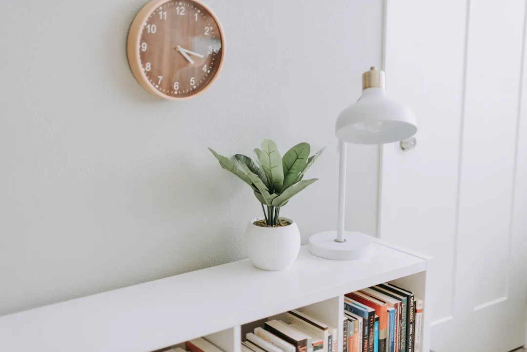
I once helped a client in a Lincoln Park one-bedroom pick out the most gorgeous ladder shelf she’d seen on Instagram — natural oak, clean lines, genuinely beautiful. We installed it. She loved it for about eleven days. Then the reality settled in: the shelves were 6 inches deep, fixed at awkward intervals, and the whole unit leaned slightly against the wall, which meant anything placed near the edge was a liability. Her architecture binders wouldn’t fit. Her equipment was too heavy. She ended up using it exclusively for plants and moved her actual work materials to a plastic rolling cart she hated looking at.
Aesthetics without specs. It almost always ends the same way.
Shelf depth is the single most underspecified variable in home office shelf selection. A 10–12 inch depth accommodates most reference books and small equipment without precarious overhanging edges. Eight inches is appropriate for paperbacks and small decorative objects only. If you’re storing anything with genuine mass — thick binders, reference textbooks, equipment — measure the depth of those items before you buy the shelf, not after.
Adjustability is non-negotiable for a workspace. Fixed shelves are for spaces with predictable, unchanging contents. Your work life is not that. Adjustable shelving lets you reconfigure as projects change, as equipment upgrades, as your actual daily reference materials shift from one quarter to the next. The extra fifteen dollars a unit costs for adjustable pin-hole systems is the single best investment you’ll make in a home office shelf — better than any styling object you’ll place on it.
Wall-mounted versus freestanding is a question of permanence and load. Wall-mounted shelves — properly anchored into studs, not just drywall — can hold significantly more weight per linear foot than most freestanding units of comparable price. If you’re storing heavy reference materials, equipment, or anything you’d be genuinely upset to see on the floor, mount to studs or use a proper freestanding unit with a rated weight capacity. Don’t guess at this.
One more variable that rarely makes the spec sheet but matters enormously in a working space: the visual weight of the unit itself. Open shelving with thin metal frames recedes into the room and keeps the space feeling light. Solid wood or MDF units with full backs and thick shelves create a heavier, more enclosed feeling that some people find grounding and others find oppressive. Neither is wrong. But if you’re in a smaller room, or one that gets limited natural light, a unit with an open back or no back panel at all will keep the space from feeling like it’s closing in on you during long work sessions.
Before you buy: measure your three largest items and your three heaviest items. The shelf has to fit both.
How Bookshelf Styling Home Office Ideas Go Wrong (And What to Do Instead)
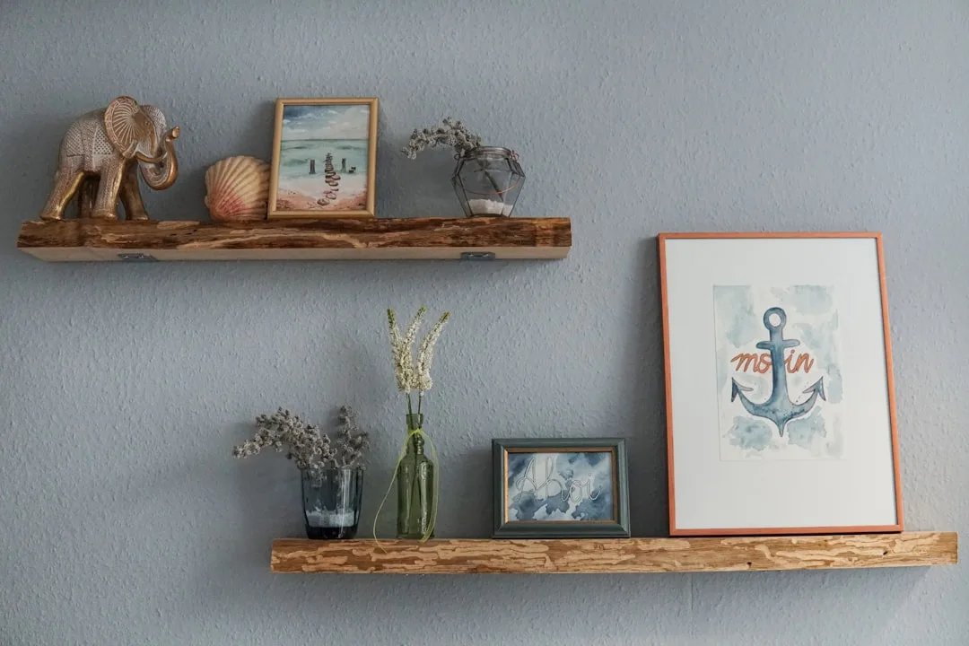
Most bookshelf styling home office ideas circulating online share a common flaw: they were developed by people optimizing for a photograph taken at 10am with a ring light, not for someone sitting at that desk at 3pm on a Thursday trying to find a contract they need to send in twenty minutes.
The result is a category of advice that looks authoritative but is structurally incompatible with actual work. Here’s where the most common ideas break down — and what the better version looks like.
The “all books facing the same direction” rule. Visually cohesive. Practically fine, unless some of your books are oversized, which they probably are. The real problem is when this rule gets extended to turning spines backward for an “aesthetic” neutral look. You cannot read a backward spine. If you turn your books backward, you are decorating with objects you have permanently made inaccessible. Use spine-forward organization. If visual consistency matters to you, use bookends and leave deliberate gaps rather than filling every inch.
The “odd numbers only” rule. Grouping objects in threes and fives does read well visually — this is grounded in actual perceptual psychology. But it becomes a problem when people apply it rigidly to functional objects. You have four notebooks you’re actively using. Group them in four. The rule applies to decorative arrangements, not to working materials. Know which zone you’re in before you apply which rule.
The “one large, one medium, one small” height variation rule. Again, legitimate for decorative zones. Not useful for reference zones, where consistent heights and labeled spines make retrieval faster. In your Active and Reference Zones, let function set the arrangement. In your Visual Rest Zone, let this rule do its work.
The “clear the clutter” advice that means “hide all your actual tools.” This is the most damaging category of home office shelf advice in circulation. Hiding your tools in opaque boxes and behind closed cabinet doors in the name of visual calm means your tools are now inaccessible. The solution isn’t to hide your tools — it’s to choose tools that are worth looking at. A well-made pen cup in ceramic or leather doesn’t need to be hidden. A proper file folder system in a consistent color doesn’t need to be hidden. Invest slightly more in the objects you’ll look at daily, and you get function and aesthetics simultaneously without the hiding.
The underlying principle: good bookshelf styling home office ideas start with the workflow, not the aesthetic. Map what you actually do at your desk across a typical week. What do you reach for? When? From where? Build the shelf around those answers and then refine the look within the resulting structure. That sequence — function, then form — is what separates a shelf that still works in month six from one that was perfect on day one and abandoned by day twelve.
The Visual Calm Framework: Making a Functional Shelf Look Intentional
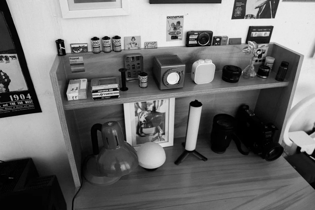
Function-first doesn’t mean aesthetics last. It means aesthetics get applied after the functional structure is set — which actually makes the styling decisions much easier, because the constraints are already defined.
Once your zones are established and your working materials are placed correctly, you’re styling a much smaller problem than you thought. You’re not styling a whole bookshelf. You’re styling Zone 3, and doing small visual edits to Zones 1 and 2 so they look deliberate rather than haphazard.
Negative space is the most underused tool in home office shelf styling. An empty shelf section is not a failure to fill it. It’s a visual rest — the shelf equivalent of a pause in a sentence. Deliberately leaving one-third of a shelf empty, particularly in Zones 1 and 2, gives your eyes somewhere to land that isn’t competing for attention. People who work in front of their shelves consistently report feeling less anxious in spaces where they can see the back of the shelf behind their objects. That blank wall or back panel is doing something. Let it.
Consistent containers do more visual work than consistent colors. The all-white shelf aesthetic became popular because uniformity reads as calm. But you don’t need white everything — you need similar-looking containers. A set of matching file folders. Three baskets in the same material. Pen cups and supply containers from the same collection. Consistency in texture and material reads as intentional without requiring you to repurchase all your books in matching covers.
One accent, repeated. Rather than a color palette, choose one material — brass, matte black, natural wood, white ceramic — and repeat it in small functional objects throughout the shelf. Your pen cup, your small tray, your bookend, your cable organizer. If they share a material, the shelf reads as curated even if the content is completely utilitarian. This is the single most efficient styling move for a working shelf.
Plants, but specifically. Trailing plants on upper shelves create a softening effect without occupying working space. A single small plant on the Active Zone shelf, however, creates visual complexity directly in your eye line during focused work. If you want greenery, keep it in Zone 3 — at the top of the unit where it trails down without interrupting your sightline when you’re seated.
The test: sit at your desk and unfocus your eyes slightly. What draws your attention first? That’s where your shelf is creating unnecessary cognitive load.
Choosing a Shelf Unit That Actually Fits How You Work (Not Just How Your Room Looks)
I once helped a client in a Lincoln Park one-bedroom pick out the most gorgeous ladder shelf she’d seen on Instagram — natural oak, clean lines, genuinely beautiful. We installed it. She loved it for about eleven days. Then the reality settled in: the shelves were 6 inches deep, fixed at awkward intervals, and the whole unit leaned slightly against the wall, which meant anything placed near the edge was a liability. Her architecture binders wouldn’t fit. Her equipment was too heavy. She ended up using it exclusively for plants and moved her actual work materials to a plastic rolling cart she hated looking at.
Aesthetics without specs. It almost always ends the same way.
Shelf depth is the single most underspecified variable in home office shelf selection. A 10–12 inch depth accommodates most reference books and small equipment without precarious overhanging edges. Eight inches is appropriate for paperbacks and small decorative objects only. If you’re storing anything with genuine mass — thick binders, reference textbooks, equipment — measure the depth of those items before you buy the shelf, not after.
Adjustability is non-negotiable for a workspace. Fixed shelves are for spaces with predictable, unchanging contents. Your work life is not that. Adjustable shelving lets you reconfigure as projects change, as equipment upgrades, as your actual daily reference materials shift from one quarter to the next. The extra fifteen dollars a unit costs for adjustable pin-hole systems is the single best investment you’ll make in a home office shelf — better than any styling object you’ll place on it.
Wall-mounted versus freestanding is a question of permanence and load. Wall-mounted shelves — properly anchored into studs, not just drywall — can hold significantly more weight per linear foot than most freestanding units of comparable price. If you’re storing heavy reference materials, equipment, or anything you’d be genuinely upset to see on the floor, mount to studs or use a proper freestanding unit with a rated weight capacity. Don’t guess at this.
One more variable that rarely makes the spec sheet but matters enormously in a working space: the visual weight of the unit itself. Open shelving with thin metal frames recedes into the room and keeps the space feeling light. Solid wood or MDF units with full backs and thick shelves create a heavier, more enclosed feeling that some people find grounding and others find oppressive. Neither is wrong. But if you’re in a smaller room, or one that gets limited natural light, a unit with an open back or no back panel at all will keep the space from feeling like it’s closing in on you during long work sessions.
Before you buy: measure your three largest items and your three heaviest items. The shelf has to fit both.
FAQ
How do I start implementing bookshelf styling home office ideas without having to redo everything at once?
Start with one shelf — specifically, the one at your eye level when seated. Clear it completely. Put back only what you’ve touched in the last two weeks. That single change will have more impact on how the space feels during work than restyling every other shelf combined. Do the rest of the unit over the following weekend if you want, but the eye-level shelf is where the return is highest.
My home office shelf has to look good on video calls. How do I balance that with function?
Video calls show a shallow slice of your background — usually about two shelves’ worth at whatever height sits behind your head. Style that specific zone for visual calm and some personality: a few well-chosen books with readable spines, one or two objects with visual texture, nothing chaotic. Keep your actual working zones out of frame or deliberately below the camera line. You’re not lying about the space — you’re making a sensible distinction between what’s on camera and what’s in use.
Is it okay to organize books by color in a home office?
In your Visual Rest Zone (top and bottom shelves, out of your direct sightline during work), color organization is fine and can look genuinely considered. In your Reference Zone, where you need to retrieve specific materials efficiently, color organization will slow you down every single time. Organize by project, discipline, or frequency of use in the zones you actually work from.
How often should I audit my home office bookshelf?
A practical rhythm is once per quarter — roughly aligned with how project work tends to shift. Set a fifteen-minute timer, sit at your desk, and look at what’s at eye level. Anything you haven’t touched since last quarter moves to a lower zone or out of the room entirely. Annual deep audits for the full unit are enough for everything else.
What’s the minimum number of decorative objects a functional home office shelf actually needs?
Zero, technically. But most people work better in spaces that have some personal resonance — a photograph, an object from a meaningful trip, something that reminds them why the work matters. One to three objects with genuine personal meaning will do more for your relationship with the space than a carefully curated collection of aesthetically matched pieces that mean nothing to you. Choose for meaning first. If it also happens to look good, that’s a bonus, not the criterion.