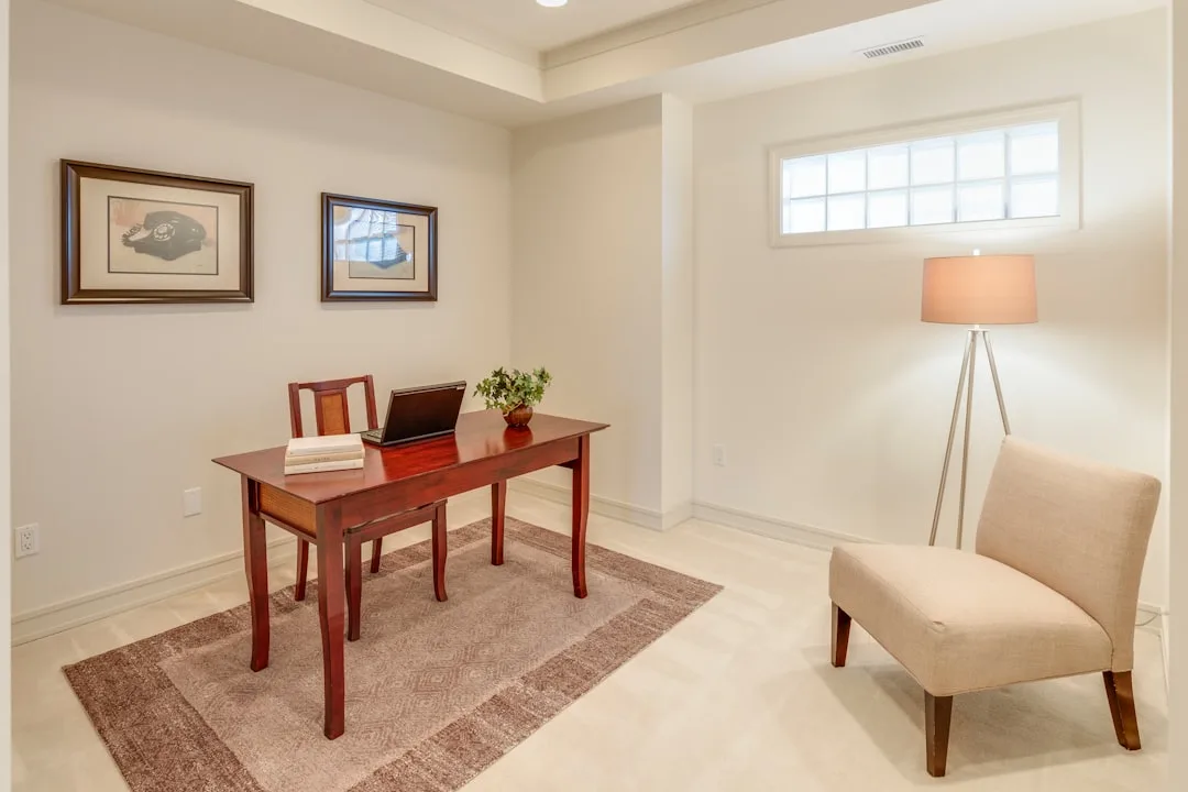
The most popular home office paint color advice on the internet is built on a 1990s lab study that was never designed to apply to real rooms — and following it may be the reason your workspace feels off no matter what you try. Color psychology research conducted in controlled environments, under standardized fluorescent lighting, with test subjects performing isolated tasks, doesn’t map cleanly onto a 9×11 spare bedroom with a north-facing window, a secondhand desk, and three different light sources competing for dominance by 3pm. You’ve probably read that blue increases focus and green promotes calm. That advice isn’t wrong exactly — it’s just so stripped of context that it becomes useless the moment it meets your actual room.
Quick Answer
The most popular home office paint color advice on the internet is built on a 1990s lab study that was never designed to apply to real rooms — and following it may be the reason your workspace feels off no matter what you try.
This is the gap most paint color guides refuse to address. Not because they don’t know better, but because nuance doesn’t drive clicks the way a ranked color list does.
Why the Standard Color Advice Is Making Your Home Office Worse
In This Article
- Why the Standard Color Advice Is Making Your Home Office Worse
- The Real Variable Nobody Talks About: Your Work Type Determines Your Color
- How Your Room’s Natural Light Rewrites Every Color Rule
- Colors That Actually Support Productivity — Matched to Real Conditions
- The 60-30-10 Rule Applied to Home Office Color — and Where to Break It
- Before You Paint: The 5-Day Sample Test That Saves You From a Costly Mistake
- What to Do When You Can’t Paint (Renters and Quick-Fix Solutions)
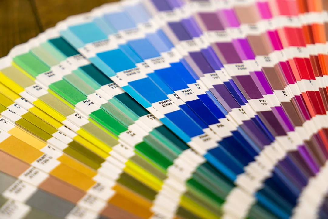
Most color guides are written backward. They start with the color and then reverse-engineer a justification for it — blue calms the nervous system, so paint your office blue — rather than starting with the specific conditions of your room and the specific demands of your work. The result is advice that sounds scientific but functions more like a horoscope.
The blue-for-focus claim traces back to color psychology research that was genuinely useful inside a university lab. But those studies controlled for every variable your home office doesn’t have: consistent lighting, neutral surfaces, no screens, no external visual noise. Paint a room Benjamin Moore Hale Navy and then sit in it at 4pm in January with a west-facing window and a white monitor, and tell me whether you feel focused or just cold and vaguely defeated.
The commercial bias problem is also real. A significant portion of what reads as editorial content — “the best office paint colors for productivity” — is either written by or written for paint brands. That doesn’t make the color recommendations fraudulent, but it does mean the selection criteria is “what sells” rather than “what works.” Sherwin-Williams doesn’t have a financial incentive to tell you that their popular Agreeable Gray makes north-facing offices feel like a dentist’s waiting room.
Here is what actually matters and what most guides ignore entirely:
- The color of your office must be evaluated against your specific light conditions, not a stock photo
- Paint brand editorial content is built around product lines, not around your cognitive needs
- Lab-based color psychology rarely accounts for prolonged screen work, which changes how your eyes register wall color over hours
One piece of data that rarely makes it into these guides: a 2022 study from the University of Texas found that beige and white offices raised feelings of sadness and depression in women, while red and orange environments produced the same effect in men. Yet neutrals — and the ubiquitous “calming” blues — remain the default recommendation across virtually every design guide published in the last decade. If the research itself shows these defaults carry real psychological risk for a significant portion of the population, the one-size advice isn’t just unhelpful. It may be actively harmful.
Actionable takeaway: Before you look at a single paint color, ask yourself what problem you’re actually trying to solve in this room. Vague goals produce bad color decisions.
The Real Variable Nobody Talks About: Your Work Type Determines Your Color
Here is the conversation I had with nearly every client who came to me frustrated with their home office: “I painted it this calm, soft blue like everyone says to, and I still can’t concentrate.” Nine times out of ten, I’d ask what they actually did at that desk all day. The answer was almost never creative work. It was data analysis, financial modeling, legal writing, line editing — high-focus, detail-intensive tasks that require a different kind of mental state than brainstorming or ideation.
The distinction matters enormously. Analytical work and creative work are cognitively opposite environments, and they respond to color stimulation in opposite ways.
For analytical work — coding, accounting, legal writing, copy editing, technical research — the goal is to sustain narrow, sustained attention over long periods. The worst thing a room can do in this context is add visual stimulation. The room needs to recede. Colors that introduce energy or warmth can increase error rates not because they’re “bad” colors, but because they’re working against the neurological state the work requires.
Creative work is different. Design, brainstorming, video production, writing first drafts — these tasks require your brain to make loose associative connections, and a room that’s too quiet and neutral can actually suppress idea generation. You need just enough visual interest to keep the brain gently activated.
Research published in the journal Color Research & Application found that red environments improved performance on detail-oriented tasks by up to 31%, while blue environments boosted performance on creative tasks — which is almost the exact opposite of how most people apply this information. People hear “red is stimulating” and assume that means it will help them focus. It helps them with precision detail work. Blue, meanwhile, gets recommended universally as a focus color when it actually performs best for open-ended thinking.
Identify your work type before you identify your color. It’s the most important step most guides skip entirely. Ask yourself:
- Is the majority of my work analytical (data, writing, editing, research) or creative (design, ideation, content creation, visual work)?
- Do I primarily work alone at this desk, or do I take video calls and collaborate?
- What is the emotional state I need to enter within 5 minutes of sitting down?
Actionable takeaway: Write down your single most common cognitive task before you open a paint deck. That answer determines your color range before light, finish, or anything else enters the conversation.
How Your Room’s Natural Light Rewrites Every Color Rule
I once specified a warm greige — a color I had used successfully in four other offices — for a client’s north-facing study in a vintage Chicago brownstone. It photographed beautifully. In person, by 10am on a cloudy Tuesday, it looked like a beige cardigan soaked in dishwater. The color was fine. The light destroyed it.
Natural light direction is the most underweighted variable in home office color decisions, and it’s also the one that’s completely free to diagnose if you know what to look for.
North-facing offices receive cool, diffused, indirect light throughout the entire day. That consistency sounds appealing — no harsh glare, no dramatic afternoon shifts — but it means the light has a blue-gray undertone that will make cool-toned paints feel stark and cold, and will make warm-toned paints appear muddy or gray. If your office faces north, you need to compensate with warmth in your color choice, not reinforce the problem with a soft blue or bright white.
South-facing rooms are the opposite challenge. Strong direct light, especially by midday, can wash out pale or muted colors entirely — the wall reads as almost white regardless of what you actually put on it. Saturated colors hold up better in south-facing spaces, but by mid-afternoon in summer, even a thoughtfully chosen terracotta can tip into something aggressive.
East and west-facing offices are the most deceptive because they perform completely differently at different hours. A color that looks grounding and warm at 8am in an east-facing office may look flat and dull by noon. West-facing rooms get intense, raking afternoon light that can make mid-toned colors look completely different from how they appear in the morning. Test these rooms across multiple times of day. Not twice. Three times minimum.
Then there’s LRV — Light Reflectance Value — which is a number printed on every paint chip that most consumers ignore entirely. Rated on a scale of 0 to 100, LRV measures how much light a color reflects back into the room. Most interior designers recommend an LRV of 55 or higher for home offices that lack abundant natural light, specifically to prevent the kind of eye strain that develops slowly over hours of screen work and feels, by the end of the day, like a headache you can’t explain.
Actionable takeaway: Before you buy a single sample, stand in your office at three different times of day and note the quality of the light — its temperature, its direction, whether it shifts. Write it down. This diagnosis should take twenty minutes and will save you from a repaint.
Colors That Actually Support Productivity — Matched to Real Conditions
Specific recommendations below, but only meaningful when matched to the framework above. These aren’t universal. They’re conditional.
Muted sage and eucalyptus greens — not the bright, saturated versions you see on Instagram but the grayed-down, almost-olive variations — reduce ambient visual noise in a way that performs particularly well in east-facing offices with moderate natural light. They sit at the intersection of warmth and coolness, which means they don’t fight the shifting light the way a pure cool green or a pure warm green would. For creative work environments, they provide just enough organic visual interest without becoming a distraction. Benjamin Moore’s Saybrook Sage (HC-114) is the version I’ve returned to most often.
Warm off-whites and greige tones with yellow undertones consistently outperform stark whites in north-facing offices. The yellow pulls warmth into a room that the light is actively working to cool down. Stark white in a north-facing room — the kind of crisp, magazine-ready white people imagine — looks clinical and cold within two hours of natural daylight. Sherwin-Williams Accessible Beige (SW 7036) and Benjamin Moore White Dove (OC-17) with its very slight warm lean are the practical anchors here.
Terracotta and dusty clay tones are the most consistently underrated option in this entire conversation. They provide psychological warmth — the kind of warmth that makes a room feel inhabited and intentional — without the aggression or edge of true red. For solo deep-work environments where someone needs to sustain long, focused sessions without visual interruption, a well-chosen terracotta creates a contained, anchoring feeling that I’ve seen work reliably across different room types and light conditions. The key word is dusty. If it looks orange, go one shade grayer.
Charcoal and deep navy are not wrong choices — but only when used as a single accent wall placed opposite the primary work surface. Wrapping a small home office in deep charcoal creates visual compression that most people find either dramatic in a good photograph or exhausting after forty-five minutes of actual work. One wall, behind the monitor rather than behind the person, creates visual depth and a sense of contained focus without enclosing the room.
Pale yellow — and this must be a muted, low-chroma version, not anything close to school-bus or lemon — is one of the most effective choices for offices with limited natural light precisely because yellow wavelengths mimic daylight tonality. The brain reads that warmth as light-adjacent, which reduces the flat, compressed feeling that darker or cooler colors produce in windowless or low-light rooms.
One piece of supporting evidence worth noting: a Scandinavian study tracking remote worker output over eight weeks found that participants in offices with warm-toned neutral walls reported 18% higher workspace satisfaction and took fewer unplanned breaks compared to those in cool-gray or white offices. That gap — more unplanned breaks in cool environments — aligns with what I observed repeatedly in practice. The room that doesn’t feel right produces micro-escapes throughout the day that people attribute to distraction but are really about discomfort.
Actionable takeaway: Identify your light direction and your work type from the previous sections, then match to this list. If you still can’t narrow it down, start with a muted warm neutral with an LRV above 60 and test from there.
The 60-30-10 Rule Applied to Home Office Color — and Where to Break It
The 60-30-10 rule is one of the few pieces of design advice I’ve found consistently useful in practice, not because it’s rigid, but because it gives people a decision framework when they’re drowning in options. The structure: 60% dominant color covering walls and flooring, 30% secondary color in large furniture and shelving, 10% accent color in decor, accessories, and art. Most people know this rule. Almost nobody applies it correctly to a home office.
The dominant wall color should be the most neutral element in the ratio. This is where people go wrong — they want to use the wall as the place to introduce personality or energy, and then they wonder why the room feels chaotic or exhausting. The accent layer — that 10% — is where stimulation and personality belong. A terracotta wall with a white desk and black accessories works. A terracotta wall with a warm wood desk and burnt orange accessories creates a room that feels aggressive by noon even if each individual piece is beautiful.
Breaking the rule works — but only intentionally. The specific scenario where I’ve seen a single bold wall succeed in a home office is when it functions as a focus anchor: a saturated or deep-toned wall placed directly behind a monitor or bookcase, pulling the eye inward and away from peripheral visual noise like doorways, windows, and household movement. This works because it doesn’t compete with the work surface — it frames it.
Finish matters more than most people realize. In screen-heavy work environments, matte finishes reduce the ambient glare that accumulates over hours and produces the kind of low-grade eye fatigue people mistake for tiredness. Eggshell is the practical middle ground — it has just enough sheen to clean easily, which matters in a room you’ll use daily, without introducing reflective surfaces that compete with a monitor. Interior design research consistently shows that finish sheen affects perceived room temperature — high-gloss finishes can increase perceived brightness by up to 20%, which sounds useful until you’re sitting in a west-facing office at 4pm in July.
- Matte: Maximum glare reduction, hardest to clean, best for feature walls
- Eggshell: Best all-around for home office walls — low sheen, wipeable, minimal glare
- Satin: Fine for trim and doors, too reflective for large wall surfaces in screen environments
- Semi-gloss / Gloss: Avoid on walls unless used very deliberately on a single accent surface
Actionable takeaway: Choose your wall color as if it’s the background — because it is. Put your stimulation, color personality, and design intent into the furniture and accent layer, not the walls.
Before You Paint: The 5-Day Sample Test That Saves You From a Costly Mistake
Early in my career I watched a client repaint a perfectly good home office twice in three months because she kept choosing colors from a 2×2 inch paint chip under showroom lighting. The third time, I made her do the sample process properly. She’s still living with that color seven years later.
Paint industry data shows that approximately 40% of consumers repaint within 12 months of an initial color choice — and the primary reason cited is that the color looked different on the wall than expected. Almost entirely preventable. Here is the process that actually works:
Step one. Paint a minimum 12×12 inch sample patch directly on the wall — or use a peel-and-stick sample card from Samplize or Backdrop, which use real paint formulas rather than printed approximations. This matters because printed samples shift under different light in ways the actual paint pigment won’t.
Step two. Observe the sample at morning light, midday, and late afternoon on at least three separate days. One observation session tells you almost nothing. Light in your room is not static and neither is your perception of color under it.
Step three. Test the sample next to your actual desk surface and your monitor while it’s on. The color relationship between your walls and the surfaces you stare at for eight hours is not a secondary consideration — it’s a primary one. A wall that looks lovely in isolation can create visual tension when it meets a particular wood tone or a white monitor bezel.
Step four. Photograph the sample under your artificial lighting at night. This is the step almost everyone skips. Your office is lit primarily by artificial light for four to six hours of every workday, and most people make their entire color decision in daylight. Artificial light — especially the cooler, bluer LEDs that dominate most desk and overhead setups — shifts color perception significantly. What reads as warm and enveloping in afternoon sun can read as muddy or gray under a 4000K LED.
Step five. Live with the sample for five days before you decide anything. Sleep on it. Work in front of it. See what it feels like at the end of a hard day in the room, not just the beginning.
Actionable takeaway: Order samples today — Samplize ships to most U.S. addresses within two days. Test your top two or three colors simultaneously, side by side, on the same wall.
What to Do When You Can’t Paint (Renters and Quick-Fix Solutions)
Roughly 36% of U.S. households rent — which means a significant portion of the people researching home office paint color ideas are doing so for a room they legally cannot paint. This is where most guides abandon you. It shouldn’t.
The color psychology framework built throughout this article doesn’t require paint to apply. What it requires is enough color mass in the right hue to influence how the room registers neurologically. A single 2×3 foot art print doesn’t do that. A removable wallpaper panel covering a full wall behind your desk can.
Removable wallpaper has become substantially more viable as a product category — the removable wallpaper market grew by 34% between 2020 and 2024, driven largely by the rise in remote work and rental-friendly home improvement demand. Brands like Chasing Paper and Tempaper have moved beyond novelty patterns into genuinely sophisticated color options that can introduce the warm sage or warm neutral that your existing white walls are missing. Prioritize a single accent wall directly behind the desk, not the wall you face — texture and color behind you creates a background in video calls while influencing the room’s overall color balance.
Desk and surface color have a measurable effect on focus that is almost never discussed. A dark desktop surface — even a simple desk pad in deep olive, charcoal, or warm chocolate — reduces screen-reflection fatigue by absorbing light rather than bouncing it back toward your face. This is a $30 to $60 change that can have an immediate, tangible effect on afternoon eye strain.
Large-format art prints, pegboards in a chosen hue, and floating shelves painted or wrapped in a deliberate color can create enough visual mass to shift the room’s dominant tone. The rule of thumb I use: if you can see the color in your peripheral vision while looking at your screen, it has enough presence to function. If you have to turn your head to notice it, it doesn’t.
Colored desk lamps with adjustable kelvin temperature give you a dynamic variable that paint cannot. A warm 2700K lamp in the evening shifts the entire perceived tone of existing white or cool walls, simulating the psychological effect of a warmer wall color during the hours when that warmth matters most — late afternoon through the end of the workday. The Elekslamp and BenQ ScreenBar Halo are both worth investigating for this purpose.
Actionable takeaway: If you can’t paint, commit to one removable wallpaper accent wall behind the desk and one dark desk pad. Together, those two changes introduce enough color psychology benefit to meaningfully shift how the room feels — without a lease violation.
Frequently Asked Questions
What is the most productive paint color for a home office?
There isn’t a single answer, which is the honest one most guides won’t give you. The most productive color depends on your work type, your light conditions, and your room size. For high-focus analytical work in a room with warm natural light, muted terracotta or dusty clay tones tend to support sustained concentration. For creative work in an east-facing or north-facing room, muted sage or eucalyptus greens perform well. For rooms with limited natural light regardless of work type, a warm off-white with yellow undertones and an LRV above 60 is the most reliable baseline. The only universal answer is: the right color is the one tested in your specific room under your specific light, not chosen from a stock photo.
Does paint color really affect work-from-home productivity?
Yes — but not in the dramatic, instantaneous way most content implies. The effect is cumulative. A color that creates low-grade visual tension or contributes to eye strain won’t tank your productivity in the first hour. It will slowly increase fatigue, reduce the time you can comfortably sustain focus, and make you more likely to seek unconscious micro-breaks throughout the day. Over weeks and months, that adds up to a meaningful difference in output and wellbeing. The reverse is also true: a room that feels right doesn’t transform your work ethic, but it removes a layer of friction that most people don’t even realize is there until it’s gone.
Should my home office walls be light or dark for focus?
It depends entirely on your room’s natural light. In a room with abundant natural light — south or west-facing with good window coverage — darker walls can be used effectively, particularly as a single accent wall, without creating the visual compression that makes small or dim spaces feel oppressive. In a north-facing room, a room with small windows, or a basement office, darker walls will increase perceived fatigue over the course of a workday. LRV above 55 is the practical guideline for low-light rooms. The goal isn’t to maximize brightness — it’s to match the room’s reflectance to its actual light supply so your eyes aren’t working overtime to compensate.
What paint finish is best for a home office with lots of screen time?
Eggshell finish on walls, without exception. It has low enough sheen to prevent glare from overhead or natural light sources, and enough durability to wipe clean — which matters in a room used daily. Matte is an option for feature or accent walls where durability is less critical and maximum glare reduction is the priority. Avoid satin, semi-gloss, or gloss on large wall surfaces in any screen-heavy environment. The high-gloss options that perform beautifully in kitchens and bathrooms create afternoon glare fatigue in offices, particularly in west-facing rooms where late-day light arrives at a low, raking angle that bounces directly off reflective wall surfaces into peripheral vision.
The action you can take today costs nothing and takes twenty minutes: stand in your office, identify which direction it faces, write down the primary cognitive task you do at that desk, and note what the light looks and feels like at three times of day. That simple diagnosis — light direction, work type, light quality — tells you more about what color belongs in that room than any ranked list ever will. Order two or three sample cards tonight. Test them this week. The repaint you avoid is worth more than the time it takes.
What is the most productive paint color for a home office?
There isn’t a single answer, which is the honest one most guides won’t give you. The most productive color depends on your work type, your light conditions, and your room size. For high-focus analytical work in a room with warm natural light, muted terracotta or dusty clay tones tend to support sustained concentration. For creative work in an east-facing or north-facing room, muted sage or eucalyptus greens perform well. For rooms with limited natural light regardless of work type, a warm off-white with yellow undertones and an LRV above 60 is the most reliable baseline. The only universal answer is: the right color is the one tested in your specific room under your specific light, not chosen from a stock photo.
Does paint color really affect work-from-home productivity?
Yes — but not in the dramatic, instantaneous way most content implies. The effect is cumulative. A color that creates low-grade visual tension or contributes to eye strain won’t tank your productivity in the first hour. It will slowly increase fatigue, reduce the time you can comfortably sustain focus, and make you more likely to seek unconscious micro-breaks throughout the day. Over weeks and months, that adds up to a meaningful difference in output and wellbeing. The reverse is also true: a room that feels right doesn’t transform your work ethic, but it removes a layer of friction that most people don’t even realize is there until it’s gone.
Should my home office walls be light or dark for focus?
It depends entirely on your room’s natural light. In a room with abundant natural light — south or west-facing with good window coverage — darker walls can be used effectively, particularly as a single accent wall, without creating the visual compression that makes small or dim spaces feel oppressive. In a north-facing room, a room with small windows, or a basement office, darker walls will increase perceived fatigue over the course of a workday. LRV above 55 is the practical guideline for low-light rooms. The goal isn’t to maximize brightness — it’s to match the room’s reflectance to its actual light supply so your eyes aren’t working overtime to compensate.
What paint finish is best for a home office with lots of screen time?
Eggshell finish on walls, without exception. It has low enough sheen to prevent glare from overhead or natural light sources, and enough durability to wipe clean — which matters in a room used daily. Matte is an option for feature or accent walls where durability is less critical and maximum glare reduction is the priority. Avoid satin, semi-gloss, or gloss on large wall surfaces in any screen-heavy environment. The high-gloss options that perform beautifully in kitchens and bathrooms create afternoon glare fatigue in offices, particularly in west-facing rooms where late-day light arrives at a low, raking angle that bounces directly off reflective wall surfaces into peripheral vision.